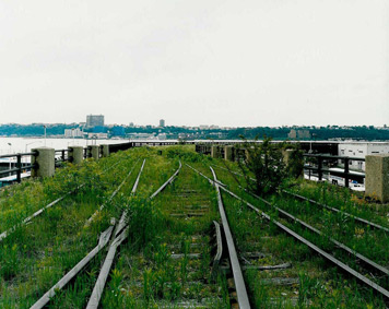
Photo by Joel Sternfeld; the unrenovated High Line, April 2000, New York, NY
“The park should, as far as possible, complement the town. Openness is the one thing you cannot get in buildings. Picturesqueness you can get. Let your buildings be as picturesque as your artists can make them. This is the beauty of a town. Consequently, the beauty of a park should be the other.” — Frederick Law Olmsted, “ Public Parks and the Enlargement of Towns” (1870)
In Frederick Law Olmsted’s writings about parks, one can hear the sweat of his brow. We’ve become so accustomed to the Olmsted style of park: open greenswards, thickets of trees with curving walks, rambles of greater “wildness,” that they just seem natural. But they are as constructed, and as theorized, as any building. It was his genius to make them seem easy, and thus to allow the masses to move at their ease through his additions to the urban landscape. His parks (the most famous designed with British architect Calvert Vaux) had an agenda, one which derived directly from the idea of the park as a complement to, but ever different from, the town.
The High Line in Manhattan, whose first section opened Monday, would seem to be Olmsted’s nightmare. Built atop an abandoned railroad trestle, it is long and narrow. There is no room for a lawn, the soil is too shallow for big trees, and the city presses in, sometimes closely, sometimes from afar, at every point. There is nowhere to forget where you are, who you are, where you have come from, in the way Olmsted hoped Central Park would (a thought borrowed from A. J. Downing), wiping away class distinctions with fresh air and free admission. The High Line goes against all Olmsted’s principles, and yet reveals what we take for granted in larger more pastoral parks. The extreme compression of the trestle makes the choices of landscape architects James Corner Field Operations, the team leader, with architects Diller Scofidio + Renfro, and planting specialist Piet Oudolf, obvious and unavoidable. Each element, whether path, street furniture, flower bed, has to function in multiple ways to keep the landscape from getting cluttered. To put it another way, the High Line is a park as designed object — emphasis on object, since all parks are designed. The parts of the High Line, as well as the whole, are all as carefully considered as a tool that has to fit in your hand.
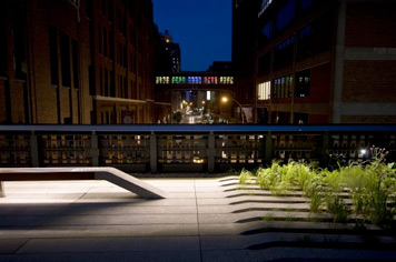
Photo by Will Femia; the High Line planks and integrated plants
One example: the planks that make up the walkway. For a park that is really all path, the surface of that path is extremely important. Central Park can have dirt and gravel and hexagonal pavers, but things so common and assorted would have looked messy here. The architects needed something beautiful in itself, since sometimes the whole High Line is path; something that could blend in to the plants as the original tracks did (and, reinstalled, do); something that could eliminate the need for keep-off-the-grass barriers. As Olmsted said, “A great object of all that is done in a park, of all the art of a park, is to influence the mind of men through their imagination, and the influence of iron hurdles can never be good.” So they came up with a custom concrete plank, polished to show its aggregate, tapered at the ends to merge into the beds, bumped up at the sides and ends to indicate, like a rumble strip, when you’ve gone too far. Of course, they are also a tripping hazard, but so is a curb. And unfortunately, they have decided to add signs, at least for the time being.
The long strips of the plank also draw your eye into the distance, providing the openness Olmsted prized at least in one direction. In the original wild photos of the High Line the glimmer of the tracks under the weeds had the same effect. In places in the park those tracks have been preserved, but they’ve lost the romance of the railroad, stretching off into infinity. My toddler could identify the tracks’ origins with the “choo-choo” but they are more like museum pieces.
The path is primary, and its meander slows you down as Olmsted’s curved roads in central park were meant to. The railroad tracks may have been straight, as are the streets below, but the planks don’t follow the grid. You can’t race along this sidewalk, it suggests the unusual pace of a stroll. This is the most contemporary park in the city in design, yet the most old-fashioned in ideals, since what it truly is, is a shaded walk, away from the bustle, and without the possibility of greater impinging activity — carriage race or the perpetual Hudson River Park marathon. The lounges in the park north of 14th Street suggest a similar polite repose (though they also seem like an ideal cruising spot); by Wednesday they had already attracted a set of lunchtime readers with appropriate paperbacks by Haruki Murakami and Eric Larson.
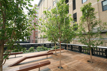
Photo by i'mjustsayin; the High Line benches at 16th Street and 10th Avenue
Another example: the ipê benches, which rise like pointer fingers from the concrete (and at 16th Street, wood) deck. Like the planks, the benches had to be different from those at other city parks. The typical wrought-iron model would have looked even more Victorian than usual in this setting. Again, the architects made them long and lean, emphasizing the direction in which the park expands. And they made them multi-functioning, with lights below to illuminate the path at night, but not distract you from the urban stars in the surrounding buildings.
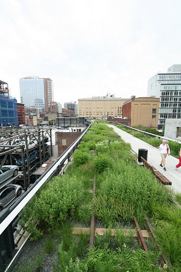
Photo by i'mjustsayin; the old High Line tracks in the new park
In interviews, Field Operations principal James Corner has sometimes contrasted himself with Olmsted, wanting the artificiality of his (Corner’s) parks made plain. I’ve always thought that his renderings undercut this intellectual position, since in competition after competition, he’s created gorgeous, swelling, mysterious and various environments. But New York City has given him two opportunities (here and at Fresh Kills) to create natural beauty that is defiantly and necessarily artificial, thus having it both ways. At Fresh Kills, you will always have the uneasy sense that the ground beneath your feet is garbage. At the High Line, the paucity of space allows the park to borrow the picturesqueness of architecture for its own ends.
Olmsted wanted the park to give the impression of nature, and to blot out the buildings, but also to be the lungs in an overbuilt city. Each tree served two, sometimes three purposes, as he planned the upper part of Central Park as an educational arboretum of native American trees. It is hard to romanticize the thickets of trees in the upper park when you realize every one was trucked in and located on a plan. The plants themselves have their roles in a natural park, as surely as the fixtures.
On the High Line, of course, the buildings can never be blotted out. But the change in perspective the height of the trestle gives, lifting you above the cars if not the buildings, turns them into something stranger, and indeed more picturesque, than they might otherwise be. Other critics have already noted the panoply of starchitecture along the park, but that’s not even providing the best moments. Passing through the Chelsea Market Building can feel like a moment in a copse, when all the other information of the park is blotted out. An artwork by Spencer Finch — new glass panes in the building’s old frame, their blues sampled from the light on the Hudson River — is like glimmers from a pond. In another place, an old building with peeling siding presses in like a thicket of trees. (Real trees only appear at the park’s southernmost point, a polite and gridded stand.) Or the ivy growing wildly up the side of a warehouse reinforces the green of a planting bed.
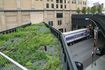
Photo by i'mjustsayin; the northern spur preserve
The buildings act as foliage, but there is also foliage — native plants, now all the rage, another way in which Olmsted was avant la lettre, return, now obviously planted by human hand. These are no perennial borders, but a rich and sometimes strange assortment of ferns, grasses, wildflowers, vines, in shades from pale green to russet to purple. I particularly liked a creeper with flat reddish leaves the color of fall maples. They range from high to low, stick up oddly and sometimes cover the tapered ends of the planks. They are always defiantly bordered by those planks, by the edge of the trestle, at one point just running smack into a building. The plants aren’t multi-functioning but designed to do just one thing, rather than the usual covering up, edging out, and artificial proximities of the garden. They evoke but do not imitate those lovely weeds above our heads, seen in Joel Sternfeld’s photos, that inspired the whole enterprise.
Many things about the High Line remain to be seen, after the initial sightseeing and obsessive picture-taking wears off. What will its hours be? A 6 p.m. passeggiata or an 8:30 a.m. walk to work? Is it only a path, or will points along the way gather a sense of place? Will the buildings blot out the plants, or vice versa? And with all its starry patrons, even whether it fulfils Downing and Olmsted’s democratic ideals remains to be seen. The Friends of the High Line are at pains to make sure the park doesn’t seem exclusive, but it could come to be seen as the backyard of The Standard, et. al. despite the zoning against this fate. For it to fulfil the idea of a park as complement to the town, it has to be a place that appeals to almost everyone, and allow the fussy considerations of urban life to all fall away.
