This month, The Monacelli Press publishes the first English translation of a famous 1972 debate between Dutch graphic designers Wim Crouwel and Jan van Toorn, a public clash of subjectivity versus objectivity at Amsterdam’s Museum Fodor that helped set the stage for bold philosophical showdowns to come in design culture.
Held in response to an exhibition of Van Toorn’s work at Stedelijk Museum, including student posters protesting the Vietnam War—in an era of youth culture and increasing resistance to authority, capitalism, and the power of media—the stakes were aesthetic, ethical, and politically charged.
This week, Design Observer publishes four excerpts from The Debate, now available from Monacelli.
Today's is the final installment. Read parts 1, 2, and 3.
++
Wim Crouwel and Jan van Toorn both designed postal stamps as well. In the 1970s Van Toorn did a few assignments for the national postal service, PTT. In 1971 he designed a stamp for the Prince Bernhard Foundation, while in 1975 he created three stamps on topics related to Amsterdam (together with Paul Mijksenaar): two commemorating the capital’s seventh centennial and one on the Portuguese-Israeli community that had been in the Netherlands for three centuries. The original idea had been to design a sheet of one hundred stamps featuring images of Amsterdam residents from the last seven hundred years, with the overall color of the sheet changing from red to yellow.
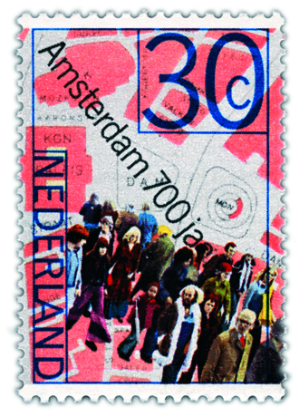
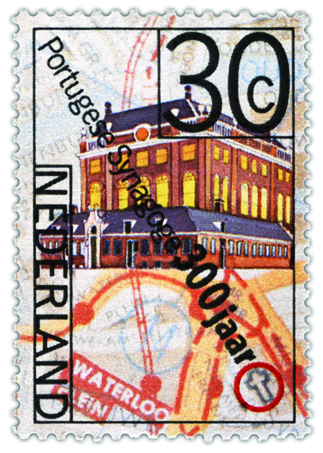
Above: Jan Van Toorn, 1975
Unfortunately, this idea was not feasible for technical reasons. The stamps Van Toorn ultimately designed are structured as a collage, showing a map, a procession of Amsterdam residents, and an image of the Portuguese Synagogue. Although the design of these stamps was a collaborative effort, they still look like typical Jan van Toorn designs.
The next year, Crouwel designed two series of stamps: one on the occasion of the Amphilex stamp exhibition, and the other to replace the famous number stamps by Jan van Krimpen from 1946. Crouwel used a modified version of his own typeface, Gridnik, which he had originally designed for Olivetti for use in typewriters but was never implemented as such. The name refers to a nickname given to Crouwel, Mr. Gridnik. The series of eleven variants printed in two opposite gradients remained in circulation until 2002.
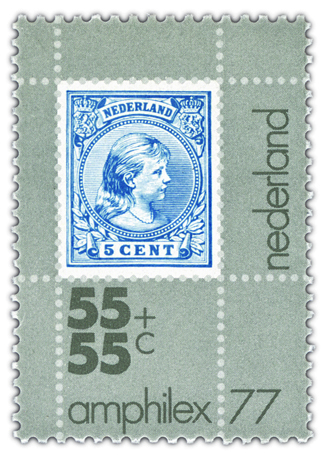
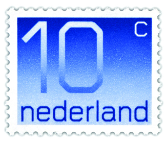
Above: Wim Crouwel, 1976
The stamps concisely illustrate the preferences of both designers: while Van Toorn mainly pursues the use of images, Crouwel prefers emplying purely typographical means.
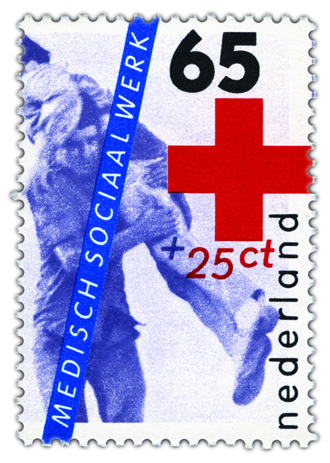
Jan Van Toorn, 1983
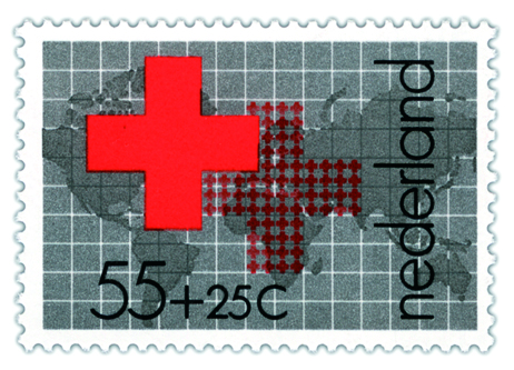
Wim Crouwel, 1978
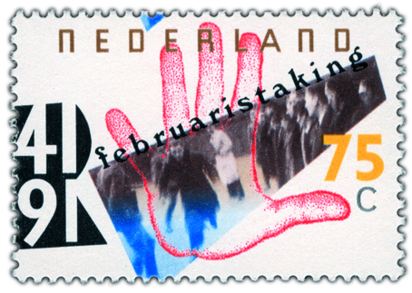
Jan Van Toorn, 1991
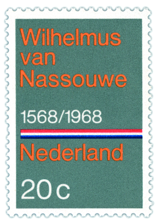
Wim Crouwel, 1968
