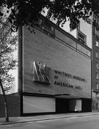
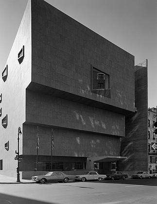
Marcel Breuer's Whitney building is such a solid, idiosyncratic thing, and the museum's identity is so tied up in it, that it's hard to imagine the museum leaving it behind. The Whitney, though, is the most peripatetic of New York museums, and in 2015 (or thereabouts) it will decamp for a new Renzo Piano-designed home at the foot of the High Line. That the Whitney needs more exhibition space is without question. The proposed new building also suggests, to me, the Whitney's aspiration to shed its image as the underdog of New York's art museums.
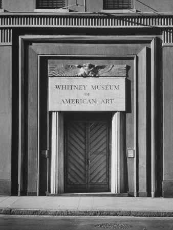
The Whitney, it should be noted, would not have existed at all had the Met not considered Gertrude Whitney's collection of modern American art beneath its dignity. Spurned, in 1931 she opened up her first gallery on Eighth Street, in a converted neo-classical townhouse. In 1954 it became the virtual stepchild of MoMA, when it moved to boxy new outpost on West 54th Street adjacent to MoMA's garden. The building was designed by Augustus Noel, architect of the Eighth Street building, but the facades were essentially the work of Philip Johnson, MoMA's house architect. (The space has now been fully cannibalized by MoMA.) No surprise, then, that the Whitney would want a new place wholly of its own, and one with a distinct visual form that would set it apart from MoMA and from the Guggenheim.
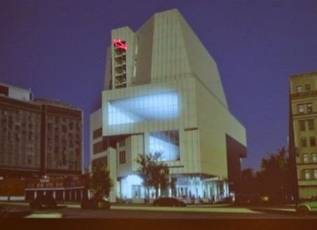
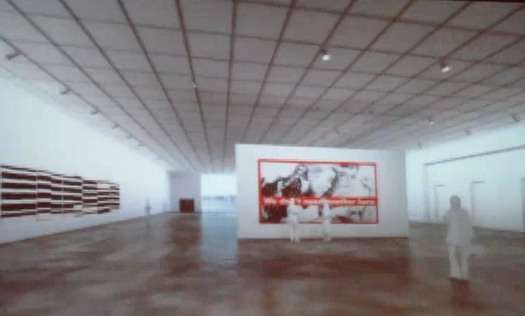
From what one can divine from the early renderings, Renzo Piano's new Whitney will be very much in the formal spirit of Breuer's building: a staggered stack of volumes, some cantilevered, with broad windows facing the street. The galleries also seem to have been designed with a sensitivity to the museum's history. [See images below] A few thoughts about the new building:
• An auditorium that faces a large picture window [the square in the picture above left] will put everything on stage in silhouette, and precludes any backstage area. Also, DS+R did this in Boston.
• More generally, the building seems very concerned with generating river views. These bright views will create glare problems, but I also wonder about the obsession with great views of Jersey City. The best views of New York are of New York, not of New Jersey. The Whitney, bastion of Edward Hopper, should understand this, and privilege views of New York architecture, as Jean Nouvel has done a few blocks uptown.
• Will there be any intimate spaces for viewing art? So much of the early collection begs for this kind of display, and not giant warehouse rooms.
• The "Meatpacking District" is hot right now, and a connection to the Chelsea gallery world via the High Line is nice (until it departs for Bushwick?), but it's somewhat disturbing that the museum is moving to a place virtually untouched by public transportation. How are they going to get school groups to this building? On the Upper East Side, the Whitney was in the heart of a residential community. This new venue will be much more tourist dependent.
• Remember when Florent was the only thing worth visiting on Gansevoort?
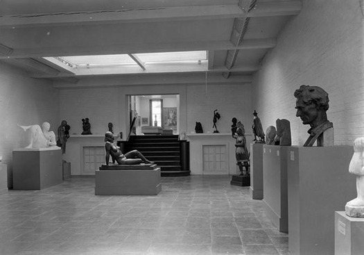
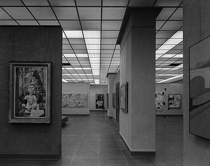
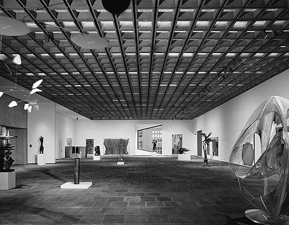
As it is, I'm still digesting what this all means. The idea that the Met will now put its own modern collection in the Breuer building is heartening, at least, and not a bit ironic given the history of the museums. For the record, here's a look at the Whitney galleries through history.
