Photo: Dan Meyers
As I write this, it strikes me that the Rand House is 62 years old, very well over a half a century. My understanding and appreciation for Paul Rand’s work was significantly influenced and enhanced by my first encounter with his house and home in Weston, Connecticut, about an hour and fifteen minutes by rail to New York City. Like many who had been invited to the Rand House, I had first heard about it, imagined it, seen photographs, and anticipated the visit. I was not disappointed.
In 1952 when Paul Rand designed his house and home, he desired an enduring essential house, built for beauty and privacy, security and shelter, peace and an intimacy with its surroundings. The character of the Rand House perhaps is best exemplified through a subtle unobtrusive and deeply moving pattern of beauty, an austere elegant color, sophisticated luster, balance and tranquility. He built a house to work and live in.
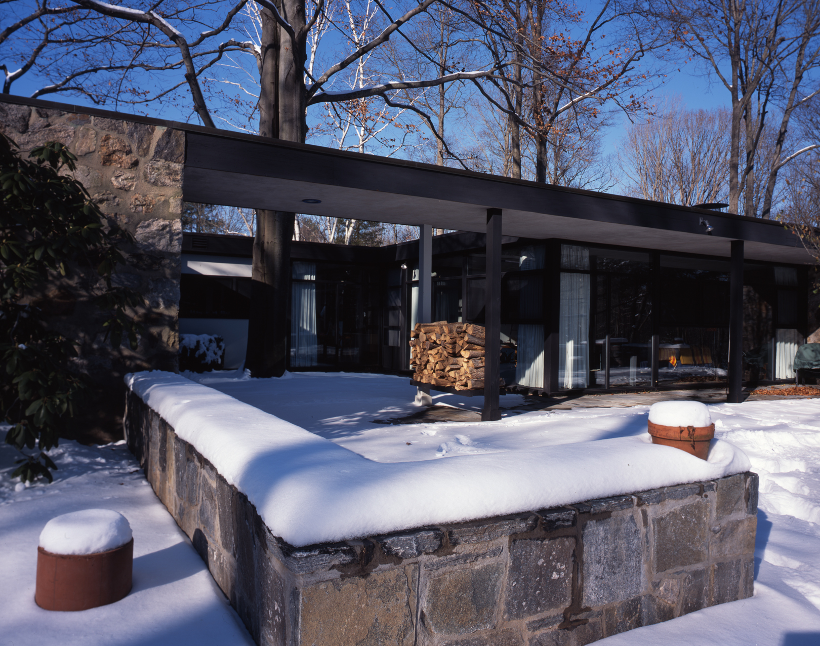
While not a large house, it felt just right, as if it had been made to measure for every interaction and every function. The vista from the living room to the inner court and beyond is breathtaking. The court, open to the sky, temptingly visible from the other rooms, brings the outdoors in, offers shelter from the elements, and offers the privacy of a room. The open floor plan lends the house a significant sense of spaciousness. There is a strong dualism in the design of the Rand House because of the contrasts of polarities. Despite the formal functionalistic tendencies, the house is rich with organic details, and the use of metaphors, forms and materials and textures are the recurrent themes. Rand matched romantic ideals with rationalism, natural forms with geometry, the modernist with the vernacular and as a result created an infinitely rich environment.
The dining area is a clearly defined room despite its semi open connection to the kitchen and long corridor. All the house’s functional areas, though well defined, borrow visual space from the open areas and adjoining rooms, and thus create a feeling of spaciousness. The spaces are especially beautiful and in perfect scale with the human body, standing or seated. Space is not treated as a tangible substance to be contained but as the logical consequence of structure. Rand had long welcomed plants as a natural ornament. This is one way he infused humanism into his interpretation of modernism. He displayed his considerable collection of art salon style, a clear move meant to compliment the whole rather than respond to the prescriptive style of a clinical modernist interior.

Photo: Dan Meyers
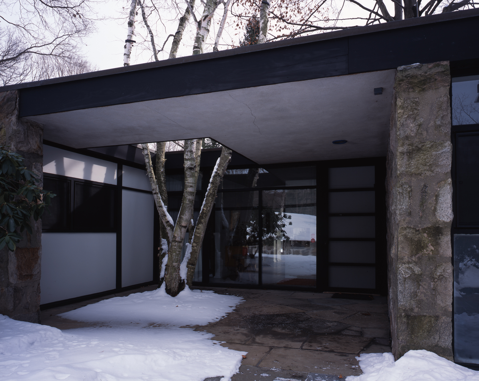
The Rand House avoids the clichés of the modernistic and strives for a warm companionable use of building materials. The geometrical, one-story structure offers on the outside a collection of plane surfaces with a rough texture of native fieldstone. The wood used in the frame is black-stained cypress, the white panelling is Marlite, and the pavement for court and entrance are bluestone.
The forms developed by the De Stijl movement are everywhere in the Rand House with subtle variation of elementary compositional principles, such as horizontal versus vertical, small versus large, light versus dark and the three primary colors–red, yellow, and blue. This interpretation of the vocabulary of form is what Paul Rand understood, adapted and used to stir up and sharpen our ability to perceive the nuances of simple visual phenomena in visual communication.
The compact yet spacious modern home takes into consideration Connecticut’s rustic environment and a knowing nod to traditional New England architecture. The house neither tosses the inhabitants out into the open by too much “picture window” exposure, nor shuts them off from the outdoors by conventional barriers. The entrance, for example, utilizes natural light in the small court and roof opening to the left, where stand birch trees reaching to the sky, all this, from a reasonable distance creates an illusion reminiscent of a painting by René Magritte.
It is these inherent coherencies and balances, which characterize Paul Rand’s designs that have rendered their continued appreciation and relevance.
This appreciation is excerpted and adapted from Paul Rand: Modernist Design.
