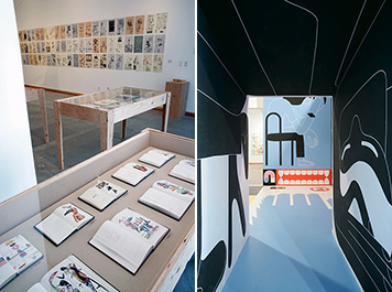
Installation views: Two Lines Align: Drawings and Graphic Design by Ed Fella and Geoff McFetridge, Redcat Gallery, Los Angeles, 2008
Two Lines Align: Drawings and Graphic Design by Ed Fella and Geoff McFetridge was the first exhibition of graphic design at the Redcat Gallery at the Disney/CalArts Theater in Los Angeles. The show, which closed in early April, presented a retrospective of the established “art-designer” Ed Fella and a prospective of Geoff McFetridge, a young designer essentially at an early stage of his career. Curated by Michael Worthington, a design educator at California Institute of the Arts, it is both an examination of two careers and a reflection of the state of graphic design in the now. But after seeing the show, in its context — in California, in LA, in the Frank Gehry-designed Disney Concert Hall — it occurs to me that this was also a show about the trajectories of modernism, specifically, the trajectories of American modernism, which may not seem so obviously connected to the work of designers such as Fella and McFetridge.
Fella is American by both birth and education and has taught at CalArts since 1987; McFetridge is Canadian born, but received his MFA in graphic design from CalArts. The experience of seeing the show in a Gehry building says as much about American modernism as it does about its California context. And this context is not to be taken lightly. While thoroughly modern, Gehry’s work is expressive, idiosyncratic and stands in contrast to the strict rational glass-and-steel boxes most often associated with the idea of Modernism. Gehry’s work “fits” the particular — some might say “peculiar” — visual environment of Los Angeles. It is disjointed, multilingual, raucous and youthful, and it resists easy summation.
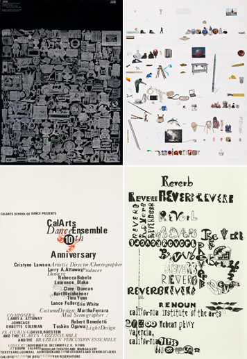
(Top left to right) Ed Fella, poster using excised 19th-century engravings, ca. 1970s; Coming of Age: No. 3, Male History/Self-Portrait, collage, 1981; (Bottom left to right) CalArts Dance Ensemble poster, 1989; flyer for Lisa Nugent, Reverb lecture, 1999
Since the mid-1980s, CalArts has pursued a specific form of modernism that was cut short by the influx Bauhaus-influenced European designers fleeing the conflict of the Second World War; a caesura later reinforced by the popularity of Swiss graphic design. Conventional (European) modernism imposed a grid of rationality from without, a conceptual grid which existed a priori and external to its subject. Guided by reason, that form of modernism placed an emphasis on the clarity of communication and the transparency of organization. It assumed a direct relationship between the message and its manifestation in advance of the act of designing. Alternately, the Arts-and-Crafts-inspired, “decorative modernism” practiced by the likes of Dwiggins, Goudy and Rogers — to which I would add Fella and McFetridge, and the CalArts School in general — developed its logic from within. Decoration, embellishment and “doodling” determine their logic internally, as they are being practiced. Decorative modernism develops a structure relative to its immediate context, during the act of designing. When we doodle, perhaps while distracted, we add marks on the page as a reaction to our immediately preceding marks, and not owing to some predetermined aesthetic organization. Fella’s work is measured letter by letter, with each subsequent addition contributing to the finished piece; McFetridge’s work is measured by time: “If it’s a one hour lecture, I’ll do a drawing for an hour and videotape it and project it while I am talking. So I figured out how much I can draw in an hour.” A drawing is complete when time is exhausted.
The catalog notes the traditionally uneasy relationship that graphic design seems to have with art practices, but that unease was not on display at Redcat. While McFetridge has a longer, established gallery relationship — he has previously exhibited his work in numerous venues — both Fella and McFetridge’s work feels at ease at the Redcat Gallery. This comfort stems not from an interest in producing “client-free” works, but rather because the work maintains its voice irregardless of whether it was client-commissioned or self-initiated. The conventional assumption that the graphic designer should subsume individuality to the client’s message is precisely what causes the public to think that graphic design is an insignificant form of cultural production. Both Fella and McFetridge contradict this assumption: included in the show are posters for music festivals and opera, music videos, sneakers and skateboards — all of which display the same strength of artist’s vision as work done for purposes of self expression.
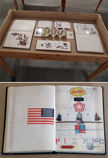
Vitrine of Ed Fella sketch and collage books; Fella’s first sketchbook, 1976
Fella’s work is discrete. It is not environmental. His work accumulates. Similar to the detritus of American vernacular production that he gathers — bits of found typography, collected Polaroids, ticket stubs, mailing labels, lost dog announcements — these seemingly innocuous elements, when seen together as a fragile web of connected threads, are simply delightful. Fella’s many accumulations are present in the show, including over 50 of his sketchbooks, nearly 70 flyers, numerous collages and poster commissions. Also included are samples from his early commercial work for the automobile industry through his thesis from Cranbrook, on through his early fascination with 19th-century engraving: excised from books, these engravings are repositioned and recontextualized in later collage posters. These collages in turn, with their irregular spacing and cartoon quality imagery, herald the “bad kerning” typography series and “FellaPart” dingbat treatment we have come to recognize him for in his mature work. The magic of Fella’s designs lies in the fact that his flyers belie the labor involved in their production. It may take a full day to wax down three letters to the point of sufficient satisfaction. Thirty years of accumulation covering a gallery wall, as well as seven vitrines, represent untold hours of drawing, photocopy-reducing, positioning, pasting and then starting all over again — simply because the letter “just isn’t right.”
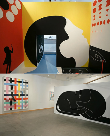
Geoff McFetridge, installation views
McFetridge is a counterpoint to Fella: his work envelops its audience. It covers a surface in grand, generous brushstrokes. His work’s impact and scale is felt in an environment not simply because its been applied to the walls of a gallery space, but because his outlook is broad. Any object is a potential design surface. While much of Fella’s work is discretely arranged, like jewels in a display case, McFetridge’s work wants to “bust out” of any container. His work is cacophonous, boisterous and exuberant. His naïf drawing style acts as a foil to his metaphoric and often enigmatic subjects. Everything is (generally) innocent. Everything is (generally) new. In his reference to the simple clarity of childhood — devoid of perspective, life is “flat” in Geoff’s world — McFetridge returns to the juvenile optimism we lost to our consumer-oriented culture. While Fella’s art riffs on the hackneyed commercial experience of his past, McFetridge recalls the wonderment of childhood. McFetridge reminds us that teddy bears can ski (but should do so without scissors) and that Yetis can be found if one looks hard enough.
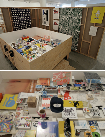
Geoff McFetridge, installation views
The restraint of Michael Worthington’s curatorial intervention in Two Lines Align creates a dialogue which would have only been muffled had their work been displayed in a more intertwined manner, however, some interpretive information to accompany at least the major pieces would have been appreciated, particularly for the members of the non-design public who might not recognize with the significance of the work on view. Worthington designed the accompanying catalog (which includes essays by Jamer Hunt, Worthington, and a conversation between Worthington, Fella and McFetridge). Worthington’s shrewd strategy is extended beyond the homonym of the show’s title. Where two-color signatures occur, the book’s design maximizes duotone printing in a painterly manner: the colors do not reproduce Fella’s flyers exactly but rather suggest the printed intent; in other signatures, white paper is colored with “knocked out” white accents to a grand effect. Even the choice of typefaces is a reflection of Worthington’s acerbic wit: the body text is set in Electra, a typeface designed by the American patron saint of graphic design and former commercial artist, William Addison Dwiggins. And the headline type is set in Paul Renner’s Plak, a heavy, “grotesk” interpretation of Plak’s geometric sibling Futura. (Originally released in sizes between 72 and 624 points, Plak was intended for display size use in the coarse reality of advertising — “plakat” is German for “poster”).
Two Lines Align was much more than a collection of commercial poster or package design artifacts. Under the guise of a “two-man show,” it provided a window into an array of differences reflecting the respective practices of two different generations of marginal modernists tied together by a common thread. It is a point of continuity that Fella notes best when he ends the catalog with, “I can also see that as part of a shift that we both epitomize: something ending and something beginning but still being a continuum.”
David Cabianca teaches graphic design at York University in Toronto, Canada. He received masters degrees from The University of Reading UK, Cranbrook Academy of Art and Princeton University. He has been working on his text typeface, Cardea, since 2003; upon completion, Cardea will be released by the Emigre Type Foundry.
All photos by Scott Groller © CalArts 2008 except the following: Michael Worthington: flyer for Lisa Nugent, Reverb lecture, 1999, and Coming of Age: No. 3, Male History/Self-Portrait, collage, 1981; David Cabianca: vitrine of Ed Fella sketch and collage books, and Fella’s first sketchbook, 1976.
