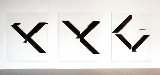
Untitled, 2007 and 2008, Wade Guyton. Courtesy of the artist
Wade Guyton’s show at the Whitney Museum in New York has drawn a rave review from Roberta Smith and others, and it’s easy to see why. Big and bold, abstract and impactful, Guyton’s canvasses are a celebration of the visual language that we used to call graphic design. Is this good news for graphic designers? Smith says the exhibition provides "cause for optimism": in her view, Guyton's is a fresh, new voice, but it is equally true that the work draws from the formal language of typography — a vocabulary that will be familiar to anyone familiar with the work of certain experimental type designers over the past several decades. Much has been and will be said about Guyton's references to the work of certain painters (Ad Reinhardt comes to mind) but there are shades of any of a number of graphic designers you know (not to mention a throwback to that advanced typography class you took in college) in this work, which may indeed offer cause for optimism.
