
Nicolai Ouroussoff on Charlie Rose, December 2005.
When I told an editor recently that my dream upon graduating from college was to be an architecture critic, she laughed. Not at me (I don’t think), but at the idea of aspiring to a job that might be doomed. Online, both everyone and no one is a critic, and architecture talk proliferates, often in the absence of buildings. Yet there are still a few architecture critics who count, and Nicolai Ouroussoff of The New York Times is perhaps the most powerful (rivaled only by his predecessor Paul Goldberger, now at The New Yorker). Ouroussoff has the opportunity to write about architecture anywhere and often. He is read by people who are not already interested in the topic, and he is read by important people. Should Ouroussoff turn out to be the last architecture critic, that makes it even more imperative to say: He is not good enough. He is not winning hearts or minds. He is not making a case for keeping the breed.
In 1985, Michael Sorkin wrote a Village Voice article titled, “Why Goldberger Is So Bad.” A set of recent Paul Goldberger columns in the Times on prospective buildings for Times Square had sent Sorkin into personal attack mode. His issue was not the designs, though the massive, repetitive Johnson/Burgee buildings would have truly been terrible, but Goldberger’s inability to take a position for or against them. “Goldberger artfully presents the existence of conflicting opinions as a means of showing the superiority of having none,” Sorkin wrote. “His strategy is to take all the positions.”
Now, I am not as mean or as funny as the 1980s Michael Sorkin, but I can’t help sharing his wrath. What outraged him about Goldberger was Goldberger’s inability to express his own opinion and his refusal to speak truth to power (in the form of Philip Johnson). What outrages me about Ouroussoff is partly the opposite. Ouroussoff has an opinion about design, but his reviews offer not much more than that opinion. His approach — little history, less politics, occasional urbanism — shrinks the critic’s role to commenting only on the appearance of the architecture. He might have been the perfect critic for the boom years, when looks were the selling point, but this formal, global approach seems incongruous in a downturn. His evaluative criterion was never clear to me until I embarked on this essay; in re-reading him, I found frequent defenses of one quality: the new.
If that’s what he’s selling, I’m not buying it. For three reasons: We don’t know where he lives. He’s slippery. And he doesn’t care (enough).
To which the proud Brooklyn resident could only respond: We need Frank Gehry’s affirmation?
There are those — especially acolytes of the urbanist Jane Jacobs — who
When I told an editor recently that my dream upon graduating from college was to be an architecture critic, she laughed. Not at me (I don’t think), but at the idea of aspiring to a job that might be doomed. Online, both everyone and no one is a critic, and architecture talk proliferates, often in the absence of buildings. Yet there are still a few architecture critics who count, and Nicolai Ouroussoff of The New York Times is perhaps the most powerful (rivaled only by his predecessor Paul Goldberger, now at The New Yorker). Ouroussoff has the opportunity to write about architecture anywhere and often. He is read by people who are not already interested in the topic, and he is read by important people. Should Ouroussoff turn out to be the last architecture critic, that makes it even more imperative to say: He is not good enough. He is not winning hearts or minds. He is not making a case for keeping the breed.
In 1985, Michael Sorkin wrote a Village Voice article titled, “Why Goldberger Is So Bad.” A set of recent Paul Goldberger columns in the Times on prospective buildings for Times Square had sent Sorkin into personal attack mode. His issue was not the designs, though the massive, repetitive Johnson/Burgee buildings would have truly been terrible, but Goldberger’s inability to take a position for or against them. “Goldberger artfully presents the existence of conflicting opinions as a means of showing the superiority of having none,” Sorkin wrote. “His strategy is to take all the positions.”
Now, I am not as mean or as funny as the 1980s Michael Sorkin, but I can’t help sharing his wrath. What outraged him about Goldberger was Goldberger’s inability to express his own opinion and his refusal to speak truth to power (in the form of Philip Johnson). What outrages me about Ouroussoff is partly the opposite. Ouroussoff has an opinion about design, but his reviews offer not much more than that opinion. His approach — little history, less politics, occasional urbanism — shrinks the critic’s role to commenting only on the appearance of the architecture. He might have been the perfect critic for the boom years, when looks were the selling point, but this formal, global approach seems incongruous in a downturn. His evaluative criterion was never clear to me until I embarked on this essay; in re-reading him, I found frequent defenses of one quality: the new.
If that’s what he’s selling, I’m not buying it. For three reasons: We don’t know where he lives. He’s slippery. And he doesn’t care (enough).

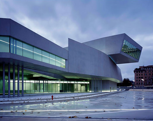
Zaha Hadid, MAXXI, National Museum of 21st-Century Art, Rome, 2009.
He Doesn’t Seem to Live in New York City
Local residency should be a requirement for the Times architecture critic as it is for city police officers and politicians. Ouroussoff must have moved here in 2004, when he was hired from the Los Angeles Times to replace Herbert Muschamp, but I don’t recall him ever referring to his neighborhood, to a favorite park or plaza or to the pedestrian everyday city that the rest of us occupy. Alice Twemlow argued recently on Design Observer that the best design criticism is based on user experience and unpretentious language, and the same standard can be applied to architecture criticism. To know where critics are coming from, particularly on urban matters, it helps to know what they personally prefer: high-rises or brownstones, big parks or small. Does Ouroussoff jog? Have a dog? Ride the subway? The easiest way to draw in readers who don’t think they’re interested in architecture is to offer a parallel experience, say, approaching a building on foot, as a stranger. I’m not asking for personal revelation — though it always charms me when Christopher Hawthorne, Ouroussoff’s replacement at the LA Times, makes appropriate mention of his family — but for a sense that he dwells in our reality and not Airworld. Even after all this time, he rarely writes as if his feet touch the ground.
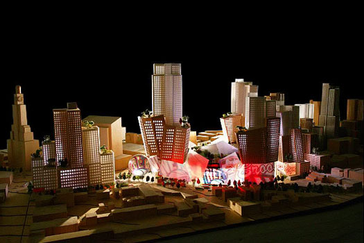
Exhibits A and B in this critique are Ouroussoff’s reviews of the massive Atlantic Yards project in Brooklyn. It was unclear from his first review whether Ouroussoff had ever been to Brooklyn, so grateful did he think we should be for the services of (Los Angeles) architect Frank Gehry. On July 5, 2005, he wrote:
Frank Gehry's new design for a 21-acre corridor of high-rise towers
anchored by the 19,000-seat Nets arena in Brooklyn may be the most
important urban development plan proposed in New York City in decades.
If it is approved, it will radically alter the Brooklyn skyline, reaffirming the
borough's emergence as a legitimate cultural rival to Manhattan.
To which the proud Brooklyn resident could only respond: We need Frank Gehry’s affirmation?
There are those — especially acolytes of the urbanist Jane Jacobs — who
will complain about the development's humongous size. But cities attain their
beauty from their mix of scales; one could see the development's thrusting
forms as a representation of Brooklyn's cultural flowering.
Here Ouroussoff performs a neat trick, (mis)characterizing the opposition as a bunch of Jacobsian sentimentalists, and informing us that Gehry’s new architecture would be the borough’s best representative. Those brownstones are apparently so retrograde that they and the rest of the project’s existing context warrant only a three-sentence paragraph. Ouroussoff never bothered to orient his readers to the importance of the site, the windy, well-trafficked corner of Flatbush and Atlantic Avenues. Naturally the Brooklyn bloggers had a field day with this piece, for reasons valid and conspiratorial.
Later, much later, Ouroussoff would try to make amends, when, in one of the more scathing reviews of his Times career, he told Gehry to walk away from the compromised vision. On March 21, 2008, he wrote:
No development at all would be preferable to building the design that is now
on the table. What’s maddening is how few options opponents seem to have.
We could wage a public campaign to stop it. We could pray that Forest City
Ratner comes up with more money…
The use of the royal “we” was startling — Ouroussoff had suddenly aligned himself with the opposition — but in truth he was just as worried about Frank Gehry’s reputation as “our” options.
Mr. Gehry, on the other hand, could walk away… But by pulling out he would
be expressing a simple truth: At this point the Atlantic Yards development
has nothing to do with the project that New Yorkers were promised. Nor does
it rise to the standards Mr. Gehry has set for himself during a remarkable career.
In neither review, nor those in between, did Ouroussoff ever describe the intersection as it exists or offer any personal experience with that Brooklyn renaissance. It was as if all he knew was what he had read in his own paper. He could see the models at the office. He could talk to Frank Gehry. That was enough. He was far more lyrical, and particular, when he walked a series of redevelopment sites in Paris last year in the company of various famous architects.

Frank Gehry, Atlantic Yards, first proposal, 2005.
The first Atlantic Yards review went a way toward establishing Ouroussoff as a character, and like Muschamp and Goldberger, a lover of stars. Muschamp’s repetition of a short list of famous names — including Rem Koolhaas, Frank Gehry, Peter Eisenman and Diller + Scofidio — became so noticeable that it provoked Michael Sorkin to publish the number of times (as a percentage of total citations) those architects were mentioned in his columns.
If we were to reduce Ouroussoff’s output to a list, the names would be slightly different, but the emphasis remains the same: yes to Gehry, Norman Foster, Zaha Hadid, Jean Nouvel; no to people you haven’t already heard of. His neighborhood, then, is the floating world of the international architectural profession. He goes where the big-name action is (most recently, to Boston and Basel). This approach only reinforces contemporary architecture’s disastrous tendency toward placelessness and divorces the New York Times critic from New York. He can judge a design anywhere, but he can’t assess its function, urbanity or livability. And he’s unlikely ever to revisit, since that would involve another flight.
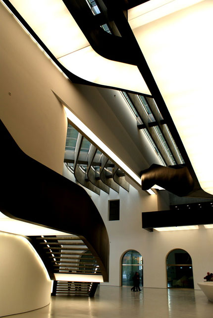
When Ouroussoff critiqued MAXXI, Zaha Hadid’s museum of 21st-century art, in Rome, he did recommend the best pedestrian approach along Via Luigi Poletti, but without characterizing that street, or the neighborhood around the swoopy object. There was nothing to talk about but Hadid.
Maxxi, which opens to the public on Saturday for a two-day “architectural
preview,” jolts this city back to the present like a thunderclap. Its sensual
lines seem to draw the energy of the city right up into its belly, making every-
thing around it look timid. The galleries (which will remain empty of art until
the spring, when the museum is scheduled to hold its first exhibition) would
probably have sent a shiver of joy up the old pope’s spine. Even Bernini, I
suspect, would have appreciated their curves.

Zaha Hadid, MAXXI, interior.
It is hard for me to get over the oddity and cheesiness of characterizing that pope, Urban VIII (1568–1644), as “dreaming up lavish new projects over breakfast with his artistic soul mate, the Baroque sculptor and architect Gian Lorenzo Bernini,” and imagining his MAXXI enthusiasm. This was Muschampian smoke and mirrors leading the eye away from the uncomfortable fact that the building wasn’t ready for him. Ouroussoff, because he’s the Times critic, was first on the scene, but even he had to admit that his job wasn’t quite done:
What we don’t know, however, and won’t know for a while, is whether the
galleries strike the right balance between the need to move crowds and the
stillness required for contemplating art.
Contemplating art. Isn’t that what museums are for? Ouroussoff’s review makes it sound as if MAXXI is more important as “proof that this city is no longer allergic to the new and a rebuke to those who still see Rome as a catalog of architectural relics for scholars or tourists” than as a functioning building. He’s treating Rome the same way he treated Brooklyn: as a city of nostalgics who should be grateful that a curvaceous UFO has awakened them from slumber.
He’s Slippery
I teach architecture criticism at New York University and the School of Visual Arts. In trying to stay current, I have often assigned Ouroussoff reviews. Typically, we only end up discussing the topic rather than Ouroussoff’s approach. Rarely does he turn a phrase that sticks in the mind, or take risks with comparisons, structure, even vivid description. The emotional tenor of his writing is always fairly close to that of the rest of the Times’s Arts section: knowledgeable, covering all the bases, but somehow unremarkable. This evenness makes it almost impossible to characterize his critical persona. To follow in Ouroussoff’s footsteps (as I encourage my students to do with the critics we read) wouldn’t lead them to be more than competent writers. That would be a plus in innumerable cases, but is not, in my opinion, what criticism is about. Critics should have followers, people who can’t wait to hear what they say next. It makes me nostalgic for the days when you couldn’t believe what Herbert Muschamp had just written. That outrage was earned. Ouroussoff seems only to inspire annoyance.
Ouroussoff’s lack of artistic ambition leads to lazy writing, words and characterizations, unexplained assumptions and manufactured opponents that appear and reappear. In his largely unqualified rave for the High Line, enthusiasm inspired him to use some colloquial references, from Carrie Bradshaw (horrendously dated) to Bambi:
What saves all this from becoming a saccharine exercise in nostalgia is
the sophistication with which these elements are fused together.
Given that he had just been talking about the fragments of railroad track in the thickets, if I were grading his review, I would ask first, What’s “all this”? And then, Who ever said the High Line was going to be nostalgic? He raises the specter of nostalgia only to demolish it, a one-paragraph tempest. I was so struck by his abuse of nostalgia in the High Line review that I went back through my clippings. Nostalgia came up again and again, never explained, always as a negative. In his similarly positive take on the designs for the East River Waterfront, he writes:
The typical riverfront developments of today, with their traditional lampposts
and quaint park benches, drip with nostalgia for a city that never was.
I agree we should install no more reproduction 1880s streetlights. But “nostalgia” (whose nostalgia? Nostalgia for what era, what architect?) without context becomes a straw man, an illusory opponent for contemporary architects to triumph over.

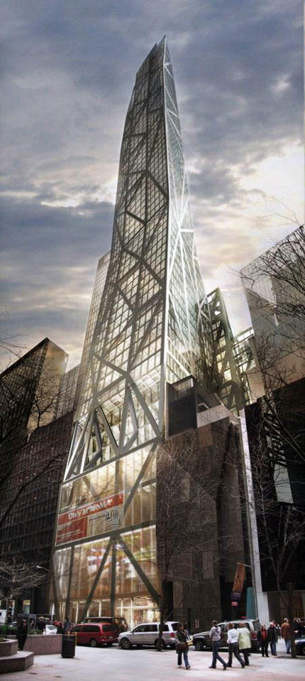
Jean Nouvel, 53 W. 53rd Street, proposal, New York.
A different straw man appears, bearing pitchforks, in Ouroussoff’s January 20 review of Renzo Piano’s Isabella Stewart Gardner addition.
More than a few eyebrows will likely be raised on Thursday when the
Italian architect Renzo Piano unveils his design for the expansion of the
Isabella Stewart Gardner Museum here. The cultural watchdogs of Boston
don’t take well to change…
Well, the preservationists should put away their torches and pitchforks.
Whose eyebrows? Why pitchforks? I believe the stereotype that Boston is a city of conservative taste, but this sort of broad-brush introduction is too easy. He’s invented an opposition to the addition and then demolished it, in the space of two paragraphs. It is manufactured drama, and only delays our access to the building.
If the design has a flaw, it’s not that it tramples all over Gardner’s memory,
but that it holds it in too high regard. Mr. Piano has been so careful to protect
the sanctity of the existing museum in his design that you may find yourself
tiptoeing through the galleries instead of floating joyously through them as
visitors do today.
Why shouldn’t we raise our pitchforks against banality? If you read previous Ouroussoff reviews of Piano’s work, you realize that he has made the argument that Piano is too cautious — possibly nostalgic! — before. Here, about Piano’s addition to the Whitney Museum:
Such humility may seem laudable. Who doesn't want to preserve the city's
architectural legacy? But great design is never cautious; it cannot arise amid
a climate of fear. The risk is that the building will ultimately be too subdued,
as if it is trying too hard to fit in.
If Piano really is as boring as all that, Ouroussoff should finish him off, shaming museum directors out of ever hiring him again. But he can’t do that, because sometimes he likes Piano, and history too:
In the end, the Morgan expansion is the work of a master who has reached
full maturity, and is thus at ease with contradiction.
Mr. Piano no longer has any interest in annihilating the past; nor does he
worship it blindly. He appreciates its rare treasures while living solidly in the
present. A result is a building that doesn't retreat from the city, but makes
us fall in love with it all over again.
Maybe I can’t teach him as a critical model because he keeps changing his mind.
He Doesn’t Care
For me, architecture is emotional. When I see a terrible building, or even just one with large, windy, unmanageable public spaces, I get mad. One of the best aspects of Muschamp’s writing was that he would get mad too. Ugliness and ordinariness were an affront. By the end of Muschamp’s time at the Times I had grown weary of his shtick — the flights of greater and greater fantasy, connections between architecture, poetry and film comprehensible only to himself, the droning repetition of the same list of big-name, big-gesture architects any client should have hired. Everyone had a different breaking point. But now I see why we had to put up with all that. He cared, and kept on caring for quite some time. Ouroussoff rarely seems roused above a scold, and then only to defend a similar list of big-name, big-gesture architects. (One notable exception: “New York City, Tear Down These Walls,” in which he advocated the demolition of Madison Square Garden, the Javits Center, Charles Gwathmey’s condominium on Astor Place and 2 Columbus Circle.
A sudden blast of energy: “Does Manhattan have a future as a great metropolis?” he asked on September 10, 2009, about Jean Nouvel’s controversially colossal midtown building design.
If you hope the answer is yes, you will be disheartened by the City
Planning Department’s decision on Wednesday to chop off 200 feet from
the top of a proposed tower next door to the Museum of Modern Art on
53rd Street …
It’s true that aspects of the design had yet to be developed fully. The three
peaks were too symmetrical, which gave them a slightly static appearance.
And they could have been sharpened to finer points. But Mr. Nouvel, one
of the profession’s most creative forces, would have been more than capable
of dealing with these issues.
This review returns us to Sorkin and Goldberger. They have made up now, and appear on panels together, so I don’t want to quote too extensively and ruin their friendship. But Sorkin specifically savaged Goldberger for suggesting that all that Johnson’s mega-towers needed was a few tweaks at street level, and that the problem was essentially decorative, not conceptual. Ouroussoff is taking the opposite position — taller is better — but argues, like Goldberger, for the supremacy of the architect’s idea. This guy is so good, he seems to be saying, we should just let him do what he wants and worry about the details later. In doing so, Ouroussoff has to ignore a lot of other problems with Nouvel’s project. Problems way down there at street level, where people live. Fifty-fourth Street is already a wind tunnel on the south side, what with the blank and blanker facades of the new MoMA and its sculpture garden, and Nouvel’s tower simply holds that line, albeit with a scrim of structure-as-spectacle. Ouroussoff wrote,
The design’s beauty stemmed from its elegant proportions, particularly
the exaggerated relationship between its small footprint and enormous
height. Seen from the street, its receding facades would have induced a
delicious sense of vertigo.
But we have to take his word for it. Vertigo can go either way. He paints City Planning chair Amanda Burden as an enemy of progress, without mentioning the highly interpretive reading of the city’s zoning laws that allowed the tower’s developer to accumulate air rights from non-adjacent landmarks like St. Thomas Church, and the role of the Museum of Modern Art, which will be a tenant of the tower, in further raising the skyline of its midtown block. He’s leaving the politics out of it, along with an assessment of the pedestrian impact.
Ouroussoff is at his most Mumfordian when he walks us through buildings that aren’t there, relating the experience of the virtual architecture so specifically that many readers have been sometimes confused about whether buildings like the downtown Whitney Museum or the Berkeley Art Museum exist. He is most convincing about the beauties of unbuilt architecture because the real world has not yet impinged upon its design. For it is ultimately design, the endless renewal of architects’ dreams, that Ouroussoff supports. Back to Nouvel’s tower:
Still, the notion of treating the Midtown skyline as a museum piece is
more disturbing. The desire of each new generation of architects and
builders to leave its mark on the city, to contribute its own forms, is
essential to making New York what it is.
It is our city the New York Times architecture critic should be trying to save, not the gargantuan works of Frank Gehry or Jean Nouvel (or Philip Johnson). They can parachute in and out, but we (and ideally the Times itself) remain to live with the consequences. In his defense of the Nouvel tower, Ouroussoff comes closer than ever to embracing the new as his preeminent critical value. That’s why nostalgia is bad. That’s why Zaha and Frank and Jean are good. That’s why Renzo is only sometimes good, or only good when there isn’t a better, bolder architect (like Rem Koolhaas, in the case of the Whitney) waiting in the wings.
That’s just not enough. Architecture criticism cannot simply be about what’s new because that leads precisely to the globe-trotting, star-gazing, architecture-as-sculpture approach we have now. What we need is criticism that treats renderings and buildings as different, since users are the ultimate critics. We need criticism that connects us to a building’s references, emotions and textures, not only its news value. We need criticism moored to place, and to the history of that place, so that the ways forward multiply (and don’t only involve building something curvy). Ouroussoff is not good enough because he reinforces the worst trends in architectural culture, never explains where he comes from and never explores the many different places we might go.
