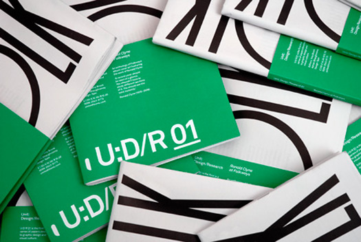
Unit: Design/Research 01
It is routine to hear tutors and studio heads bemoaning the amount of time students and designers spend gorging on the numberless websites and blogs devoted to the visual archaeology of graphic design. If you dig deep enough online, you can pretty much guarantee you'll find every significant piece of graphic design ever made. If it's not on Flickr, ffffound, Grain Edit, or one of a thousand other sites, it will be soon.
It is routine to hear tutors and studio heads bemoaning the amount of time students and designers spend gorging on the numberless websites and blogs devoted to the visual archaeology of graphic design. If you dig deep enough online, you can pretty much guarantee you'll find every significant piece of graphic design ever made. If it's not on Flickr, ffffound, Grain Edit, or one of a thousand other sites, it will be soon.
This super-abundance of visual material floating untethered in the frictionless wastes of the internet has had two profound side effects. The first is on the sales of graphic design books. I recently interviewed Marc Valli, the astute co-founder of Magma Books, the mini-chain of UK bookstores known intimately to all British designers. He told me that there is a sardonic mantra regularly exchanged by book buyers: “5 is the new 50.” Where once a buyer would take fifty copies of a title, they now take a paltry five. “Do not believe anyone who tells you that people are buying the same amount of books,” says Valli. “They're kidding themselves — or they're lying.”
Most people deal with this comfortably enough, and are inspired to discover the factors that determine the way a message or visual artefact is shaped. But others develop a lopsided view of design. They are seduced by the notion that great design “just happens”, which affects their own approach to design. It’s a phenomenon that Saul Bass commented on as far back as 1983. In an interview republished in Essays on Design: 1 AGI’s Designers of Influence he said: “One of the difficulties that students and young designers have to deal with is a perceptual one. They look at the exceptional work that’s being done. What they see is the end product. They are not privy to process. They may have the illusion that these things really spring full-blown out of the head of some designer.”
It is into this brave new world of super-abundance and declining book sales that — in partnership with the designer Tony Brook — I have launched a publishing company. Unit Editions is dedicated to producing books on design and visual culture. Alongside two or three “proper” books each year, we also aim to publish a series of low-cost, fast-turnaround, tabloid-format “research papers” covering the neglected and hidden corners of graphic design. These papers – 64 pages printed on good quality newsprint – will contain essays, interviews, critical writing, and carefully curated visuals assembled with appropriate commentaries.
Inevitably these papers will contain material that can be found online, but as one designer said to me: “Sure, you can see everything online — but you can’t always find it again.” By making our papers collectable, we hope to offer a more enduring format than the internet.
To date, we have published two papers. The first is devoted to the woefully neglected American “folk modernist” Ronald Clyne. Clyne designed over 500 album covers for the venerable Folkways label. His distinctive use of two-color printing on matte paper in tandem with his deft use of modernist design strategies created a body of work that wrapped Folkways recordings in a distinctive aroma of integrity and purity. Yet despite his towering achievement at Folkways, Clyne rarely appears in the textbooks or literature of graphic design.
The second paper is devoted to Form, a quarterly magazine published in Great Britain between 1966 and 1969. It ran for ten issues, and is one of the lost artefacts of British graphic design. What makes it remarkable is that it designed in the high-modernist style at a time when Britain had been invaded by Pop Art and the Psychedelic style.
The paper features a long interview with Philip Steadman, Form’s co-editor, publisher and designer. Professor Steadman trained as an architect, and is the author of several books on geometry in architecture and computer-aided design. He is untrained as a graphic designer, but acquired a love of printing and typography while at school.

