The most important thing about design, it turns out, is not the result but the process. The design process: we talk about it, but are we sure we really understand its value? Recently the New York chapter of the AIGA decided to put the design process to the test. They picked a project that had no easy solution and applied to it the kind of thinking that is the prerogative of our profession.
Design/Relief: Legible, Visible, Navigable was a participatory initiative conceived to make a difference—albeit a small one—in three New York waterfront communities that had been hit hard by Superstorm Sandy: Red Hook, Rockaway, and South Street Seaport. A year after the hurricane, these neighborhoods had yet to recover a sense of identity, so disruptive had been the event. Trying to help them recapture a modicum of dignity seemed like a good cause to begin with—however, the ultimate incentive was the challenge it represented. Can design be construed as a vital tool in time of recovery?
AIGA NY Chapter then president Willie Wong endorsed the initiative, with the active participation of board members Glen Cummings and Manuel Miranda. Coordinating the efforts was Laetitia Wolff, a design strategist. Members of the chapter volunteered considerable time, talent and energy. Teams, composed of designers, community engagement strategists and storytellers got in touch with community leaders and grassroots organizations in the three battered neighborhoods. Then, deliberately, they engaged in what is probably the most critical part of the design process: they listened.
Listening is not a technique for the fainthearted. Curb your enthusiasm. “You have to hold back the desire to ‘do something’ or ‘change something’,” explains Daniel Latorre, community engagement strategist on the Rockaway team. “Our role was to give form to a need that was not yet perceived as such.” Warning: trying to keep the design process on course without a clearly defined brief can induce dizziness and nausea.
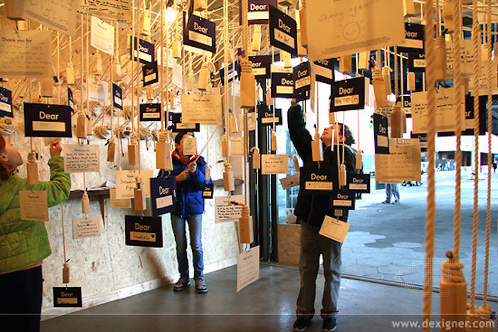
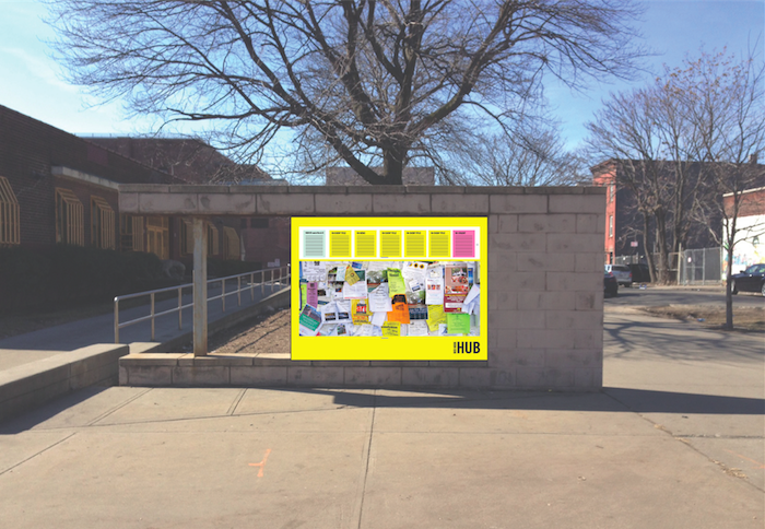
In the Spring of 2015, after eighteen months of engagement with an audience of often perplexed participants and balkanized community activists, the three AIGA/NY teams completed their self-appointed mission. In Red Hook, they had been able to create “The Hub,” an outdoor information-sharing bulletin board backed with a super user-friendly, participatory digital platform; in South Street Seaport, they had devised “Catch & Release,” a playful indoor interactive storytelling installation; and in Rockaway, they had produced an oral history campaign, titled “Dear Rockaway,” manifested in a series of bold posters, newspaper inserts, and sidewalk stencils.
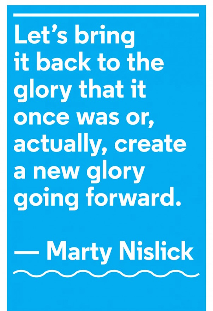

Identified as creative placemaking, these modest design solutions served the communities involved by activating public space. But while the practice of creative placemaking usually shapes the social and physical character of neighborhoods by leveraging the power of the arts, The AIGA initiative hoped to do the same by leveraging the power of good typography. That was a first! To my knowledge, never before in the United States had graphic designers tried to drive a broader agenda for change in urban environments by selecting the proper typefaces, their point size, line length, leading, tracking, and kerning.
To be sure, vernacular letterforms, from graffiti to neon signs, are semiotics markers that are as much part of the identity of a place as brick and mortar—but what about posters featuring stylish fonts? Do they belong on placards pasted on derelict storefronts or on grimy fences? For dishearten residents of neglected communities, can digital type foundries provide as credible a visual language as that generated by a spray can or a fat magic marker?
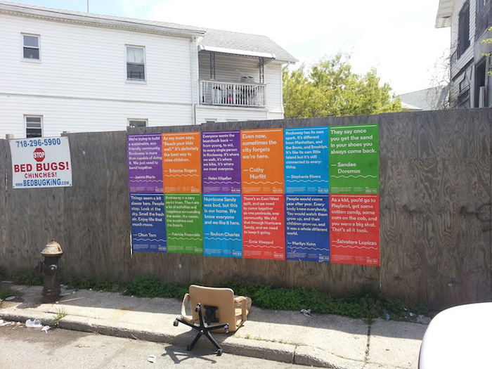
Heartbreaking is a photograph taken in Rockaway of twelve colorful AIGA posters neatly lined up on a rotting hoarding, side by side a small handbill advertising the services of the Bed Bug King. Lying on the trash-littered sidewalk is a shattered desk chair. The contrast between the typography, featuring a handsome font called “Regular” by the Village foundry, and the wretchedness of the environment, makes for a striking image, yet the much-maligned Broken Windows theory comes to mind.
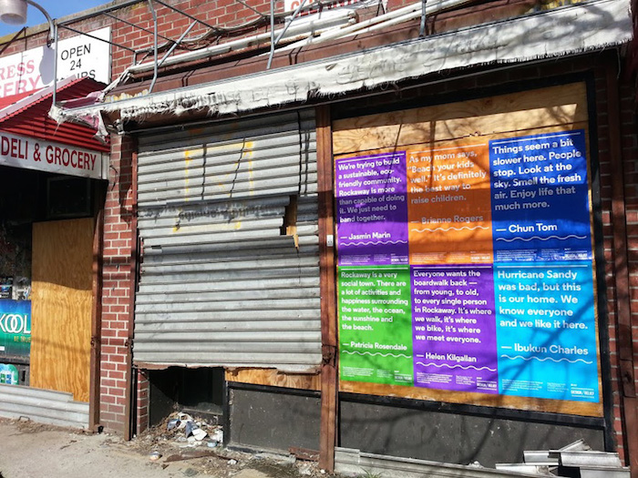
I can’t help but wonder: was the AIGA/NY initiative a courageous endeavor to bring diverse people together, or was it a misplaced attempt (pun intended) to prove that, no matter what and no matter where, the design process can prevail?
A short film about the program can be seen here.
