Choe Yun-ui invented moveable typefaces in 1234, two centuries before Gutenberg, but it took another 781 years before the contribution of this obscure Korean civil minister received the tribute it deserves. The long overdue accolade came this fall in the form of a major show on Korean graphic design at the Musée des arts décoratifs in Paris. Better late than never. The opening of the show coincided with the beginning of the France-Korea Year, a diplomatic commemoration that kicked off in October.
Korea Now! at the Arts décoratifs is one of many events planned for the occasion. Focusing on design but also on fashion, it brings to our attention the work of contemporary Korean graphic designers—and the ancient typographic traditions associated with it.
Visitors wandering from the fashion section into this part of the show might have low expectations (Korean graphic design, what’s that?), but they are in for a surprise. The beauty of the work on display is disconcerting. If you go, first turn off what you think you know about South Korean design. Think of the visit as a cultural reboot.
Who are these people?
The Korean students who, fifteen years ago, paid stiff tuitions to get their MFAs at Yale, SVA, Arts Center, Gerrit Rietveld Academie, or Central Saint Martins, have come of age. They’ve gone back to Korea and blended seamlessly back in with their contemporaries. Oddly enough, what they’ve learned from their experiences in the West is not what to do, it seems, but what not to do. Their work is disorienting because it makes no reference to the graphic culture as we know it: no obvious Dada influence, no allusion to pop art, no identifiable visual references. It’s totally its own thing.
Hangul, the Korean alphabet
As it turns out, the originality of Korean graphic design is not a fluke. Its roots can be traced back to its typographic past. At the same time Gutenberg was in Mainz, Germany, mass-producing the first printed books, about 6,000 miles away in Seoul, Korea, King Sejong the Great was overseeing the creation of hangul, a twenty-eight-letter phonetic alphabet designed to replace the 40,000 Chinese ideograms the language had been employing. As a simplified writing system, it could be taught to anyone in a matter of hours. Conceived originally as a tool to battle illiteracy, it is now the official script in both North and South Korea.
Recently, hangul has experienced a creative renaissance thanks to the work of graphic designer Ahn Sang-soo, who has redesigned the traditional characters to bring out their edgy and digital dimensions. A translator of Jan Tschichold’s and Emil Ruder’s books in Korean, Ahn Sang-soo doesn’t claim to be a Modernist, though. Always elegant, his work transcends the sacred rules of composition with minimalist aplomb.
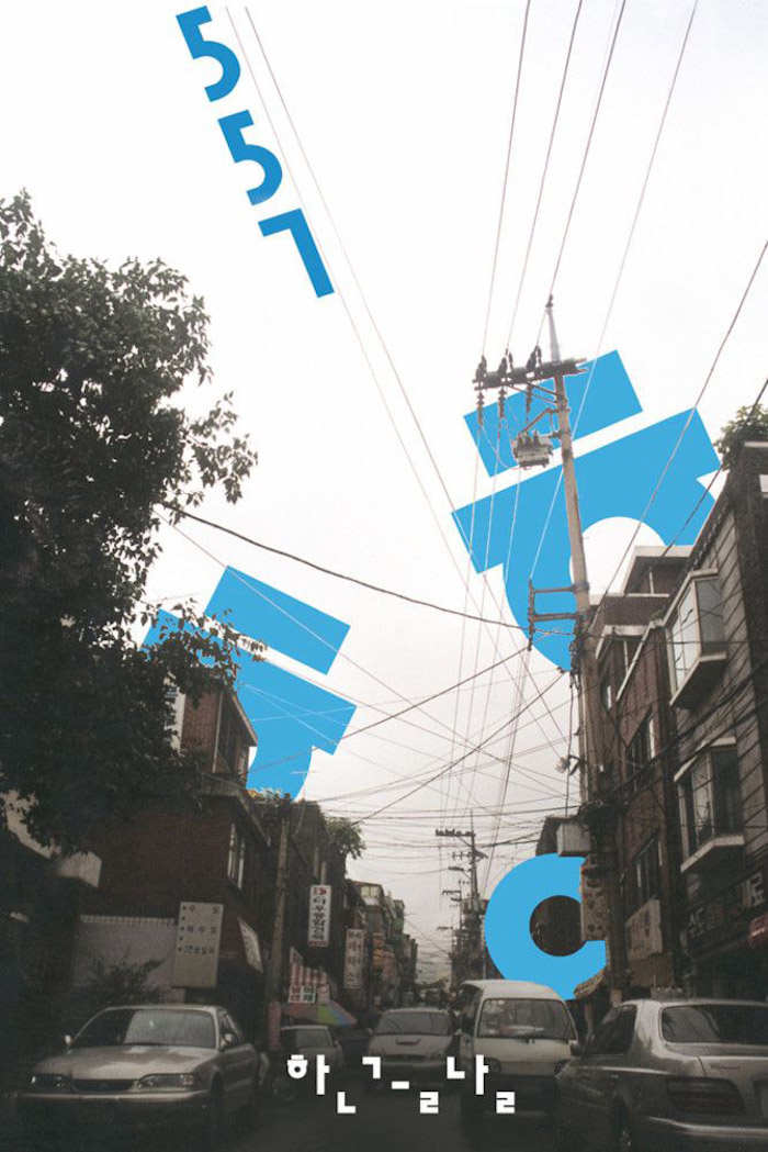
Ahn Sang-soo
Hanji, the Korean paper
An emblematic figure, Ahn Sang-soo has inspired a generation of indie graphic designers, with Park Kum-jun one of the most prolific experimenters. Like the majority of designers selected by the curators of the Arts décoratifs show, Park Kum-jun is mainly working in print media, and, like most of them, he finds the quality of the paper he usesis as much part of the message as the text or the images. Fascination with hanji, traditional handmade paper, is another Korean idiosyncrasy. Made of the inner bark of a native tree, the laminated sheets have a distinctive multi-directional grain that ensures that, no matter how precise the original artwork, you always get slightly unexpected results in print.
Sensory Design
Sheathed in corrugated cardboard, hybrid books designed by Park Kum-jun incorporates layers of semi-transparent, smooth yet brittle paper that crackles when you turn the pages.
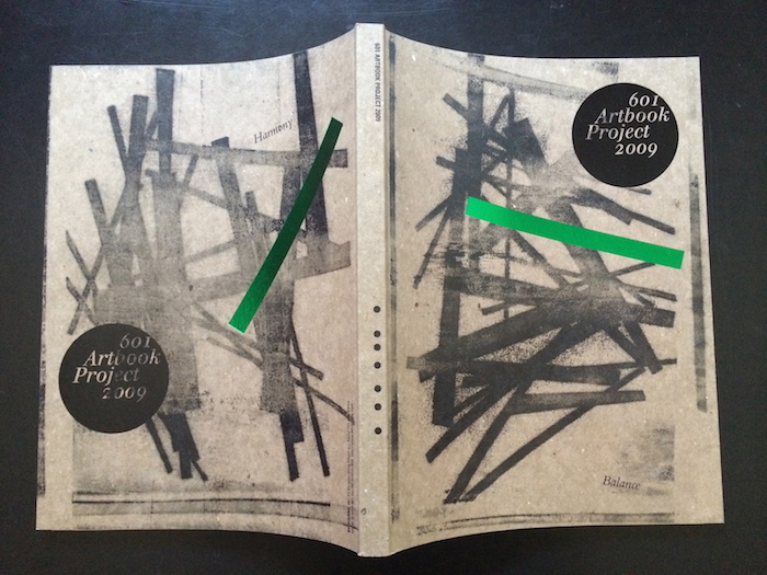
Park Kum-jun

Park Kum-jun
In the next room, the posters of Sulki & Min feature dramatic high-gloss photographs that are partially obscured by waves of thick, dull-varnished fluorescent ink.
Next to them, silkscreened on lightweight paper, the posters of Hey Joe look like black velvety embroideries on thin, fragile muslin. Further down the hall, a digitally printed red-and-green composition by Kim Bo-huy vibrates off the page, its colors so hot they could induce a heat stroke—befitting the poster’s message against global warming.
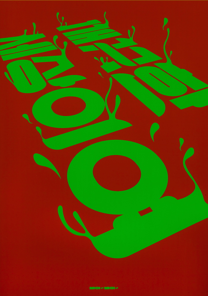
Bo-huy Kim
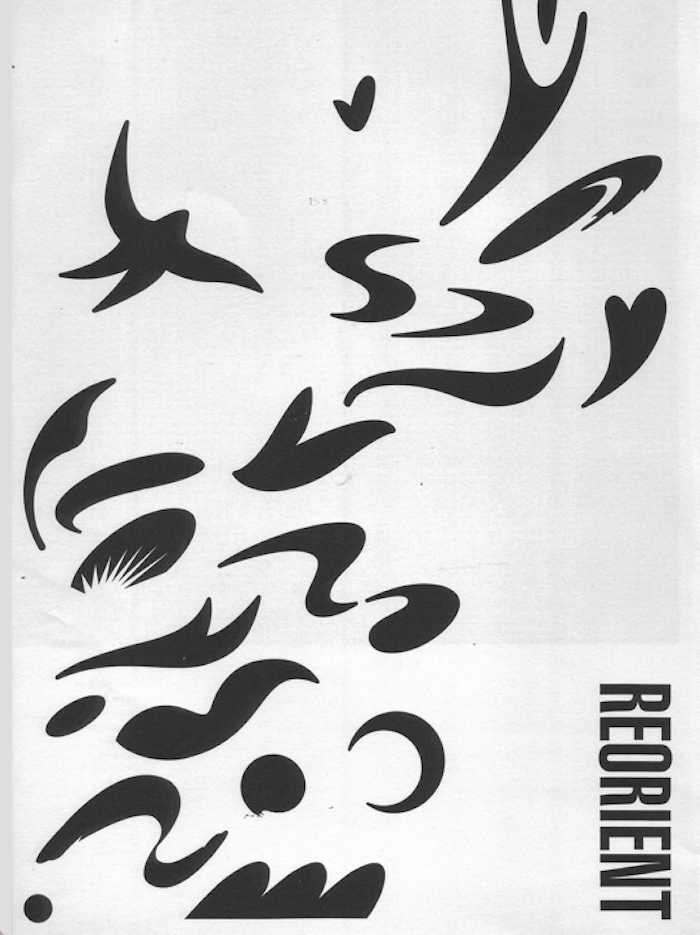
Hey Joe
A sensory feast, the show is a reminder that what we see can engage more than our eyes. Korean designers believe that, through vision, printed matter stimulates other senses as well—a neurological phenomenon called synesthesia.
To Parisians, their approach makes sense. What these savvy communicators are proposing is the graphic equivalent of Proust’s madeleine.
++++
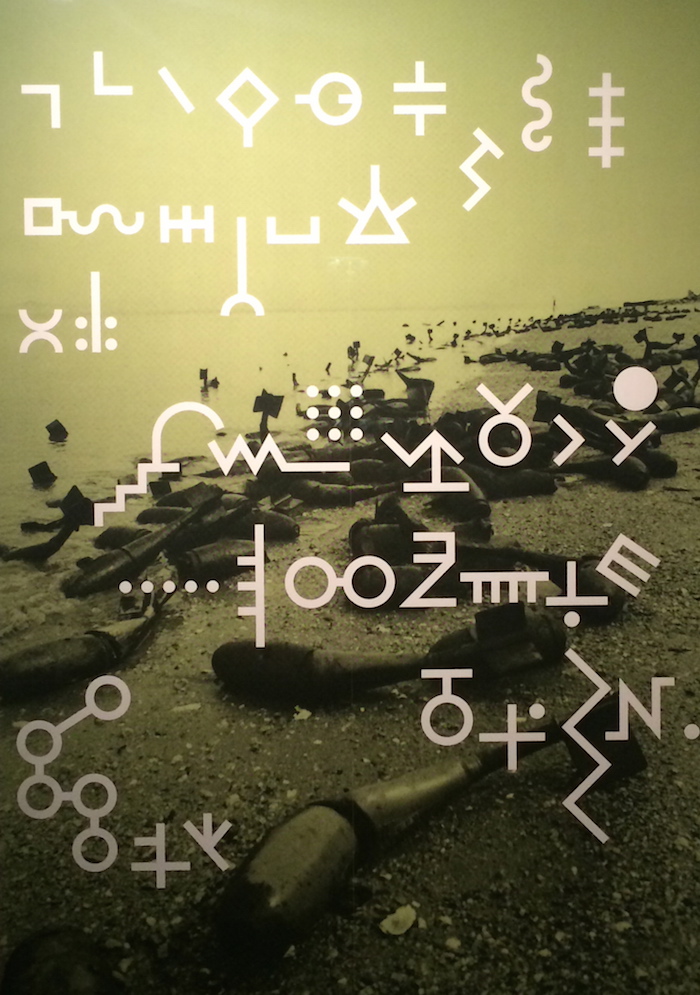
Ahn Sang-soo
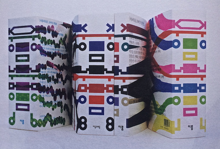
Ahn Sang-soo
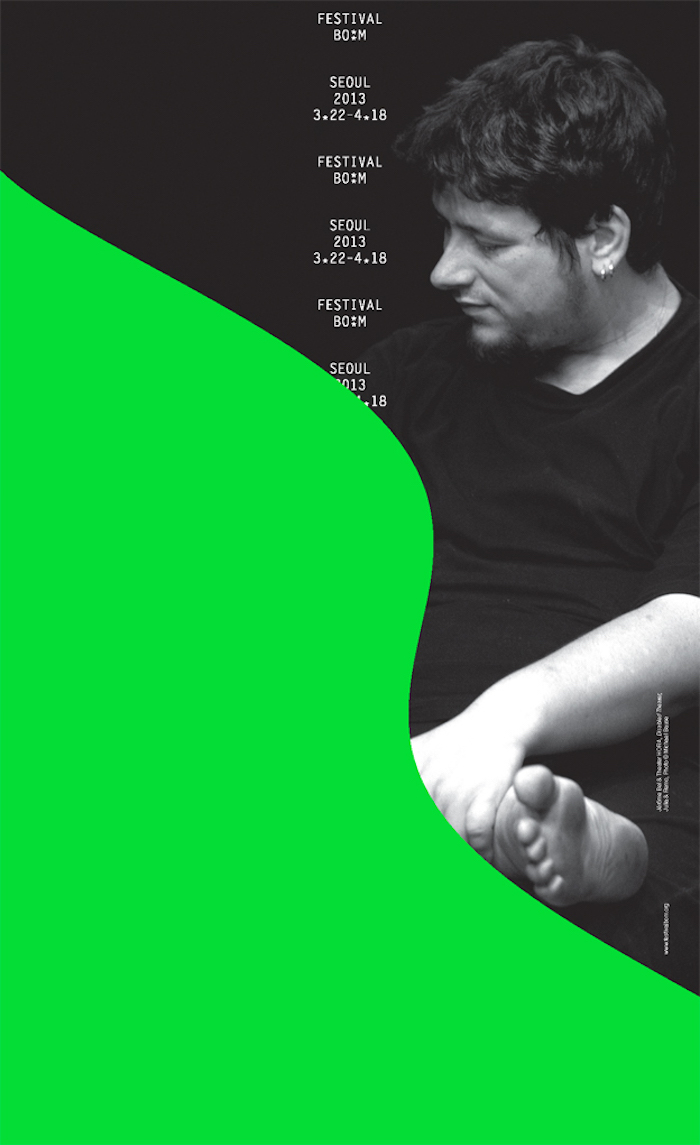
Sulki & Min
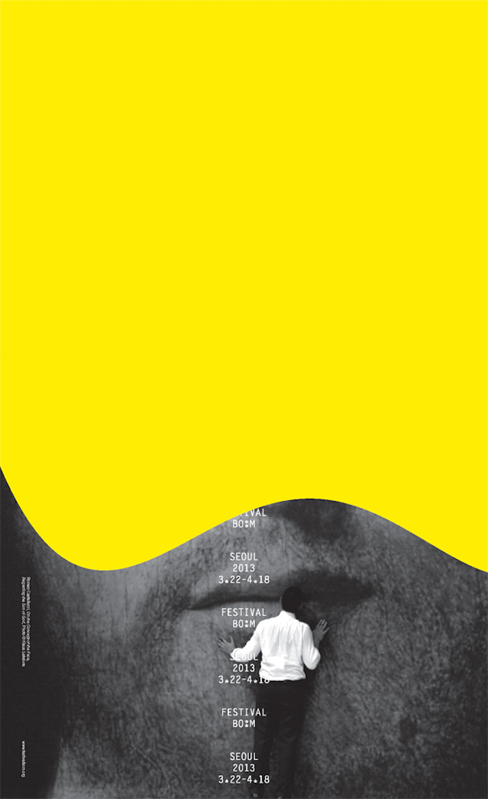
Sulki & Min
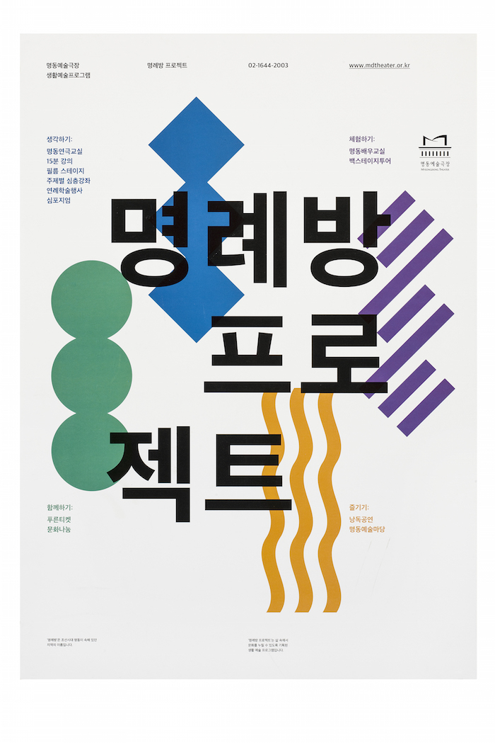
Lee Jae-min
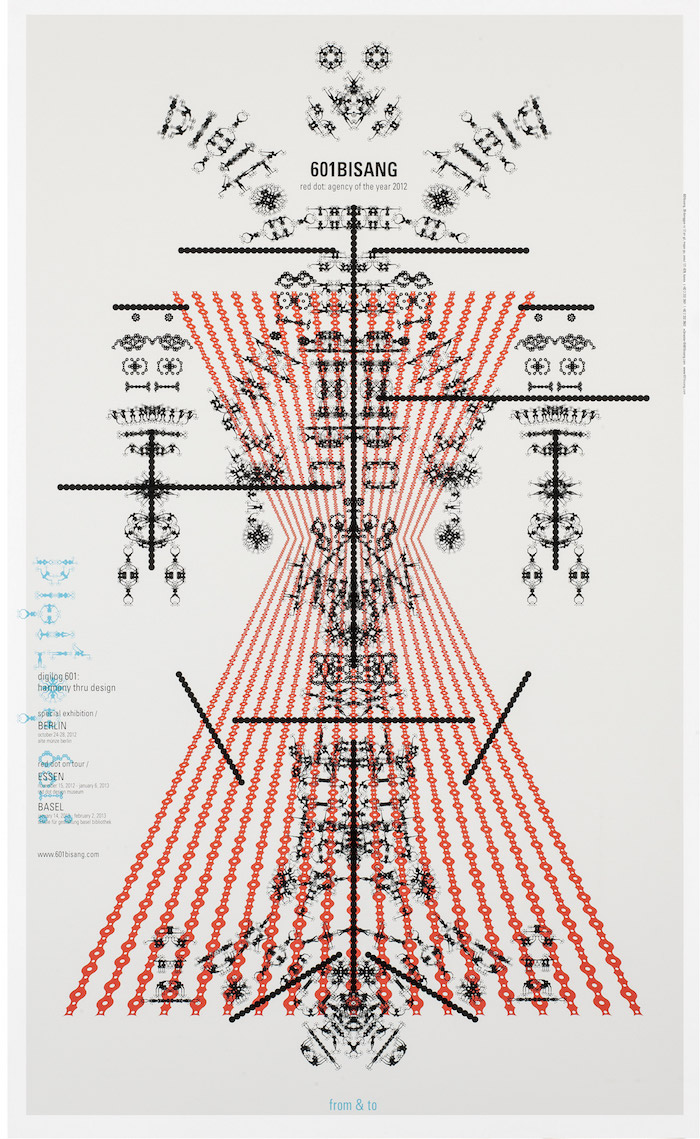
Park Kum-jun
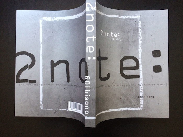
Park Kum-jun
