“Will you still need me, will you still feed me, when I'm sixty-four?” is not the real question. Sixty-four isn’t that old these days. A whole generation of late baby boomers are reaching this lyrical age, and are as productive and spry as when they were sixty.
The real crossing of the Rubicon comes in the following year, when we’re sixty-five. That’s when it is clear that the design of certain things that we once took for granted change—and often for the worse.
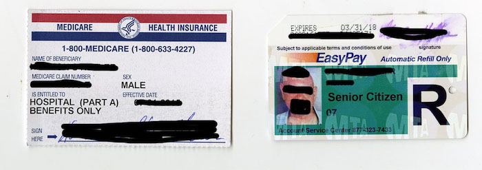
First case in point: Medicare ID. The government is obligated (thank heavens) to provide some form of medical coverage to those of us sixty-five and older. It is a great entitlement that should be accompanied by equally celebratory graphic design. Instead, it is a ’70s typographic throwback that doesn’t even qualify for shiny plastic, just rather flimsy card stock. Even New York’s death certificates are more inviting. We’ve heard that Medicare is fraught with financial challenges, but seniors are not so design challenged that they can’t tell good typography from bad. To add insult to injury, if you’ve ever received an email from the Social Security Administration, which manages Medicare, you’ll think it’s a fake from an offshore Viagra subsidiary. Even the Liberian ponzi Prince has a better email format. Cartoon Bold italic, please!!

Second case in point: New York City’s half-price MetroCard: a badge of shame by any other name (save for the discount). Yet unlike the Medicare card’s poorly perforated paper, the Metrocard is lightweight plastic with holograms of the city seal over the bearer’s photo, which is fine. But printed in Helvetica for the world to see are the words “Senior Citizen.” It might as well have a digital readout of years, months and days left on earth. It is functional, but cold and unforgiving like a Geritol label.
Good design is supposed to be ageless, not aged. Then how come so many products and services targeted towards those sixty-five and older feel like my grandparents used to smell?
Having a Medicare card should not disqualify us from browsing Club Monaco or shopping Joe Fresh. Having a MetroCard with a photograph below the brand Senior Citizen on the front shouldn’t mean we are wanted for crimes against the young.
But seriously, this is the tip of a much larger concern. There is definitely design and typography for certain age groups. From birth, designs change according to cognitive development. Youth culture also demands a different design language or code than previous and subsequent ages. Factors, including style and fashion, enter into the calculus, and there is good and bad typography that bridges all age groups. But holding those Medicare and MTA cards was something of a revelation. As if we didn’t already know, graphic design telegraphs profound signals. I’m not saying everything should look like Kleenex decorator boxes, but a little respect for aesthetics would be nice, especially in senior-targeted graphics.

Don’t get me wrong, there are some great advantages to being sixty-five: wisdom, experience, and preferential seating on the bus. But why must the design that is so essential to our esteem be second rate? The boomers are more design attuned than any other generation. After all, we invented tie-die and psychedelics. And watch out, you guys at the Social Security Administration, punk turns forty in 2016 and is next out of the aging gate.
