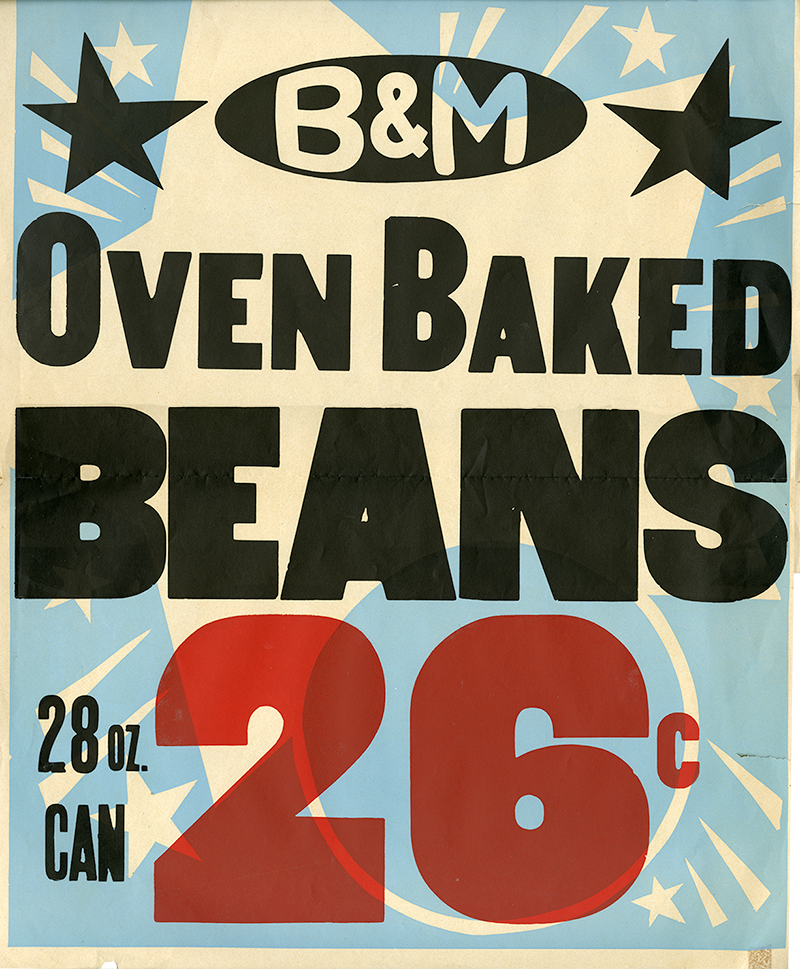
“Appetite appeal” in design jargon is the measure of sensory stimulation that a food package or promotion must have to whet the average consumer’s appetite. The contents of a package, for instance, with type alone on its front, usually seem less mouth-watering than, say, a photograph of a delicious, freshly served chicken taco or cheese and sausage pizza.
So, could there be anything less appetizing than the word “BEANS” typeset in a a mildly distressed bold gothic wood type? Probably showing a photo of the beans themselves would be considerably less appealing than this conventional c. 1960s supermarket window poster. Yet, this pitch for a twenty-six-cent can of Oven Baked Beans is curiously tantalizing.

Of course, aesthetic judgements are in the eyes of the beholder. And although this three-color, printshop produced, handmade silk screen print announcement may be a throw-a-way, it is nonethteless startling and effective communication. The graphic components are not refined, but they are respectable. The pieces de resistence are the printer’s type and color decisions. The black plate alone would have acheived the fundamental messenging job, but the addition of the soothing light blue and rich fire engine red are authoritative, forcing the viewer to take notice.
The rationale for making the price larger than “BEANS” was arguably because it was the only available type size. More likely, it was a scale decision based on relative importance given to each element of the message. Yet as the conventional wisdom for these kinds of signs goes: price is key. The customer is more interested in what it costs than what it is.
What adds to the appeal of this work is its relationship to a film or carnival poster. The sunburst and star accents dropped out of the color may seem improvisational rather than thought through (i.e. see the M in B & M), but as a critical mass of graphic effects, harmony is achieved and the poster as a whole has life.
