High production LP album cover design was at its zenith during the anti-establishment, youth-culture, hippy era. Amid the tumultuous sex, drugs, and rock n’ roll tidal wave of the mid- to late sixties bands wanted their share of the spotlight. It was certainly ironic, in retrospect, that the uproarious in-your-face spirit of the time—a rebellion against ostentatious materialism—gave birth to the most excessive design pyrotechincs since art nouveau.
Major record companies could not refrain from investing resources and cashing in on expensive packaging of youth culture’s radical musicans, which may account for why the Beatles’ legendary 1968 White Album—an entirely blank double record sleeve—was at once surprising and refreshing.
During the ensuing years and into the early 1980s, record album designers had shed the psychedelic and subsequent glitter extravagances that were fashionable in favor of a punk or DIY aesthetic. Punk was a critique of hippy and glam decadence that at its best was considered authentic, expressive, and ad hoc.
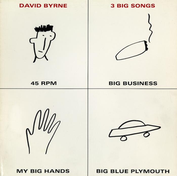
David Byrne’s 1981 album titled 3 Big Songs, an electronic/new wave/art rock 12” vinyl mini-album, was mini in more ways than one. Not only did it play at 45rpm, its minimal design suggested a handmade production. Designed by M&Co., the New York firm co-founded in 1979 by Tibor Kalman, and illustrated by his wife, Maira Berman, the cover art totally demystified the how graphic design operated as a problem-solving service. Kalman, in fact, often railed against the unnecessary superficiality of design and style.
So, rather than a conventionally rendered typographic or illustrative surface, Berman (who goes today by the name Maira Kalman) said her artwork was “Simple. Cheap. Clear. Clean.” Although it appears to be a rough sketch, she said "I must have sketched a bunch as I always do. Then Tibor and I would talk it over. And that was it.”
Four loose, black-and-white drawings, including a head (a portrait of Byrne), cigar, hand, and car (which could second as a flying saucer), were each placed in one of the four quadrants of the album cover. This was mimicked on the back cover as well. A small line of sans serif expanded caps indicated Byrne's name, album title, and the titles of the three tracks. Every element was well ordered but minimal. Berman/Kalman, whose painting and drawing techniques are now much more sophisticated, yet retain some of the naïf charm, said of her affection for this work: “I love drawing. Pen and ink on paper reveals some great human truth. I am always trying to find my voice.”
While the cover suggests the rejection of design formalities, the fundamenal grid is very structured. And in relation to contemporary informal approaches, almost forty years after its creation, Kalman concluded “I like it. It looks delightfully free and forthright.”
