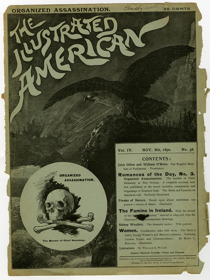
The art of newspaper and magazine layout began in earnest starting in the early nineteenth century as a method for printers to jam as much information (first words, then—as technology advanced—words and pictures) and advertising onto a page as could fit and still be readable. This was graphic “design” by default, requiring considerable craftsmanship to align the various letterpress elements, and demanding more than a modicum of typographic competency to distinguish the editorial from advertising content—and also one advertisement from another. The craftspeople who generally did this work, who began as printers or typesetters, were called layout or make-up artists, and their responsibility was to compose pages while adhering to the periodical’s particular logic or format.
These formats were default as well, governed more by functional constraints and availability of type styles than aesthetic forethought and conceptual thinking. The advertising pages of The Illustrated American, a typical late nineteenth-century pictorial weekly, provides a routine example of how layout was an ad hoc or opportunistic practice. Ad spaces varied as did the styles of type used in them inorder to stand apart or shout out from amid the noise of all the neighboring ads. Traditional central axis composition was the norm, although ads were distinguished by type size and case that varied considerably based on ultimate impact. The diversity of this kind of ad hoc layout is characteric of the Victorian era’s graphic style – and straddles the acts of serendipitous and deliberate design.
While the advertising pages were stuffed to fit, most periodicals used a staff art editor, who selected the illustrations and dictated the prefered scale and position on the pages, along with other aesthetic commands. In the case of The Illustrated American’s brushwork nameplate, the art editor probably selected this one because it was distinct from most of the typeset periodicals of the day, which was its biggest virtue.
