I have been writing short essays on how commercial, ad hoc and folk art things became part of a larger design language. One might think of it as anti-design, but its not so much a rebellion as a foundation for graphic design. This new series will focus on the anonymous originators and more contemporary figures who buck the canon in interesting ways. —SH
++++
In a precis for “Technical Preservation Services” section of the online manual of the National Park Service, U.S. Department of the Interior term “Signs” refers to “a great number of verbal, symbolic, or figural markers. Posters, billboards, graffiti, and traffic signals, corporate logos, flags, decals and bumper stickers, insignia on baseball caps and tee shirts: all of these are ‘signs.’ Buildings themselves can be signs, as structures shaped like hot dogs, coffee pots or Chippendale highboys attest. The signs encountered each day are seemingly countless, for language itself is largely symbolic … .”
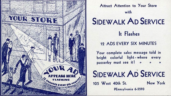
There is no mention of illuminated sidewalk projections, largely because these shadows are even more ephemeral than printing on paper. Turn off the light and the message is gone forever. Well, it may not be a proper preservable sign, but there is, however, an sustainable artifact involved – the illustration board on which an image or text is painted or drawn.

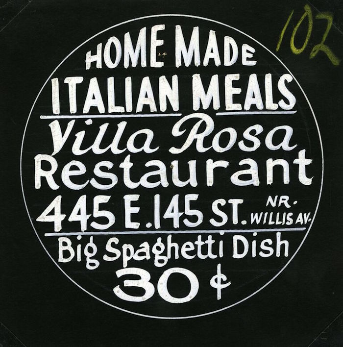
Here’s how it works for Villa Rosa Restaurant: The Sidewalk Ad Service of New York provides up to twelve hand brush-lettered circular cards from which negatives are made. These films are then loaded in a revolving cartridge that is timed to advance every six minutes, projecting “your ad” on the sidewalk.

In many instances a so-called Gobo projector is used today using utilizing energy saving LED technology that produces cool light. Called gobo, it is a stencil or template slotted inside, or placed in front of, a lighting source, used to control the shape of emitted light. But the premise is the same as this c.1930 version. Showing multiple messages on the sidewalk increases store visibility. Today’s ads, however, are doubtless more polished than the Sidewalk Ad Service specimens. This is a typical example of rudimentary show card writing. The artist has a modicum of lettering skill yet perhaps because this is not meant to be printed the end result is flawed in terms of letterspacing and scale. The top half works better than the bottom. “Home Made” efficiently contours with the circle. Villa Rosa is effective calligraphy, with both V and R working well. The rest is crammed into the space.
Still all the necessary information is there – and that’s the point. Aesthetics takes a backseat to content. Paul Rand once said that there must be a balance: When aesthetics dominate, then content is sacrificed. But when content dominates there is no aesthetic core. Graphic design is the equal marriage of these two elements, otherwise Rand noted “Its not graphic design, its something else.”
