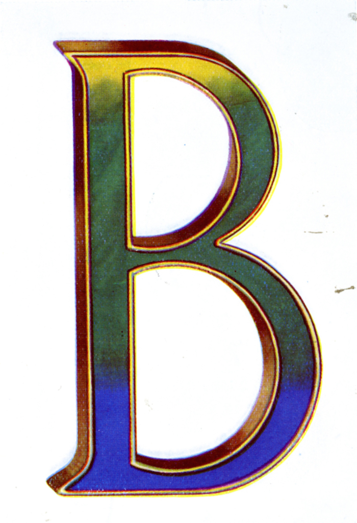
That type should always be a “crystal goblet” is an ideal perpetuated by typeface expert Beatrice Warde in a 1955. “Type well used,” she said, “is invisible as type, just as the perfect talking voice is the unnoticed vehicle for the transmission of words, ideas.” But tell that to sign makers. They don’t know the meaning of invisible; their job is to make words scream—very loudly!
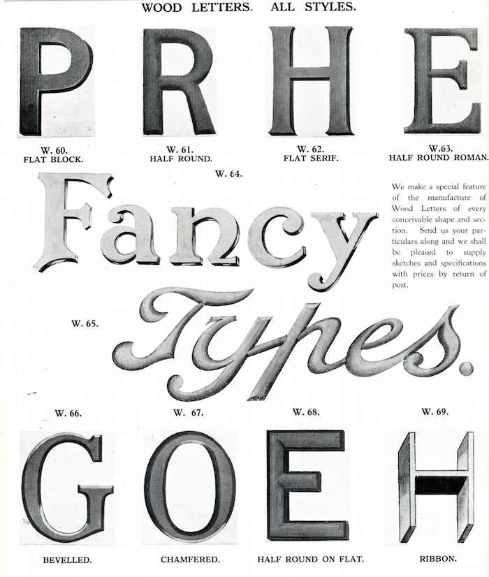
Signs, like the varieties showcased in the 1934 catalog of Brilliant Sign Co. of London, were a fairly common vernacular approach to mainstream English signage for liquor and tobacco and more. Although this particular company was well established, other sign merchants provided similar styles in metal, wood, or painted on glass. The need for these demanded variety, though. Some letters, like Round Block, Serif Blook, and Roman came in standard sizes. Scripts were custom and priced according to the physical size and word length. And special decorative faces, New Century, fishtail (a hybrid bifurcated Tuscan), and semi-fishtail required more craft time to achieve a satisfying result.
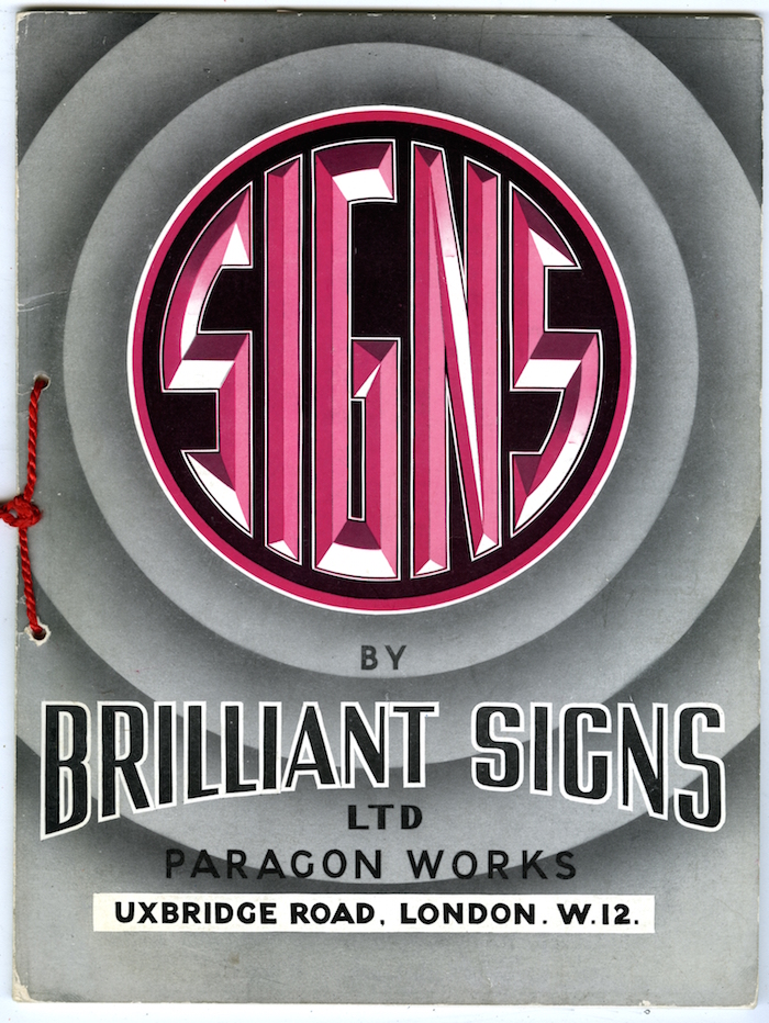
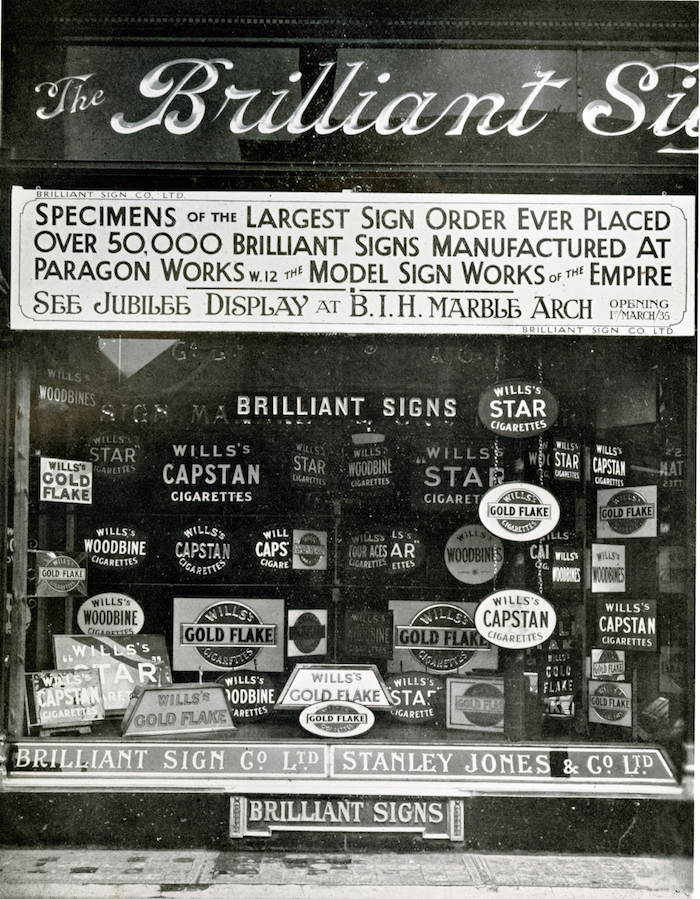
All the dimensional type styles had similar print equivalents. And Brilliant Sign’s artisans were capable of copying any existing or speculative typefaces for all kinds of sign displays. “We make a special feature of the manufacture of Wood Letters of every conceivable shape and section,” the catalog asserted. “Send us your particulars along and we shall be pleased to supply sketches and specifications with prices by return post.” They made pretty good time at the time. The business of making letters into storefront signs has gone on unabated since merchants hung their first outdoor shingle, and even with the advent of recent digital marvels, the process of creating signs has not changed. New materials, including plastics, and light emitting sources, have changed but this catalog is dated only by the hand drawn samples, which today would probably be photographic.
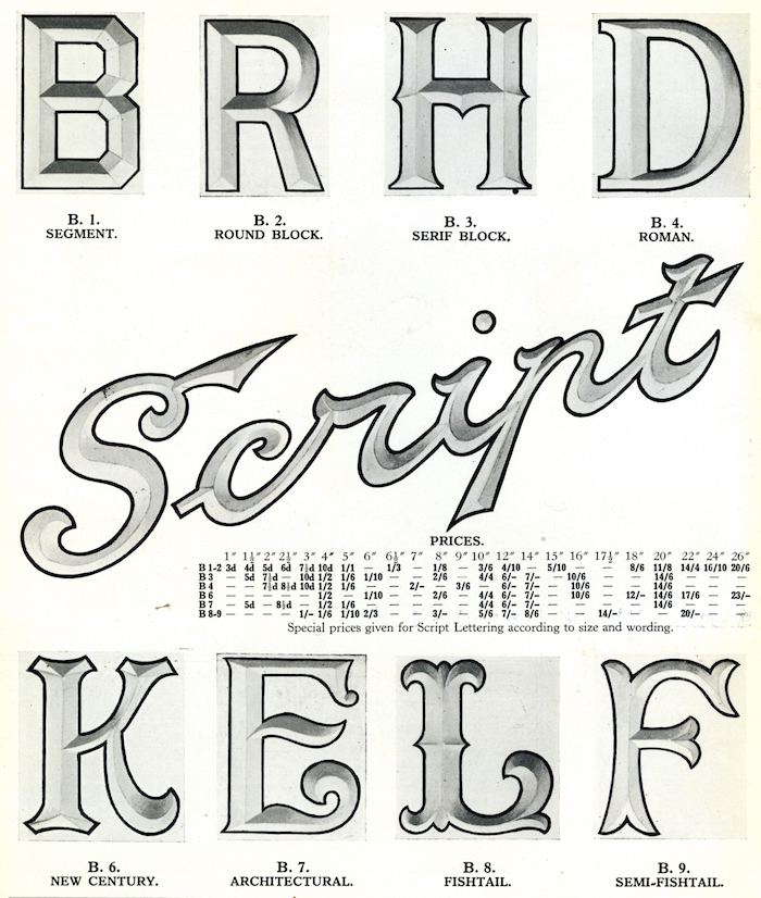
Back then, graphic or environmental designers rarely lifted a hand in the design of these quotidian signs. Although signmaking was a specialty, artists, carpenters, metallurgists and engineers were involved. This accounts for why the families of letters were referred to simply as “Lead Coated Sheet Steel” or “Recessed for Neon Lighting.” Letters were not part of a font nor were they exactly copies of the printed version. The only direction was to make them as eye-catching from a distance as possible—and customers were advised to keep them maintained lest they loose their brilliance.
