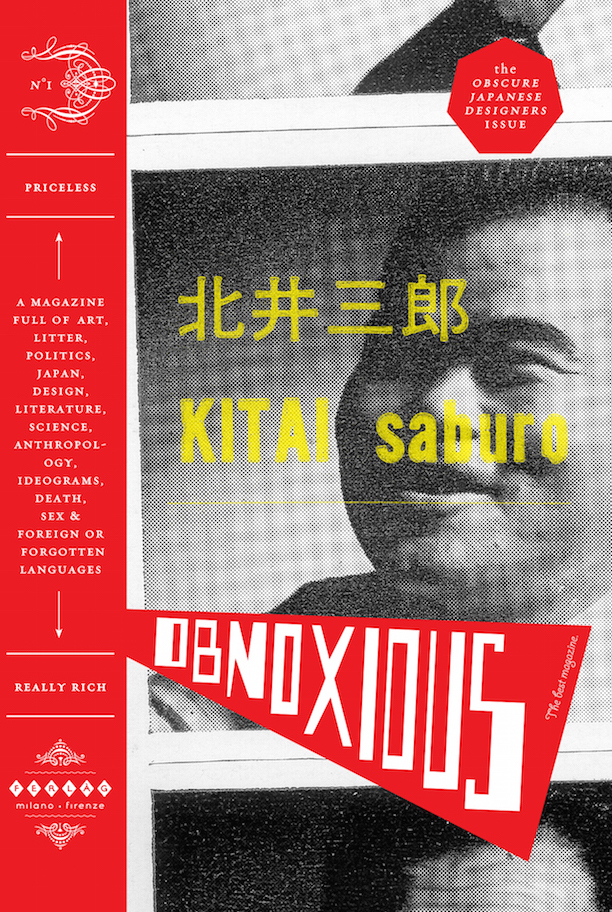
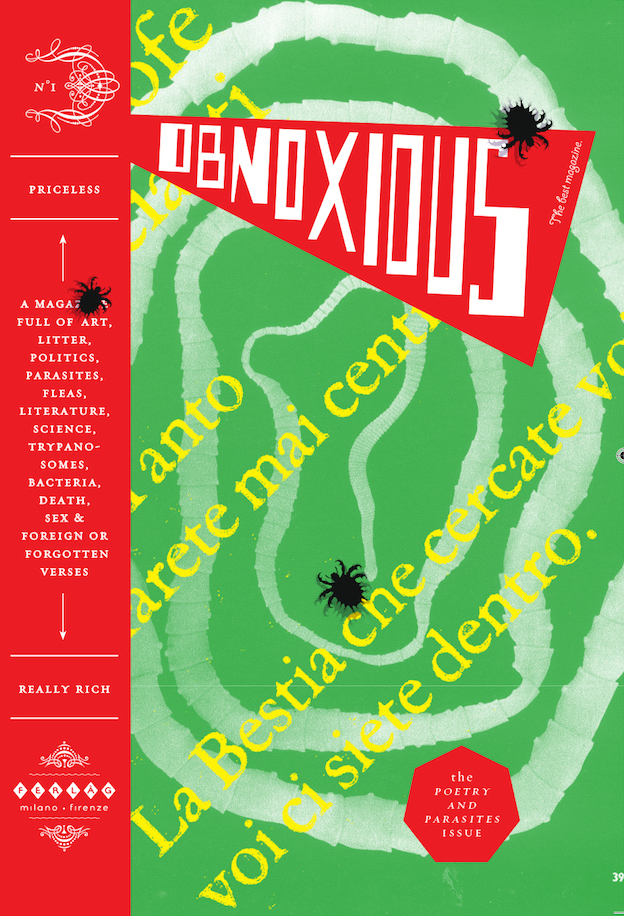
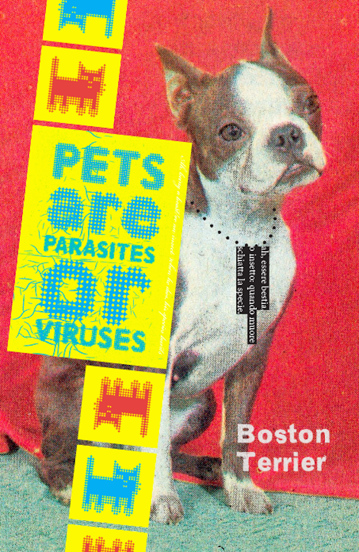
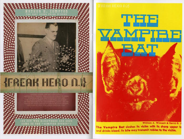
Obnoxious magazine is not truly obnoxious. However, if the reader wants something to, well, read, then this Milan-based, self-described “priceless” journal of art, litter, mummified heads, literature, dead people, and forgotten words, among a litany of other eclecticisms, is going to confound and annoy. That is, if the reader/viewer cannot appreciate the aesthetic intelligence at play (and play is what best describes the publication).
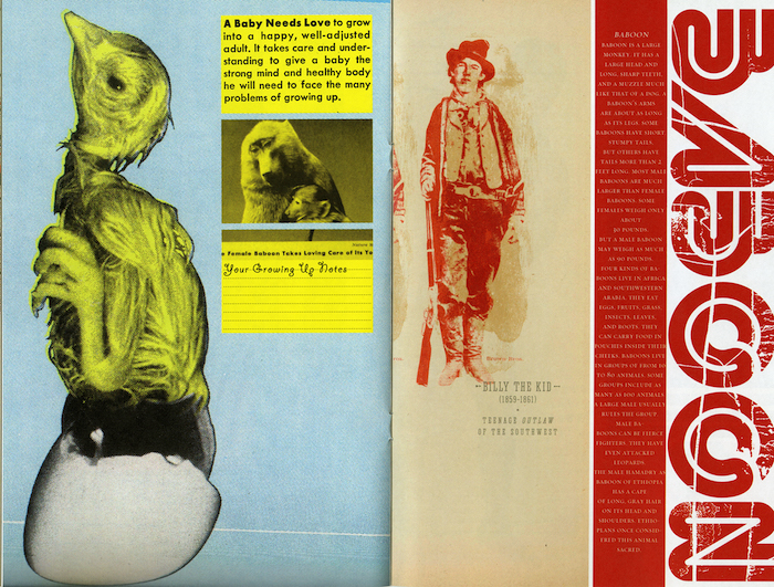
The founding editor and designer, Beppe del Greco, said that this visually explosive experiment was conceived and designed to give a new shape and meaning to things, people, books, issues, and subjects that have become displaced in the tidal flow of cultural waste; “If you like, you may consider it as a kind of cultural recycling … made of stuff collected everywhere: books, thrown away papers, found imagery, pictures, personal shots, and drawings and so on.” Indeed del Greco’s goal is to see how text and images “change their meaning depending on its juxtaposition, and to explore their new reciprocal relations everything is mixed up and shown on the pages.”
So, is Obnoxious the outcome of design intentions, anti-design protestations, or a combination of the two? Clearly, the journal is akin to a cabinet of curiosities, which implies that however crude some of the imagery may be, the contents are a curated collection of graphic artifacts—with purpose. Each of the items has its own personality that draws upon naive, kitsch, academic, and classic references. Del Greco focuses his designer’s eye on the inherent beauty of jarring juxtapositions. Rather than a deliberately primitive ’zine, Obnoxious implies that orthodox and unorthodox design can co-exist on the same armature.
In the issue devoted to “Obscure Japanese Designers,” del Greco deploys a mix of stock art, poorly reproduced, half-toned photographs and vernacular Japanese pictorial relics with an eye toward resurrecting them from their ephemeral state into all new formal compositions. Here are patterns that clash with patterns and colors vibrate against colors in a kind of volatile cold fusion of then and now.
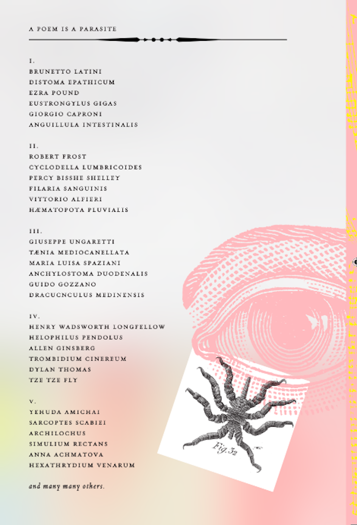
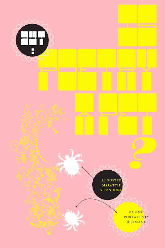
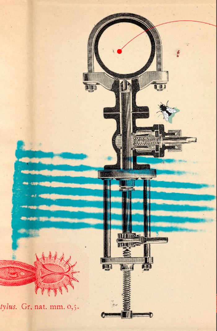
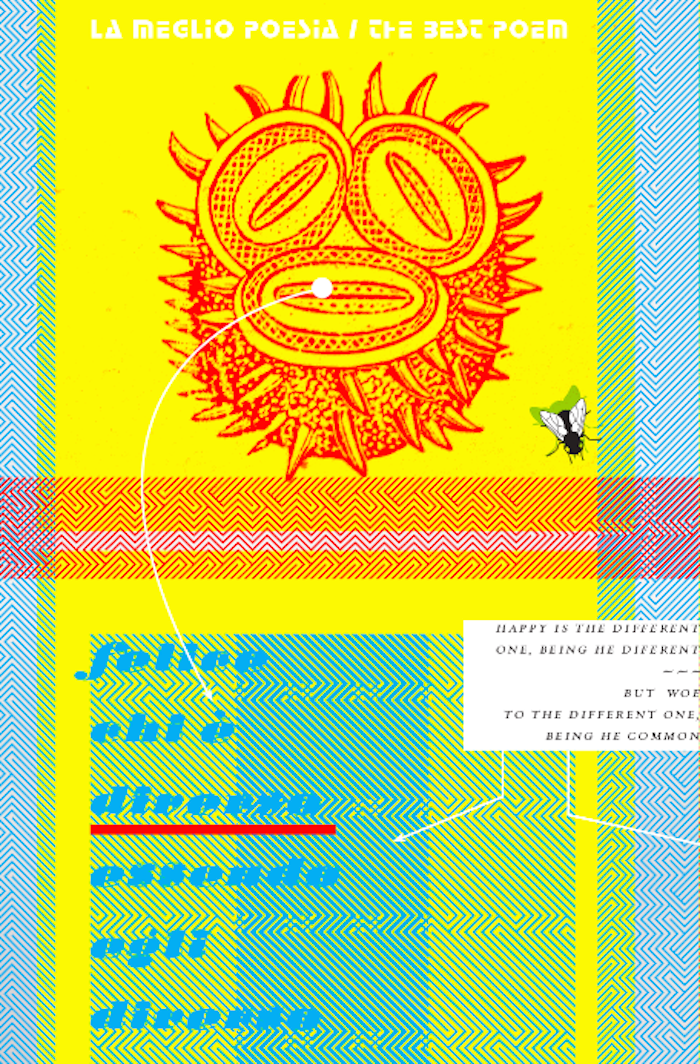
And speaking of juxtaposition, the “Poets and Parasites” issue mines two the most uncomplimentary themes into one. This is also the most Dada- and Surrealistic-like of all the Obnoxious issues in its employ of scientific and mechanistic clip art used in seemingly random fashion. Whether this is good design or not does not matter; Obnoxious may be annoying if the reader wants design logic but brilliant as an intense visual experience.
++++
