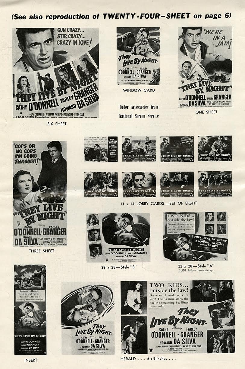
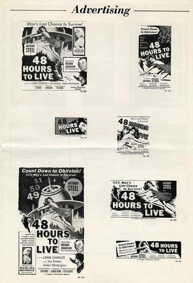
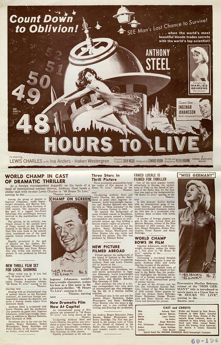
“Gun crazy … Stir crazy … Crazy in love!” (They Live By Night); “Count down to oblivion!” (48 Hours to Live). The shrill tenor of these movie advertising come-ons, imbued with a helping of hyperbole (hype), did a good job of triggering an audience’s anticipation. In the period when Hollywood motion pictures were hawked to the public through dramatic catchphrases like these, the tone of catch phrase and movie title together packed a one-two punch. Add to that a startling, snarling or prurient image and bold, sensational typography and all the pieces were in place for a real knock-out. Since the formula usually worked, regardless of the quality of the movie, Hollywood studios allowed the monopoly known as the National Screen Service to take charge of the overall production of these kinds of movie advertisements and trailers that perpetuated the Hollywood graphic style of that era.

Movies are a visual art that was sold to the public through visual artifacts. Of course, the artifacts are only considered as such in hindsight, long after usefulness was over. These advertising “posters and accessories,” sampled in four- or eight-page booklets known as press books or slicks, from the late 1940s and ’50s, were considered essential but were nonetheless throwaways when they were originally used to promote movies. They were mostly intended for newspapers and on the street—and the designs were hard sell, so-called shirt-sleeve advertising, often related to the sultry or menacing style of pulp men’s magazine covers.
Big businesses bottom-liners ran the studios. So the majority of movie directors had absolutely no say in how their films were promoted. Even the most complex dramas were treated to ostensibly the same kind of salesmanship used for selling cars or liquors—which means, without subtlety or nuance. Sometimes the outcomes were apt: Take 48 Hours To Live. It was a perfect candidate for the “exploitation” technique of silk screen stenciling of footprints “prepared by your local sign shop,” reads the text on the slick, “and plastered liberally around your streets, can be a very dramatic scare reminder to your prospective audience … a film the entire family should see … and won’t soon forget.”


For They Live By Night the studio sought to paint this Nicholas Ray directed noir (an early example of a couple-on-the-lam movie) with a pulp brush by collaging its handsome star, Farley Granger, in poses that suggest romance, murder and mayhem. It is interesting, that for some ads the title typeface is novelty lettering with cheesy speed lines, while others use a slab serif “Western" style lettering. A lot of effort went into making these variations yet the results are of tabloid quality—which in the end is exactly what was wanted.
