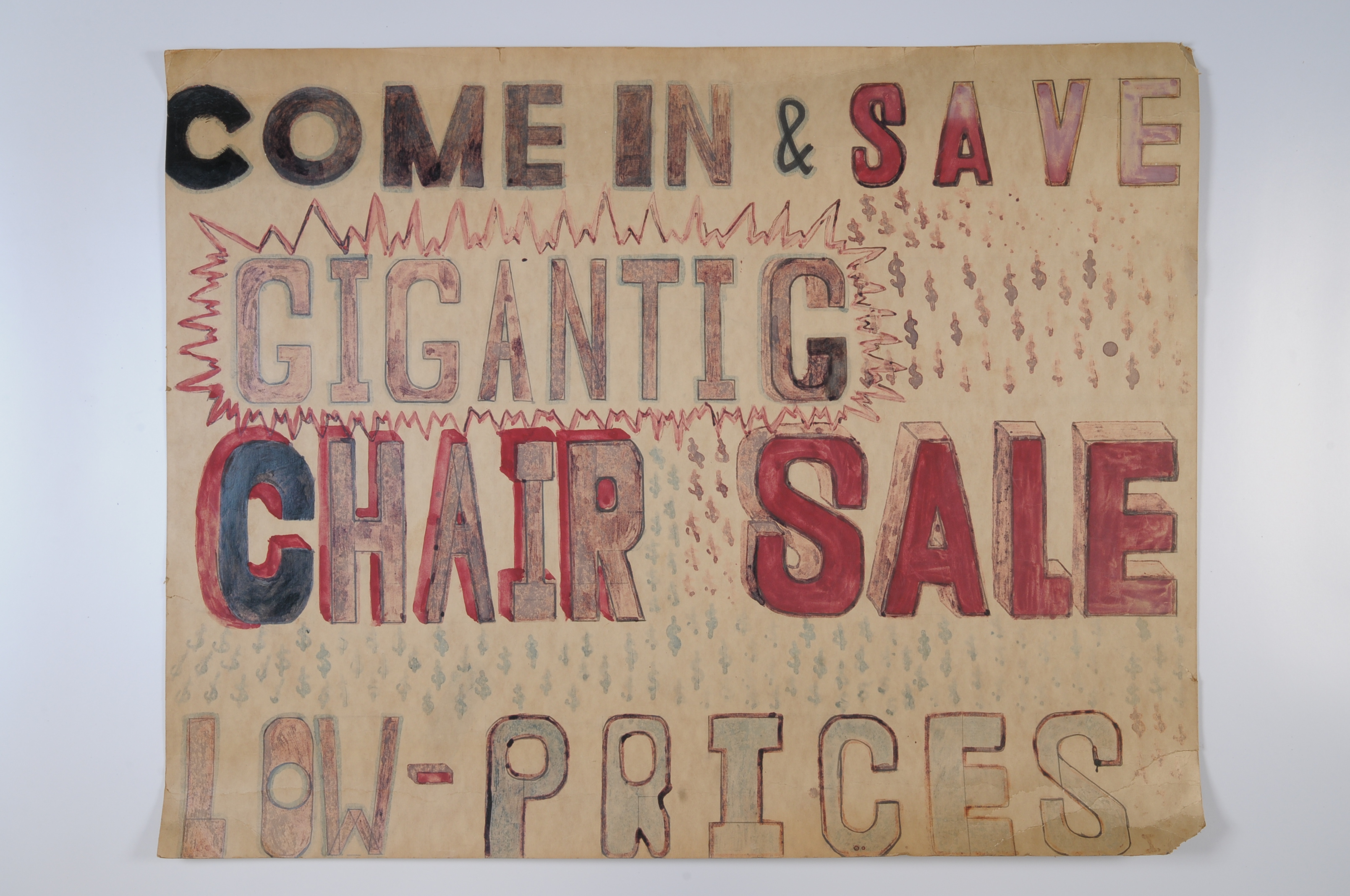
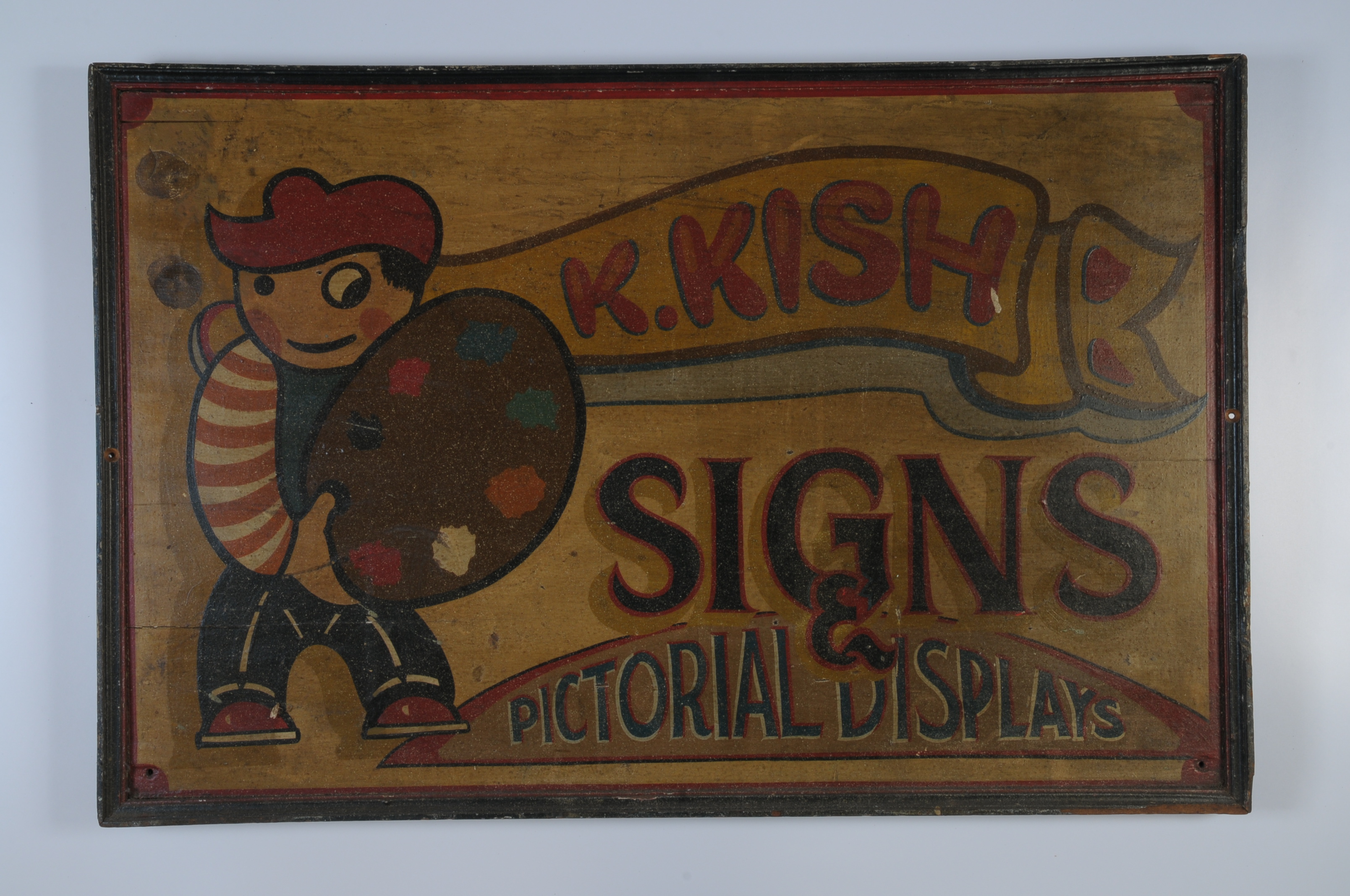
Folk, naïf, or indigenous artwork is not derived from or beholden to the popular styles, manners, and movements that dominate the art and design worlds—unless a particular folk art or craft has itself been catapulted into a style, manner, or movement by a collector or speculator. Given that contemporary art and design dealers and collectors hunger voraciously for new and extraordinary oddities, picking through stacks of untutored art and finding primitive geniuses has long served as a replenishing resource. Before DIY became a fashion, do-it-yourself advertising signs were merely artlessly utilitarian, although some are nonetheless guilelessly artful. Today, these hand-scrawled, untutored signs are intensely emulated.
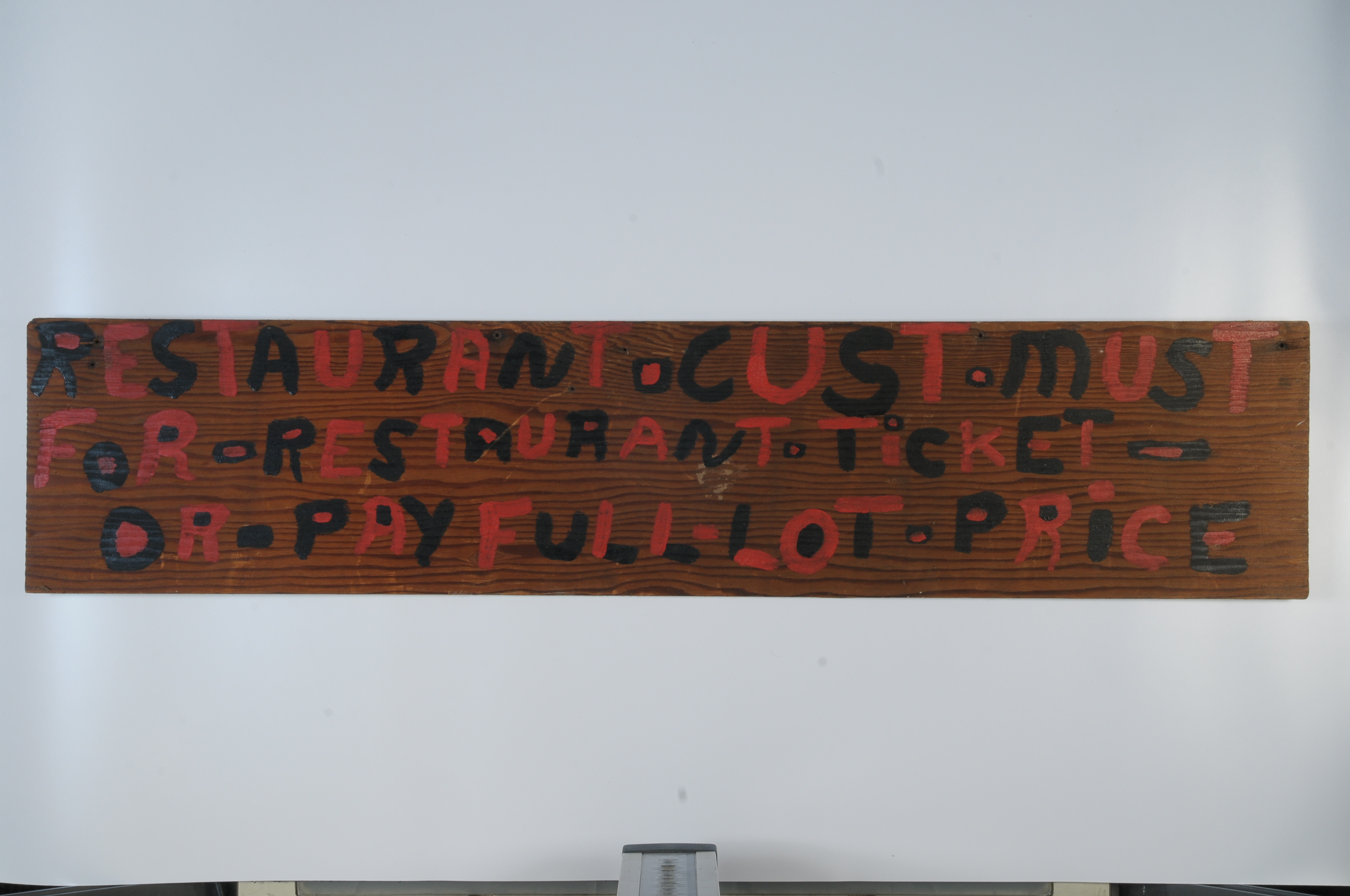
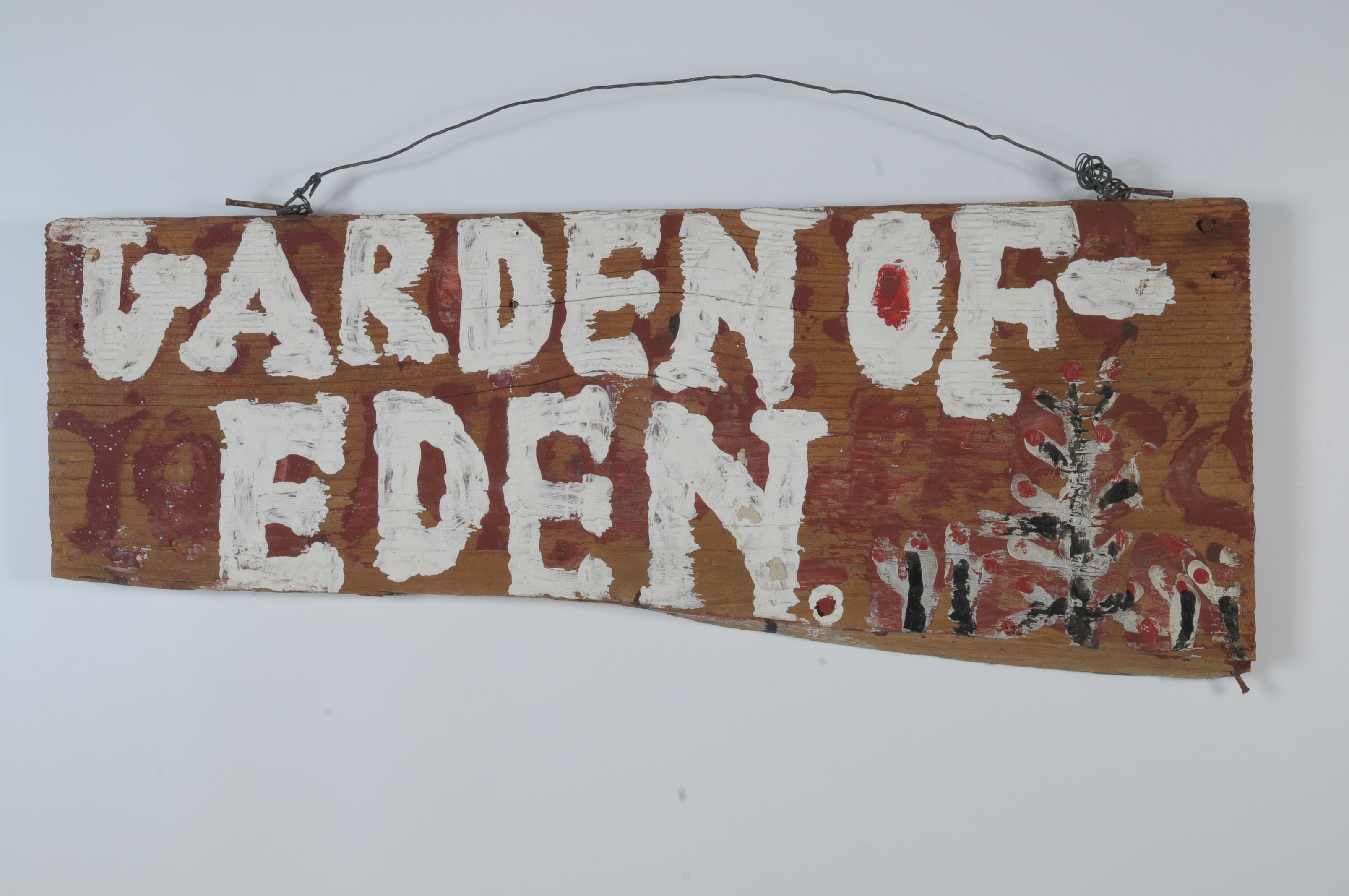
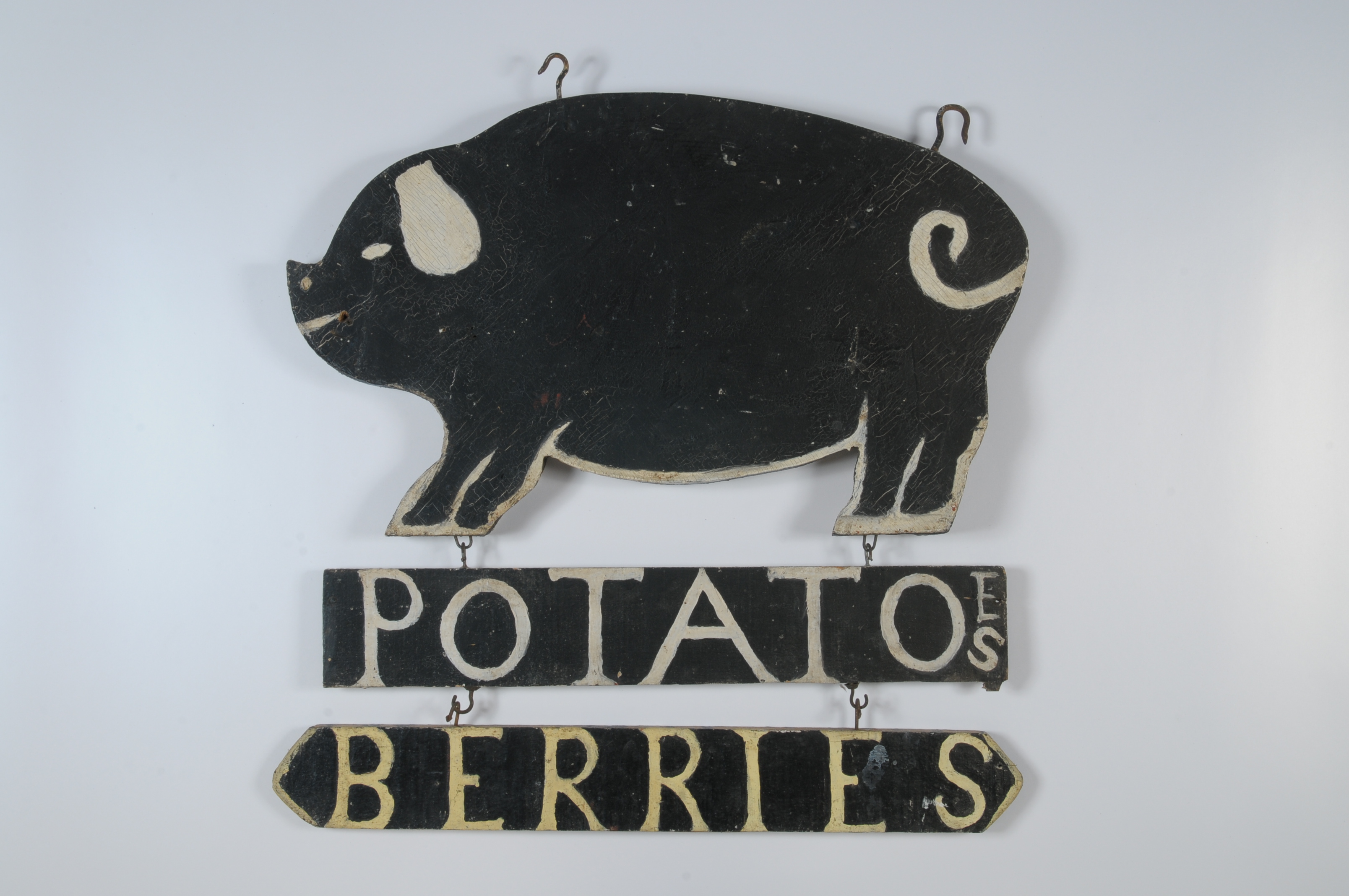
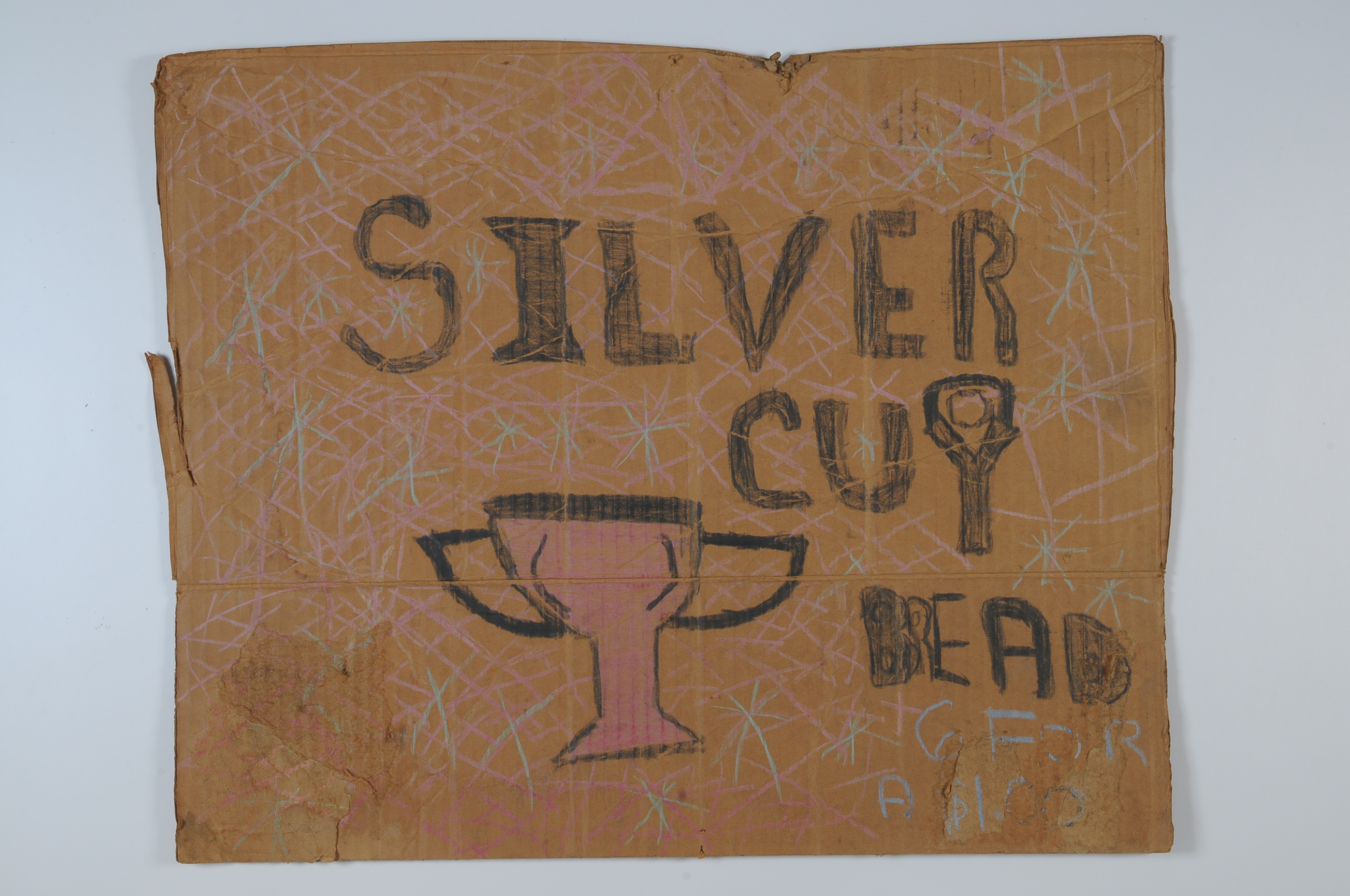
These makeshift signs painted, drawn, and nailed up on walls everywhere are what painter and photographer John Baeder, the foremost documentarian of vernacular subjects, labels "music of the street." They may indeed be unsophisticated, but in the current digital age primitivism has become a deliberate rejection of slick, formatted professionalism. In fact, what is sometimes called "neo-primitivism" has become its own professional anti-design style. Crude announcements and messages scrawled or painted on wood, metal, cardboard, or glass are humble expressions, some designed to closely approximate professional typography, others made simply to convey a distinct message.
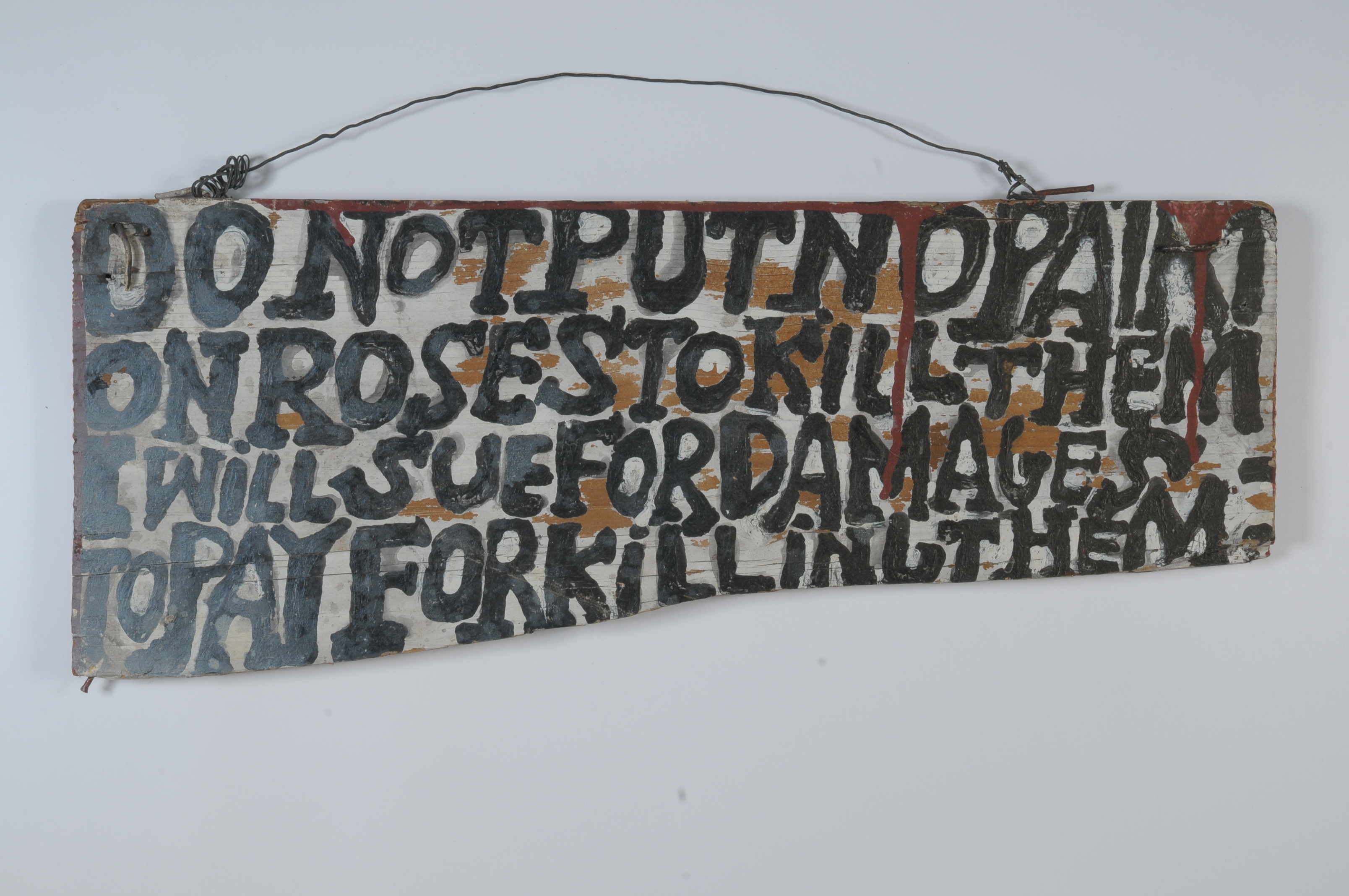
Here are some examples noteworthy alternately for their ingenuity and serendipity: FISH BAIT combines uppercase letters with a lower-case i, enlarging the swerving S to perhaps suggest a worm. The breaking of the word "hard" and the undifferentiated word spacing between r and D and the ON in PUSH HARD ON DOOR may be deliberate or accidental; it is hard to decipher but shows a happy disregard for rules of writing. SHOE SHINE 15¢ is a beautiful folk artifact and at the same time reveals a basic understanding of typographic display techniques in its grey outline and white inline letters. SWEET CHERRIES shows a keen eye for display: the red on yellow is a grabber, while the unadorned centred letters and the tasty cherries nestled into the empty space seem to imply, through the color and rendering, two of the basic taste sensations—sweetness and bitterness.
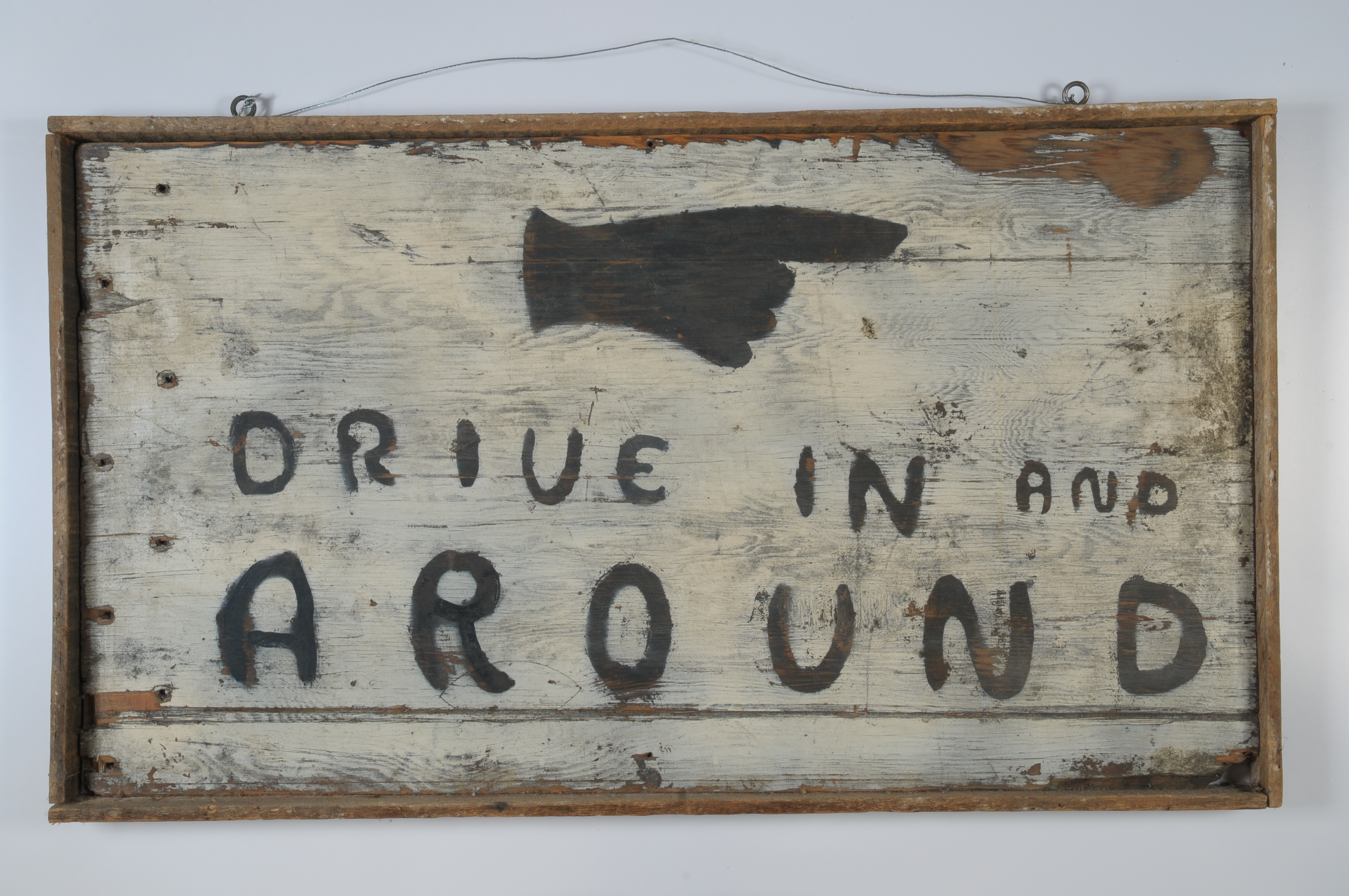
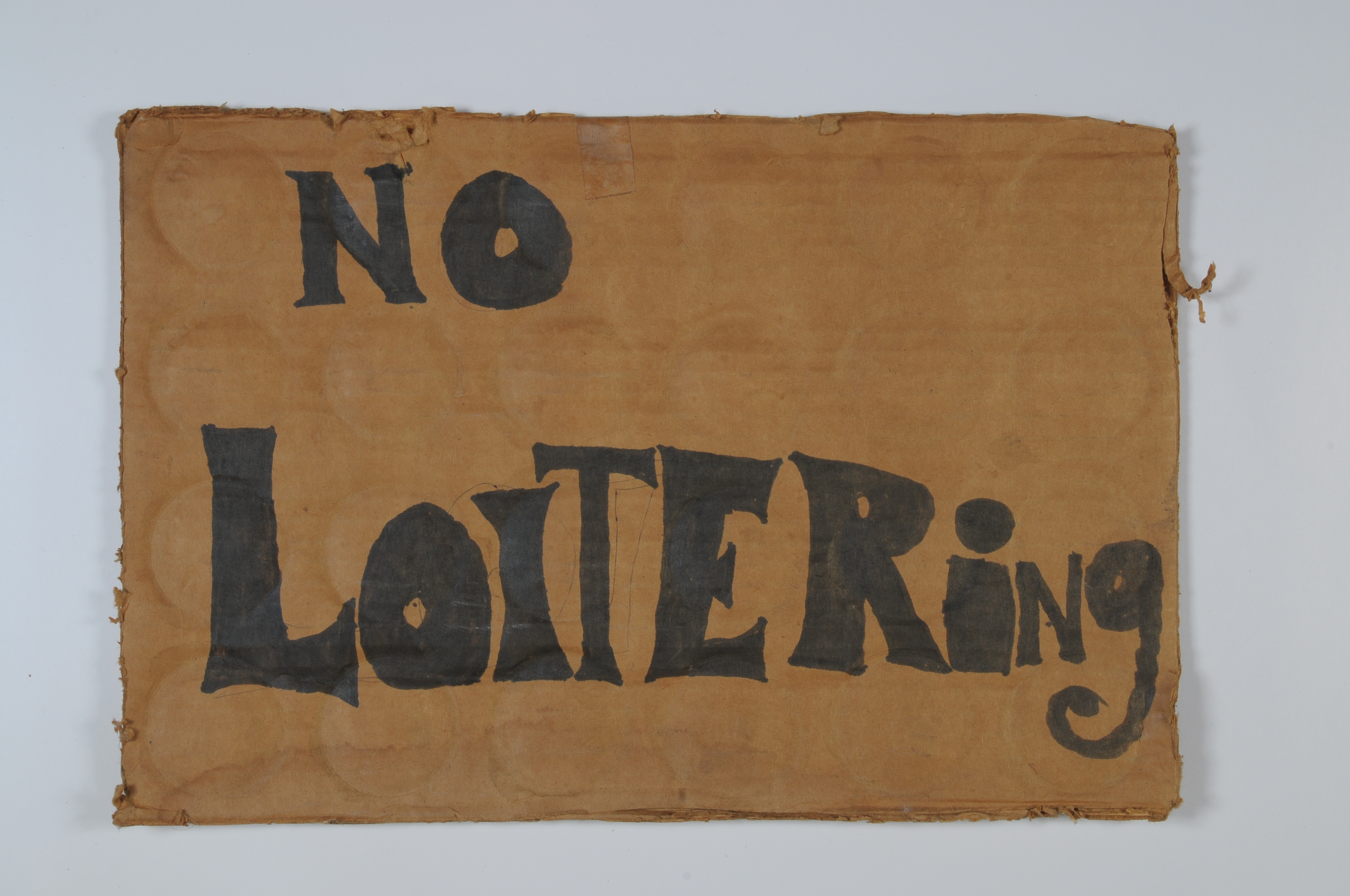
Even these impromptu signs do not entirely lack innate ambition. The anonymous person who designed DRIVE IN AND AROUND was not without awareness of the way letters can evoke personality; and NO LOITERING, rather than a stern command, is attempting to be playful with a hint of psychedelic flair. But there are also signs that do not seem to have been done with any gusto whatsoever: the word STRWBERRIES is barely legible, abbreviated or misspelled, haphazardly broken on two lines and smeared in pale red on the cardboard with what could very possibly be a strawberry.
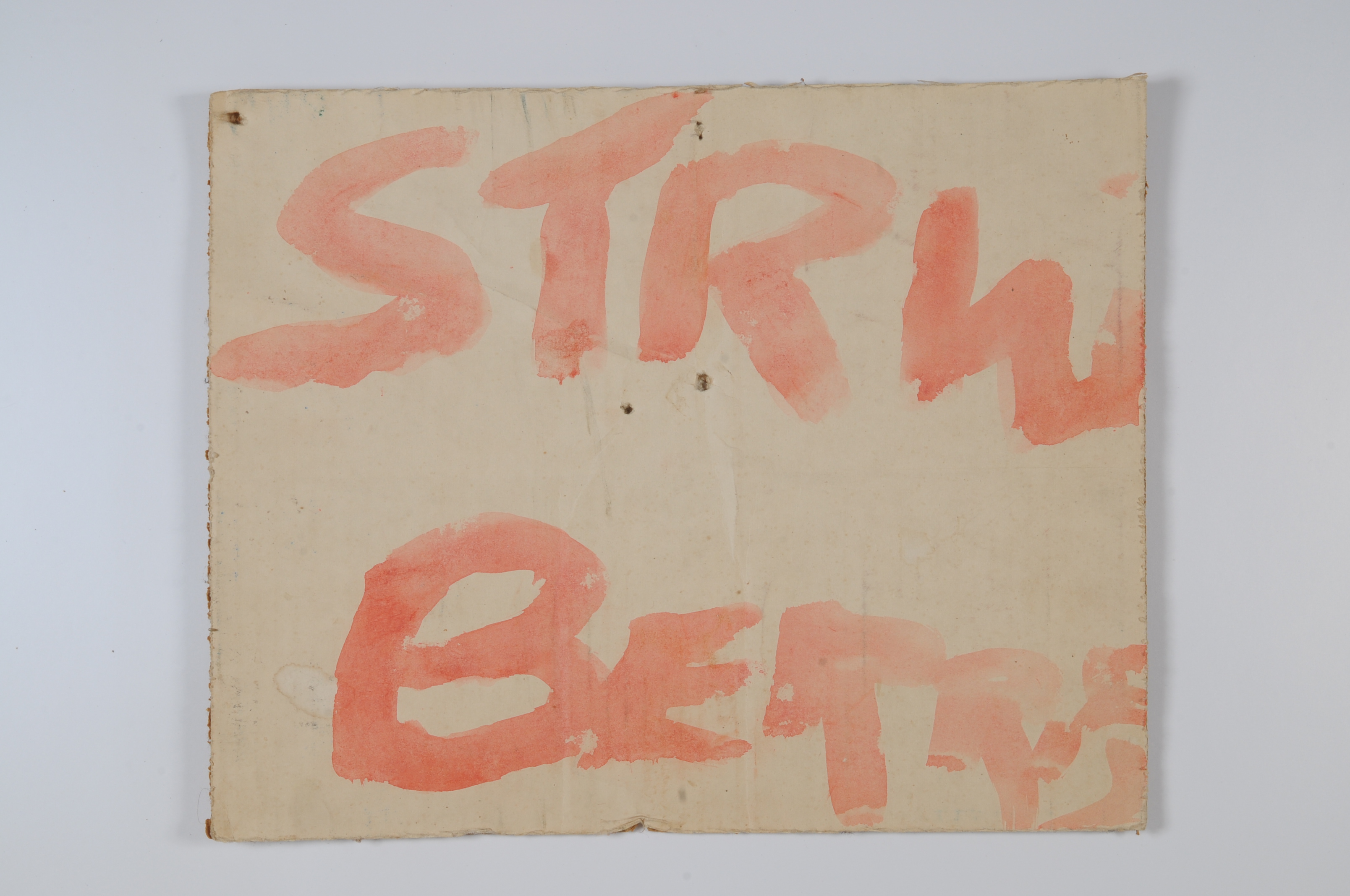
It is doubtful that the majority of makeshift sign makers have design on the brain, but in their dispassionate way these signs exist in an alternative design universe.
++++
