Layouts have gone the way of the shoehorn, the hot water bottle, and the pincushion. The grid is now a relic from the past, a Rosetta Stone of sorts. As for the page—that thing with a recto and a verso—isn’t it annoying the way it doesn’t work unless manually activated?
My design students seldom touch paper. Isolated in front of their screen and handcuffed to their keyboard, they routinely use ready-made templates to do a layout. It pains me to watch them mock-up and mangle information on an electronic page. Sitting next to them to review their design solutions, I sometimes have to cover my eyes. Seeing them in action is like watching a car accident in slow motion.
Unlike me, Susanna Shannon doesn’t sit next to her students to show them how to combine words and visuals. “I don’t hover, I sit on a high stool in the middle of the room,” she explains. “Students know that I am there, and that’s enough for them to integrate my internal vision as their own.” When someone gets stuck on a particularly “catastrophic” layout, they call her. She can reboot the process in less than two minutes by simply looking at the mess.
“It’s weird. Students can figure out how to fix their layout by just watching me look at it,” she offers.
Shannon has a tremendous advantage over me: she teaches editorial design at the Villa Arson, the prestigious national school of fine arts in Nice, France. The faculty is composed of contemporary artists for the most part (Shannon, an accomplished magazine art director, is an exception), and students tend to view school projects as potential performance pieces rather than a chance to get good grades. Shannon unusual teaching method fits right in.
“Collaboration is the way it works. We have fun. I bring food to the class—baguette, jambon, six-packs,” she says. “Food for thoughts as well: books, articles, interesting stuff.”
The class assignment—to create and design a weekly newsletter for Villa Arson—is but a pretext. Shannon’s goal is to explore the act of turning pages as a medium, one on a par with oil paint, tempera, marble, or wood. The physical contact with the bound leaves, the sharpness of their edges, the smooth surface of the paper as fingers travel across the page to grab its upper right corner of a page—all of it is part of the final design.
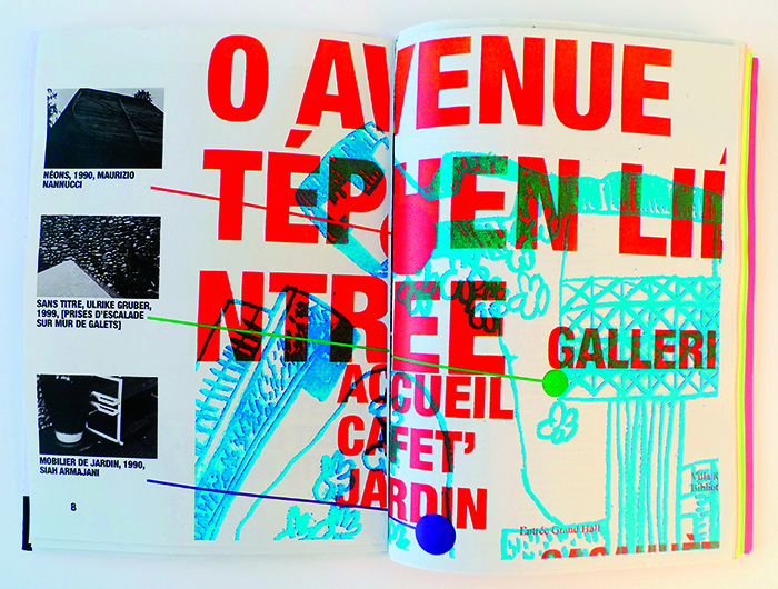
“There is a certain amount of sheer savoir faire that has to be acquired,” she explains. She makes it happen in real time, in one single sitting, with students drawing, writing, cutting, and collaging bits and pieces into a sixteen-page publication in the course of one evening. Apart from siting on a high stool, Shannon’s contribution is to do the typesetting. She hands over galleys, surreptitiously defining a grid with the width of the columns she creates.
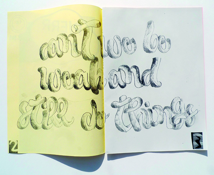
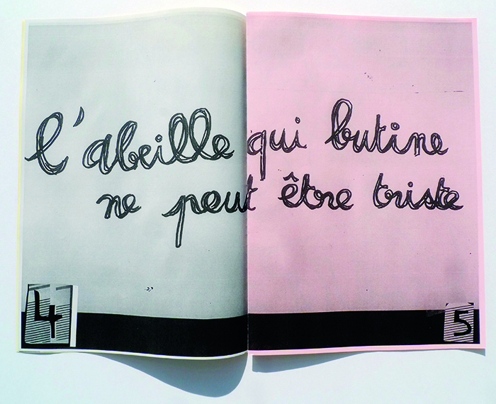
Named after the founder of the Villa Arson, Pierre-Joseph, the newsletter is a cut-and-past, photocopied, DIY, Dada-inspired publication, a well-established genre. What is less established is the reason why a collage technique pioneered 100 years ago—Cabaret Voltaire opened in 1916—has lost none of its allure today.
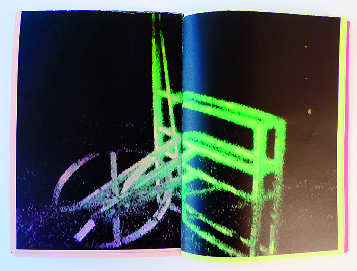
For a recent open house event at the Villa Arson, Shannon’s students created a slightly more conventional publication, Gonzague, a handsome 104-page catalog featuring a grainy sampling of the work of students and faculty. More of a classical magazine format, it manages to present the information as a color saturated, ink-soused, visceral experience. It is a graphic demonstration of what happens when taking in information is not construed as a series of isolated typographical events but as a choreography of precise gestures and boldly defined sensory stimuli.
Truth be told, the bulk of today’s printed matter is a product of desktop publishing. Of necessity, perhaps, most of what we read on paper has been designed on computers, and as such it lacks that hand-made touch that used to characterize what we now call “print”. Today’s electronically generated layouts, even the most handsome ones, are often rigid and hard-edged. Again and again, the scale of the text is all wrong, with aggressive display type and hard to decipher reading matter.
No wonder people prefer to stare at a screen than look at a piece of paper. What passes for “print” today is an inferior substitute—no longer the real thing.
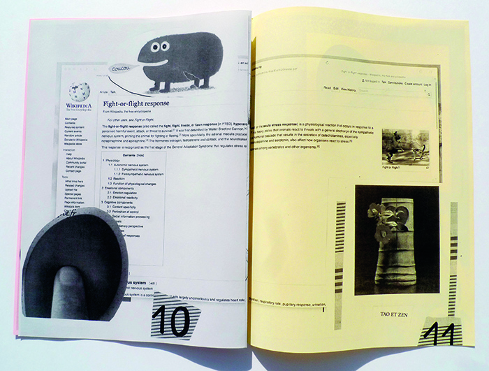
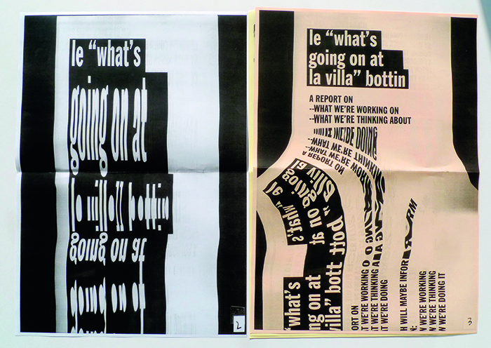
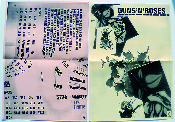
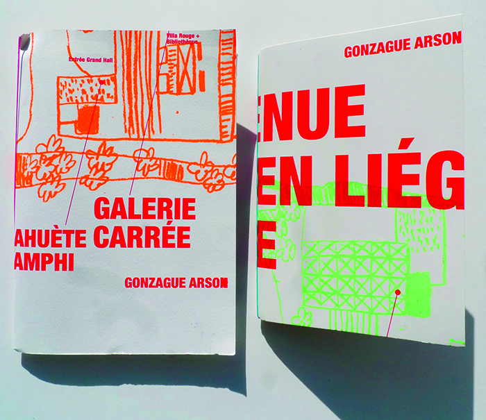
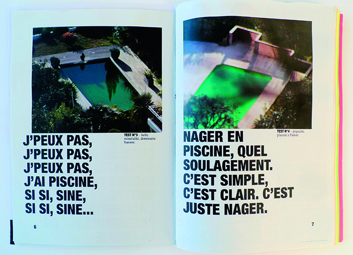
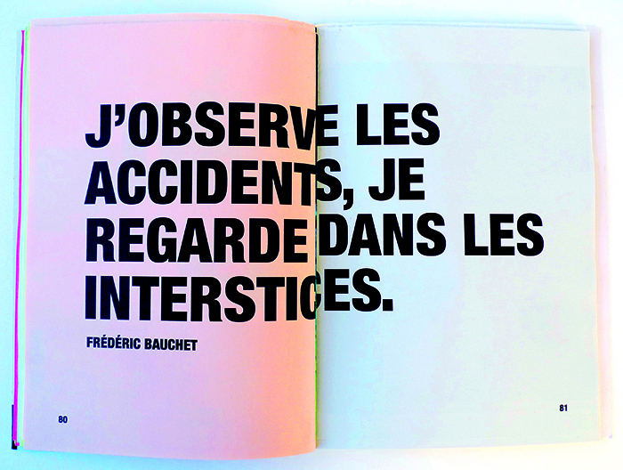
All work shown was designed by the following École Nationale Supérieure d'Arts students: Thomas Leclerc, Camille Chastang, Brice Delplanque, Gaël Salefranque, Line Ramel, Daisy Grey and, from time to time, Clémence "Ryan" Mauger; and Siann Schalvin, Lucas Cero, Victorai Vie, Maeva Grapain, Cédric Aguillon, Jean Charles Ardilouze, Emma ReÍnard, Léo Dupré, Loriane Norgiolini.
