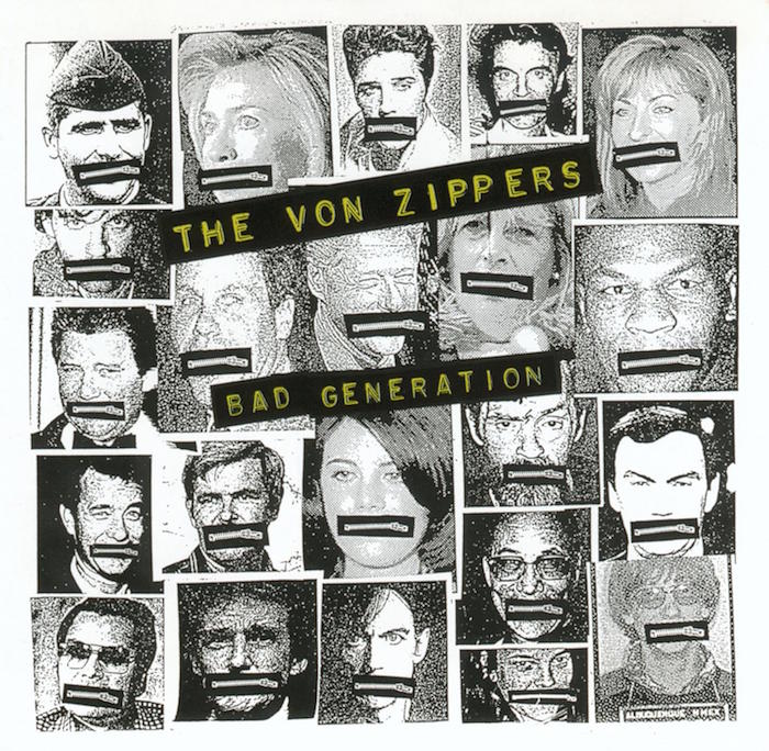
Seattle poster designer Art Chantry’s deliberately untutored approach stemmed from his youthful interest in and sampling of surfer and hot rod culture, psychedelia, comic books, and monster magazines. As a designer, Chantry developed a cut-and-paste style that included quirky typography, distresssed lettering, and anarchic collage. “I’m basically an artist masquerading as a graphic designer,” he said. “I have a degree in painting, though my teacher used to scream because I put type on my paintings.”
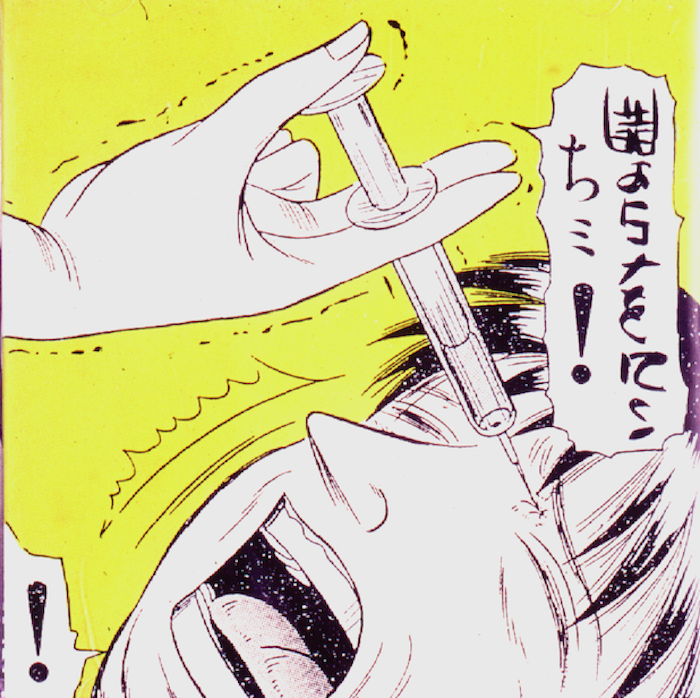
When Chantry left school in 1978 the punk scene was in full pitch, and scores of posters by seasoned unprofessionals were plastered everywhere. He knew that this was someplace he could fit in.
Chantry believes that commercial art is America’s true folk art, “not so much the work of individuals as the work of culture itself.” And he found a fresh vein of vernacular gold in a lost industrial graphic style, which from 1945 to 1955 was common in tool catalogs and the industrial trade magazines. His own eclectic assortment of advertisements and catalogs for an alternative Seattle arts groups were sometimes made by lifting entire pages from these original sources, with all the printing and layout imperfections intact.
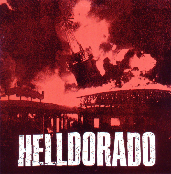
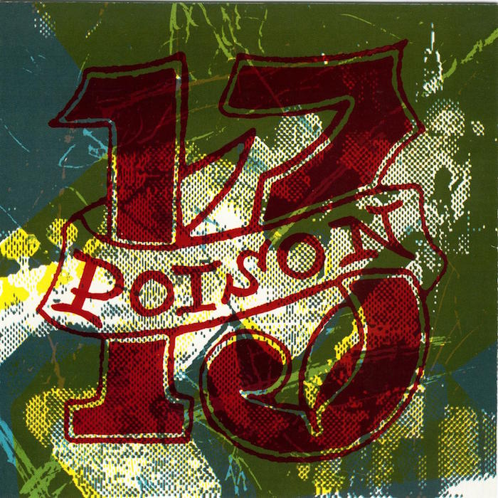
When Chantry began, he did not have access to typesetting facilities, so he generated type by photocopying it from books, cutting it out letter by letter, and pasting it into place with glue sticks. Some projects were image heavy/type light and others were all type. “When I make type decisions that interplay with an image it is usually based on gut reaction. I might scan all my old type books—or comic books and things like that—until I find something that just feels right. I try to avoid type that clashes with my image.”
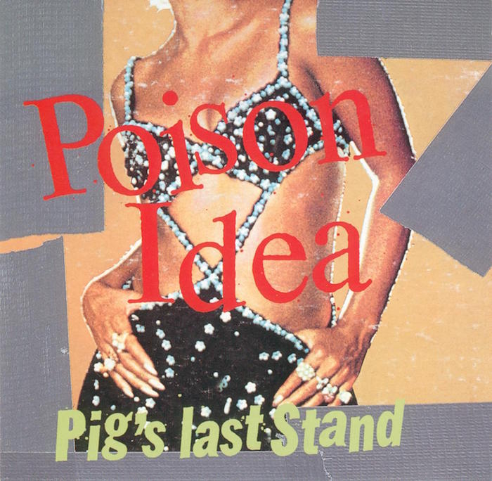
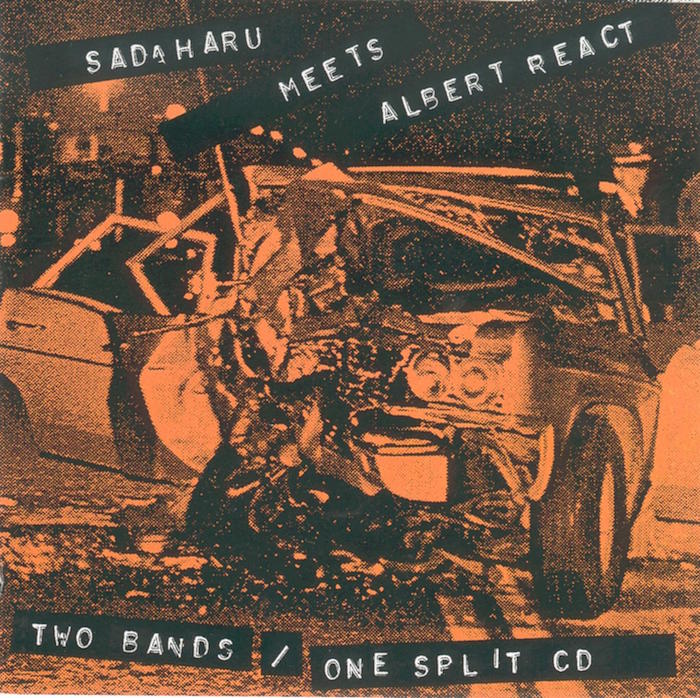
The crudeness achieved by craftsmen isolated from professional design movements held great appeal and years before vernacular became an official 1980s graphic style, Chantry said he “unearthed the work of naïfs and then tried to ape it. Ultimately it became part of my general vocabulary and all of a sudden my language expanded.” He added that other “outlaw” or anti-canonical styles, such as tattoos and “the Hallmark card idea of what hippie stuff looked like in the 1960s” informed his work, too.
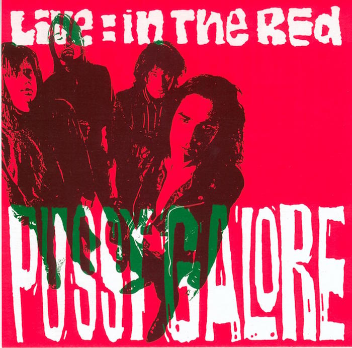
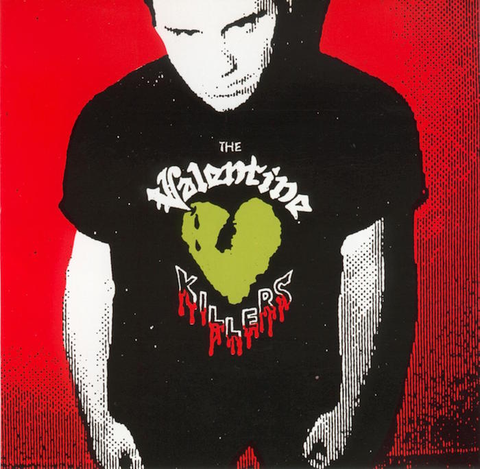
He wants his posters to have “an archaeological function, so that twenty years from now, when people are researching certain aspects of this culture they will be able to refer to my posters for reference to a historical moment.”
