Religious tracts introduce sinners to the downside of eternal damnation. If the illustrations of mortals burning in hell do not attract the eye, such titles as Are You In Danger?, The Burning Hell, and The Consequences of Sin should send a shudder down the spine. With the desktop-publishing tools available, current tracts are rather slick, as though a trained Photoshop or InDesign operator had designed them. But for intense fire and brimstone, the grittier design of pre-computer specimens does a better job in exposing unpardonable sins with more impact.
In these evangelical handouts, the persuasive rhetoric of repentance is dour at best. Yet if one does not believe in sin (original or otherwise), the Second Coming, the Devil or the “vice of sexual immorality,” then these flyers are designed in a decidedly crackpot fashion. But that does not imply they do not have their allure.
Some leaflets are, nonetheless, more deliberately designed. Chick Publications produces the most professional of all religious handouts. Hundreds of small comic-book-sized gospels and testimonies are drawn and written by Jack Chick, following a standardized format that has become so recognizable as to have inspired parodies. Yet these comic booklets are no joking matter.
Chick’s career as "a publisher for Christ" began more than forty years ago, since when he has produced hundreds of comics, presumably for a young audience, of such parables as The Loser (“He was afraid of everything. But God changed Gideon from a loser to a great leader”), Party Girl (“A young woman’s brush with death reveals Satan’s plot for her destruction”) and Sin Busters (“Nobody can keep the Ten Commandments. Jesus is the only way to heaven”). Chick’s conventional drawing style was at first considered sacrilegious in evangelical circles, but this master of dramatic narrative has managed to become ubiquitous in the gospel tract business over the years.
Despite the fact that the computer makes it so easy to produce proficient layouts, the majority of grassroots missives are fairly primitive. There Is No Water in Hell by Old Paths Tract Society is typical of the genre of blurrily printed four-page, two-color (red and blue) testimonies that appear to have been typeset with discarded hot type. Now Is the Time to Act, Not Later On!, an even coarser folded-over, four-page tract with a vintage line illustration, appears to have been photocopied from an old Bible.

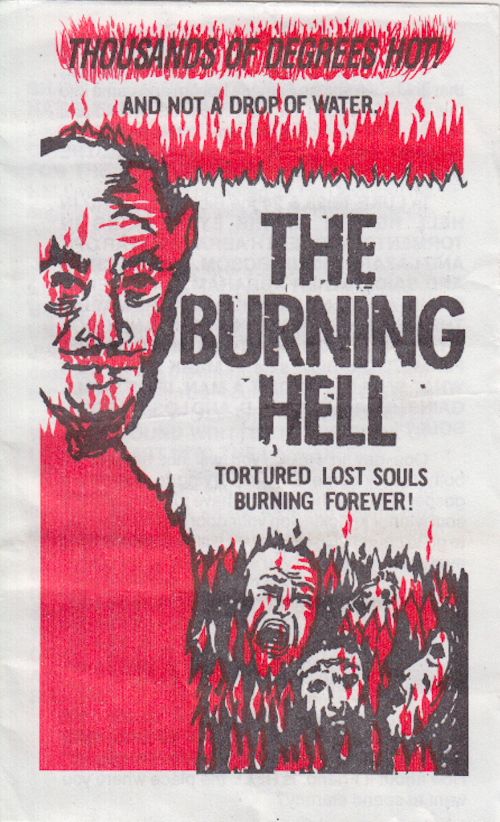
The Fellowship Tract League, whose motto is “All tracts free as the Lord provides,” distributes the most common, like The Burning Hell: Tortured Lost Souls Burning Forever. With an expressive woodcut of Satan on the cover, printed in red and black, overseeing lost souls trapped in hell and engulfed by flames, its crude simplicity gives it an honest air. Satan is not some hokey horror-film apparition but a convincing form embodying the banality of evil, while the lost souls are more than merely comic caricatures. The abundance of red flame is a startling graphic device with iconic impact.
Graphic design has long played a strategic role in the branding of the organized religions. The grassroots side of evangelical proselytizing is clearly stripped down to the bare graphic bones, thus avoiding the sins of hubris and pride.
