There is no such thing as timelessness. Everything existed or exists or will exist in time. Then again, time is a concept that, it’s said, does not exist in nature. It is a construct. Still, it exists in mind, if not in nature, and everything is based on (or recording in) time.
Is your brain exploding yet? No?! Well, I haven’t even hit you with Google’s famous quotations yet. And I probably won’t.
Time may be concrete and abstract, but in terms of design, timelessness is imposed. It is a critical and subjective, yet generally agreed upon label for style—or lack of style.
When design critics and historians—or people like me—write about timelessness, we are really writing about a style or manner that transcends or defies or skirts around the accepted timely categorizations imposed on design by critics, historians, or people like me.
Lately, I’ve been writing the fourth and final edition of Graphic Style: From Victorian to Hipster (Abrams Books) with Seymour Chwast, in which we track through time the look of various styles of graphic design and typography. I realized that the things I called timeless were indeed representative of the time in which they were created. Art Nouveau, for instance, is easy to pinpoint, although Modernism is a little more slippery (on purpose). Yet Art Nouveau in its time was “modern.” And Modernism, a reaction to it and other styles, was also “modern.”
There are exemplars of Modernism whose work is described as timeless—because they cannot be fixed in a tight timeframe. But there are various Modernisms that come with self-limiting prefixes like early-, midcentury-, classical- (which suggests old yet revered), post-, and even post-post-Modernism. These terms imprison the design, if not by the hands of a clock or in a grid of a calendar, to a period or even state of mind.
Still, if timelessness has no real meaning, then how can one describe design that is not tied to a style? For me, timelessness has two meanings: locked in a time that is untethered to an imposed period, or transcendent of time by virtue of avoiding the tropes that will locate it in time. But enough!
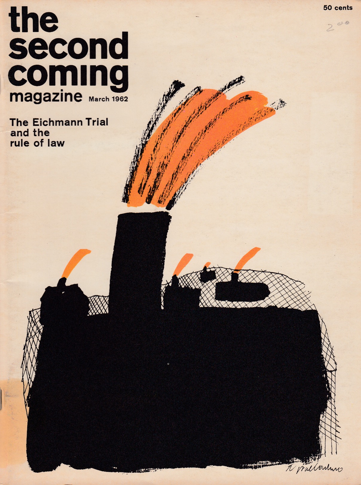
Here is a piece of graphic design that is rooted in time. You can read the date clearly. The headline also gives it away. But it, nonetheless, has a special “timeless” quality. The illustration by the late Tony Palladino looks now as good as it did then and even (maybe) will tomorrow. The masthead of The Second Coming (a short-lived political/cultural magazine edited Samuel P. Edwards, published by Jack Rennert, and art directed by Palladino) and the total cover are indeed untethered to a particular moment.
For me, timelessness is that which I can experience without thinking of time. I’ve had this magazine for over forty years, and it is as fresh (there’s a useful word) as it was when it came off the press. That’s timelessness, no?
