Pablo Ferro died in November last year, just in time to be included in the remembrance film on Turner Classic Movies. The mention was indeed well deserved. If the name Pablo Ferro does not ring any bells for a young generation of motion graphics designers, CGI and interactive designers, and augmented reality designers, it should. Famous for his award winning commercials and ground breaking logos, Ferro designed some of the most popular Hollywood film titles and graphic sequences ever, for some of the most iconic films. Notably titles and trailers for Dr. Strangelove, titles and multiple screen sequences for The Thomas Crown Affair, the quick-cut 60 second trailer for A Clockwork Orange, and recently main titles for Men in Black and scores more. In all cases, he has a special attention to text graphics. Some of these have outlived the movies they titled because Ferro turned up the volume on those bells and whistles.
A former artist at Atlas Comics, Ferro began his motion graphics career with primitive yet brilliant TV commercials from the late 50s and early 60s, and then with film titles from the 60s through the 2000s. He introduced various pioneering approaches to graphic / cinematic storytelling: For his commercials he adopted a quick-cut animation technique, using comic characters and decorative typography sandwiched between bits of live action film along with sound effects, music and voice. At a time when TV had not yet tapped into its kinetic potential, Ferro rejected plodding camera work and stagnant narratives, common to television, for lively short films that used the camera in rhythmic and cadenced ways. Jazz-like improvisation infused his work and these sequential serendipities evolved into more polished film title sequences that made an industry take notice.
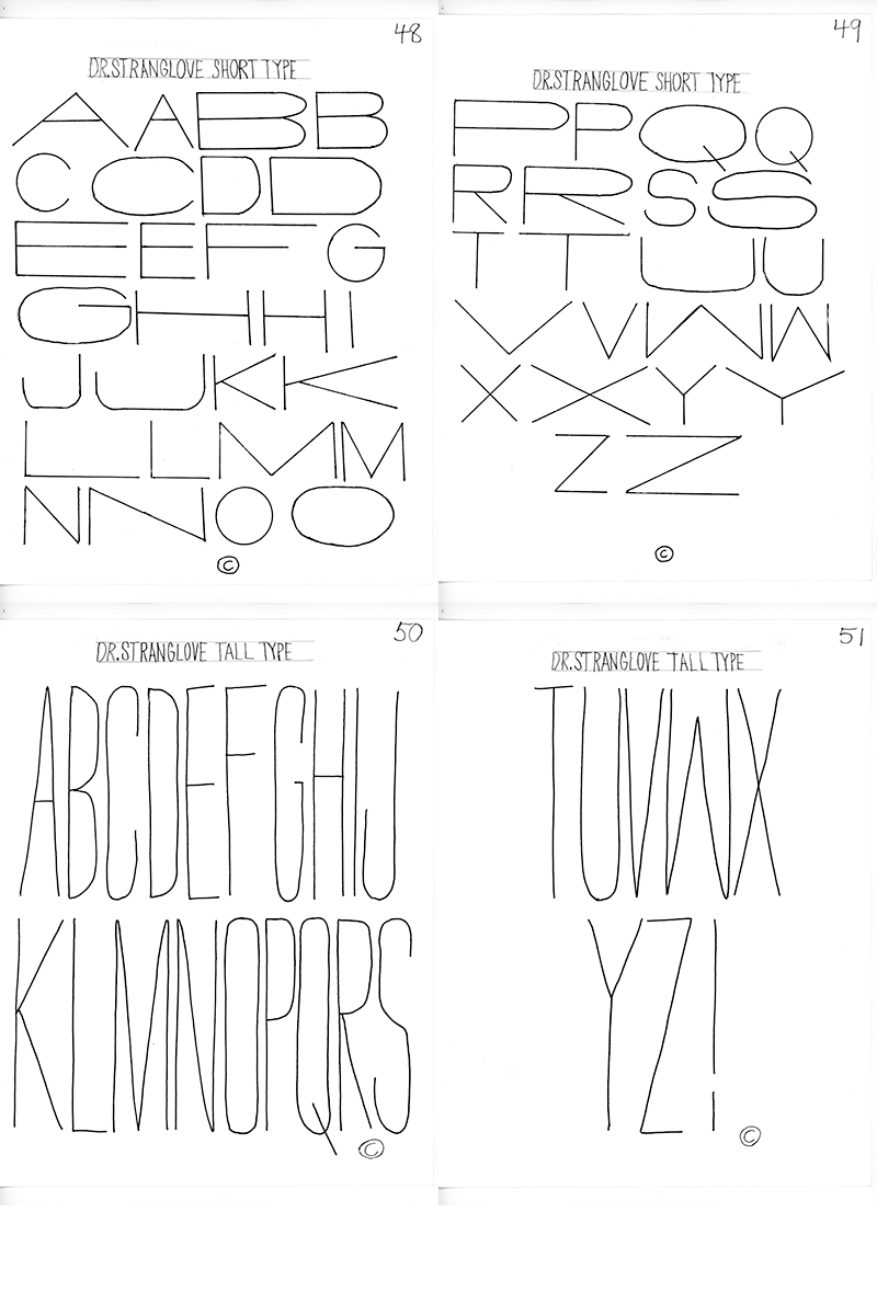
Top among them is the rule-breaking hand scrawled opening sequence for Dr. Strangelove, where words are roughly written at random sizes depending more on how well they fit in relation to the other words and ignoring the conventional star-billing hierarchy. Laid over black and white film of an actual B-52 bomber refueling in air accompanied by the woeful World War II lyric, “We’ll meet again, don’t know where, don’t know when,” the titles establish the dark comedy about to begin. It also typifies Ferro’s creative calculus as at once serious and playful.
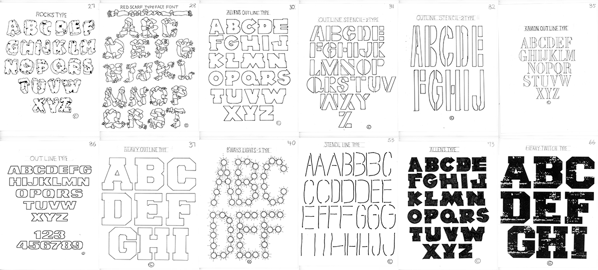
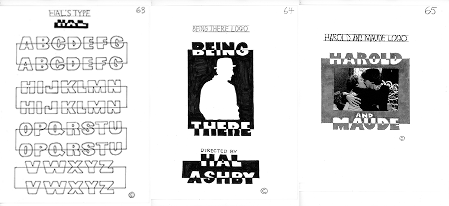
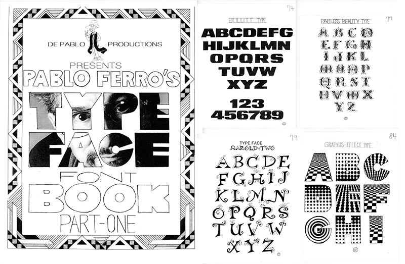
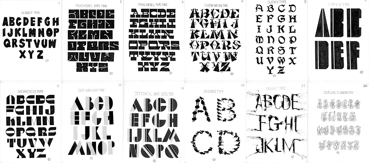
Before he died, Ferro played with all kinds of imagery, including an unpublished book Alphabet Show. A book may seem like a counterintuitive medium, given his decades of motion virtuosity, nonetheless he has successfully recreated the kinetic experience on otherwise static pages. When it came to lettering, Ferro’s imagination went beyond all boundaries. The images here are from an unpublished book of lettering and type that he sent me and I recently uncovered. It is a pleasure to see how these forms translated into motion as they movingly push the canon of graphic form.
