"It was the best of times, it was the worst of times, it was the age of wisdom, it was the age of foolishness, it was the epoch of belief, it was the epoch of incredulity, it was the season of Light, it was the season of Darkness, it was the spring of hope, it was the winter of despair…”
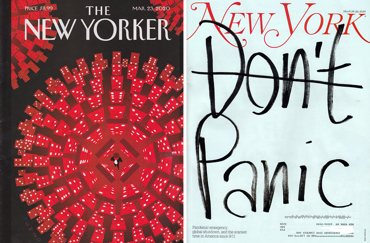
This introduction by Charles Dickens to his Tale of Two Cities encapsulates feelings of many eras. I would like to rephrase it this way aimed at these days when wisdom is at a premium and dread is filling our lives: It was the best of covers, it was the worst of covers, it was a response to an epoch of incredulity with a brilliant visual idea on one major magazine and a misfire on another. Both covers were published on the same week, one on the New Yorker magazine the other on New York magazine (both that are known for their conceptually iconic graphic commentaries).
I anxiously anticipate what the print and digital media have to say about our current cataclysm. So, I was glad when New York and the New Yorker arrived on the same day together in the mail. As expected, each had covers and stories addressing the COVID-19 emergency. New York’s cover with the words “Don’t Panic” in hand-drawn-marker letters looked like a hastily scrawled notation; It was a clever way to visualize the speed that the virus had altered city life. At first, however, I hadn’t noticed that “Don’t” was crossed out, leaving only the word “Panic,” which changed the meaning radically. The New Yorker’s more graphically rendered illustration by Christoph Neimann, typical of the magazine’s concept-driven cover style, showed a pattern of dominoes encircling a nose-blowing individual designed in the pattern of a corona virus, suggesting two ideas, distancing and fate.
Niemann’s cover was elegantly nuanced. The New York cover was more sensational. The former was not weak but the latter overly exploited the collective fear. Which was a better message for it respective readerships? Well, New York’s was ill-conceived and, in my opinion, unnecessarily thoughtless. The New Yorker’s cover stated the obvious with more sensitivity to the common good, it did not exploit our fears it just underscored them.
“It was a rare case where I only worked on the one concept,” Niemann explained, “Initially my intent was to show the fragility of the situation — that this is not about an outer force that threatens us (like a bullet or a flood), but that we are the threat, that has the potential to wreak havoc.”
Neimann says that the cover was sent to the printer on Thursday, “and over the weekend, it became clearer that social distancing became a more urgent strategy to help slow the pandemic. I assume that enough readers saw it as a nonverbal plea about the importance to #stayhome.”
Meanwhile, New York’s cover was not simply issuing a safety warning per se, it was yelling “VIRUS” in an infected theater. It was raising the level of terror instead of informing its readers.
Graphic and typographic messages have the power to impact behavior. At the risk of carping, I repeat emphatically, that their cover was an unnecessary and irresponsible overstatement — the last thing we need is a respected media source telling us it is alright to panic. Its already happening, anyway.
