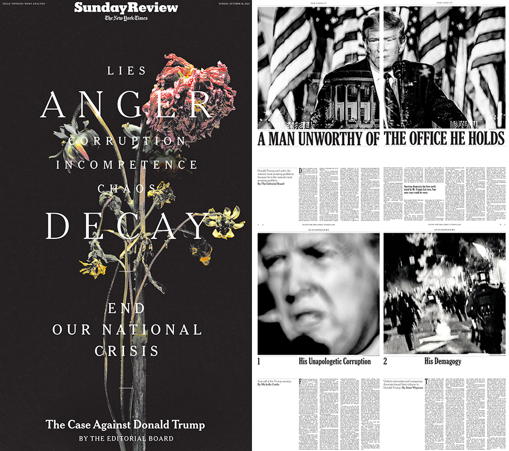
For the print version of its Sunday Review section, the New York Times Editorial Board introduced a special edition with the heart rending image of a wilted flower with the headline “Lies, Anger, Corruption, Incompetence, Chaos, Decay” with two subheads “End Our National Crisis” typeset in differing sizes of Times Chelteham caps, and “The Case Against Donald Trump” set in upper and lower. On the web site, a similar animated flower slowly wilts and decays before our eyes. We all know the meaning of this mournful poetic image.
Times editorials over the years have strongly advocated various positions (like October 6’s unprecedented looking endorsement for Vice President Joe Biden) and devasting rebukes. The board did not support Donald J. Trump during his presidential campaign, and it is fair to say, it has vociferously scolded him for most of his misguided polices and criminal activities. But in my memory, the newspaper of record has never unleashed such a full-bore graphic condemnation of a sitting president in an entire section, particularly where the photography and typography were so damn elegantly art directed.
Some background from Kate Elazegui, design director:
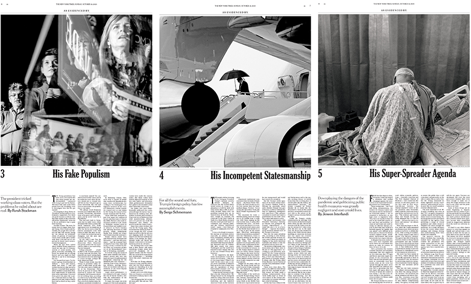
The editorials were originally planned to take up only a few pages in the weekend section, but our design team knew it could/should land a bigger punch. After lobbying for the entire 10 pages, we took the opportunity to make a provocative visual statement about the state of our nation, creating and choosing non-news/non-traditional political imagery that delivered deep visceral emotions.On numerous occasions I’ve written about how the Times has excelled at redefining print and internet journalism through its graphic design and information design journalism. The printed version of this section is a tour de force yet model of restraint. The grid is simple: One large black and white photo, slightly larger than half of the page, jumping over the “fold”. A six column text grid with ample white space in the two empty left hand columns for headline, subhead and byline (all in Chelt). The opening spread is a double page montage of Trump against American flags and the White House portico atop the utterly damning (but not a sensational) headline: “A Man Unworthy of the Office He Holds.” It stretches across the two-page spread.

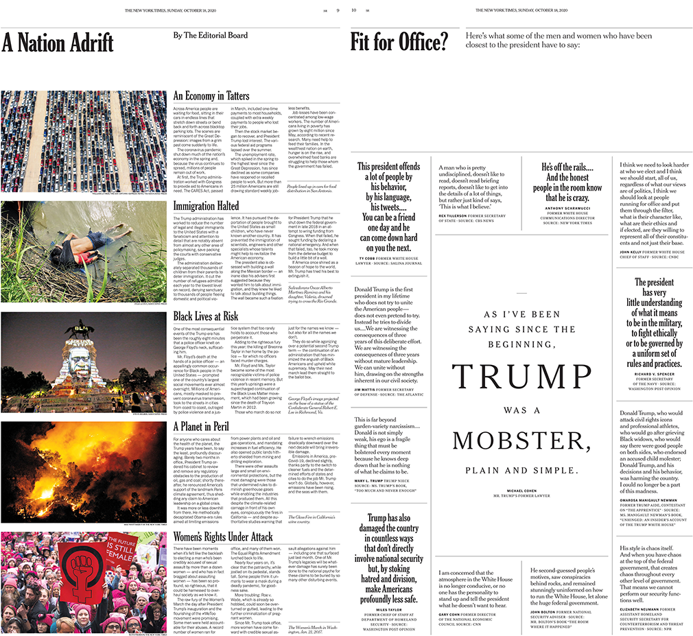
There are no drawn or painted illustrations. The penultimate page includes color photos and is a list of six Trump-era tragedies titled “A Nation Adrift,” summarizing the major failures of this unconscionable presidency. And on the back page, headlined “Fit for Office?” an elegant typographic display of quotations by Trump’s onetime cohorts damning him for his incompetence.
Some might argue (perhaps 30% of America, I reckon) that this is liberal media run amuck, showing detestable contempt for the man in office. I’d argue without one screaming gothic headline to give it the look of protest or opposition propaganda, it is a rational critique against an irrational leader. Trump is an easy target for graphic commentary, that this is so elegant and restrained is a test of the Times’ editorial and design directorial intelligence.

With respect for the team:
Kate Elazegui, design director
Frank Augugliaro , deputy design and lead design
Jessia Ma, digital design
David La Spina, Sara Barrett: photo editors
Cover photo and online animation: Michael Vahrenwald
