All images by Steven and Nicolas Heller
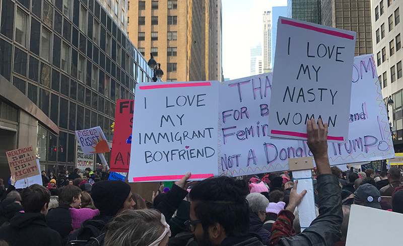
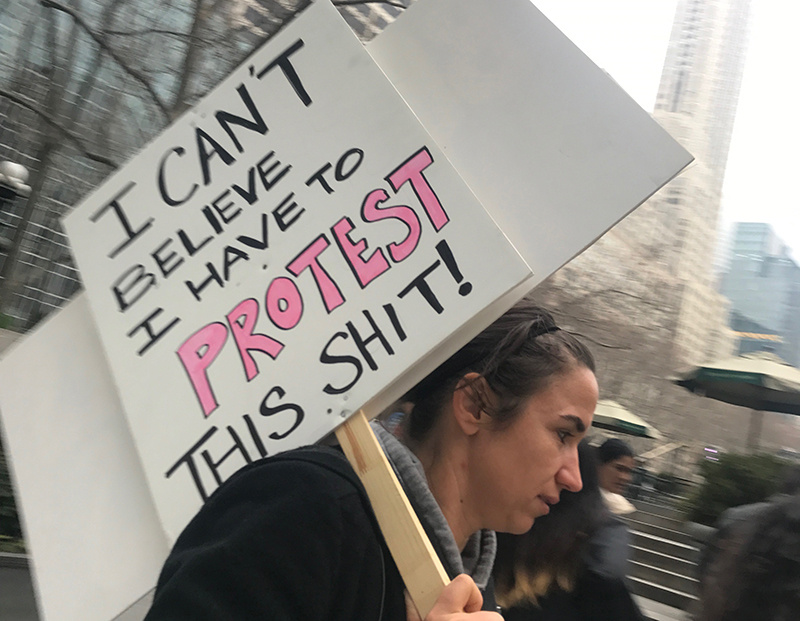
The signs held by participants of all the women’s marches that took place throughout the world were not designed to win awards. The posters and placards, the hats and t-shirts were not intended to impress other designers. They were made to convey truths.
Often the most effective missives of dissent are not beautiful type and exquisite illustration; they are marker on foam core, collaged cut-out letters on oaktag and long stretched fabric with words hand scrawled in cheap paint. For some, the placard is not even as impactful as a voice raised in unison and hand-punching the air. The march in New York City comprised hundreds of thousands of committed ragtag individuals with different voices but one belief: “This is what democracy looks like,” they chanted over and over.

I marched (or rather slowly shuffled) along a packed 42nd Street with Paula Scher, Seymour Chwast, and my son Nick Heller for four hours before reaching the turn-off on Fifth Avenue to Trump Tower. We passed the Grand Hyatt (the first development that Trump’s father erected next to Grand Central Station) and stalled for at least 20 minutes under the bridge over Pershing Square, which was packed with chanting supporters. Very few police were present, and the few I saw were wearing women’s march buttons (now that’s New York’s finest!). The mild (40ish degree) weather produced a patchwork of people in winter parkas, brightly colored scarves, and pink pussy hats. With the exception of a couple of Shepard Fairey posters and a Hanksy cut-out of what Trump once referred to as a “potato with my head on it—so what?” (it is actually something a bit more bodily), the range of “designs” were crude, if you like, but heartfelt and honest. Slogans were much more important than typography. “My Body My Choice,” “Make America Vote Again,” “Women’s Rights Are Human Rights,” “Orange is the New Facism,” “Sorry World, We’ll Fix This,” “Facts Checkers of the World Unite,” and my favorite, “Donald Trump Is A Real Shit Stain.”
Granted, this last one reveals my own preference for bleep-speak, but given the peaceful, even respectful tenor of the march, I was hungry for a little comic vulgarity.

The marchers were clearly proud of their handmade declarations. When my son and I peeled off from Scher and Chwast because I simply couldn’t walk another step, we passed the New York Public Library. People were propping their signs against the wall in an ad hoc makeshift display. Another woman carried a box labeled “recycled signs” and others still proudly carried theirs, having left the march but not their messages.
During a march in 2002 protesting the inevitable Iraq War, I saved many of the signs and leaflets as artifacts of designed dissent. Years later, I put some in a few of my books to show how clever designers could be in times of political crisis. This march was different. The few that were probably designed by designers lacked the authenticity of the D.I.Y. versions, which, whether complex or simple, were testaments that this march represented a deep belief that the true America must not pivot into an alternative America—a real threat to our legacy and our future.

