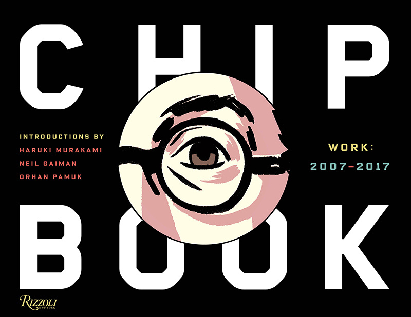
The following is an excerpt from Chip Kidd: Book Two, out now from Rizzoli and published here with permission from the publisher. — The Editors
Reading Cormac McCarthy’s The Road in manuscript form was thrilling, devastating, and yet another reminder of how privileged I am to have my job at Knopf and to work with this author. I thought this was by far the most affecting and brilliantly controlled work from this artist I had ever read, and in retrospect it preceded Robert Kirkman’s The Walking Dead by several years while drawing on many of the same themes as that international phenomenon: a mysterious global catastrophe that brings the world as we know it to a stop—and then for those who survive, the sheer daily trial of trying to stay alive without knowing exactly what the rules are. Of course the difference is that The Road dials back the sci-fi quotient by not going so far as to add zombies to the mix, but that only makes it even more terrifying.

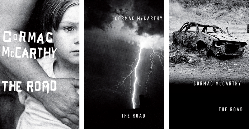
Early cover designs for The Road. Of the one on the far right, Kidd says "I really thought I nailed it here, using a photo by Jason Fulford. Cormac disagreed."
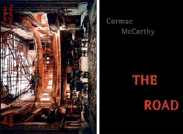
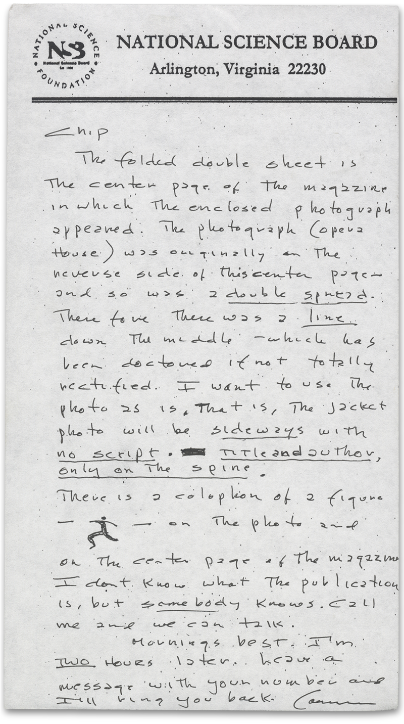
As described in his letter (below), Cormac wanted Andrew Moore’s photograph of the collapsed theater to be set on its side to accommodate the format. He also wanted something (or didn’t want it, to be more specific) that made our marketing and sales department very concerned: his name and the title nowhere on the front cover, only the spine. As a designer, I thought this request was really ballsy and cool, but the reality was that it would have been recklessly counterproductive. That approach just didn’t prepare you for what the book really was: an extremely dark and spare meditation on what would happen if all the basic conventions of modern civilization were suddenly removed, and we as a people were rendered savages again. Every-one involved finally agreed on the design, soon to be adorned with an “Oprah’s Book Club” sticker, which allowed any remaining doubts of success to instantly evaporate. Bless you, Oprah. I mean that in all sincerity.

Left: A mockup with the photo and treatment requested by the author. Right: The final book cover.
Shortly after The Road was released, Sonny Mehta asked me to do some exploratory work on how I might redesign Cormac’s backlist for Vintage Paperbacks. I was thrilled at the prospect and started to think about basic visual themes that united the work: wide-open landscapes, peril, savagery, the American West, and ... storms. McCarthy’s descriptions of epic weather systems across the vast deserts and plains are jaw-dropping, and I knew there were extreme-weather pictures to match. The thing was, images like these naturally work better horizontally (thus the term “landscape format”) than vertically. So I really went from the gut and decided that all the covers would be rotated onto their sides (much like Cormac had initially wanted on The Road) and I mocked them up. This approach, sadly, was nipped in the bud, with potential confusion about how booksellers would display the books becoming the concern that led to their doom. The one design from this series that did get produced features a photo of a crop fire by Larry Schwarm, who provided the image for Cities of the Plain.
 A letter from Cormac McCarthy detailing his design requests.