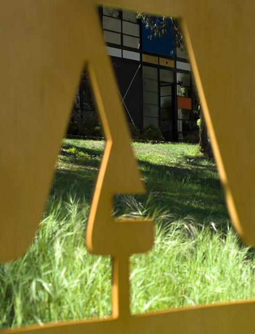
A stencil of Eames Century Modern in front of the Eames House, 2010
"Sitting high atop the Pacific Palisades and overlooking Santa Monica and the Pacific Ocean," the House Industries crew fawns, the Eames House "is still recognized as a revolutionary use of space and materials." The house is the most salient work of Charles and Ray Eames, arguably the most distinguished couple in design history. And a private tour for three lucky House Industries fans was an idyllic gesture for the inauguration of the Eames Century Modern typeface collection last spring. "We are going to time the release with the sunset in the Pacific Palisades," said House Industries owner Rich Roat in the run-up to the event. "How poetic."
The tours, guided by the Eames's grandchildren, may seem like a lavish gesture — the House Industries catalog is free, while the privilege of seeing the Eames House interior and studio is only afforded to those with a $5000 Eames Foundation membership — but the company considers the Eames Century Modern collection, like the namesake artists, worth celebrating in style. Especially considering that, the typeface was a long time coming; Andy Cruz, Roat's partner and resident art director at House Industries, first presented the idea to Eames Demetrios back in 1999. "We kept up the dialog and finally made a deal a few years ago," Roat says.
The Eames House was an obvious point of incorporation for the launch of the type collection for a number of reasons. After hashing out a licensing arrangement with the Eames estate in 2007, Cruz and Roat negotiated the final terms at the kitchen table in the Eames House. Back then, though the real typography work was still to come, the largest paperwork hurdle had been cleared and to commemorate the event, House Industries released a few solid-wood models of the Eames House, what Roat calls "a celebratory notion." Three years later, they’ve come full circle, with the Eames Century Modern font (drawn by Erik van Blokland, of Beowolf typeface fame, whom Roat calls a "serial doodler") finally in the bag. The "celebratory notion" has become a set of "36 replenishable Michigan-grown basswood blocks representing 29 separate hand-pulled screen passes." These 36 wood blocks can be used to build a miniature model of the Eames home and studio.
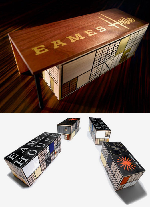
Top: A limited edition of 10 solid maple and walnut models of the Eames House
Bottom: House Industries has issued the 36-piece Eames House Blocks set
The Eames House hints at the myriad reasons why Charles and Ray Eames have attained an irreproachable degree of design celebrity over the years. The building isn't just structurally interesting or aesthetically telling or technically impressive or personally relevant to the Eames story. Much more than any other Eames creation, it is all of those things combined. Designated a National Historic Landmark in 2006, the house has been extensively documented by the U.S. Library of Congress as a beacon that "represented the fruits of postwar American life, combining living and working, indoors and outdoors, high style and popular culture."
Built more than sixty years ago, the house originated as the eighth project in the celebrated Case Studies on design sponsored by Arts & Architecture magazine in the mid-1940s, and is today both a touchstone and shrine to mid-century modernism. The structure is revered as an embodiment of the Eameses' artistic inclinations. But on the technical side, too, the house hits the mark. Not only were the Eameses charging headlong into the postwar prefabrication boom — embracing its numerous logistical and social advantages, which were particularly suited to modern architecture — they were also embracing design sustainability in a time of devil-may-care prosperity. The Seattle-based designer Claude Breithaupt points out that the Eameses were also well aware of the context in which the home would be placed, and planned accordingly. "Great construction for the climate, giving lots of natural light and ventilation, which makes for the really nice interior space," he says of the building's relationship to its perch between Santa Monica's bay and mountains.
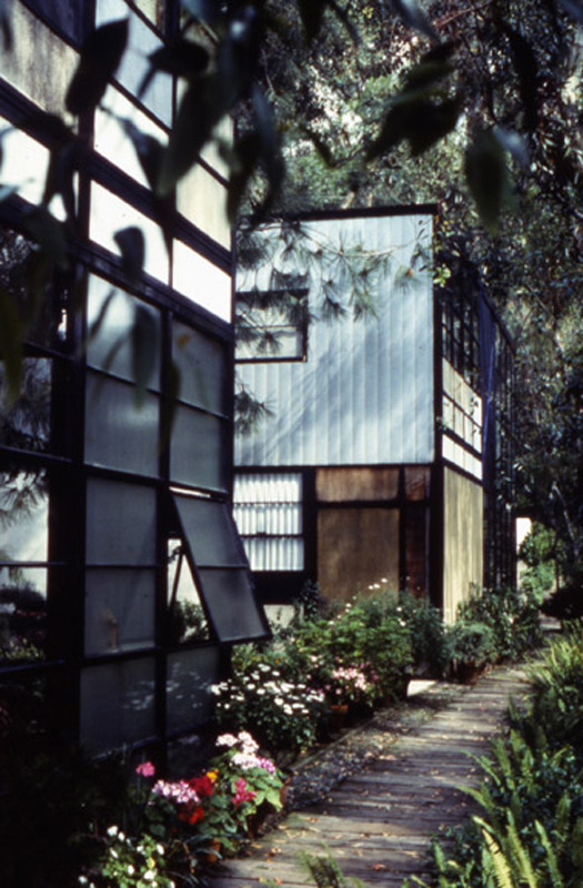

A photo of Eames House’s distinctive exterior, photo courtesy of Eames Office
"I have never been forced to accept compromises but I have willingly accepted constraints," Charles Eames once said of his architecture. Not surprising, then, that the initial plans for Case Study #8, drawn up in 1945 by Eames and his friend and fellow architect Eero Saarinen, were remarkably different from what ultimately came to fruition. That first design, an ominous glass-and-steel pavilion pitched dramatically above the property, was more reminiscent of a cold financial center or airport skyway than the cozy modern house the Eameses are known for. Due to the postwar shortage of construction materials, the Eames/Saarinen plan was shelved until, after several years of delay, the building's design was completely re-configured. There would be no compromise, especially for Eames's own house.
Though still optimized for prefabrication, the new Case Study #8 concept ditched the "raised glass box" approach for something more artistic and tightly knit with the sensibilities of both Charles the architect ("How cheap is space? How industrial is our building industry? How light is steel?," he mused in an Architectural Forum article on the house), and Ray the designer and painter. The couple had a deeply collaborative relationship (the Eames Lounge Chair and the film Powers of Ten are just two of the many benchmark works they created in tandem), and they envisioned the home as a new type of free-flowing, multi-tasking hybrid that could double as residence and workspace without undue fuss. As the Eames Foundation literature puts it, "The home they designed would be for a married couple who were basically apartment dwellers working in design and graphic arts, and who wanted a home that would make no demands for itself, but would instead serve as a background for [what Charles would call] 'life in work' with nature as a 'shock absorber.'"
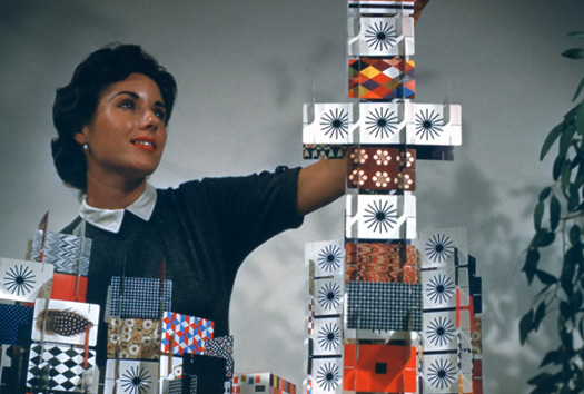

Along with their iconic contributions to architecture and furniture design, the Eameses also designed more humble objects like playing cards. Touches like the circular starburst pattern also figured into the House Industries design. Photo courtesy of Eames Office
In terms of the artistic process, the Eames House is a poignant commentary on the idea of personalization. Whether or not the Eameses intended to live in the house from the time Arts & Architecture's director and Case Study creator John Entenza approached Eames and Saarinen for the project, the initial hypermodern design on which the two architects had collaborated — or it would seem compromised — fell away. Before they made what was literally their own house, the Eameses had to make it their own in terms of design. The chicken-and-egg question of whether they decided to live in the house and then exclusively took over the design, or took over the design and then decided to occupy what they had created, doesn't have a clear answer. "I don't think you'll find the chicken or the egg," Roat concludes. "It was a Case Study house, but the Eameses never lived anywhere else for the rest of their lives."
In terms of the artistic process, the Eames House is a poignant commentary on the idea of personalization. Whether or not the Eameses intended to live in the house from the time Arts & Architecture's director and Case Study creator John Entenza approached Eames and Saarinen for the project, the initial hypermodern design on which the two architects had collaborated — or it would seem compromised — fell away. Before they made what was literally their own house, the Eameses had to make it their own in terms of design. The chicken-and-egg question of whether they decided to live in the house and then exclusively took over the design, or took over the design and then decided to occupy what they had created, doesn't have a clear answer. "I don't think you'll find the chicken or the egg," Roat concludes. "It was a Case Study house, but the Eameses never lived anywhere else for the rest of their lives."
It bears noting that although the Eames/Saarinen design was scrapped for House #8, the two chums would soon collaborate on Case Study House #9, located next door and named for Entenza. With no defamation intended toward the immensely accomplished Saarinen, the Eames House is by far the more celebrated of the two neighbors, and precisely because it is so very Eamesian.
So how does one go about turning a legend into a font? The roundabout way, apparently. "Charles and Ray Eames did not design a typeface," explains the House Industries catalog. "But they did leave a philosophical template for a font collection worthy of their name." Roat describes the process of sifting through the Eameses' legacy as "exhaustive research and interaction with the Eames family" that was well worth the effort, as it "further clarified our mission to honor the Eames aesthetic while maintaining the timeless relevance and functionality that characterized their work."
"The contemporary design environment [is] so much about 'originality' that designers spend more time over-intellectualizing their work and trying to cover their tracks from the swiped file they keep in that secret shed in the back yard than they do trying to execute something that actually has merit," Roat snarks. "Our visual landscape is rife with 'original' ideas that probably never saw a sketchbook. Entire careers of highly paid 'art' and 'creative' directors and entire corporate identities are based on dusty piles of mid-century-era design annuals."
Obviously House Industries were under no delusions of inventive grandeur when it came to creating their Eames typeface. They rolled up their sleeves and set to work translating the particularities of the duo into their lettering. "The execution is from scratch. You can't scan and autotrace something that doesn't exist," Roat says of the finished typefaces. "The curves in the 16 styles of Eames Century Modern are original. We drew them with a pencil, then with a pen, then with a Bézier tool."
So how does one go about turning a legend into a font? The roundabout way, apparently. "Charles and Ray Eames did not design a typeface," explains the House Industries catalog. "But they did leave a philosophical template for a font collection worthy of their name." Roat describes the process of sifting through the Eameses' legacy as "exhaustive research and interaction with the Eames family" that was well worth the effort, as it "further clarified our mission to honor the Eames aesthetic while maintaining the timeless relevance and functionality that characterized their work."

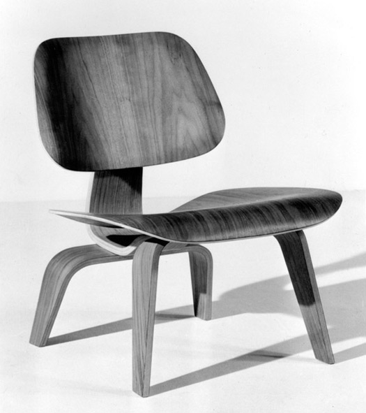
Made from mundane materials but routinely cited as one of the preeminent design advances of the 20th century, the Eames Molded Plywood Chair was hailed by Time magazine as "something elegant, light and comfortable...much copied but never bettered." Photo courtesy of Eames Office
Although the Eameses didn't design a typeface themselves, in their dossier of work the couple left more than enough hints for House Industries to absorb. "Ray designed lots of Art & Architecture covers." Roat says. "Look at any of their exhibitions or displays or simply photos of their office. The clues are ubiquitous."
House Industries is no stranger to the process of translating the work of prominent mid-century modernists into a typeface. The company's 2002 Neutraface type family is based on the design styles favored by the Austrian-born architect Richard Neutra. As it happens, Neutra designed the West L.A. apartment where Charles and Ray lived before moving to Pacific Palisades, and he delivered four designs for the Case Study program as well. (Of the four, Omega House #6, Alpha House #13, and an unnamed house #21A are all unbuilt; only the unnamed house #20A, a 1948 structure just up the road from Eames House, was constructed.)
Whereas the Eameses both engaged in all manner of artistic pursuits, from films to fabrics, Neutra was purely an architect and as such represented a different challenge for House Industries. As far as Roat and his colleagues could tell from the blueprints, Neutra did not design lettering for his buildings' signs. In the case of Neutraface, they had fewer specific references to work with than the Eameses supplied and more leeway with a general impression. "Sure, that's the point, isn't it?," Roat says of the decryption. Since Neutra was working with available typefaces, the artistic cascade of influence gave a clear sense of his preferences, which factored into the Neutraface decision process.
"Richard liked to use geometric sans letters because they dovetailed nicely with his style," says Roat of Neutra's penchant for open and elegant but subtle type. "The Neutra project was more about incorporating Richard's philosophy and his architectural aesthetic into a working and practical typeface. The geometric sans serif letters on buildings were just a starting point."
A starting point was all they needed. For Roat, any additional backtracking — attempting to further distill a common "Neutra element" from the third-party typefaces that were not Neutra's creation but a reflection of his preferences — crosses into the no-win territory of overthinking. "I think we did our homework, worked really closely with Dion [Neutra's son and partner] and tried to apply his aesthetic to a collection of typefaces," Roat explains. "I would like to think that Neutraface is a reflection of Richard and that he would have approved, but we can never really be sure."
Roat makes his case coolly, though, considering the Eameses portfolio, not to mention the family's years-long hesitation in greenlighting the project. When working on assumptions, isn't a fairly deep artistic vocabulary a necessary filter to ensure that those assumptions are valid? Never mind the sonorous body of Eames work — considering the couple's house alone, if the average student of art history or typography had no broader frame of reference, he or she would likely look at a photo of its façade and credit it to Piet Mondrian. Still, Roat doesn't consider an encyclopedic grasp of design a prerequisite for a project like Eames Century Modern. "I just think we have to have a genuine love for the subject matter," he says. As for the precision of their particular interpretation, "I wouldn't want to get into an intellectual or philosophical battle with another type designer or art historian. At the end of the day, we are just trying to interpret their aesthetic and apply it to something that's never been done."
"The contemporary design environment [is] so much about 'originality' that designers spend more time over-intellectualizing their work and trying to cover their tracks from the swiped file they keep in that secret shed in the back yard than they do trying to execute something that actually has merit," Roat snarks. "Our visual landscape is rife with 'original' ideas that probably never saw a sketchbook. Entire careers of highly paid 'art' and 'creative' directors and entire corporate identities are based on dusty piles of mid-century-era design annuals."
Obviously House Industries were under no delusions of inventive grandeur when it came to creating their Eames typeface. They rolled up their sleeves and set to work translating the particularities of the duo into their lettering. "The execution is from scratch. You can't scan and autotrace something that doesn't exist," Roat says of the finished typefaces. "The curves in the 16 styles of Eames Century Modern are original. We drew them with a pencil, then with a pen, then with a Bézier tool."

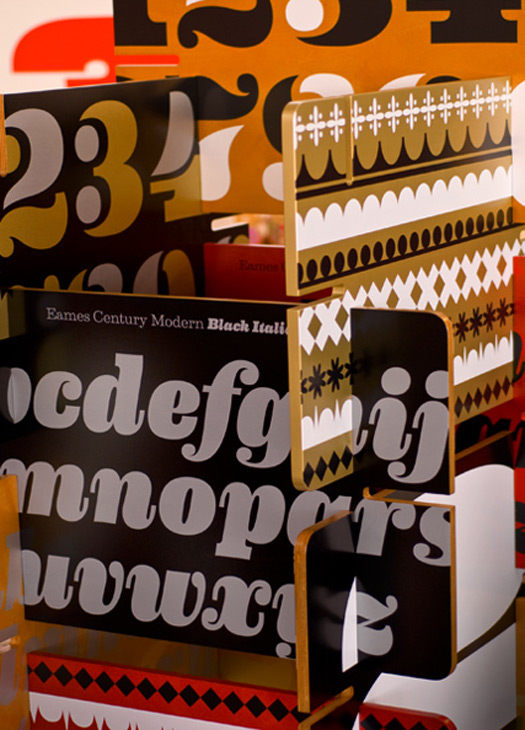
Typographical sculpture at the Eames Century Modern exhibition in California
Although Charles was an architect by trade, the absence of any previous Eames-drafted typography in breadth of his and Ray's work — from architecture and painting to photography and film, from the design of toys to furniture to entire exhibitions, even materials application for the U.S. military — seems a bit anomalous. What of the couple's approach to things like house numbers or mailbox lettering, product packaging or exhibition signage? Rather than creating something of their own, would two of the 20th century's most celebrated and versatile designers have phoned it in with generic stencils picked up at the hardware store?
Although Charles was an architect by trade, the absence of any previous Eames-drafted typography in breadth of his and Ray's work — from architecture and painting to photography and film, from the design of toys to furniture to entire exhibitions, even materials application for the U.S. military — seems a bit anomalous. What of the couple's approach to things like house numbers or mailbox lettering, product packaging or exhibition signage? Rather than creating something of their own, would two of the 20th century's most celebrated and versatile designers have phoned it in with generic stencils picked up at the hardware store?

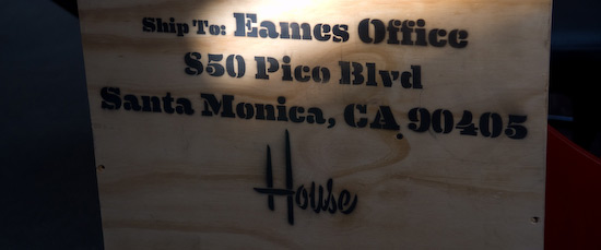
Riffing on the Eameses use of stencils for the military, House Industries did some stenciling for the Eames Office exhibition
"If you look at some of the photos of the splint packaging (for the U.S. Army), for example, that looks like exactly what they did," Roat says. "That stencil was nothing. The use and the context was everything," he adds, "but isn't that the mark of a truly great designer?" Such are the peculiarities of genius. "That was the whole point of the house as well," Roat says. "It was built from standard 'off the shelf' materials available to anyone." What they did with it, of course, was purely Eamesian.
When it comes to materials and technology influencing their own approach, House Industries straddles the divide. Eames Century Modern "is fairly low tech in terms of typography," Roat says. "We're using the deep type handling capabilities of modern layout applications to access things like true small caps, nine different figure styles and some key ligatures." Along with alternate serifs, two stencil cuts, four number sets, proportionally correct "smart ornaments" and encoding to support several dozen languages around the globe, from Afrikaans to Welsh, the typeface is also designed with ease of use in mind.
"We also wanted it to work for the mid-century modern fan who uses an old version of Word to write letters and compose signage for their grandchild's christening," Roat says. "We think that's what Charles and Ray would have wanted."
