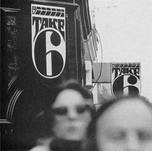
Photograph: Herbert & Mafalda Spencer, from The Book of Numbers published by Latimer New Dimensions, 1974
Editor's Note: This essay was originally published in January, 2013.
A few posts ago, I wrote about photographs taken by the British designer Herbert Spencer. Thinking about Spencer again, reminded me of a book that he gave me many years ago, which I put to one side as it fell outside the period in his career that I was researching at the time. It’s a children’s book aimed at seven to 11 year olds, titled The Book of Numbers, and Spencer created it in collaboration with his daughter, Mafalda, who was then 16; the two shared equal billing as authors on the cover. Published in 1974, the volume is long out of print and it’s safe to say that only the most devoted design history buff or design rarity collector would be likely to have seen a copy.
I don’t know how effective The Book of Numbers was as an educational exercise intended to encourage kids to think about numbers in the environment, but as a collection of photographs it’s much more interesting than I gave it credit for. In fact, the book’s visual approach is far more “photobook” than “schoolbook.” The concept is simple enough. “We live in a world full of numbers: on houses and shops, on buses and motor cars, on magazines and packages, on stamps and labels, in fairgrounds and markets, on boats and aeroplanes, on road signs and posters,” write the Spencers. A series of photographs documents the occurrence of the numbers 1 to 100 going about their business somewhere out there in the world. Most numbers — seen on a showcard, a trash can, a hanging sign, a ceramic tile, a bus stop — receive their own images. In a few cases, such as house numbers and a set of maps, several consecutive numbers form a photogenic group within the same picture. 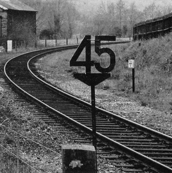
Photograph: Herbert & Mafalda Spencer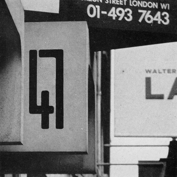
Photograph: Herbert & Mafalda Spencer
Each black and white photo sits in the center of its own page. Most images are square and a luxurious white border surrounds them all; there are no captions or page numbers. This minimalistic style of presentation would normally be used to invite the reader to contemplate the photograph as an aesthetic image. By today’s standards of warmly engaging page design, the book seems remarkably subdued for an experience intended to excite and hold the attention of eight year olds. At the back, in a “Join-in Section,” the Spencers provide a few projects to encourage young readers to assemble their own sets of numbers, using cameras and other means.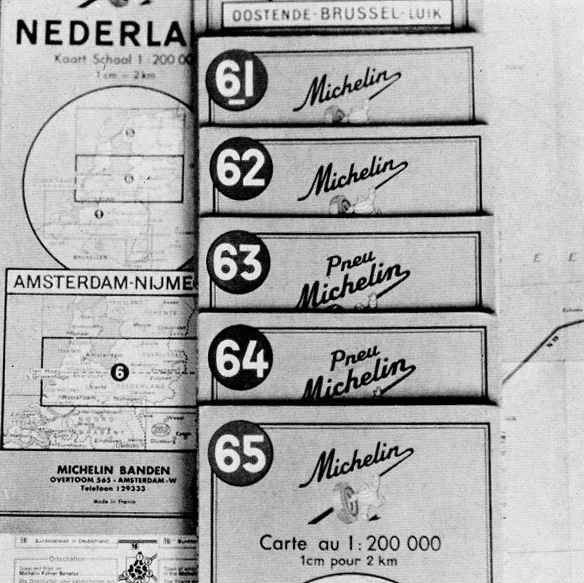
Photograph: Herbert & Mafalda Spencer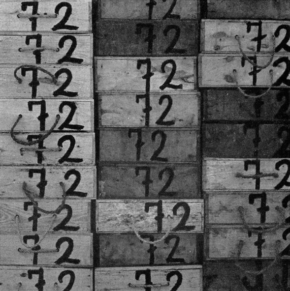
Photograph: Herbert & Mafalda Spencer. Fish boxes in Majorca
There is a clear relationship between The Book of Numbers and Spencer’s pictures for visual essays in the second series of Typographica magazine (1960-67) and in his book Traces of Man (1967), and he re-uses a few earlier pictures. Many of the book’s photos are straightforwardly framed records of the subject and some numbers are less compelling than others, though all gain impact from the visual relationships that occur within the sequence — Spencer was a conscious practitioner of the photographic sequence. The idea for the book must have come from an earlier series, “Objects Count” by Crosby/Fletcher/Forbes, which Spencer published as a 16-page feature in Typographica no. 15 (June 1967). There, the numbers, counting from 1 to 50, appear on disembodied objects — playing card, telephone dial, theater ticket, and so on — rather than within outdoor environmental scenes.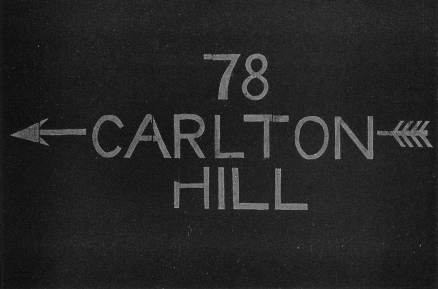
Photograph: Herbert & Mafalda Spencer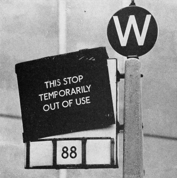
Photograph: Herbert & Mafalda Spencer
The most intriguing pictures in The Book of Numbers, such as those shown here, go beyond simple descriptions chosen to serve the book’s educational agenda. They would be interesting in any context. The picture of the man’s legs walking across the number 48 and out of the frame (I have a suspicion they might be Spencer’s) has the quality of unfathomable mystery — why these legs, this number? — that makes one return to a photograph. Notice the way that the markings in the street’s surface combine with the shoes’ direction of travel to form an implied trapezium that holds the figure’s scissoring legs. The bottom corner of that semi-concealed shape rests in the center of the number. This piece of irregular geometry has almost certainly been intensified by cropping the image from a larger picture — cropping was another photographic skill at which Spencer excelled. 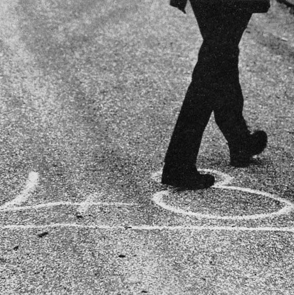
Photograph: Herbert & Mafalda Spencer
A few pictures break with the square format simply to make a better photograph. Again, one has to wonder whether British children in junior school would have fully appreciated the decision to include the oddly birdlike fossilized tree trunk propped against the wall next to the 37. In this case, Spencer chose not to crop, and the entire tableau, in a picture reminiscent of the British artist Paul Nash’s countryside photographs, looks like it might have been constructed rather than found. The composition seems as much about the strange dialogue between the three cipher-like forms against the rough, angular frieze of the stone wall as it is about the number.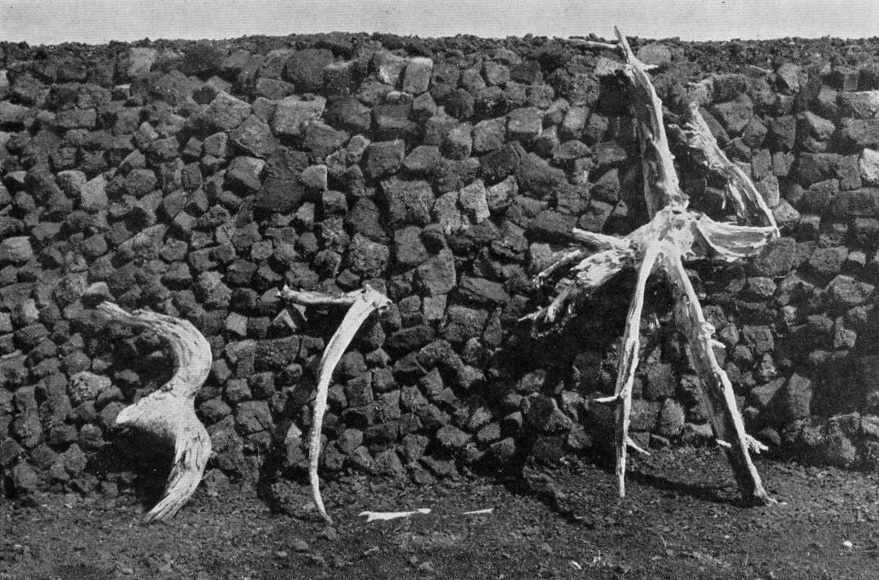
Photograph: Herbert & Mafalda Spencer. Fossilized tree trunks dug out of a peat bog in Ireland
Although it’s reasonable to attribute a lead role to Spencer, as an accomplished editorial designer and as a photographer with 15 years’ experience, the book is credited in its entirety both to Spencer and his teenage daughter; there are no separate photo credits. Mafalda Spencer had accompanied her father on his photographic trips from her earliest years. In a picture taken in Rotterdam, she can be seen as a little girl standing next to a dark, towering graffiti-covered wall later shown in a Typographica article. As The Book of Numbers’ dust jacket notes, Mafalda was also interested in graphic design — she became a designer and a design teacher — and she was an enthusiastic photographer, too. By 1974, Spencer was deeply absorbed as a senior research fellow in legibility studies at the Royal College of Art in London. Their work on the book drew him back, for a time, into his earlier photographic absorption in the endlessly nuanced world of environmental signs.
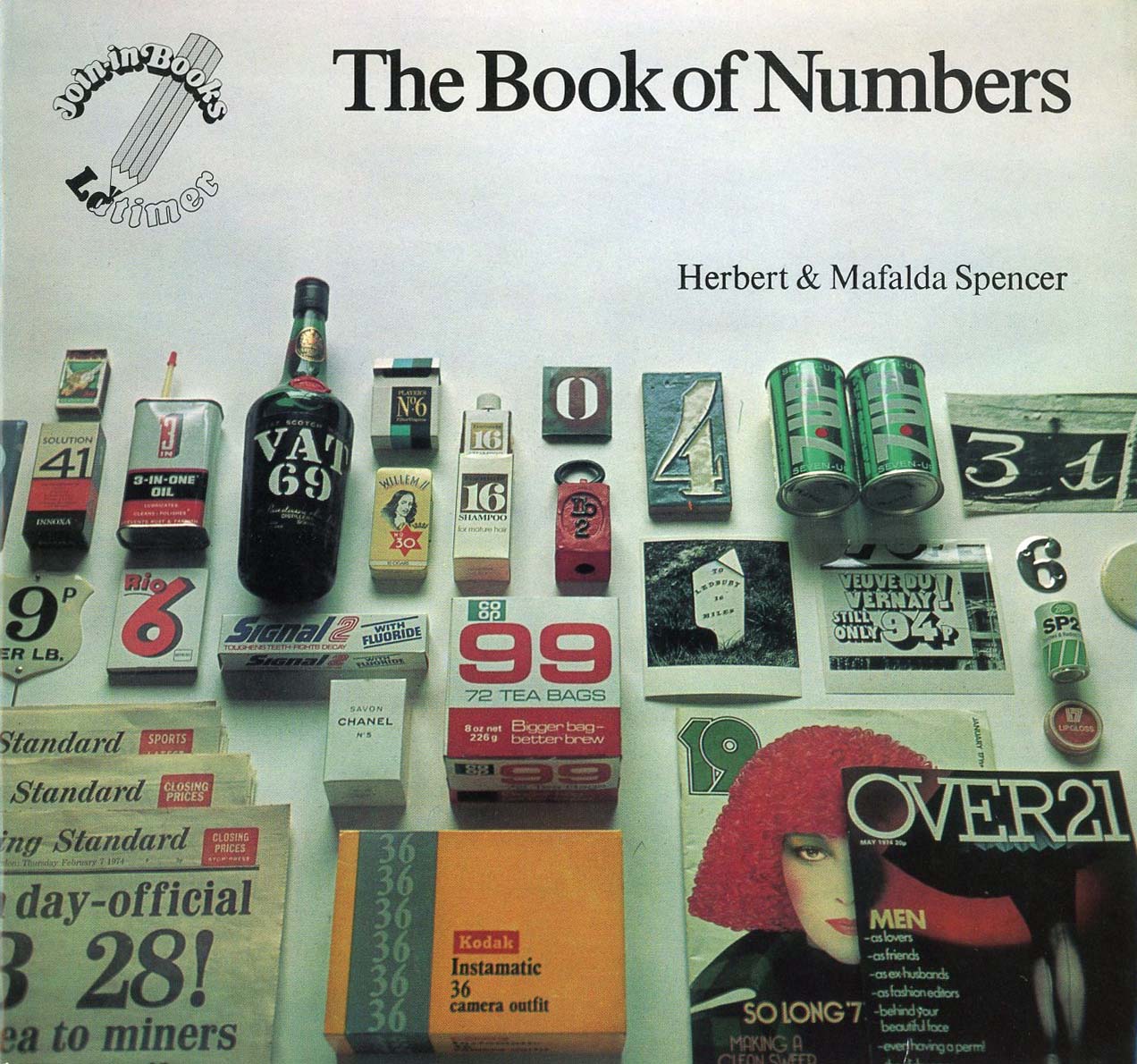
Herbert & Mafalda Spencer, The Book of Numbers, Latimer New Dimensions, first edition, 1974
See also:
Herbert Spencer and the Decisive Detail
Robert Brownjohn: Photos at Street Level
Saul Leiter and the Typographic Fragment
Ernst Haas and the Color Underground
