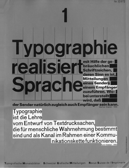
The silver ink and stair-step knock-outs looked zippy, unconventional. Standard-issue international Swiss Design of the period looked more like this:
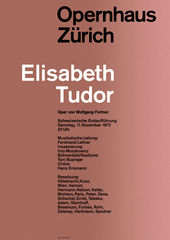
Joseph Muller-Brockmann
Switzerland
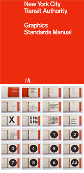
Massimo Vignelli, Unimark
USA
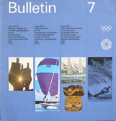
Otl Aicher, Munich Olympics
Germany
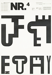
Over the next two years, there appeared a remarkable series of 14 covers that featured quotes by key figures in design theory and communication science on the meaning of typography and that displayed a range of fresh and exciting compositional ideas. (1)
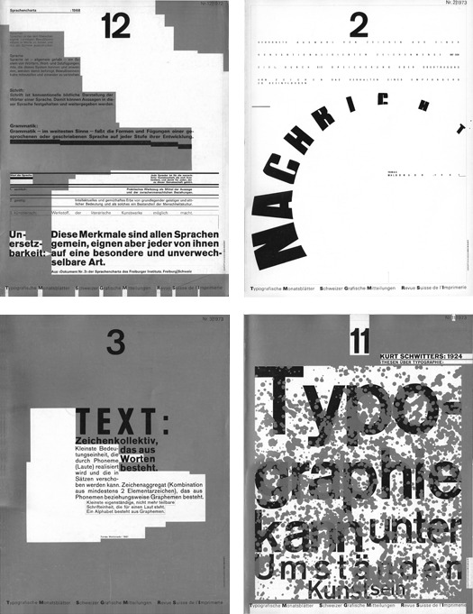
On each cover, in tiny print running up the side, was the modest credit, “Concept and Design: Weingart.” That would be Wolfgang Weingart, a teacher at the Allgemeine Gewerbeschule in Basle. His covers appeared periodically, and mysteriously, with no explanation, until finally, in the October 1973 issue, there appeared a short article in which the designer briefly explained his motive for the series.
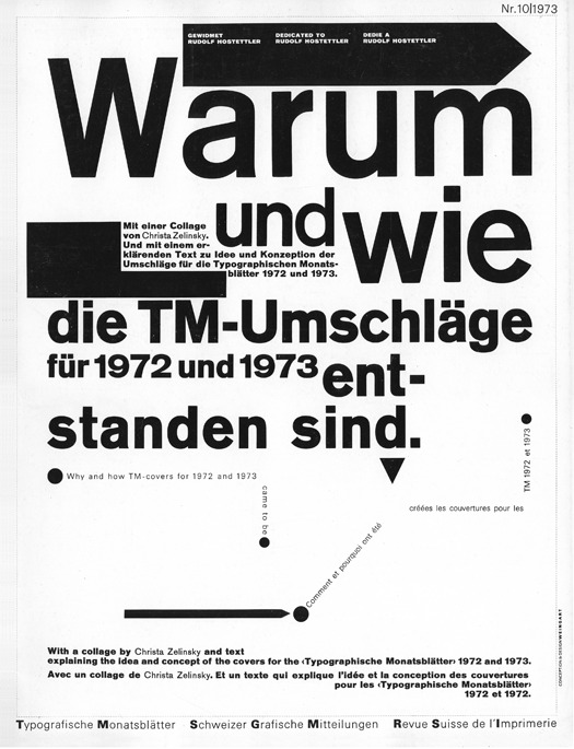
The cover states: “Why and how the TM-covers for 1972 and 1973 came to be.” Inside he explains: “[Their] composition ignores hand-setting dogma and challenges design ideology. Here lies the crux of the issue…not only to irritate the theoretician, but primarily the practitioner…Hopefully the additional scale will help provoke the reader to confront the multi-level definitions, and from that learn something…” (2)
He later writes of the series: “Its organizational form is in a constant flux of change, which more or less reflects my life during the two year period I worked on these covers.” (3)
Indeed, those two years, 1972 and 1973, marked the culmination of an amazing decade-long rush of personal experimentation that re-imagined how typography could behave. This innovative period began in 1964, when Weingart moved from Germany, where he was trained as a hand-set compositor and printer (“in awe of the Swiss Style”), to Switzerland, to show his portfolio of typographic studies to two great, but very different teachers at the Schule für Gestaltung (School of Design), a department at the Allgemeine Gewerbeschule Basel (Basel Vocational School).
One was Emil Ruder, the director of the design program, whose approach epitomized the prevailing Swiss typographic dogma — cool, rational, rectangular, single font, grid-oriented — an approach that Weingart later described as “puritanical.”
The other was Armin Hofmann, a less rigid and more humanistic designer, whose teaching addressed the basic principles that governed the organization of images and typography into lyrical, formally elegant compositions.
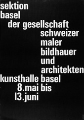
Emil Ruder
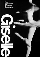
Armin Hofmann
He was admitted to the school but soon found he was unable to tolerate the structure of classwork. Although withdrawing as a full time student, Weingart was encouraged to use the school’s facilities, and in particular, the beautifully equipped type shop, to pursue his typographic experiments.
During these years of self-directed study, Weingart’s explorations took “Swiss typography” as a starting point, and embraced the constraints of hand-set type and letterpress printing in order to find new design directions. His experimentation with the expressive potential of hand-set type “…was never with the idea of throwing either ‘Basle or Swiss Typography’ over-board but instead, with an attempt to expand them — to enliven and change them with the help of intensively considered design-criteria and new visual ideas.” (4)
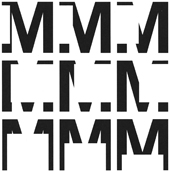
1965
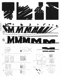
M experiment sketches 1965
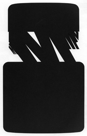
1967
His innovations accelerated when Hofmann invited him in 1968 to join the faculty of the newly launched Advanced Program in Graphic Design at the school, which attracted post-graduate students from all over the world, including many Americans. Weingart would later write that “I recognized too many good qualities in Swiss typography to renounce it altogether. Through my teaching I set out to use the positive qualities of Swiss typography as a base to pursue radically new typographic frontiers.” (5)
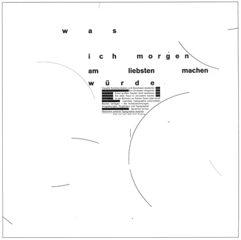
1969
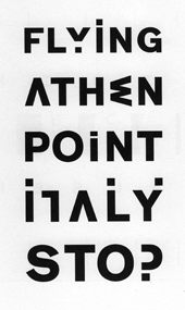
1971
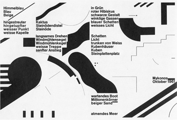
1972-3
Serendipitously, I visited the school in Basle that first summer Weingart was teaching. Yale had given me a grant to go to the school and experience first-hand their new Advanced Program in Graphic Design and to explore what it might have to offer for our own graduate curriculum.
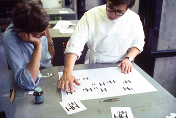
June, 1968
And there he was, in his white lab coat, guiding his students through a disciplined, step-by-step exploration of typographic basics, pushing around slivers of type, hand-set in the type shop (in 1968, this was the way to generate type to work with on paper). He believed that these elementary exercises were the only way to prepare oneself for the more complex process of self-discovery and visual invention.
Weingart’s own process of discovery was reflected in his method of teaching: as he did in his own work, he encouraged students to first explore every possible technical and visual permutation that could be created with the materials of a type shop (thinking of the type shop more like a printmaking studio); and then, apply those ideas to a particular design problem (a text, form, diagram, announcement, etc).
The extravagant experiments of Weingart and his students are now widely known, but at that time few had yet been published or ever even seen outside of the school. Even during my visit in 1968, there was little hint of what would come.
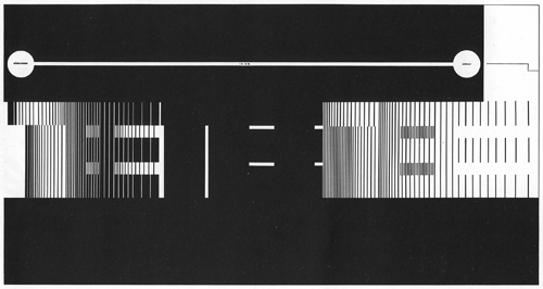
High speed TEE train passing through the Gottard Tunnel, from Switzerland to Italy
Philip Burton
Letter combinations
Various students
Then in 1972 the TM covers appeared. And by this time, Weingart had also been able to summarize his fertile period of exploration and teaching in a document (prepared on a typewriter), coyly titled “How Can One Make Swiss Typography.” (6)
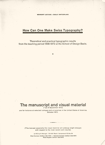
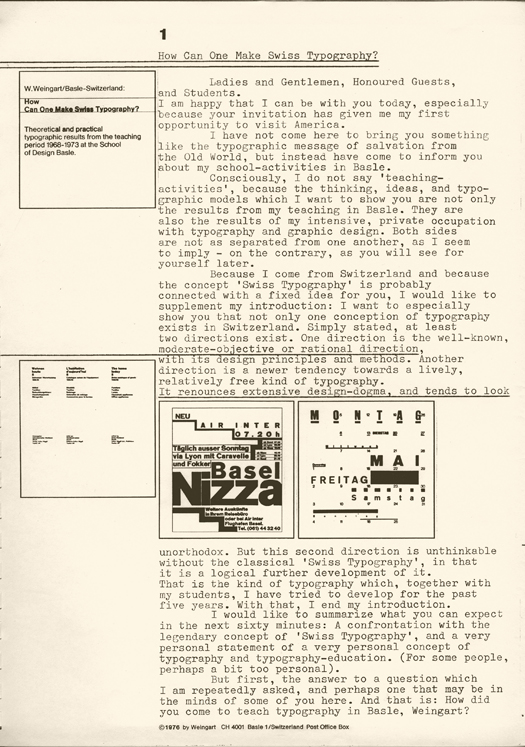
This document became the text for a series of lectures in 1972 and 1973 when Weingart arranged to visit many of the most important design schools in Europe and America.
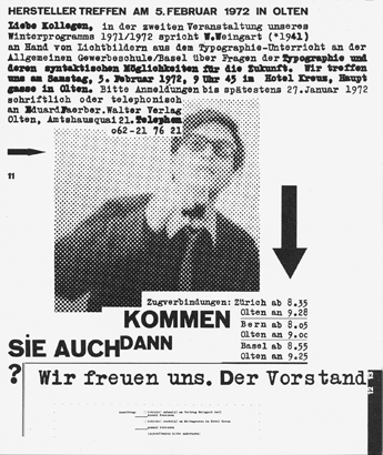
Lecture announcement for Olten, Germany
1972
And sure enough, in the fall of 1972, at the invitation of Dan Friedman, his former student and now on the faculty at Yale, Weingart arrived at the School of Art on his first of a number of memorable visits, for a lecture and workshop demonstrating his principles.
This whirl-wind tour exposed the design education community to Weingart himself — a charismatic and droll presence — and to a new brand of Swiss Typography, freed up from the rigid, impersonal conventions of High Modernist style, providing instead a more provocative, witty and engaging option for the visualization of language.
As I look back on it, Weingart’s tour provided a tipping point for what would come to be known as “New Wave” typography. His presentations influenced programs at Yale, RISD, Philadelphia College of Art, University of Cincinnati, Boston University, Ohio State, Cooper Union and Pratt, among others. His own students, like early graduates Dan Friedman and April Greiman, became teachers and role models on both coasts.
Over the next decade Weingart’s ideas proved to be compatible with the rise of Post-Modernism and could be felt in the ground-breaking work of other designers following similar, more expressive paths, like Katherine and Michael McCoy at Cranbrook, and their students, such as Alan Hori, Scott Makela, Nancy Skolos and Tom Wedell; Zuzana Licko and Rudy VanderLans at Émigré; and Jeff Keedy and Lorraine Wild at Cal Arts. Eventually this gene pool begot David Carson and finally Ed Fella, the master of the artless vernacular, about as far from the 60’s Swiss Modernism of Emil Ruder and Joseph Muller-Brockman as you could get.
Notes:
(1) The whole set can be seen at: http://www.tm-research-archive.ch
(2) Typografische Monatsblätter, Nr. 10, 1973
(3) Design Quarterly 130, 1885.
(4) How Can One Make Swiss Typography, 1976
(5) Design Quarterly 130, 1885.
(6) The lecture has been re-printed in Octavo 4, 1987 and Looking Closer 3, 1999
For the whole story, consult Weingart’s own book, Typography, Lars Muller Publishers, 2000
For the importance of the periodical TM, see: 30 Years of Swiss Typographic Discourse in the Typografische Monatsblätter, 1960-90, Lars Muller Publishers, 2013
