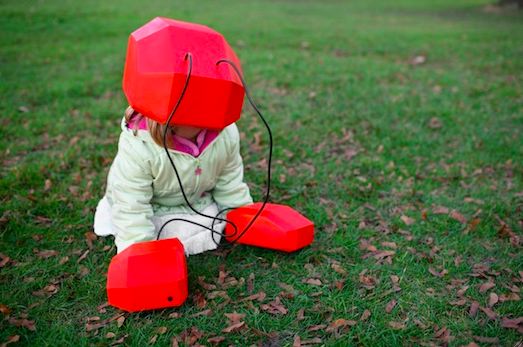
Chris Woebken and Kenichi Okada, Animal Superpowers: Ant, 2007. Photo: Chris Woebken
In his book The Information, James Gleick relays an anecdote from the dawn of telegraphy. A man entered a telegraph office in Bangor, Maine, with a written message he wished to send. The operator pressed a key, then hung the paper on a hook. The patron was perturbed: The message was still there, he argued. How could it have been delivered?
“A message,” Gleick writes, “had seemed to be a physical object.” While that was always an illusion, “now people needed consciously to divorce their conception of the message from the paper on which it is written.” Not only that, but this language — the Morse Telegraphic Alphabet — was no alphabet, notes Gleick. “It did not represent sounds by signs.” It was, rather, a “meta-alphabet, an alphabet once removed.” It was code.
As Gleick describes, telegraphy, “the crossing point between electricity and language — also the interface between device and human — required new ingenuity.” There was the cadre of “operators” trained in this new form, but also an entire industry of compression; language (as later with text messaging) was turned into fragments and stock phrases (e.g., “wmietg” stood for “when may I expect the goods?”) sold via code-books, then into dots and dashes, only then to be reconstituted as words on paper. And a few decades later, it was mostly gone, all those code words and clacks rendered largely obsolete, supplanted by another form of information traveling down the wire: the human voice.
This story came to me as I toured “Talk to Me,” which recently opened at the Museum of Modern Art. Curated by Paola Antonelli and Kate Carmody, and a kind of coda to Antonelli’s 2008 MoMA exhibition “Design and the Elastic Mind,” it aims to explore, through dizzying and occasionally overwhelming range, “the communication between people and things.” As the website notes, “whether openly and actively, or in subtle, subliminal ways, things talk to us, and designers help us develop and improvise the dialogue.”
Telegraphy is interesting in this context not simply because it anticipated some of the themes found in the show — managing the superabundance of information, the creation of a real-time, geographically distant consciousness (weather, news, prices, time itself fused in synchrony), the creation of networks (Gleick: “the earth was being covered, people said, with an iron net-work”), the “gestural interface” of the transmitter (we are now our own telegraph operators, clacking, swooping, squeezing our fingers across our devices), signal-to-noise ratio (garbled telegraphs, like garbled Google Voice transcripts, could send radically varying messages), not to mention questions of secrecy and privacy, or the way technological imperatives might affect the way we talk — long before the Twitter-fication of the language, we had the telegraphization.

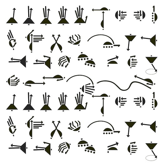
Susan Woolf, Taxi Hand Sign Shapes, 2010
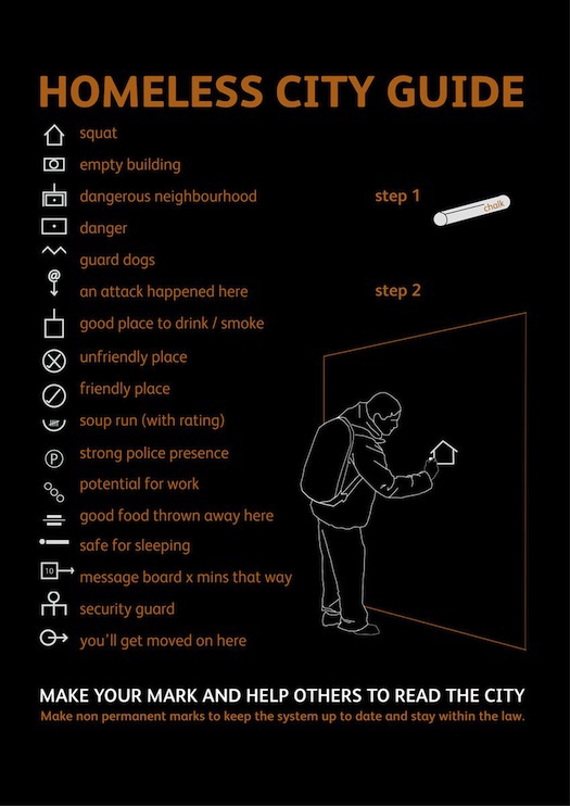
But even as we think about communicating with things, telegraphy also reminds us that communication itself is an object; “language,” writes Gleick, “is an instrument.” It does things, it changes things; it is built and it erodes away. A few exhibits here remind us of that: The Taxi Hand Signals, created in South Africa to assist the blind in communicating with drivers (and documented here by anthropologist Susan Woolf, who has further codified the system in a tactile book, where the signs are raised for touch, as well as accompanied by Braille labels); or the Homeless City Guide, hobo-like chalk markings (lo-fi “augmented reality,” of a sort) to “help others read the city” — an encircled “P,” for example, signifying “heavy police presence” — published each month in the magazine The Pavement.

Emily Read and Chen Hsu, Homeless City Guide, 2007
Or take the QR code, those pixillated, vaguely crossword-like forms — better, faster “data matrix” bar codes — which for me may be the show’s central icon. “Quick response” codes, originally used by Toyota in its assembly process, first appeared like samizdat icons — a digitized version of the mysterious muted post horn from Pynchon’s Crying of Lot 49, peeking out silently from the consumer landscape. They are now familiar to us, but only as a prompt to action. We cannot decipher them (there may be an obsessive or two who can). The “reader” of a QR code is not a person but a machine (in the way that a “computer,” before it was a thing, was a person’s job title). In theory, QR codes are emblematic of what "Talk to Me" is trying to achieve, one of the icons of what Antonelli calls “pancommunication,” or “everything and everybody conveying content and meaning in all possible combinations.” And yet what’s really happening? We scan the code with our phone, something happens, but this hardly seems interactive. Perhaps inter-passive? That sense of passivity runs throughout "Talk to Me," precisely because so much of the experience is bound by screens, which are, albeit, a function of both the subject terrain and of museum logistics.
The QR code appears, functionally and more metaphorically, throughout "Talk to Me." Each work, for instance, is accompanied by a QR code, the reading of which leads the viewer to that work’s place in the show’s website (and per the above, the last thing we want is another screen). But there’s also Terada Design’s N Building, an office building in Tokyo whose façade is composed of nothing but QR codes, like curtain-wall architecture whose transparency is no longer enabled by materials but mediated by whatever messages those inside the building wish to send. Passersby “read” the building — an act shrewdly foreshadowed by theorist Lev Manovich, who wrote, in 2002, “in the longer term every object may become a screen connected to the Net, with the whole of built space becoming a set of display surfaces.”
The QR code hints at something that "Talk to Me" rather underplays: Not how humans and things interact, but how machines (will increasingly) interact with things.

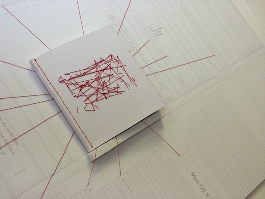
Dan Collier, Typographic Links, 2007
If Chris Woebken and Kenichi Okada’s brilliant Animal Superpowers, exhibited here (though, unfortunately, without any visitor demos), endows its wearer with a vision of how ants interpret their environment — microscopes in the gloves magnify our surroundings by 50 times — QR codes are an emblem of how machines see the world. The reason they look so alien to us — we struggle without avail to detect patterns in the visual noise (though some strive to bring beauty to QR codes) — is becausethey are optimized to be coded and decoded by algorithms. It is always a bit of a shock to see machine vision at work: when I rode, a few years ago, in a Stanford University–produced autonomous vehicle, a VW Passat named Junior, I rather naively asked how Junior “read” things like brake lights. Junior, I was told, always knows the distance and approximate velocity of other objects; he does not need symbolic reification of their action.
In an essay in the “Talk to Me” catalog, Area/Code’s Kevin Slavin observes how the eponymous cyborg in The Terminator saw the world as “a steady stream of text superimposed on raw optical input”; e.g., when he looks at his assassination target, Sarah Connor, the words “Sarah Connor” pop up on his visual screen. But the label was for the film’s viewers. “What is curious about the Terminator’s vision,” writes Slavin, “is the presence of text, as if the computer would need to read in order to know what to do.” Like “Junior,” his sensors and microprocessors would interpret the world, not language.
Which leaves the rest of us out of the loop. This, arguably, is what QR codes do: embed a data layer of abstraction between us and the world. This too is emblematic of larger realities. As Slavin noted in a talk at this year’s Lift Conference, the “objects” that increasingly govern our lives are black boxes; as with automated high-frequency trading on Wall Street, they are “algorithms locked in loops with each other, without any human oversight.”
Some further possible implications of the QR code are sketched out in a project by Diego Trujillo-Pisanty, a student at the Royal College of Art. Trujillo-Pisanty envisions how future homes might be rearranged to be made more “robot -friendly” — e.g., cupboards won’t have doors because they are “not fit for A.I.”; and, similar to an automated warehouse where bar-codes instruct robotic pickers and sorters, the surfaces will be covered with QR-like optical tags, so the machine can read the environment. Describing the project, Geoff Manaugh writes, at BLDGBLOG, “Like a tomb from Egypt's Valley of the Kings, our houses will be covered in hieroglyphs — machine-hieroglyphs, not legible as much as they are optically recognizable.” We are already here, in a sense; that Roomba you let loose in your living room won’t vacuum the way you would, but the particular optimizations involved are beyond recognition.
One of the many fascinations in "Talk to Me" harks back to that dichotomy discussed by Gleick: What is the thing-ness of communication? This crops up here in a fetishized, crafty sense with Dan Collier’s Typographic Links (“link” being another communication word that was first used to refer to a material object and has since gone digital). Collier envisions hyperlinks as threads in a book, sewn between connecting words and concepts; while Chie Mitsuyama’s Kaoiro melds craft and digital ephemerality in an old rubber stamp dispensing emoticons.

Chie Mitsuyama, Kaoiro, 2008
And the converse question: What is the communicativeness of objects? Design has always given things a symbolic voice, but what is gained, and what is lost, when they actually begin to speak — when, for example, as in a project from MIT’s Sensible Cities lab, our e-waste stream pings us with locative updates along its removal chain. “Talk to Me” posits this as a social good. And it can be: research has shown that diabetics who were sent reminders via mobile phone fared better than those not using the system. But it is worth noting the paradoxes and perils. Work by Stanford’s Clifford Nass has shown that in-car feedback systems, meant to improve safety by alerting or coaching drivers in certain situations, can actually make a driver perform worse. And as Matthew Crawford notes in Shop Class as Soulcraft, the idea that some new Mercedes models no longer have dipsticks — instead housing self-diagnosing electronic systems — liberates us on the one hand but equally entangles us in “layers of collectivized, absentee interest in your motor’s oil level.” Prototype car systems even read our faces to detect falling asleep at the wheel. But when machines are reading our faces to measure our happiness, as suggested by the exhibited speculative work Happylife, in which a domestic sensor reads our pupil dilations and expressions, at what point does this stop being a design problem?
