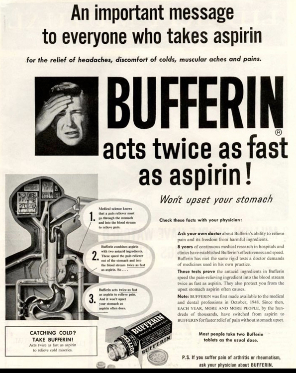
Figure 1
Die Neue Typographie (The New Typography), the early 20th century revolution in graphic design, is being re-evaluated this year in light of the Bauhaus centenary. The current exhibition at the Bard Graduate Center in Manhattan, “Jan Tschichold and the New Typography: Graphic Design Between the World Wars” (Feb 14-July 7 2019) displays materials originally assembled by typographer, designer, and codifier of the “movement,” Jan Tschichold (1902–1974), in Weimar Germany, and used as teaching aids. Eventually, the collection was bought and is now housed at MoMA. In conjunction with the exhibit about the collection (curated and catalog by Paul Stirton), I took part in a symposium that examined the role of graphic design in the broader context of Weimar culture (1919-1933). This period witnessed considerable technological innovation in the printing industry, especially in applications of photography to the mass media, as well as a range of new practices within the design community of Central Europe. “Graphic design,” itself only began to emerge as a recognizable activity, if not a profession, at this time. My talk, excerpted here addresses the “Americanization of the New Typography.”
This ad layout would give anyone a headache (Fig 1). But it was professional typography — and although lacking a modern aesthetic, it did its job. For advertisements, graphic design was of secondary importance to the message. Yet some designer/artists believed the same messages could be presented more clearly with dynamic power. Enter The New Typography. The U.S. was and continues to be impacted by this movement. This presentation is a work in progress exploring why the Americanization of modern typography lagged behind.
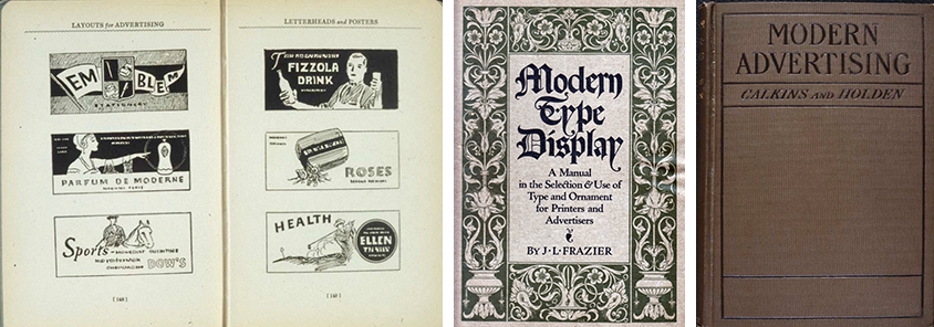
Figures 2-4
One reason is that most ad designers were not rebels. In a capitalist economy, selling goods was the goal of business and advertising was the means of achieving the goal. Advertising’s job was to attract consumers. Most commercial artists, designers and printers followed the fashions as they were dictated through trade manuals and magazines (Fig 2).
Let’s go back to 1920. The US had its revivalists, classicists, and other stylists for whom being modern was not a mission but a tool. Modern could be interpreted in many ways. Despite rule-breaking Modern art in Europe, Modern in the U.S. was a cautious blend of new and vintage (Fig 3). Earnest Elmo Calkins, an adman, was the first to venture into modern art to present, what he called “styling the goods.” He took big baby steps so as not to scare off his clients (Fig 4).
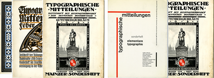
Figures 5-6
Germany had lost the great war in 1918 and suffered from punishing financial reparations. Industry took a while to revive, meanwhile political upheavals threatened the newly established Weimar Republic. It was during this time in the early 1920s that printers attempted to revitalize typography to help increase consumption through advertising (Fig 5). In 1925, the same year that Gutenberg was celebrated as Germany’s, indeed the world’s, most influential inventor, Jan Tschichold became the spokesperson for a revolution in typography through his special issue of the trade magazine Typographic Messages (Fig 6) titled “Elementary Typography.” “It is due largely to the efforts of men like Tschichold that Gutenberg’s mechanical convenience has become a means of genuine artistic expression,” wrote Paul Rand.
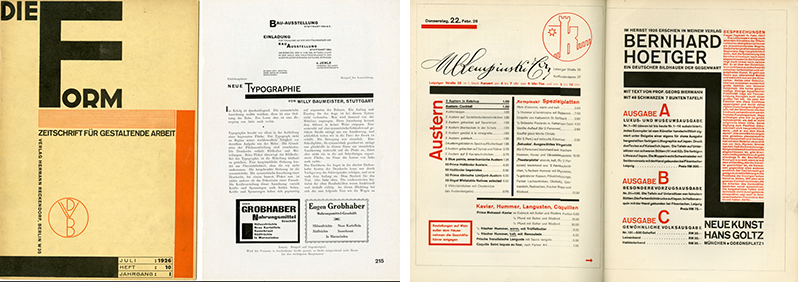
Figures 7-8
Figures 9-10
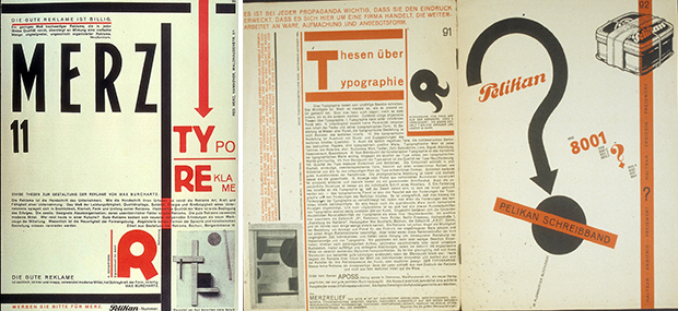
The rationales for the shift in aesthetics were technological, aesthetic, and pragmatic. Politics entered the discourse too (Fig 7). Art also motived typographic change (Fig 8). This issue of Kurt Schwitter’s dada magzine MERZ (Fig 9) was devoted to “typo-advertising” and one of its progenitors, Max Burchartz, wrote a manifesto on the reasons why it was a valid alternative. By mixing the Bauhaus visual palette with the dada sensibility of combining random types and printers’ materials (Fig 10), Schwitters showed in spec ads for Pelikan ink how recognizable visual patterns could be disrupted.
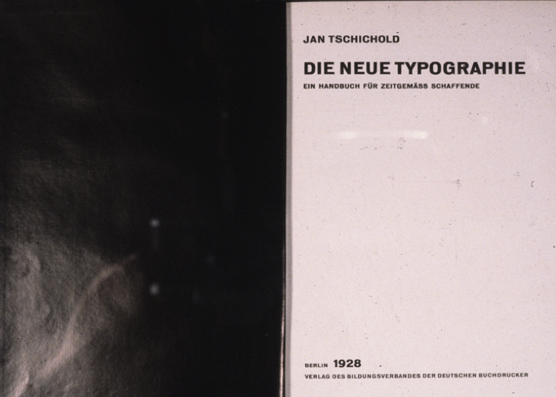
Figure 11
In 1928, Tschichold published this iconic book "Die Neue Typographie" (Fig 11) to instruct designers and printers that the new mechanistic world demanded a change from common antiquated practices. Tschichold, who once called himself Ivan to show his sympathy with the Russian Revolution, was something of a typographic terrorist.
Figures 12-13
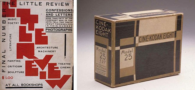
In the United States the New Typography was not marketable except in avant grade contexts (Fig 12). In fact, at the outset of the Depression, graphic design was not high on the list of national priorities. Prior to the depression, however, some U.S. companies, egged on by Earnest Elmo Calkins, introduced packages and designs (Fig 13) based on modern aesthetics as an inducement to consumers to consume. These were exceptions not the rule.
Figures 14-16
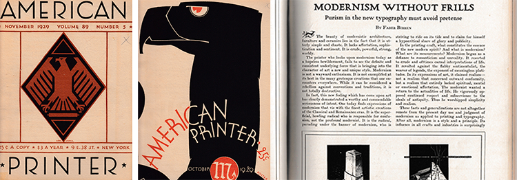
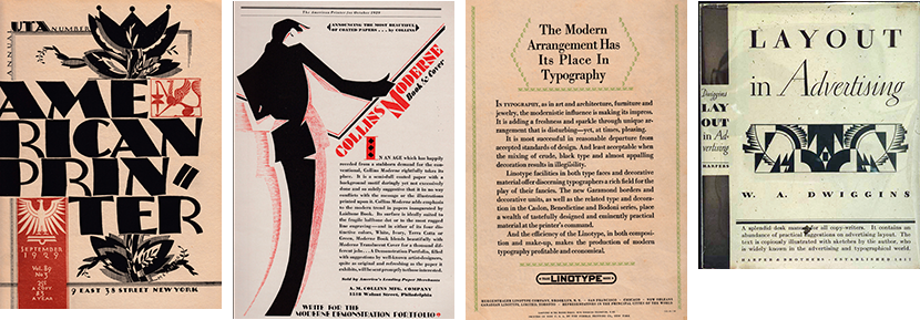
America was slow out of the new typography gate because there was no ideological need. Modernism was anti bourgoise - and moderne or modernistic design was slowly being introduced as a bourgoise style to help create desire. Sans serif type gave the allure of the new (Fig 14). Magazines like American Printer (Fig 15) ran the occasional reports and critiques of European modernism to trigger printers and typographers’ interest and perhaps motivate more clients to go “modern.” Many of the articles, like this sought (Fig 16) to attract printers and designers to the benefits of the new style. The new typography in the U.S. was not an attack on traditionalism, but on the outworn tropes of advertising.
Figures 17-20
Although contemporary, this clutter is certainly not what Tschichold had mind (Fig 17). But this ad (Fig 18) for a paper merchant shows how certain core concepts, including asymmetry could be applied to commerce. This ad promoting Linotype (Fig 19) talks about departing from the standards of layout, and promotes typefaces and decorative material for “discerning typographers” to take license with their fancies. The ad is not very fanciful.
In 1928, the same year that Tschichold’s “The New Typography” was published in Germany, in the U.S. W.A. Dwiggins, who more or less coined the term Graphic Design, published “Layout in Advertising” (Fig 20), which supported contemporary style while ignoring the avant garde. There was not even a nod to The New Typography done by what he jokingly referred to as “the Bauhaus Boys.”

Figures 21-23
In 1929, however, the first major boost for the New Typography appeared in the U.S. Douglas C. McMurtrie, a type designer and a director of Continental Type Foundry, who had written extensively about type design (Fig 21) used the term Modern correctly. This 1929 book celebrated the European avant garde in the U.S. It was a sizable survey of European advancements and how they might be adapted to American needs (Fig 22). His introduction credits Tschichold, Walter Dexel, Theo Van Doesburg, Molzhan and all the New Typography practitioners. In this spread (Fig 23), McMurtrie shows an example of German modernity — an ad for student tours, on the right. Its dynamic use of red parallel arrows pointing to tour destinations; It suggests the linear motif on the text pages of his book. He further attempts to make the case that American advertisements can adopt the same spirit even in the cluttered ads on the left.

Figures 24-28
American modern typography was in a state of evolution, but it was not about experimentation or rebellion so much as it was concerned with fashion. Edmund G. Gress was an advocate of typographic diversity in his American Printer monthly column. But Modernism was just one of many options (Fig 24). This 1934 book by Frederic Ehrlich, a type teacher, makes a much more distinct link to European design and Tschichold’s core concepts (Figs 25 26 27 28). His table of contents echoes McMurtrie’s manifesto. Here is the new typography: Asymmetry, san serif type and geometric forms, was by 1931 finding acceptance in advertising design of the times. Drawing consumers’ eyes away from traditional ads through ideas that telegraphed contemporaneity. He also shows the American counterparts that for lack of a better word were more moderne than modern. He warned against “excesses” of the Modern movement.

Figures 29-31
But probably the most popular fashion sample book of the late 20s and 30s was Alfred Tolmer’s 1931 “Mise en Page” (Fig 29), published in Paris and London but made its way to the U.S. It applied principles of modernism and The New Typography that were considerably more appealing to people sought luxury rather than modern simplicity.
FUTURA, the typeface of tomorrow, took America by storm, and even this stencil version, Futura Black (Fig 30), was extremely popular. Lucian Bernhard waded into the type business with over 30 typefaces, Although not purely geometrical, his signature eponymous sans serif bold sold well (Fig 31).
Figures 32-39
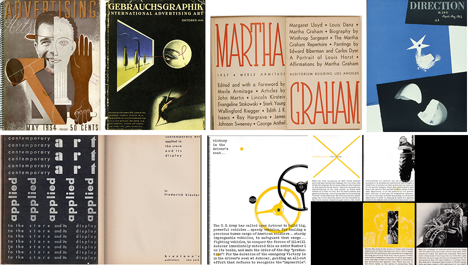
Meanwhile, magazines like Advertising Arts (Fig 32) were selling the modernist ideas to agency designers. Herbert Bayer, who was featured with his Bauhaus-influenced typography in the original 1924 Tschichold “Elementare,” did this surreal cover of Gebrauchsgraphik in 1938 (Fig 33) which also was an influential magazine for a kind of watered down modernism.
From advertising, the new typography moved to books. This treatment by Merle Armitage (Fig 34) using this thin slab serif for the title Martha Graham with FUTURA titling type says modernity but not in a radical manner. And here’s a 1930 example by the architect Frederick Kiesler (Fig 35). Note the flush right title page type nearly falling of the edge of the page on the right of the titles page.
There were a few iconoclastic and intrepid American designers who saw ways of using typo-photo and The New Typography in unique ways. Underscoring a phrase by Gress about finding an “American idiom,” this is one of Paul Rand’s early pieces for Autocar (Figs 36 37 38), the 1942 “Mechanized Mules of Victory,” selling the company’s tank production during World War II. He also drew on inspiration from Moholy Nagy among others as conceptual tools for this 1942 Direction (Fig 39).
Figures 40-43
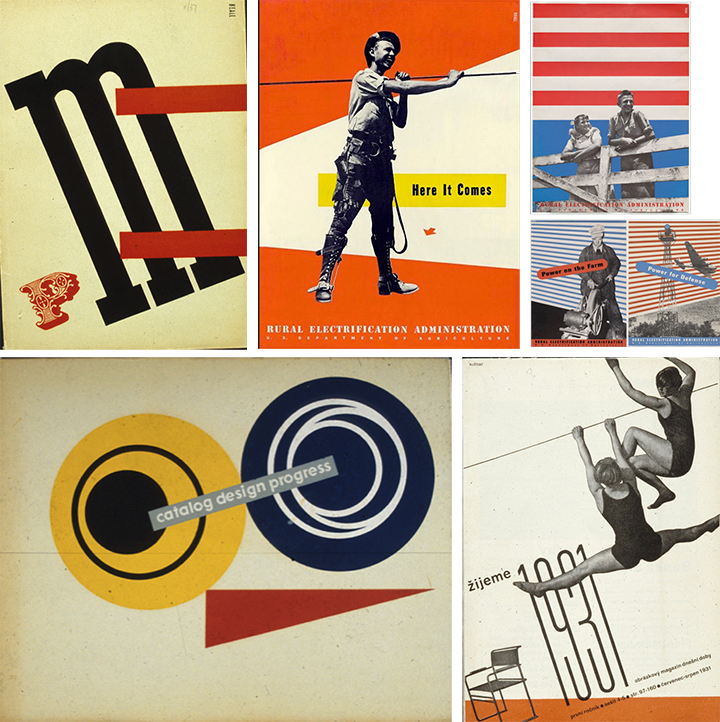
PM magazine was what we now call an “influencer” of design style and thought. This 1937 cover (Fig 40) by Lester Beall shows his New Typgraphy influence and interpretation. Beall was doubtless one of the more literal interpreters of Bauhaus, Constructivist and de Still visual concepts. his posters for the REA from 1937-1941 are classic examples (Fig 41).
By the late 40s and 50s Ladislav Sutnar most influenced the design of everyday things with The New Typography (Fig 42), integrating it into the American visual language. His legacy starts in Pilsen and Prague, Czechoslovakia with his constructivist magazine covers. When he emigrates to the United States, he starts working with Kund Lundberg Holm on Sweets service industrial trade catalogs. Combining the ideas of the avant garde with the pragmatism of American industry. This, “Catalog Design Progress” (Fig 43), which embodies all the tenets of The New typography, is his and the eras most Modern industrial design manual.

Figures 44-46
Clarity was his godhead. He believed in creating as many simple sign posts as possible. Here is the nitty gritty merchandize, in this case plumbing fixtures and parts. Pages and layouts are designed so they are accessible and decipherable. These are industrial products elevated to the level of art (Figs 44 45 46).
Corporations with design savvy relied on designers either schooled in or influenced by the New Typography. This was manifest in the work done for Container Corporation of America (Figs 47 48 49).

Figures 47-50
Alvin Lustig was not an adman, per se, but he was an exemplar of the Americanization of The New Typgraphy in ads (Fig 50) that are based on economy and the surprisingly scaled juxtaposition of photographic elements and type. For clients like Knoll, Paramount Furniture, Lansing Sound, and Miller Lighting Co., he created elegantly minimalist ads. Of course, these were design related companies. In the U.S. the New Typography eventually evolved into the International Style. But rather than me sum up the Americanization I’ll leave it to Paul Rand, who wrote this in 1952 in Typographica #5’s “Modern Typography in the Modern World: “The question of national versus international typographic style actually eludes discussion. Any country or region which has a vital and strongly characterized people will inevitably impart its ineffable flavor to all forms of artistic output. This is natural and inevitable and, I think, only objectionable when it becomes chauvinistic and therefore contrived. The more urgent issues are aesthetic, historical, and sociological. Is what we produce today beautiful? Is it timely? Is it creative? Does it strengthen the cultural fabric our society?”
