Every day at noon, a chilling siren blared from a loudspeaker atop my public elementary school building. At the same time, various other electronic screams echoed in the air. The burst of sound lasted only a few seconds before fading into silence. Though always startling, it benignly announced lunchtime. On alternate weeks, however, the same siren wailed for a longer and more menacingly three to five minutes at any time during the school day. Those warned of possible doom. These air raid sirens, remnants from World War II, were used as a cue for World War III.
As a third grader in 1957, air raid drills were a fact of life and the siren was but one of many reasons for a consuming increase in Baby Boom angst. The continuous preparations for the inconceivable were not entirely paralytic, yet we were conditioned to expect the inevitable.
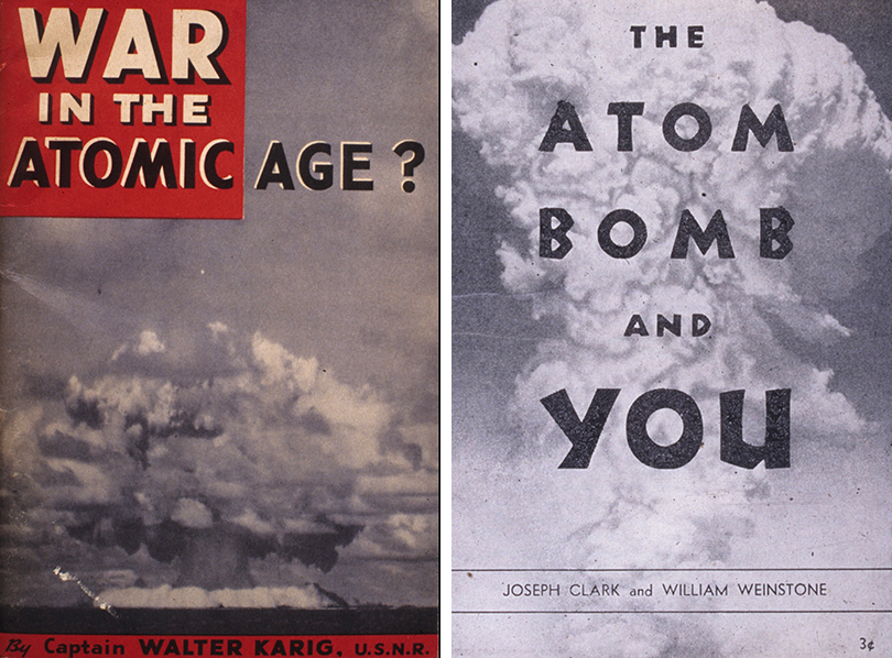
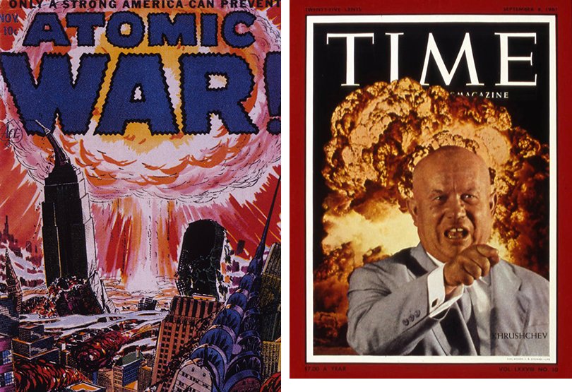
And beyond sound, graphic design triggered many of the inconsolable fears that were so pervasive during the blistering Cold War.
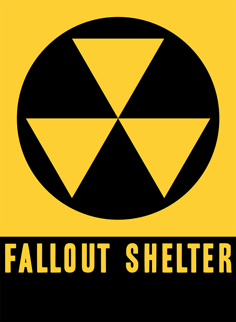
On October 27, 2017, Robert Blakeley died. You might not know the name but following John F. Kennedy's call for the construction of fall out shelters while in the midst of nuclear brinkmanship in 1961, Blakeley was responsible for the eerie icon that triggered my hopeless despair. If you look closely at certain buildings all over New York today, you’ll see it too: the ubiquitous “Fallout Shelter” sign comprised of three bright, inverted equilateral triangles joined at the center on a round black background, with shelter capacity circled near the base, followed by the words “Fallout Shelter” in large block letters and directional arrows. The symbol also seems to have taken a cue from the Civil Defense brand system designed in 1939 by N.W. Ayer’s design director, Charles T. Coiner and retired in 2006, which itself took a lead from the emblem of civil defense, dictated by the statutes on protective symbols by International Humanitarian Law.

Blakeley told the New York Times that the design might have been inspired by Handbook of Designs and Devices, written by American logo and trademark designer Clarence Hornung and originally published in 1932. But whatever the origin of the “Fallout Shelter” mark, it left an indelible impression on us all.
Blakeley, who was 95 when he died a few weeks ago, produced the sign as one of many projects while serving as a civilian worker for the Army Corps of Engineers in 1961. Nuclear mania was in the air and so was fallout from American and Russian atomic and hydrogen-bomb tests. Berlin was the potential ground zero for the next conflagration that prompted a rash of private fallout shelter construction in the affluent suburbs. In the cities like New York, fortified brick and steel-framed buildings, like the one I lived in, were designated as shelters to boost a false sense of security. Presumably, they were impervious to thermonuclear attack and residual radiation.

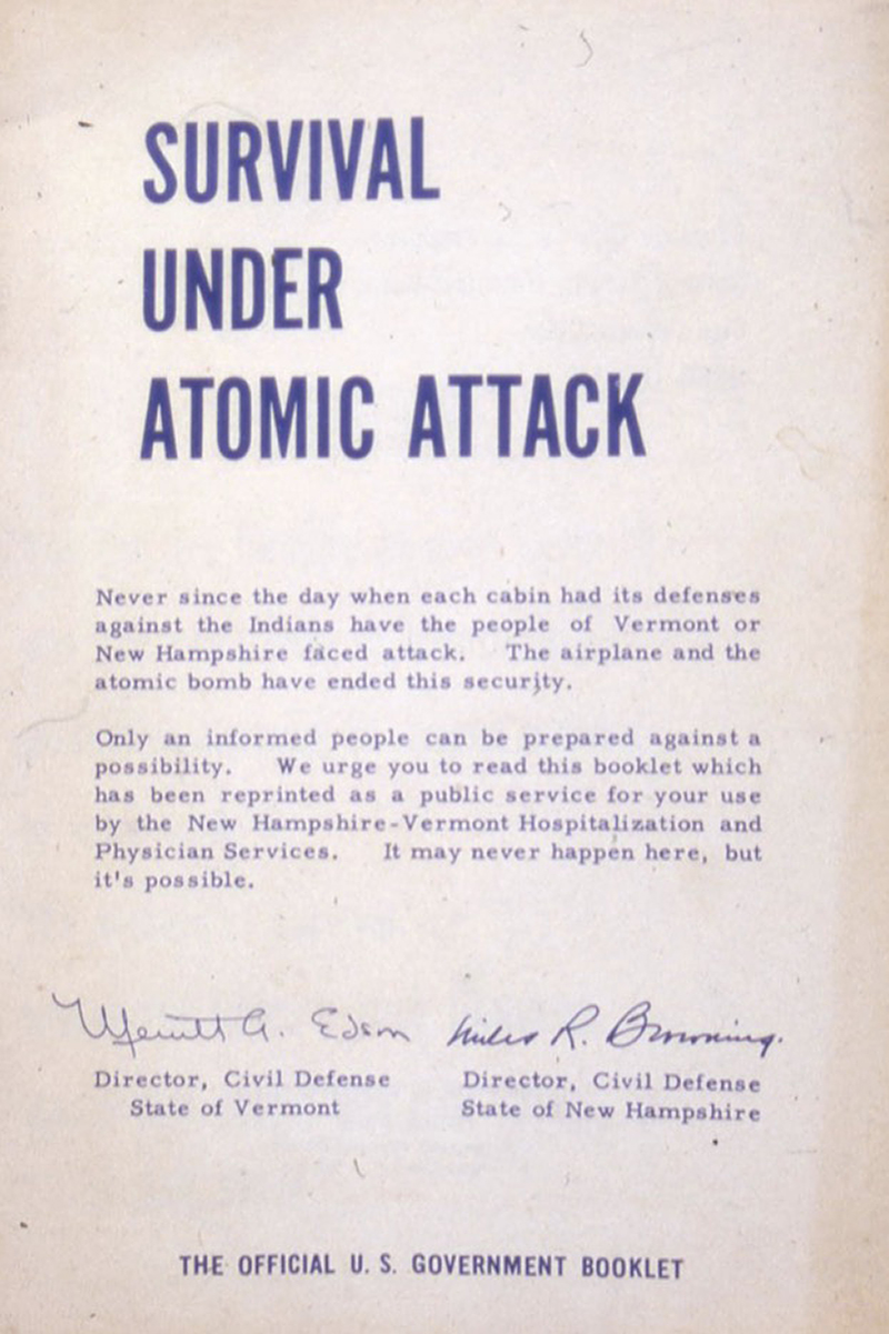
Misleading government-designed propaganda, much of it in the form of free pamphlets distributed at post offices and government offices, claimed that a high percentage of people could survive an A-blast with the right protective gear and a year’s supply of saltine crackers. And gullible people believed the nonsense. But even my fellow third-graders, who were otherwise shaken when those sirens sounded, joked that during duck-and-cover drills we might as well put our heads between our legs and kiss our collective ass goodbye.

