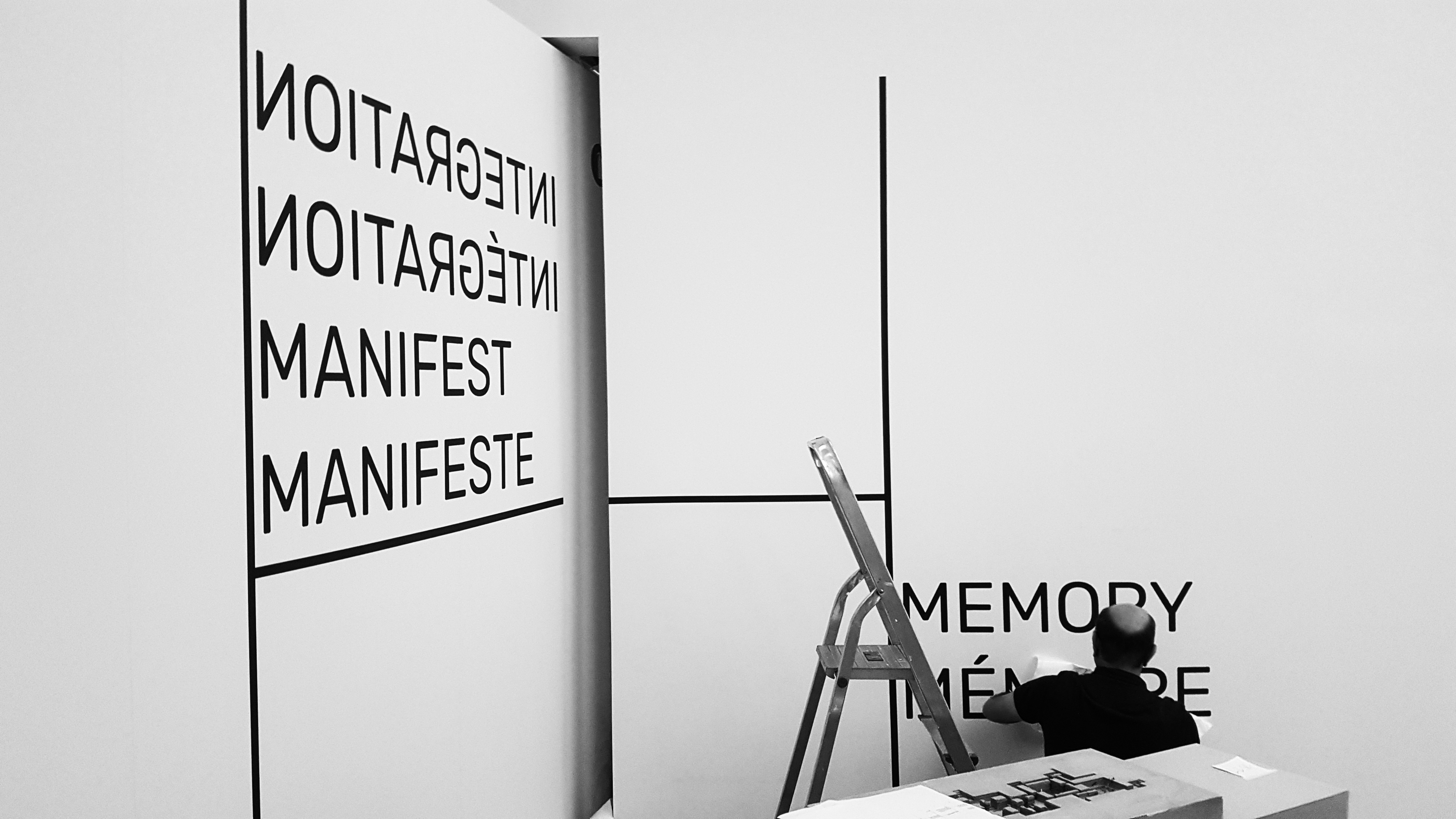
NN Studio, a small Belgian design studio, advocates for emergent forms of architecture and urbanism.
The Reciprocity catalog wasn’t ready in time for the third edition of the Belgian festival last October. And that was on purpose. NN Studio, a Liège-based design shop, in charge of the catalog for this third edition of the International Triennale of Design & Social Innovation, didn’t want to miss a chance to capture the live installation at the Museum La Boverie and the reception given to the project throughout the entire city. They wanted the book (available now) to crystallize, in one printed form, the multifaceted conversations and human experiences debated in preparation of and during the event.
I loved NN Studio’s capacity to discuss, and not just execute, how to communicate the Triennale through recognizable signs.
“Reciprocity is about research more than process”, says Giovanna Massoni, the Triennale’s curator. It addressed the fragility of human capital behind design, understood as a tool to address issues that concern our lives, our culture, and our economy. “I loved NN Studio’s capacity to discuss, and not just execute, how to communicate the Triennale through recognizable signs,” adds Massoni.
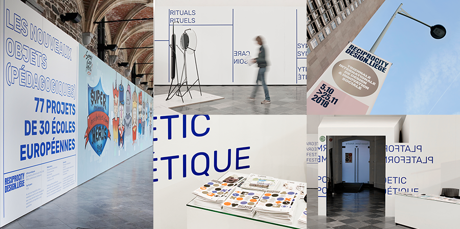
Brand identity, wayfinding, print and scenography for Reciprocity – a main exhibit featuring student work at the Wallonie Center, October 2018. Design by NN Studio
Design that discusses: that’s not unlike the rest of NN Studio’s portfolio. Rooted in the approach of radical social architects Atelier Pierre Hebbelinck and Pierre de Wit, the work of this 3-person shop is a mix of deep thinking, social agency and subtle artistic experiments. With singular results, founders Pierre Geurts, Nicolas Bebronne and Antoine Lantair like to consider themselves “devices to spread culture as ferrymen.” Limited editions, printing experimentations and art publishing projects—mostly about social architecture—are some of the ways NN Studio maintains its intellectual rigor and a clear compass.
Trained at the studio of Hebbelinck, NN Studio’s co-founder Pierre Geurts delved into publishing at a young age, and started collaborating with Fourre-Tout Editions in 2006. The editions signal the architecture studio’s deep engagement in socio-political issues, not just through practice, but also research and writing. Their interest lies in defending ordinary architecture for the people. “I learned to think of the book like an architect,” says Geurts who remains rooted in that DNA of critical practice.
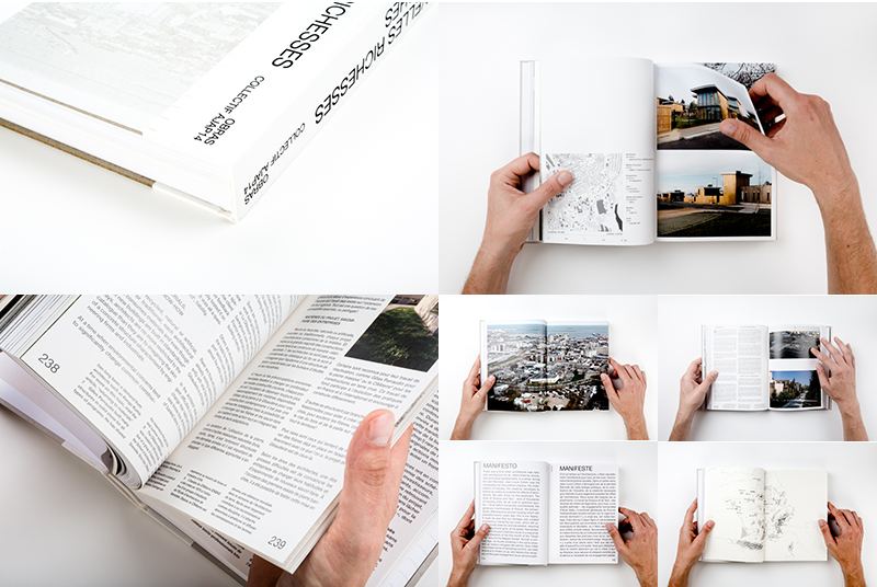
Nouvelles Richesses (or New Riches), Fourre-Tout Editions, 2016. Design by NN Studio
A good example of this coalescing of architectural and design speculation is the book Nouvelles Richesses (or New Riches). Pierre designed it at Fourre-Tout Editions for the French Pavilion at the 15th Biennale of Architecture in Venice. The New Riches catalog presented minimalist layouts of stunning architectural photography, while conveying—in bold Helvetica Neue and highly functional contrasts of white/ off white papers (recycled stock from a bankrupt printing house)—the true manifesto spirit of the Pavilion exhibit. The exhibit addressed “territories rarely spoken about, where, nevertheless, the majority of the population lives, i.e. the interstices, the edges, the suburban and rural areas,” explains Frederic Bonnet of OBRAS Architectes, who co-curated the 15th Venice Biennale French pavilion with the young collective of landscape architects AJAP14.
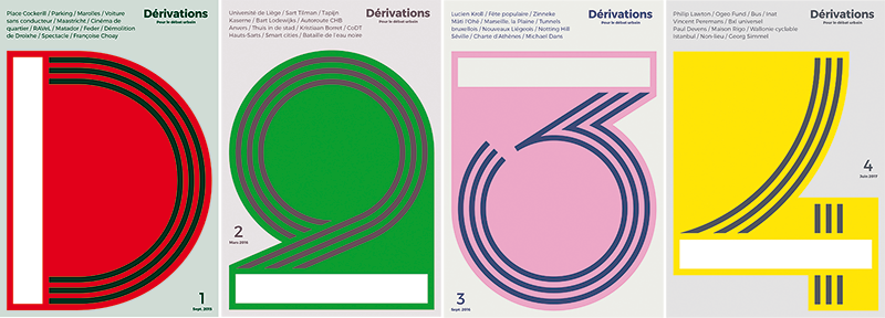
Dérivations pour le débat urbain, ongoing series. Design by NN Studio
In the same vein, at the crossroad of bold political engagement and printing experiments, NN Studio’s Derivations periodicals show their desire to be an active agent of cultural change in their city. This offset printed limited editions of 1,000, feature covers easily recognizable by a variation on the letter [D]. “For Derivations our design supports the emergence of new practices in urban design,” says Nicolas Bebronne, the second co-founder of NN Studio, who met Pierre Geurts at Fourre-Tout Editions. The periodical, whose content is written by UrbAgora, a nonprofit activist organization, encourages residents to debate the meaning of public space and offers a critical position on urban design, as a non-corporatist, people-centered alternative to the top down making of our cities.
Les Vaincus (transl. The Vanquished), 2017. Design by NN Studio
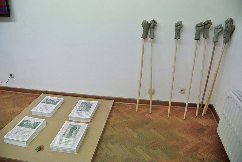
In addition to the daily production of the studio, Geurts, Bebronne and their new acolyte, typographer Antoine Lantair, host a printing lab equipped with a Risograph GR3770 press and various other printing tools. In this open-ended research space, they occasionally self-produce posters and art and poetry books. Les Vaincus (transl. The Vanquished) is a delicate, hand-made booklet, honoring the memory of “seven characters in search of justice and freedom,” as the subtitle quotes. Printed in 70 copies, using the two-color effect of the Risograph, and playing with the metaphoric evanescence of recycled vellum, The Vanquished accompanied a 2017 radio program by Rakonto Asbl, about the damned artists of the Russian Revolution. Although Risograph, a low cost Japanese copy machine, is often associated with punk graphic design culture, here it documents a dark and forgotten chapter of history, and allows the designer to experiment. “Like a carpenter who lays wood floors everyday, we take the time to make a beautiful piece of furniture every once in a while,” jokes Bebronne.
The studio, which is about to embark on a large-scale signage project for an art center in Andenne, a francophone town in Wallonie (host to many comic book festivals), likes to think that, “design congeals societal interest and culture in print.”
