07.17.14
Observed | Essays

Redesiging the Parking Sign


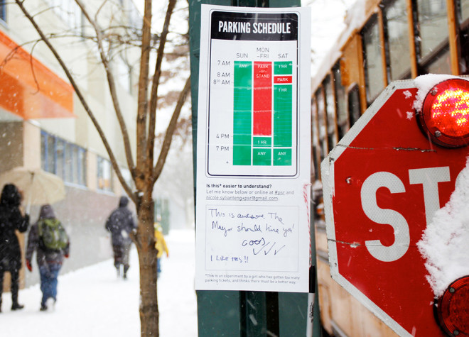
Nikki Sylianteng's redesigned parking sign with feedback. Image: Nikki Sylianteng. Via: Wired

Nikki Sylianteng was sick of getting parking tickets. Her solution: redesign the signsIn a profile on Wired:
Sylianteng has been going around Manhattan and Brooklyn hanging up rogue revamped parking signs. “A friend of mine called it functional graffiti,” she says. She’ll stick a laminated version right below the city-approved version and ask drivers to leave comments. In that way, Sylianteng’s design is still a distance from being a reality, but so far, she’s gotten pretty good feedback. “One person wrote: ‘This is awesome. The mayor should hire you.’”
Her ideas aren't without their flaws, but this kind of guerilla design combined with user feedback seems worthy of our attention: design vigilantism or public art? You make the call.
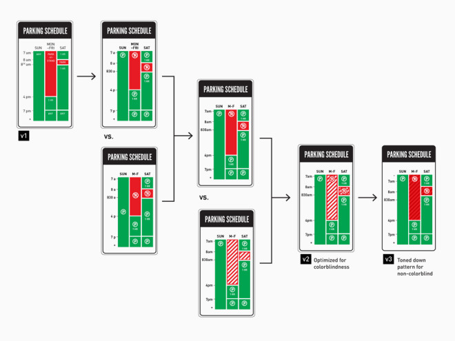


Changes in Sylianteng's parking signs addressing some of the flaws. Image: Nikki Sylianteng. Via: Wired


Posted in: Graphic Design, Social Good, Technology


Comments [3]

Neat idea, but if NYC Parking Authority is anything like MTA, they're going to order her to take it down. http://nymag.com/daily/intelligencer/2014/02/efficient-passenger-project-subway-signs-interview.html?mid=facebook_nymag
DonerKebab
07.17.14
12:07

Yeah design is definitely in the right direction but too hard to read from the road. Last year, when the NYC Parking Authority started putting up their redesigned parking signs, I also thought I could design them better so I did and blogged about the process. Check it out here: http://www.catalystnyc.com/2013/01/new-nyc-parking-signs-part-ii/
Christopher Calabrese
07.25.14
12:23

This is a great idea! Most people today are more visual readers instead of descriptive readers. It's not only thinking from the perspective that whether it is design vigilantism or public art. It actually inspires people to think more from people's perspectives. The car owners are customers in this case, who always fail to understand the parking instruction and thus receive negative experience with their parking. From the perspective of the citizens, designers should come out more applicable and simple visual tools to make people's lives simpler and easier. Although this case is very small here, it actually presents a grass rooting movement that generated from the end side of the chain. By thinking from people's site, designers will then come out better products and then generate more customers' satisfaction rate in this sense, thus overall gives everyone a positive experience of the service they are having.
Rubin Qiang
11.25.14
01:19


Jobs | November 05