All designers rely on a shorthand to communicate, but at a certain risk: the complexity of the world cannot be conveyed in a few fonts or lines. Boston-based designer Lisa Rosowsky is exquisitely aware of the dangers of simplified images, for much of her work investigates complex individual responses to persecution, danger, and death. Having explored the history of images associated with violence and stereotype, Rosowsky realizes that the reproduction of popular images is not always the most productive way to delve into nuanced historical or political issues. Stereotypical images of persecution force all of us to fall back on stories we already know, rather than opening new avenues of inquiry.


Rosowsky’s Family Reunion (2008) is a monument to family members killed in the Holocaust; each vial represents an individual member of Rosowsky’s extended family. The small memento mori testifies to the Nazis’ success in obliterating the flourishing individuality of their victims, whose distinguishing marks are here reduced to scientific data. Like other works about the Holocaust, Family Reunion is about death, but also about a loss once removed: Rosowsky, who was born in the US in 1965, never knew many of these aunts, uncles, and cousins, many of whom died during or after the 1942 Parisian roundups. Rosowsky’s work continues to generate new conversations about loss and violence.
The following transcript is itself a family reunion of sorts: the author and Rosowsky are distant cousins, brought together by shared professional interests. As the interview took place in the wake of the Charlie Hebdo massacre, conversation turned quickly to the power of images and the perils of stereotypes.
The following transcript is itself a family reunion of sorts: the author and Rosowsky are distant cousins, brought together by shared professional interests. As the interview took place in the wake of the Charlie Hebdo massacre, conversation turned quickly to the power of images and the perils of stereotypes.
++
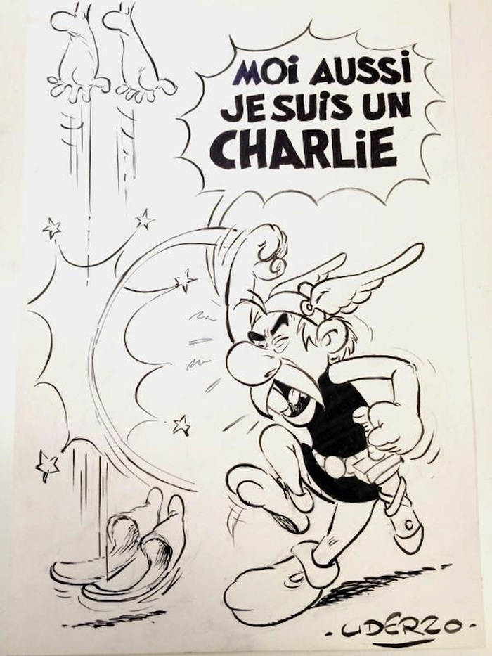
VS: The Charlie Hebdo attack drew a great deal of commentary, both written and illustrated. As a graphic designer, how do you respond to an image like Uderzo’s depiction of Asterix swiping at a disappearing villain?


LR: The character of Asterix metes out retributive justice to a figure who we see only as feet flying off the page under the force of massive uppercut. Here, “Je suis Charlie” is not a mournful refrain, but a battle cry. With Gallic vengeance, Asterix wallops the presumed terrorist up out of his shoes. But look at those shoes! They are turned-up slippers right out of the central casting prop box for Arabian Nights.
In Asterix’s day—and by that I mean the time of the Gallic-Roman conflict, not the 1950s when Uderzo created the character—such slippers would have been worn by residents of the Middle East, where they had been fashionable since Sumerian times. During the twelfth century, European crusaders admired the curly-toed footwear and brought them back home, where they were rechristened souliers à la poulaine, or “shoes in the Polish style,” and became the very height of aristocratic fashion.
VS: So Asterix would have recognized the terrorist as Middle Eastern by his shoes—but why do we?
LR: Chances are you have never laid eyes on curly-toed slippers beyond Disney’s Aladdin. Nowadays, people of Middle Eastern descent are more likely to wear sneakers than such slippers, even if they are otherwise dressed in traditional garb. Somehow, through representations in children’s literature, ballet, and theater costumes and film, the slippers have remained a symbol of all things “Arab,” and therefore function as visual shorthand that allows us to classify with confidence the feet shooting up out of the frame.
VS: I see the attraction of rapid communication, but are there not other, more responsible ways to condense a message without resorting to stereotype?
LR: Cartoonists rely on stereotype in the sense that they could not do their job without the visual shorthand that stereotypes provide. Would we have understood who was being punched if Uderzo had drawn a pair of Puma sneakers? Short of explicitly labeling the feet, slippers were what the artist chose to signify the “Arab otherness” of the killers, despite the fact that they were French citizens by birth. Another cartoonist might have shown a gun on the ground, or perhaps darkened the skin of the feet (which would have engendered a different set of comments)—but neither of these choices would have been as unequivocally suggestive of “Arab” as the slippers, outmoded and irrelevant as they are.
VS: So certain images may become outmoded, but stereotyping continues. How long has this been going on, and how does it affect your work, which also deals with issues of ethnicity and nationality?
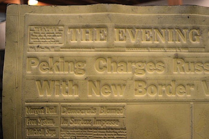
LR: Few people know that the word “stereotype” actually derives from a printing process. The term was first used in France and Germany in the late eighteenth century to refer to a method for reproducing and distributing pages of text to printers around the world. The page of metal type was set by hand or machine, then papier-mâché molds were cast. Unlike heavy type, these molds (or mats) could be shipped cheaply to multiple destinations. Newspapers leapt at this new process, and so stereotypes aided in the spread of simplified words and images across Europe and North America. The image below shows a stereotype mat—which the French call a cliché, by the way—ready for use. (It is “right-facing” because it will be cast onto a new, wrong-reading plate before printing right-reading.) [See Steven Heller’s illuminating conversation with Stuart Ewen and Elizabeth Ewen, authors of Typecasting: On the Arts and Sciences of Human Inequality.]

VS: Fascinating. As it turns out, the current meaning of the word dates to the 1920s, when journalist Walter Lippmann argued that simple stereotyping was the only way that contemporary man (and he undoubtedly meant man) could make sense of the modern world. In the 1920s, it was film, rather than newsprint that accelerated the spread of stereotypes in Western culture. Newspapers never went away, though, and neither has cartooning—though today we find ourselves in a world where line drawings fly around the world via Twitter.
LR: Yes, and I find it interesting that most of the other cartoons drawn in response to the Charlie Hebdo attack portray the Kouachi brothers as terror-ninjas, all in black with black masks and assault weapons. Dressed like this, they are ethnicity-less and faceless, and stand in as a kind of “Everyterrorist,” a stereotype in and of itself.
VS: It seems that social media—despite its potential to empower individual users—hasn’t made most of us more sensitive to nuance. Is there any way for an artist to use visual shorthand without stereotyping?
LR: Honestly, I don’t know if there are ethical ways to negotiate visual shorthand. When it comes to social interactions, while we are neurologically unable to disengage the part of ourselves which stereotypes, I think we have a responsibility to override the automatic judgments and consider the individual apart from the category. But when it comes to visual representation, artists have always packed stereotypes in their toolboxes along with pencils and paints. Da Vinci, Beerbohm, and Daumier each made use of stereotype and caricature in positive ways: to explore the human condition, or to express political dissent and comment on society’s shortcomings.
VS: Yes, and the same has been true in other human endeavors, hasn’t it?
LR: Many forms of artistic expression wouldn’t function well without stereotypes: commedia dell’arte, the plays of Molière, the indelible characters of Chaucer’s Tales, and even modern sitcoms. Visual shorthand can be advantageous, but it can also be terribly lazy, both on the part of the artist and the viewer. An artist who relies solely on stereotype to make his point—which is one of the hallmarks of the propaganda posters of the 1940s—is an artist who doesn’t have to work to create a deeper concept, and the viewer doesn’t have to work to perceive one.
VS: Is that a particular challenge for you, especially as much of your work deals with the 1940s?
LR: The issue of viewer response is one reason why I have never wanted to use “graphic” images in my Holocaust-related artwork. Many of the documentary photographs that we have all seen—stacks of corpses, emaciated prisoners in tattered striped pajamas—have become so iconic and ubiquitous that they almost function as stereotypes for the “victim Jew.” And as powerful as I find such images, I also feel that to make use of them in my work would be too easy. Some artists make great use of stereotypes! Look at the fantastic work of Kara Walker, for example. But they subvert the original stereotype, or wink at it, or change its context.
It takes some courage, I think, to do that—you have to be confident that you are adding something to the conversation.
