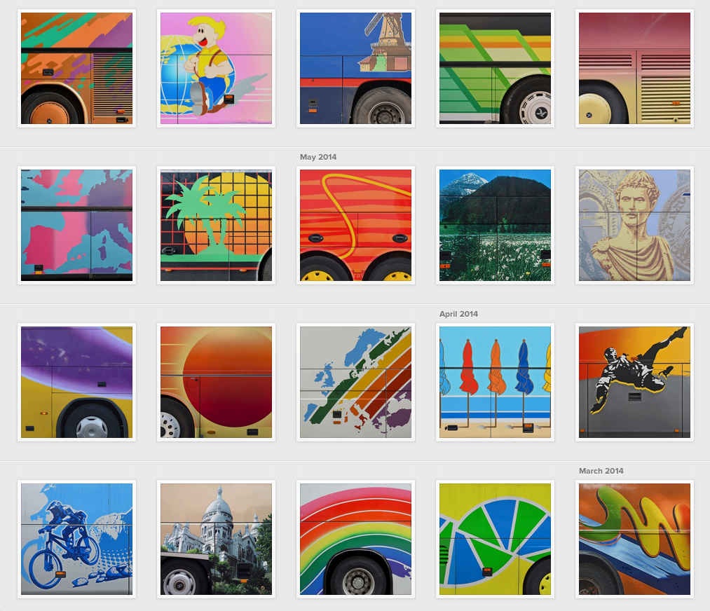
A photograph is at first a document. Crop it, and it becomes a picture. Trim it further into a square (and post it on Instagram) and you’ve got a “sign” — a potential icon.
These photographs of European tour buses, taken by Taylor Holland (an American artist and designer living in Paris) demonstrate how, through a clipping process, images cross these semiotic divides to journey from document to picture to sign.
It all began with Holland riding his bicycle around the French capital, obsessively chasing 45-foot-long, deluxe, diesel motor coaches to their parking spaces, in the Champs de Mars by the Eiffel Tower. The result — after many months documenting the wild motifs adorning the sides of the metal monsters — was a series of handsome horizontal shots, elegantly cropped into abstract compositions that reveal the sassiness of this vernacular visual phenomenon.
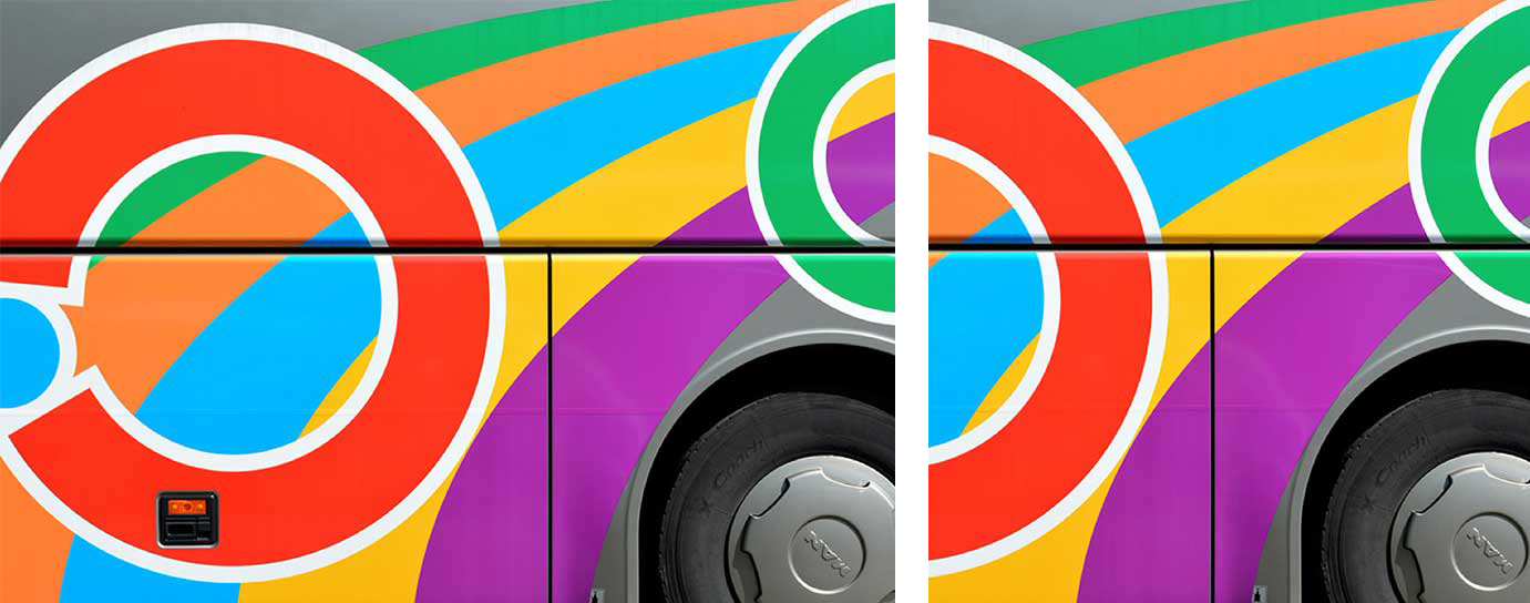
Left, the original "picture" — right, its "icon" version
“Finally, it's a lot about the framing,” says Holland. “When you and I see a bus, we are seeing two different things. I am seeing a 3x2 horizontal window floating near the wheel well. If what is in that space is interesting and frames up nicely, then, it’s a go. But there have been a lot of buses with good-looking graphics on them that failed to make the cut.”
“Making the cut” is an expression that describes accurately what’s happening to images as they make their way into our brains. Carefully cropped photographs, like Holland’s pictures, will be wedged in your memory forever. This particular group will probably alter the way you look at tourist buses from now on, transforming these behemoths on wheels into mobile museum installations.
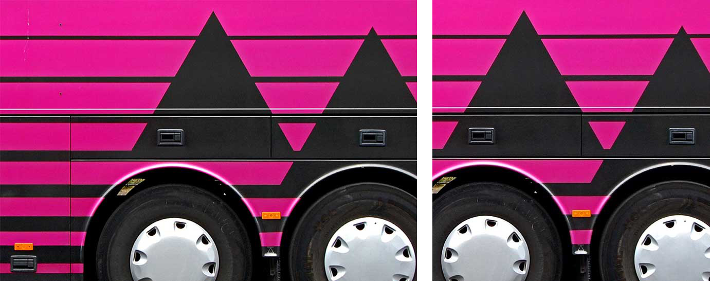
Left, the original "picture" — right, its "icon" version
At stake is the cultural significance of the scenic tour buses as artifacts. Are the photographs merely documenting a vernacular curiosity, or are they the manifestation of something else, on the scale of street art or tattoo art, for instance? “It has obvious parallels to graffiti artists,” says Holland, ”but in this case, I wonder if the graphic designers have intent. I'm hoping these artists (and the broader culture) will start to see these rolling billboards more like graffiti on subway trains.”
The auto body paint artists who work on tour buses are anonymous. Their choice of patterns and decorative imagery is steeped in popular culture: sunsets, palm trees, seagulls, waves, swooshes, surfing figures, wild horses, space travel, rainbows. There are some realistic paintings such as the Mont Saint-Michel, the Dessau Bauhaus landmark building, and the Sistine Chapel — but these are the exceptions. The candy-colored artwork is usually printed on vinyl, machine-cut to fit the dimensions of the bus and glued onto the steel surface, right on top of the vents, doors, seams and joints that bisect the exuberant designs with Mondrian-like precision.
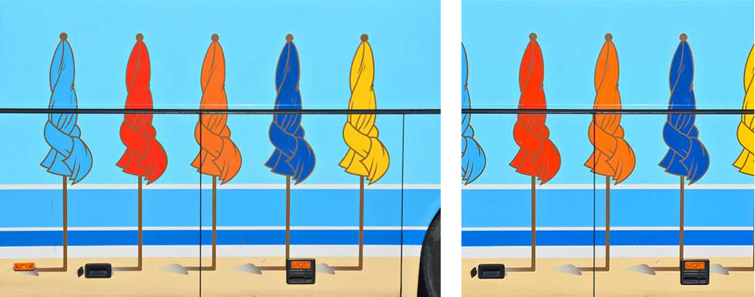
Left, the original "picture" — right, its "icon" version
When translated into squares and posted on instagram.com, Holland’s rectangular originals acquire a different dimension, that of signifiers rather than signifieds. No longer travel symbols, the images are now “signs”: in other words, they stand for something other than themselves. Oddly enough, chopping a couple of inches on the right or left sides of the photographs has had a semiotic effect on them.
“A photograph is always invisible,” wrote Roland Barthes, “it is not what we see.” What we see here is evidence that, in the virtual as in the analog realm, Less is More.
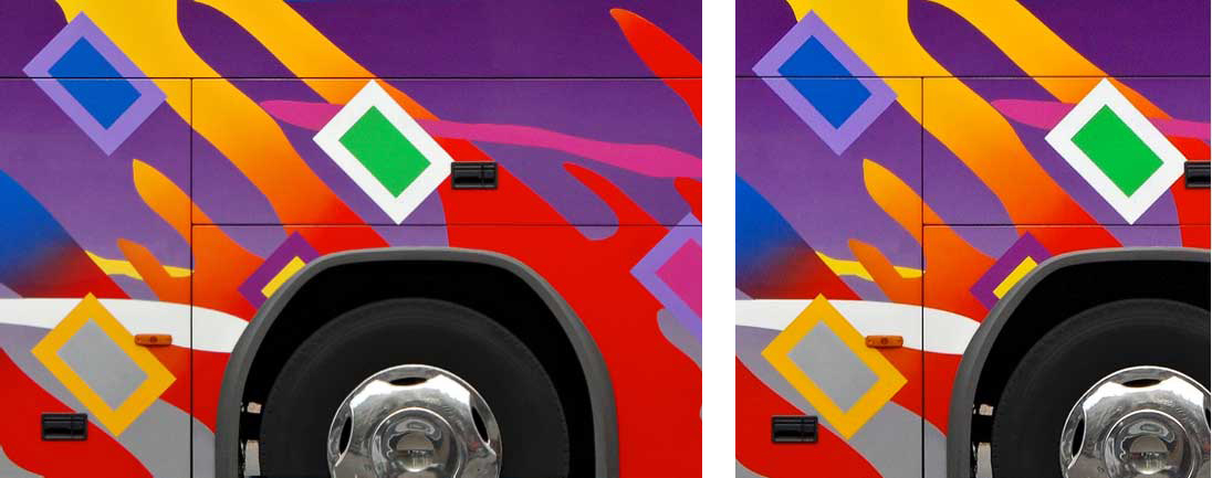
Left, the original "picture" — right, its "icon" version
On taylorholland.com, you can check some other projects by the Oklahoma-born designer, including “public sleeping” a series exploring the relationship between the intimacy of the street and public spaces, and “visa viet”, featuring residents of Saigon walking in front of fake backgrounds at construction sites. Also intriguing is “vector fields,” interactive animations that manipulates the graphics of playing fields.
