Later this month Metropolis Books will release Earthquakes, Mudslides, Fires & Riots: California Graphic Design 1936–1986, Louise Sandhaus' herculean history of (and tribute to) the unique status and nature of graphic design in the Golden State—the result of ten years of research. This week, Design Observer is publishing excerpts from the book. —The Editors
In the popular imagination, California graphic design of the sixties tends to conjure visions of posters, and posters of a very specific kind: those with Art Nouveau–inspired lettering and undulating colors that would come alive when viewed under the influence of marijuana, acid, or ’shrooms. And yet this type of psychedelic image, however much local and global attention it drew to Left Coast graphic production, was only a fraction of what was going on within 1960s poster design, not to mention graphic design overall during this period. To take a metaphor from music—since music and visual culture went hand-in-hand in defining the decade—the archetypal trippy poster represents about four bars of a 12-bar riff within the tuneful melody of an extremely complex song.
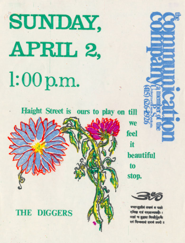
“Variety” would be the defining word for sixties California graphics, which exhibited a vast of array of colors, flavors, and voices—from Beats to hippies to political and social activists. If there was a common theme, be it conscious, subconscious, or unconscious, it lies someplace within the desire and commitment to remake the look of the world. Even so-called mainstream work was as vibrant and experimental as the production of those just “doing their thing.” How can we measure the charming, Victorian-inspired math-game graphics the Eames Office created for IBM against the exuberant, colorful circus-themed poster Dave Hodges conjured for the anticapitalist “free” commune known as the Diggers? How to compare Archie Boston’s in-your-face race-themed promotional ads for his design studio, seeking clients unafraid of daring work, to Emory Douglas’s posters for the Black Panthers (below), aiming to unite factions within the movement and radicalize the wider black community? Graphic design by those with elite training and aesthetics sits quite comfortably beside the more homegrown variety. And it wasn’t only those with revolutionary agendas for reform, aesthetic or social, who made an impact. The Pate/Francis and Garrett-Howard team (later to become Group Five) had no particular interest in setting the graphic-design world afire, yet the sheer verve of its productivity during the 1950s and early ’60s had undeniable influence: creating hundreds of album covers, the group established visual vernaculars including surfer cool and Rat Pack ring-a-ding-ding.

Anonymous, "Haight Street is Ours to Play On," 1967
Sixties design innovation also blazed vigorously outside the industry-sanctioned confines of the mainstream design studio, heating up in the streets and the underground. Many of the most exciting California makers were anonymous or, at least, little known and underrecognized, thanks to relatively inexpensive, easy-to-use technology and counterculture agendas that valued the collective over the individual: this was not the era of the singular design hero. Armed with X-ACTO knives, cameras, and varying degrees of ability,
Sixties design innovation also blazed vigorously outside the industry-sanctioned confines of the mainstream design studio, heating up in the streets and the underground. Many of the most exciting California makers were anonymous or, at least, little known and underrecognized, thanks to relatively inexpensive, easy-to-use technology and counterculture agendas that valued the collective over the individual: this was not the era of the singular design hero. Armed with X-ACTO knives, cameras, and varying degrees of ability,
these committed artists made up for any lack of formal skill with an abundance of get-out-the-message enthusiasm. Some had a bit of design training, and not necessarily just from art class: poster-design collaborators Alton Kelley and Stanley Mouse studied at the college of hot-rod culture, of pinstriped cars and airbrushed t-shirts. In terms of sheer visual thrills, though, the quick-and-dirty product of the counterculture stands shoulder-to-shoulder with the bona fide.
Lines blurred between art and design. Ed Ruscha both inspired and was inspired by commercial typography and, fascinated by the Los Angeles urban landscape, moved from behind the camera and canvas toward mass production and the multiple. A year before his first and groundbreaking artist’s book, Twenty-six Gasoline Stations, Ruscha teamed up with the street-savvy Majestic Poster Press to create a poster for the Pop Art exhibition New Painting of Common Objects. Artist Wallace Berman also straddled commissioned and independent work, designing book covers or event flyers while at the same producing works of art using methods and modes closely aligned with graphic design. Sister Corita Kent is yet another example of a producer whose visual works defy easy categorization: are the colorful, food-packaging-and-marketing–influenced banners she created for her Mary’s Day events, the once-routine Catholic festivals she transformed into counterculture-style happenings, works of art or graphic design?

We see uncanny convergences and transitions in the 1960s, leaps from one practice to another and alliances among key players. John Van Hamersveld embodies this sort of mobility, starting with the iconic surf graphics he created early in the decade that whetted and fed a national craving for Southern California cool. His surfer-artist buddy Rick Griffin headed north to the Haight-Ashbury scene and became one of the legendary “Big Five” designers of psychedelic posters. Van Hamersveld would visit Griffin in San Francisco and there he met Victor Moscoso, another of the “Big Five,” with whom he collaborated on a poster advertising a Who and Fleetwood Mac concert arranged by Van Hamersveld’s new, L.A.-based company, Pinnacle Productions. In another tangent, Van Hamersveld initiated the creation of the light-show production team Single Wing Turquoise Bird. And as if that weren’t enough, he collaborated with Warner Brothers art director Ed Thrasher to design projects including an album cover for the West Coast Pop Art Experimental Band.
The bottom line: California graphic design of the sixties leaped and surged across all sort of divides. It was produced by everyone and for everyone, during a decade of revolution and revelation, and its influence continues to reverberate across the visual landscape.
Inspired by Malcolm X’s edict of “self-respect, self-defense, and self-determination,” the Black Panther movement germinated as an arts initiative, the Black Communications Project, which aimed to bring black theater, poetry, and music events to college campuses. The Panthers saw militancy as the sole response to the way the U.S. government ignored or compromised the human and civil rights of the black community. Over time, it moved toward addressing more pragmatic community needs, instituting health care, education, and food programs while still spreading awareness of government activities. Emory Douglas—the movement’s Minister of Culture—was responsible for the Panthers’ visual communications platform. Introduced to printing and design during a teenage stint at a juvenile facility and trained in commercial art at City College of San Francisco, Douglas worked to unite the Panther membership—to align competing objectives and get everyone on the same page via emotionally rousing visual mission statements.
Working with the organization from 1967 until the end of the seventies, Douglas created hundreds of posters and a weekly newspaper that brought messages of righteousness, indignation, and hope to an audience with varying degrees of literacy.
Douglas’ Revolutionary Posters offers a multi-level example of his early work: designed by him, this newspaper advertisement functions as a combination sampler/order form for eight of his posters, all for sale (“$1.00 each”) to raise money for the party. Douglas used any means at hand—rub-on type, typewriter, pen and ink—to create these images of Black Panther leaders and the people they represented. Here, he arranges them not by a grid or other design formula, but by a what-fits-where strategy.


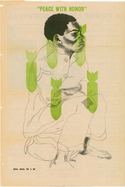
Emory Douglas, “Peace with Honor” poster, 1973
Continuing his design work with social and political vigilance into the seventies, Douglas went on producing powerful and compelling graphic communications for the Black Panthers. Throughout his career, the scope of his work reflected the shifting concerns of the Panther movement: his subject matter ranged from images of police aggression and activists in combat poses to lovingly dignified portraits of people in the black community. Wheat-pasted around the streets, his posters were intended to spread awareness about Black Panther social initiatives while radicalizing the “brothers and sisters” of Oakland into a state of raised consciousness that would, in turn, strengthen the Panther mandate.
Douglas’s oeuvre was that of a “revolutionary artist,” an identity the Panther leadership declared for him and one that artist Sam Durant acknowledges in comparing Douglas to the Russian Constructivists, artists and designers committed to social and political reform. With a goal of ending “global capitalism and imperialism,” the Panthers saw themselves as aligned with a worldwide revolutionary movement that equated U.S. government–mandated aggression at home, against its black community, with U.S. aggression overseas in Vietnam. “Peace with honor” quotes a 1968 Richard Nixon campaign promise; once elected president, he intensified American involvement in the war.
