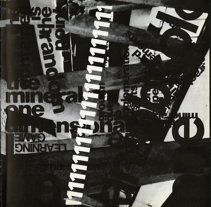
Italian-born Paolo Soleri, who died in 2013 at the age of 93, was a visionary architect and the designer of Arcosanti, an experimental community in the Arizona desert that he founded in 1970. Soleri was a pioneer of the sustainable architecture movement, and by extension a leader in alternative architecture. His desert property began as a laboratory where he built in harmony with the native environment.
Architecture and ecology had to be viewed as a whole, Soleri believed. After an apprenticeship with Frank Lloyd Wright in the 1940s, he developed a philosophy he called “arcology” (architecture plus ecology), in which buildings were densely packed and beehive-like in stark contrast to the sprawl of suburbia. People paid to intern with Soleri and live and work at Arcosanti for weeks at a time, in a process that continues to this day.
One lesser-known aspect of Soleri’s legacy is a major work of graphic design—or rather anti-design. The typographically cluttered, experimentally constructed book about his fundamental philosophy, Paolo Soleri: Visionary Cities (1971), was written and designed by architecture professor Donald Wall. The book design, which my Design Observer colleague Rick Poynor wrote about in Eye magazine, looks forward to the deconstructive typographic antics of the 1990s and is a continuation of the concrete poetry of the 1950s and the typographic experimentation of the 1970s Fluxus movement. The prototype designer-as-author, Wall manipulated word and image, taking American typographer Herb Lubalin’s penchant for smashed letters to a new level of density, intensity and illegibility.
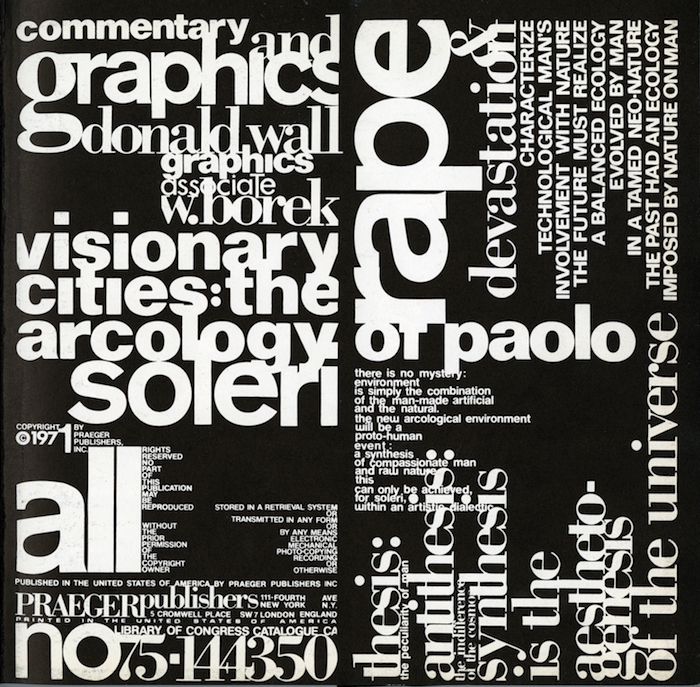
His layouts also mirrored some of the cinematic layouts that Quentin Fiore had accomplished in Marshall McLuhan’s The Medium is the Massage. Fiore sought to seamlessly integrate textual and pictorial experiences—words and pictures complemented each other in a unique yet linear way. Wall's manipulations of the text are even more inseparable from its content. Poynor noted how Wall, a former professor of architectural theory, design, and history at the Catholic University in Washington DC, “gave typographic shape to his own critical ideas, and the book is fully aware of the uniqueness of the project.”
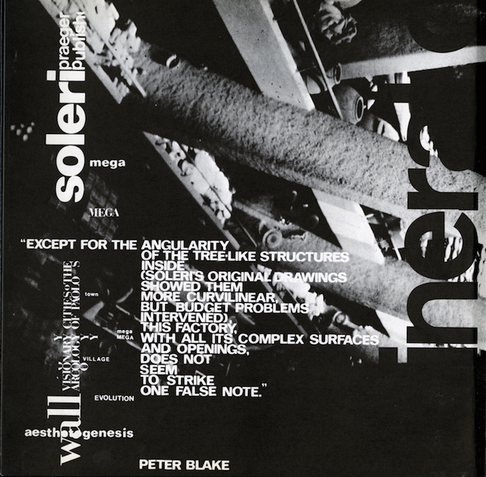
The book consists of a maze of typographic wanderings presenting phrases by Soleri and others, or as the flap copy puts it, in lowercase type: “paolo soleri’s radical aesthetic and philosophy for urban man are presented in this unique book, which embodies new graphic concepts to express the innovative insights of this most controversial architect.”
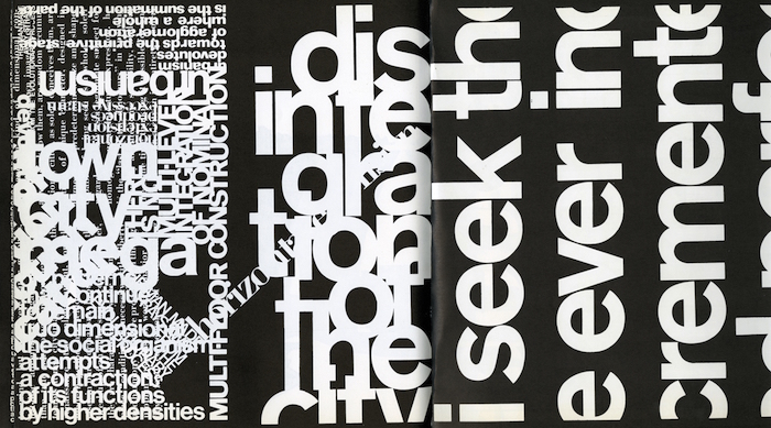
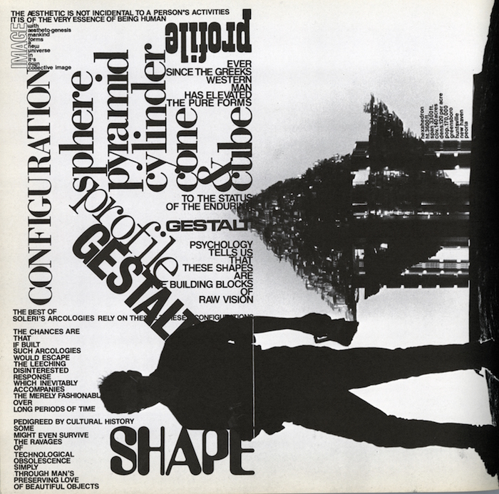
Wall was not a trained book designer, so his relationship to the medium was unfettered by constricting rules. Nonetheless, he adhered to certain contemporary conceits, including predominantly black pages with high-contrast images, the overall outcome as much a challenge to the history of the book as it is to the reader. “It confronts the reader with a spectacle so relentless and estranging that it could easily have proved insurmountable to some,” Poynor wrote. “No book that cultivates indeterminacy to this degree could be called a masterpiece, but it is certainly a landmark in its synthesis of critical commentary and design.”
