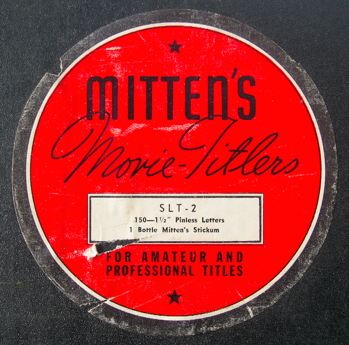
Before digital video there was no simple way to create title cards for 8mm or 16mm home movies. In fact, composing the individual two- and three-dimensional letters, gluing, filming, and splicing the film was ridiculously messy and the results weren’t always pretty. So making film titles with Mitten’s Movie Titles or Struhl Movielux Titling Set was how any novice filmmaker could, as the promotion slogan read: “Give your titles that Hollywood touch.”


According to the leading expert in the field, James W. Moore in Titling Your Color Movies, three elements were necessary for any “well-prepared” title card: “The card itself, or background; the lettering or letters which go on it; and the decoration which may or may not be used to enhance these two practical elements.” It all seemed fundamental, but it is never wise to underestimate the ability to screw things up by even the most earnest amateur.

There were ostensibly five basic ways to create titles. With a typewriter; with moveable letters—either flat or raised; with draftsmen’s lettering guides; with press printing; or with hand lettering—either traced or freehand. And there were rules to follow as with the typewriter: Typefaces should be freshly cleaned and free of all embedded ink. A studied evenness of touch in hitting the keys should be practiced. The ribbon should be set in the “stencil” position to get soft, textured outlines to avoid unattractive magnified projection.
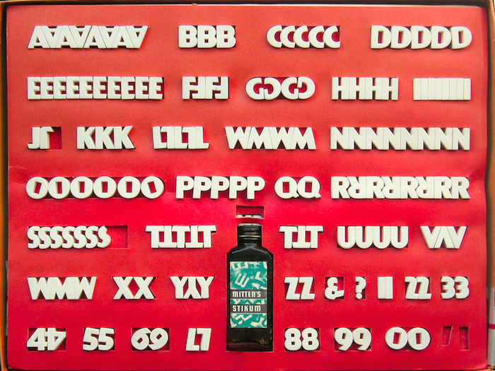
Mitten’s white plaster letters came in eight different sans-serif styles, including one that looked suspiciously a like Kabel. These tri-dimensional tile letters were meant to have the most graphic impact under harsh cinematic lights. There were three ways of lighting titles: from the front, from the side, and from the rear.

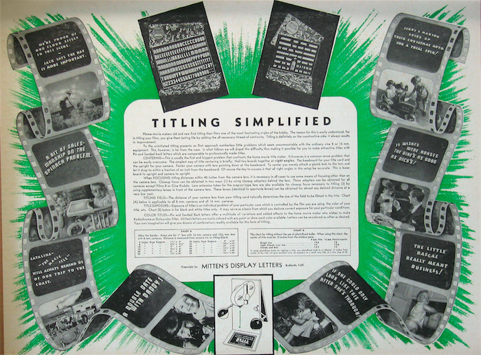
Systems for lighting were surprisingly elaborate to achieve the “hot spot” and capture the best possible shadow to increase dimensionality. They may lack the grace of printed letterforms but Mitten’s tri-dimensional bulk, when cross-lighted to achieve shadows with dramatic effect, were usually clear and readable.
Mitten’s offered versatile size options, and size mattered. “Intelligent care should be given to determining suitable letter size and spacing,” Moore wrote, “letter line up and spacing should be done with a ruler for absolute balance.” Since titling rules were aimed at the novice, the most valuable advice that Moore could give was to “keep it simple, keep it small, and keep it subdued. Remember that title art is an adjunct, not an end in itself.”
