
Hansa und Brandenburgishen
The modern corporate logo was born in Germany shortly after the turn of the twentieth century, the direct descendent of burgher crests, coats of arms, trade and factory marks. In the 1920s members of the Bauhaus and the Ring Neuer Werbegestalter (circle of new advertising designers) were given credit for inventing the reductive trademark, but this modern method actually began well over a decade earlier. Official German government registry books from the early 1900s were full of trademarks, Schutzmarken, by Peter Behrens (the father of corporate design for AEG), Lucian Bernhard, F.H. Ehmcke, Konrad Jochheim, Carl Schulpig and Valetin Zietara. Each created pictograms and graphic trade-characters that prefigured today's international sign symbols. One of the most prolific of these mark makers is barely recognized in design histories today, except for the occasional footnote. His name is Wilhelm F. Deffke, cofounder with Carl Ernst Hinkefuss of Wilhelmwerk in Berlin.
Included among Deffke's prolific output, which began in the early teens, were dozens of the era's most impressive symbols for commerce and government, not the least of which became the most charged logo of the twentieth century, the Hakenkreuz (the hooked cross or swastika) — prior to its adoption by the Nazis.
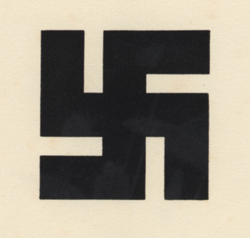
Swastika (ancient symbol)
When Deffke tackled this ancient sign in the late teens he never intended that it be used as a political symbol, nor one with such evil consequence. "Deffke came across a representation of the ancient Germanic sun-wheel on which he worked to redefine and stylize its shape," wrote his former assistant Mana Tress in a letter to Paul Rand during the 1970s. "Later on, this symbol appeared on a brochure which he had published and [the Nazis] chose it as their symbol but reversed it." Her primary reason for writing this letter was apparently to absolve Deffke* of any responsibility for the creation of the Nazi icon, and furthermore, she implied, the swastika was taken from his self-published sample book Handelsmarken und Fabrikzeichen and never paid for. Deffke was well aware that the mark in rectilinear and curvilinear variations was more or less in the public domain. Many years before the Nazi regime, he simply intended to render a cleaner version of this historical symbol, one that was more geometrically precise than others used in the period.
* Deffke was not an "ideological" Nazi but, in "The Struggle of Signs in the Weimar Republic" (Journal of Design History, Vol. 13 No. 4), Sherwin Simmons cites documents that show in 1933, when the Magdeburg School [where Deffke taught] was threatened with closure, he joined the party and "argued for modern design's link to Nazi policy on account of the party's technological sophistication and opposition to narrow provincialism."

Deutsches Reichswappen
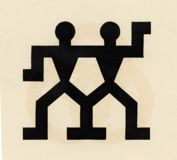
J.A. Henkels
Precision guided Deffke's practice at every turn. In 1909 he worked for the leading design precisionist, Peter Behrens, and watched as he built-up the Allgemeine Elektricitäts-Gesellschaft (AEG) brand through the concerted integration of graphics, product design and architecture. Deffke learned that a pure mark void of superfluous ornamentation could communicate directly with the public like few other business tools. After leaving Behrens' employ, Deffke became a design consultant to Otto Elsner Verlag, where he focused on developing the firm's identity.
In 1915, he opened Wilhelmwerk while simultaneously assuming an active role promoting the virtues of design to the public and profession through self-published books and portfolios that evidenced the highest graphic standards.
Deffke prided himself on how reductive he could make symbol while remaining comprehensible — and memorable. He preferred working with primitive and abstract forms because they were malleable, and his knack for manipulating them into forceful marks was acute. Deffke created a large number of marks for the postwar German military, which during the early days the Weimar Republic sought to change its public image from reliance on trappings associated with haughty Junkers to a more modern one, while retaining its authoritarian persona. He was also called upon him to design government propaganda.
Deffke understood that German industry's identity needs prior to World War I demanded a new kind of comprehensible mnemonic symbol. The introduction by 1906 of the proto-Modernist Sachplakat (object poster), created by Lucian Bernhard, which reduced an advertising message down to one memorable object or icon (a response to the rise in urban traffic and limited visibility on the thoroughfares), was critical in moving commercial art away from rococo complexity to unornamented economy. Deffke, who in 1910 taught trademark design at the Reimann School in Berlin, and years later was appointed the director of the Kunstgewerbeschule in Magdeburg, clearly saw over only a few short years the German public becoming accustomed to the witty little icons.
His Schutzmarken, in general, followed a fairly strict stylistic formula: they were stark silhouettes usually with basic geometrical attributes — a round head on rectangular body was common, as were triangles and parallelograms. Visual puns were encouraged.

Altona A.D. Elbe

Argus
The modern trademark was promoted to designers and their clients through Das Plakat, the design magazine launched in 1910 as the official journal of the Verein der Plakat Freunde (The Society for Friends of the Poster), and later by Gebrausgraphik, founded in 1923, which became the leading international graphic design and advertising journal. Both periodicals sought to expand the designer's role in business, and Deffke was one of the more outspoken proponents of this early approach to corporate identification. "Trademarks acquire their real worth and significance only through adequate usage," he sermonized in Handelsmarken und Fabrikzeichen (1929). "It is not sufficient to use them once in a while to designate certain products. They must be used systematically and frequently. The trademark will be the most likely to establish an inseparable bond between the user and the manufacturer."
Deffke's essays — sermons to businessmen on the value of branding — sound a lot like today's branding hyperbole. "These trademarks and factory seals deserve our attention as a means of improving the public taste, and because of their extraordinary economic significance," he zealously wrote. "Their value is in the millions and it would be a irreplaceable loss to the national wealth of any country, should they cease to be."
While Deffke was an unapologetic cheerleader for his profession (and his own business interests), he was no less a critic. He once wrote: "Most modern marks are lacking in artistic merit and significance. Their shapes are average and bland, ugly and utilitarian. Their designers misunderstand their purpose, leading to a kind of useless playfulness. This, in turn, harms the reputation of these marks and makes them difficult to use universally. It should be obvious to anyone that creating these marks is best left to professionals with experience, practice and the artistic strength to make them unique."
Deffke's sermonizing was a textbook example of the new art of strategic design: "It is not enough to use trademarks occasionally to identify products," he announced. "The trademark will forge an indestructible link between producer and consumer, which will successfully ward off any unfair competition." Yet aside from having practical advantages, trademarks are of great importance, he noted, for all creative entrepreneurs who "wish to display the fruits of their minds and inventions to the world now and in the future. Trademarks remain forever in our memory and so display some of the characteristics usually associated with great works of art."
Such a zealous logo designer was prone to overstatement: "If a trademark is created by competent hands, it will gain in importance, as it, in conjunction with other advertising means, reappears in ads in newspapers and magazines, business papers and brochures, on factory walls, vans and trucks. As a result, it will impress itself indelibly on people's minds," he admonished. "The greatest marks are created by that talented home of German workmanship, the "Wilhelmwerk," with rare talent and thoroughness." His message was clear: Logos were endemic to industry's success, and make no mistake, his logos were the tools to achieve it.
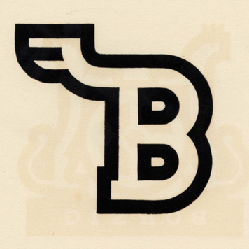
Hansa und Brandenburgishen

Frisch-Fromm-Froh-Frel
