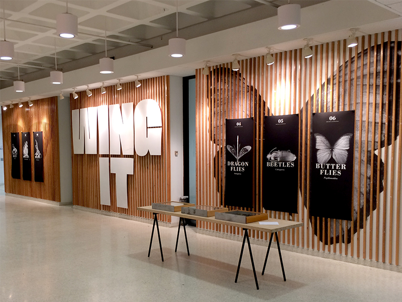
Wing It Exhibit Designs by Justus Darby, Kehong Lu, Brooke Nelson, Erin Newman, Jessica Potter, Julia Rater, Tessa Riley, Rebekah Seiler and Vina Shen with 3D modeling support from Alex Forlini, George Hardebeck, Ellie Nikoo, and Nicholas Polys.
“Suppose there were no bees or butterflies. Suppose no bird should ever cross the skies.” When Elvis first sang these words in 1967, he was supposing an impossibility — an unimaginable scenario. But have you heard? Last October, a research study in Germany reported a dramatic decline of winged insects — around a 75 percent drop of insect biomass over the last 27 years. This is alarming news. But thankfully this is not an alarming article about species loss. No, it’s quite the opposite. The focus rather is on the proliferation of another kind of environment — environmental graphic design — and how our students designed an exhibit that was so fly.
I first “met” Elvis at the Rock & Roll Hall of Fame and I was all shook up (not because of Elvis, but because of Michael Bierut). Pentagram was hired by the RRHF to design the first-ever Elvis Presley exhibit outside of Graceland, and I was newly hired to work on Michael’s team. A wella bless my soul! Never before had I worked with plans, elevations, or fabricators, let alone puppy dog eyes, sultry lips, and shaking hips. (Not because of Michael, but Elvis.) We had only one task: to impersonate the King. And we did this two-dimensionally, typographically, and spatially. So when your office is in New York and your client is in Cleveland, how do you effectively plan the space? And further, how do you test the effectiveness of the plan? For Michael and architect Jim Biber — and those with photographic memories and keen spatial ability — this requires a few on-site visits and they can imagine the rest. But for the rest of us, are there other “visualization technologies” to support an iterative design process — offsite? The answer is yes! It’s virtual reality. And you can do anything you wanna do because uh, uh, honey, it’s only an illusion.
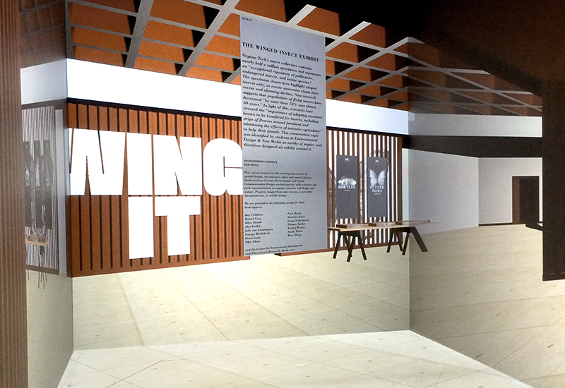
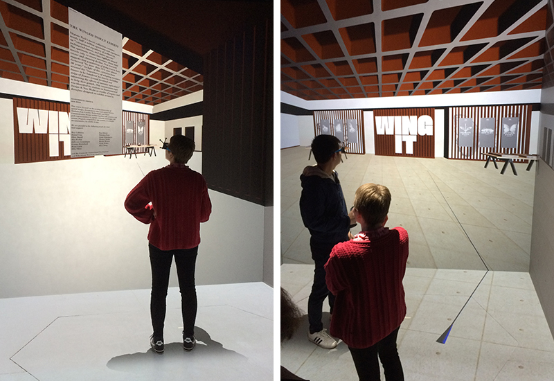
Virtual Exhibit (second walk-through) showcasing impressive type resolution.
Like Rock ’n Roll, the field of environmental (or experiential) graphic design is young and on fire. In fact, the term “way-finding” was only first coined in 1960 and “signage” as recent as 1992.1 Because of this, perhaps, there are “very few courses … that will prepare you to become a practicing Experiential Graphic Designer” (according to SEGD.org) and so most learn on the job. But what an omission from design education! And conversely, what an opportunity! At the New Bauhaus, László Moholy-Nagy referred to a set of core classes — called the Basic Course — as the backbone of the design curriculum. Is it time for EGD to be the new spine of design? Should we listen to Albert Einstein and sequence courses not only on the interplay of type/image but also space/time? (He was right about gravitational waves, after all.) Since more and more GD projects require 3D imaginings, there’s now a growing need to develop our spatial abilities.
Here’s why:
A record number of people are visiting museums and national parks, making exhibit design a growing form of education; municipalities are branding themselves (strange, I know) and need help with place-making and way-finding systems; GPS is changing how we visualize environments; discoveries in neuroscience offer new insight into internal mapping; digital displays are (regrettably) everywhere and prompting research on comprehension through digital type; rapid prototyping is ours for the making; and virtual reality is the exciting new reality, the focus of this paper, and full of design promise.
And insects are vanishing. (These things may not be unrelated.)
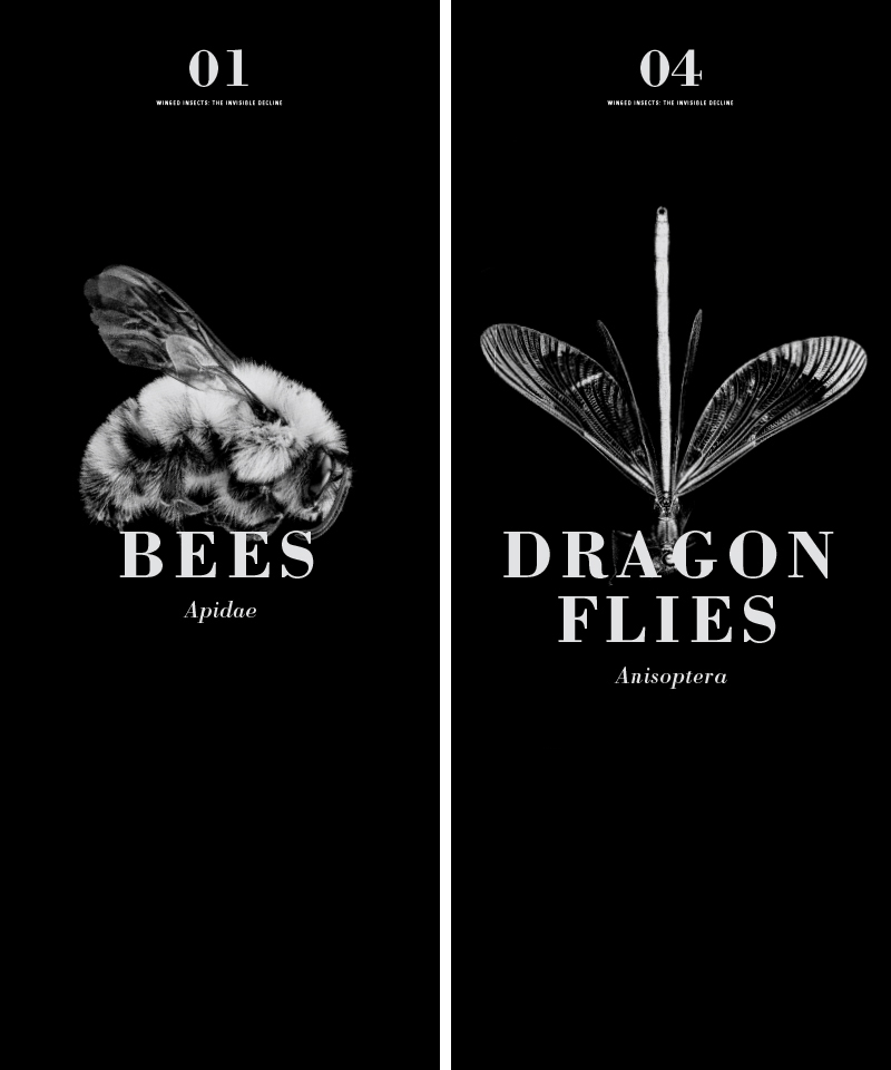
Specimen Case Posters Designs by Justus Darby and Rebekah Seiler. (Images are from the U.S. Geological Survey database.)
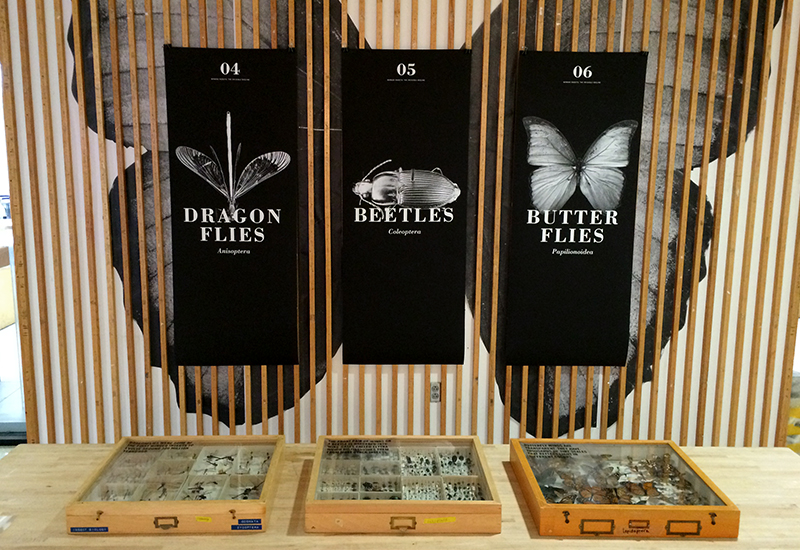
Viewing display cases and labels. Case designs by Kehong Lu, Erin Newman and Vina Shen .
In a recent lecture given by the director of the Smithsonian’s National Museum of Natural History, Dr. Kirk Johnson found correlation between the environment and environmental design (if I may paraphrase). Referring to the “golden age” of the natural history museum — a period of time between 1880 and 1910 — the natural world was being utterly exploited (think bison). In an effort to conserve and preserve dwindling species, natural history collections proliferated, and so too, an interest in them. (And, get this: institutions were sometimes killing the last remaining species in order to preserve them.) What a fascinating paradox: with the rise of the natural history museum came the demise of the natural world. But are these things always inversely related? Oh no! Attendance at the NMNH is soaring! What does this mean for flying insects?! Well, maybe we’re in for a good exhibit of dead specimens. Do read on!
Did you know that nineteenth century specimen preservation wasn’t limited to the museum alone — as universities amassed collections too? And if you’re lucky, your university has kept up those efforts. And if you’re brave, you’ll open a drawer under Kingdom Animalia > Phylum Arthropoda > Class Insecta > Order Blattodea. It’ll be a cockroach encounter of the best kind — where they’re all lined up and pinned down (unlike the “specimens” found in your Brooklyn apartment). At nearly a half-million species, our school has “an exceptional repository of pollinators, endangered insects, and many native species” all of which, I guarantee, were harmed in the production of “Wing It: The Decline of Winged Insects” (but not by us). As the title suggests, our class found the Germany report so compelling that we built an exhibit around it, using university specimen cases. Now watch what happens when you integrate natural history and virtual reality into a rich design process.
So how do you design an exhibit when you can’t test in space (due to scheduling) or test with real specimens (due to fragility)? How to you plan spatial relationships and site navigation? Do you see where this is going? Of course not, because nobody’s holding the motion tracker. So grab your joystick, you’re about to enter the Hyper Cube — an immersive digital gallery — where the “traditional development process” is suddenly replaced by an “agile” one. Here, layouts change on the fly, “what-if” scenarios are tested, and answers to questions “not yet known” may arise. Move that wall over there? No problem. Make that sign defy gravity? No sweat. Set the POV for different heights. No worries. Wall typography, specimen case arrangement, and butterfly graphics were all quickly tested before final fabrication, giving new meaning to phrase “fake it ‘til you make it.” New meaning, in fact, was the goal. As Don Norman says this new “external aid” can “enhance cognitive abilities” for when “the representation and the processes are just right, then new experiences, insights, and creations can emerge.”2 Think of it, virtual reality changes reality. Or at least our understanding of what could be.
So you can experience the world as it isn’t. And you can see things that aren’t. Bugs, decreasing by 75 percent in Germany, enlarged by 1000 percent in our environment, as oversized wall graphics. World problems solved.
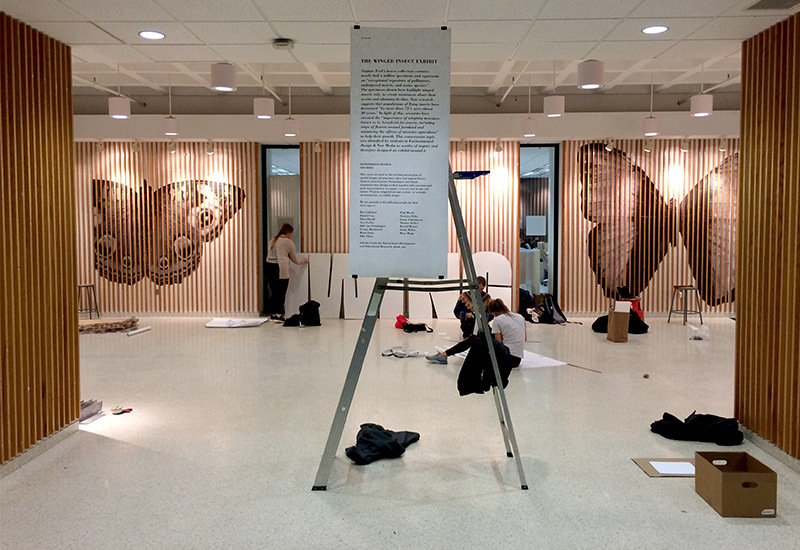
Installation night happened relatively quickly due to pre-testing in the virtual gallery. Large butterfly designs by Tessa Riley.
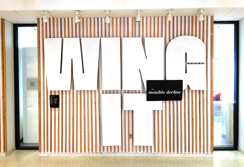
Title Wall Designs by Brooke Nelson and Julia Rater.
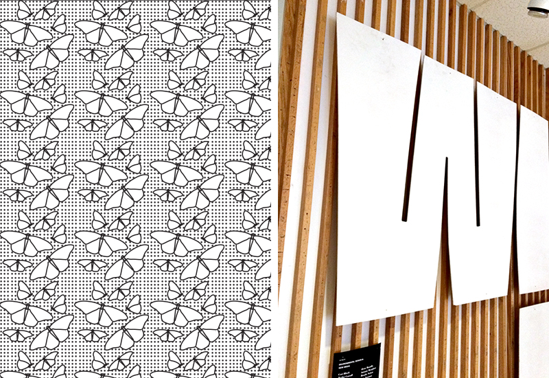
Pattern Design and Large Titles (that float atop the wall like a butterfly). Designs by Jessica Potter; Brooke Nelson and Julia Rater.
Now we define reality through our sensory experience. Some experiences challenge our notion of what is real, so we call them illusions. But maybe illusion is reality and reality is illusion. VR makes that case. While the virtual gallery is only an abstraction of space, built from 26.7 million pixels, our walkthrough was unbelievably convincing. We were duped. This kind of “awareness in the moment of being immersed in a virtual world while having a temporary amnesia … of the real world and the technical medium” is called “presence.”3 And we felt it. Upon leaving the Hyper Cube and entering the actual gallery, we had a strange feeling of déjà vu. How could this be? It seems our world is made of magic and certain moments remind us of this. Remarkably, and without effort, we also felt confident in our design plan. And maybe that’s the point. So for students with little time or money for trial and error, this reassurance gave us presence of mind.
Speaking of the mind, Einstein is attributed as saying “space and time are modes in which we think, not conditions in which we exist.” That deserves a second read, so I’ll give you some space and time to process it . In cognitive neuroscience, it’s well understood that “knowing where you have been is a very powerful way of recalling the other things that have happened to you at that time.” Turns out our cognitive maps are necessary for understanding. One could argue, then, that experiencing new environments, even virtual ones, may enhance learning. Who knows. At the very least, negotiating 3D models seems to improves spatial ability.
Let me back up. At the beginning of the project, students found it “hard to visualize the 3D shape” or predict spatial relationships. In no way, shape or form, could their 2D sketches fully clarify understandings of wayfinding, volumetrics, or spatial reasoning. That is, until the virtual walkthrough. This makes the case that VR could “extend the existing range of learning” in the classroom. How fascinating! It’s worth pointing out too that spatial ability is “viewed as a unique type of intelligence distinguishable from other forms of intelligence, such as verbal ability, reasoning ability, and memory skills.” In other words, it’s different from language and math skills, yet we’re not fully testing for this type of intelligence (think SATs). To offset the verbal and computational bias, therefore, some educational agendas are starting to assess for spatial abilities as well, which I find reassuringly democratic. This strategy may also help our case for integrating EGD into a design curriculum.
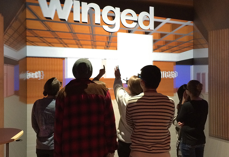
Virtual Exhibit (first walk-through) Spatial arrangements and typographic selections were tested out during this initial “walkthrough”. 3D model designs by Alex Forlini, George Hardebeck, Ellie Nikoo, Nicholas Polys and the EGD students.
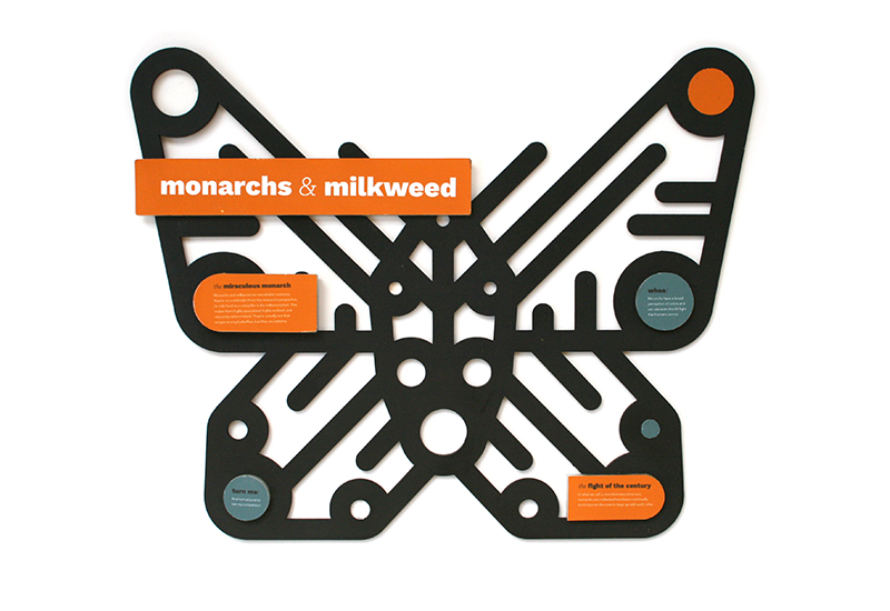
Interpretive Sign The exhibit also included outdoor, interpretive signage on the opposite side of the gallery. This particular sign showcases the interdependency of monarch butterflies and milkweed, whereby the body of the butterfly is built from a milkweed pod. Design by Julia Rater.
Time to recap: Iterative design, idea generation, illusion and learning (!) are enhanced with this powerful tool that’s easy to spell — VR. But there’s more. Let’s talk about testing.
We are entering a world of dynamic surfaces. Immersive environments are here to stay, but I bet the term will become passé, as VR fully integrates into the built environment. (Physically and through opticals.) Think of it: entire environments will become unpredictable, updatable, reusable, reproducible, customizable, educational, and, think of it (!), testable. Designers, start your engines.
We’re all scientists at heart. I’ve been known to face plant on an LCD screen, to fixate on the red, green, and blue pixels, then slowly retreat until the colors combine to white. That moment of transformation is a religious experience: I’m in a constant state of disbelief, yet I see the light. Take the speed limit sign on Highway 77. It looks normal until you get up close and realize that it’s glowing. Made from those RBG pixels, this dynamic sign can update on the fly — change from 65 to 35 miles per hour — or when the dangerous mountain fog rolls in. When driving by, I can’t help but think, “Typography saves lives! Design IS important!” The sign undoubtedly reflects extensive research and rigorous testing — which is the point of this paragraph. So move over moving image: pixel resolution is on the refine, making digital displays a typographer’s territory too (if people can still read) and a researcher’s realm. As Nicholas Polys, our grant collaborator remarked, when talking about AR/MR glasses, “we will have a LOT more social and cultural work to do.” So how do we prepare for this?
Like a flying insect, my world is full of ups and downs. Farewell flying insects! Or maybe not! Around the time that the Germany study emerged, the New York Times reported on flying insects too. Apparently, butterfly wings are changing color and through no fault of their own. It seems that scientists from Cornell University had successfully edited “patterning and colors on butterflies’ wings” through the “new Crispr-Cas gene-editing technique.” How incredible. We’re talking about understanding gene play “by deleting [genes] and seeing what happens”. One may speculate then, that as real butterflies decline, we might be on the verge of designing their replacement. Oh, the irony! Did you know that this kind of insect preservation exists in the digital realm too? There’s currently a worthwhile agenda to digitize vast natural history collections (and specimens collections) in the hopes of amassing a global database. So as species die out, they may live on, through these advancements in technology.
That’s not quite a happy ending. And this is the end of the article. You’re not supposed to write that. Strunk and White are continuously upset with me. Make “every word tell” they say, to which I agree, yet this essay is wordy. The goal is about efficiency of information, pared down and powerful, like a poem. The better the words, the fewer. So that the omission of text, the space in between, is filled in by the reader, in a collaboration of comprehension. That was a run-on sentence. I’m in trouble again.
Now I’d rather spend my days outdoors than be inside, in virtual worlds, with digital butterflies, but there’s something about VR that’s got my attention. The information is reduced, abstract, efficient. The re-enactment is limited, the features are flat. Yet, somehow we fill in the blanks — unasked and automatic, like a powerful act of perception. We make the illusion. We make it real. We can’t help ourselves. The poverty of place creates a kind of poetry. Like lyrics from a song. Which gets me all excited. And you know what they say…
I'm actin' wild as a bug
I'm in love
I'm all shook up
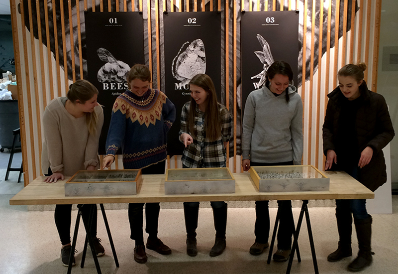
Posters and cases respond to each other.

Virtual Exhibit (first walk-through) Spatial arrangements and typographic selections were tested out during this initial “walkthrough”. 3D model designs by Alex Forlini, George Hardebeck, Ellie Nikoo, Nicholas Polys and the EGD students.

Interpretive Sign The exhibit also included outdoor, interpretive signage on the opposite side of the gallery. This particular sign showcases the interdependency of monarch butterflies and milkweed, whereby the body of the butterfly is built from a milkweed pod. Design by Julia Rater.
Time to recap: Iterative design, idea generation, illusion and learning (!) are enhanced with this powerful tool that’s easy to spell — VR. But there’s more. Let’s talk about testing.
We are entering a world of dynamic surfaces. Immersive environments are here to stay, but I bet the term will become passé, as VR fully integrates into the built environment. (Physically and through opticals.) Think of it: entire environments will become unpredictable, updatable, reusable, reproducible, customizable, educational, and, think of it (!), testable. Designers, start your engines.
We’re all scientists at heart. I’ve been known to face plant on an LCD screen, to fixate on the red, green, and blue pixels, then slowly retreat until the colors combine to white. That moment of transformation is a religious experience: I’m in a constant state of disbelief, yet I see the light. Take the speed limit sign on Highway 77. It looks normal until you get up close and realize that it’s glowing. Made from those RBG pixels, this dynamic sign can update on the fly — change from 65 to 35 miles per hour — or when the dangerous mountain fog rolls in. When driving by, I can’t help but think, “Typography saves lives! Design IS important!” The sign undoubtedly reflects extensive research and rigorous testing — which is the point of this paragraph. So move over moving image: pixel resolution is on the refine, making digital displays a typographer’s territory too (if people can still read) and a researcher’s realm. As Nicholas Polys, our grant collaborator remarked, when talking about AR/MR glasses, “we will have a LOT more social and cultural work to do.” So how do we prepare for this?
Like a flying insect, my world is full of ups and downs. Farewell flying insects! Or maybe not! Around the time that the Germany study emerged, the New York Times reported on flying insects too. Apparently, butterfly wings are changing color and through no fault of their own. It seems that scientists from Cornell University had successfully edited “patterning and colors on butterflies’ wings” through the “new Crispr-Cas gene-editing technique.” How incredible. We’re talking about understanding gene play “by deleting [genes] and seeing what happens”. One may speculate then, that as real butterflies decline, we might be on the verge of designing their replacement. Oh, the irony! Did you know that this kind of insect preservation exists in the digital realm too? There’s currently a worthwhile agenda to digitize vast natural history collections (and specimens collections) in the hopes of amassing a global database. So as species die out, they may live on, through these advancements in technology.
That’s not quite a happy ending. And this is the end of the article. You’re not supposed to write that. Strunk and White are continuously upset with me. Make “every word tell” they say, to which I agree, yet this essay is wordy. The goal is about efficiency of information, pared down and powerful, like a poem. The better the words, the fewer. So that the omission of text, the space in between, is filled in by the reader, in a collaboration of comprehension. That was a run-on sentence. I’m in trouble again.
Now I’d rather spend my days outdoors than be inside, in virtual worlds, with digital butterflies, but there’s something about VR that’s got my attention. The information is reduced, abstract, efficient. The re-enactment is limited, the features are flat. Yet, somehow we fill in the blanks — unasked and automatic, like a powerful act of perception. We make the illusion. We make it real. We can’t help ourselves. The poverty of place creates a kind of poetry. Like lyrics from a song. Which gets me all excited. And you know what they say…
I'm actin' wild as a bug
I'm in love
I'm all shook up

Posters and cases respond to each other.
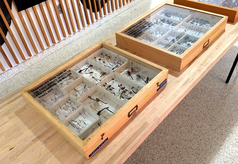
Specimen Case Labels Original designs by Vina Shen using scientific text from the Smithsonian Magazine and campus scientists.
Thank you: Michael Bierut and Jim Biber; Tracey Cameron, Rion Byrd Gumus, and Kelly Kolar; Nicholas Polys and Ellie Nikoo; Alex Forlini, George Hardebeck, Thomas Tucker and Peter Schreiner; Paul Marek, Grant Schiermeyer, and Rhea Wong; and all the EGD students! This project was made possible by a Center for Instructional Development and Educational Research grant.
1. Gibson, David. The Wayfinding Handbook: Information Design for Public Places. New York: Princeton Architectural Press, 2009. Print.
2. Norman, Don. Things That Make Us Smart: Defending Human Attributes in the Age of the Machine. New York: Diversion Books, 2014. Print.
3. Jerald, Jason. The VR Book: Human-centered Design for Virtual Reality. New York: ACM Books, 2016. Print.
