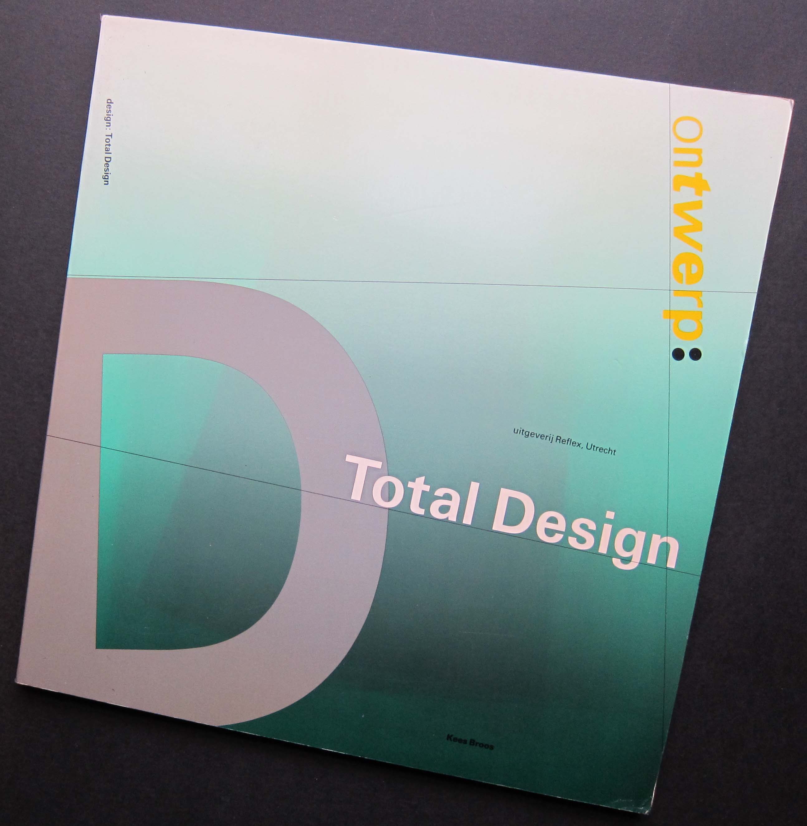
Ontwerp: Total Design book designed by Total Design, 1983
In 1983, on a visit to Amsterdam, I saw a remarkable book in a bookshop on Leidsestraat. Its shape was completely irregular. I understood a certain amount about typography and graphic design by then. I knew it fascinated me, but had yet to engage much with the history of the subject. The book, Ontwerp: Total Design by Kees Broos, had just come out and I bought it with great excitement, knowing it was unlikely to be available back home. In 1987, Wim Crouwel was the first graphic designer I interviewed for a magazine.
I begin an essay about Dutch graphic design in such a personal way because the subject is so close to me that it is impossible to disentangle these early encounters from my subsequent commitment to the discipline. It is hardly news to a Dutch audience that Dutch graphic design went through an extraordinarily inventive phase in the 1980s, but perhaps an outsider’s view can still shed some light on the degree of impact the country’s graphic design enjoyed overseas in those years.
There is a well-worn line about the Netherlands appearing to be some kind of heaven for graphic designers. The cliché holds true because that’s exactly how it seemed. Total Design, Studio Dumbar, Jan van Toorn, Anthon Beeke, Hard Werken, Wild Plakken, to name only the most obvious, were titanic figures able — as it seemed from afar — to seduce or even bend clients to their will, unless (remarkable thought) the clients actually sought such challenging work. In the 1980s, Studio Dumbar, the most emblematic Dutch designers for the British, entered project after project into the D&AD awards in London and won again and again. We had nothing to compare with this awe-inspiring level of graphic sophistication, originality and swaggering self-belief. Visits to the Netherlands, further meetings with Dutch graphic designers, and a growing knowledge of the Dutch design tradition powerfully underwrote my sense, in the late 1980s, that graphic design had much to offer and was worth writing about.
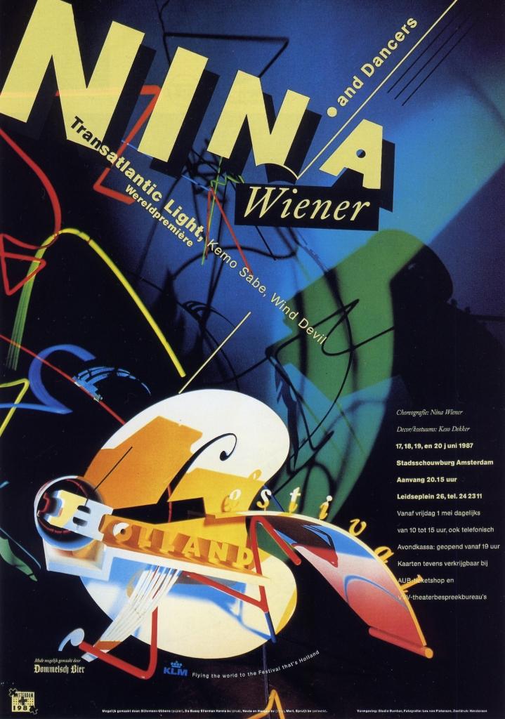
Poster designed by Studio Dumbar for Holland Festival, 1987
It is reasonable to ask, though, what exactly it was we were so enraptured by in Dutch graphic design: what were we celebrating? It was the brilliance of its graphic and typographic form. By degrees, since then, we have moved towards a situation where many of the assumptions about advanced graphic design’s inherent value as visual culture that were taken for granted among designers before the 1980s, during that decade’s design boom, and on into the 1990s, are now seen as misguided and no longer relevant to our circumstances today. As the century ended, the sticking point for many disillusioned design-watchers became form itself — the very attribute for which Dutch graphic design was once so highly prized. The repudiation of form as a valid pursuit in its own right wasn’t a specifically Dutch development. Nevertheless, Carel Kuitenbrouwer’s article “The New Sobriety,” published in Eye in 1995, was early to note a profound quietening down in Dutch graphic design after the turmoil of the 1980s.
After slow beginnings in the Netherlands and Britain (among other places), this yearning for formal sobriety became an international phenomenon within forward-thinking graphic design, a heartfelt reaction against the coercive visual overload of an increasingly spectacular global culture. Graphic excess had precipitated visual burn-out and elaborate kinds of formal expression could no longer signal anything trustworthy or meaningful. As Jop van Bennekom observed in HD: Holland Design New Graphics (2001): “Form is so worn out in the nineties.” That curious book, styled like a chunky, throwaway, airport bestseller, remains a revealing document of its moment, but compared to Dutch graphic design’s glory days, when the work was often distinguished by what Gert Dumbar liked to call “stylistic durability”, a decade later HD contains few images to set your attention on fire and little worth lingering over. Dutch graphic design, I felt then and still feel today, appeared to have thrown its beautiful graphic baby out with the decade’s excessively soapy bath water.
Visual branding versus free spirit
However well intentioned the motivations that underpinned some designers’ embrace of the new visual simplicity, it soon became just another fashionable style ripe for commercial exploitation. There was a time when much Dutch graphic design looked unequivocally Dutch because it came out of a Dutch modernist tradition of typography and montage to which it continually referred, even as it introduced new devices and directions. This tradition was still apparent in the 1980s within the postmodernism of Jan van Toorn or Studio Dumbar.
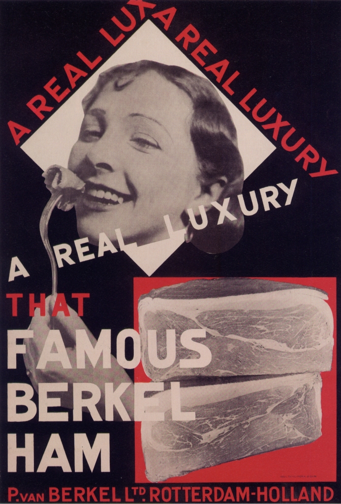
Poster designed by Paul Schuitema for Berkel ham, ca. 1928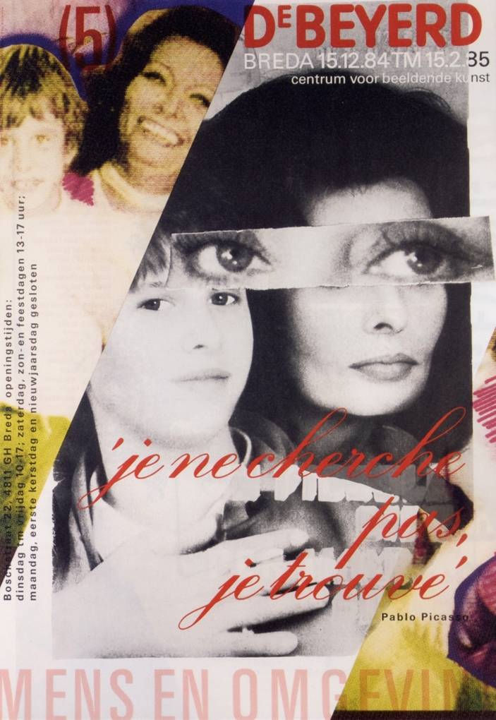
Poster designed by Jan van Toorn for DeBeyerd art center, 1984
Today, Dutch graphic design is much less obviously Dutch. Instead, its habitual graphic routines and styles of address are determined by international conventions of advertising, marketing, branding, fashion and popular culture. The most renowned Dutch “design” company of the last 15 years, KesselsKramer, is in reality an advertising agency, and co-founder Erik Kessels is regularly invited to speak about KK’s irreverent and humorous campaigns at international design conferences. Another way of saying this is that Dutch graphic design, once so vividly defined as an aspect of national visual culture, now feels much like everyone else’s graphic design. Most Dutch graphic design no longer leads the world in purely graphic terms because it has been obliged to fall into line with the imperatives of a globalised economy. Like graphic design everywhere else, Dutch graphic design mostly exists now to serve the market and the market’s needs must come first. 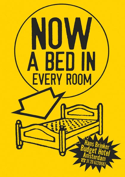
Poster designed by KesselsKramer for Hans Brinker Budget Hotel
Studio Dumbar, where strategy director Tom Dorresteijn has been a 50 per cent partner since 2005, exemplifies these changes. Dorresteijn’s concept of “visual branding” is explained in the Vision section of the Studio Dumbar website (the term also has a whole website of its own) where it is followed by a brief section titled, with heartbreaking poignancy, “Free spirit”. In this other, apparently rather recherché kind of design, we learn that “the designer has only one challenge: to see how far his or her creativity can go.” The new statutes of graphic design could hardly be made any plainer. Most of the time the designers are reined in, their creativity apportioned and constrained by the branding task. Once in a while, a benevolent client in the culture sector happens along and allows them to run around free and do what they want, like in the old days.
Somewhat anachronistically, Studio Dumbar still describes itself as a “studio”. This is a word that immediately implies a connection to art, conjuring an image of a small atelier where a creative person or group undertakes work of personal significance. Many Dutch design companies, like those in other countries, now prefer the term “agency”. De Designpolitie, a design team that fully embodies the contemporary ethos of Dutch graphic design, describes itself as a “graphic design agency”. Lava, recently named “European design agency of 2010”, also uses the term, explaining that it “belongs to a generation that has positioned itself between the traditional design agency and an advertising agency”. This is the point, of course: graphic design is ever more closely entwined with advertising, an activity whose commercial exploitation of the public sphere many graphic designers used to resist as a matter of principle. “Agency” is a service-orientated, marketing-friendly word. It makes designers sound more biddable.
Smooth and predictable visual procedures
The website rhetoric that contemporary Dutch designers use to explain their methods to prospective clients is just as revealing. “Thonik’s style is attractive and effective. Clear concepts are conveyed with a minimum of means.” (Thonik) “A lot of our work is concentrated, stripped to the bare essence.” (De Designpolitie) “Design is not art. We have no specific visual style. We always try to find a unique design solution.” (Lava) These statements are noteworthy not because they are inherently unsound but because they are absolutely standard rationales for a design company to offer. I have been hearing sentiments like these from British designers for the past 25 years. They originate from the “idea-based” design espoused by American and British designers in the late 1950s and 1960s, which was rejected in these countries in the 1980s and 1990s by younger designers, who argued that these shop-worn and often patronising methods of public address were no longer adequate to deal with the complexities of contemporary life and communication.
The wheel has now turned full circle. While the return to idea-based design might have begun as a necessary attempt to purify design of self-indulgent noise that risked obscuring the message, the outcome today is a smooth and predictable set of visual procedures that pose few challenges to client or viewer. 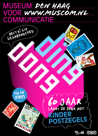
Poster designed by Lava for Museum of Communication
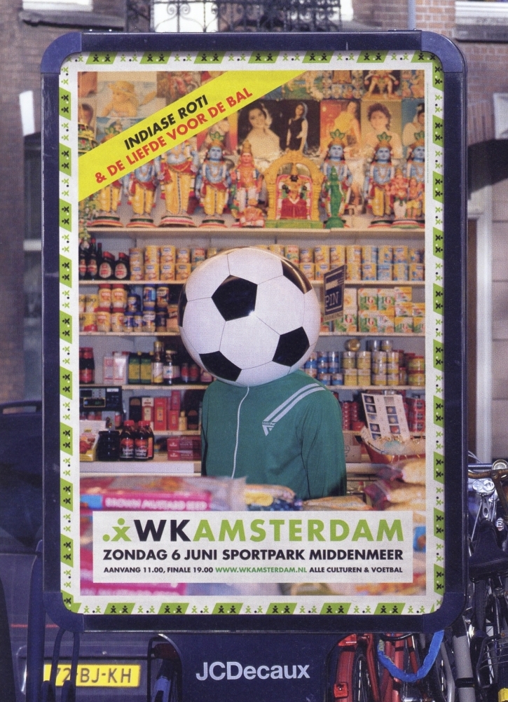
Poster designed by De Designpolitie for WK Amsterdam football tournament, 2004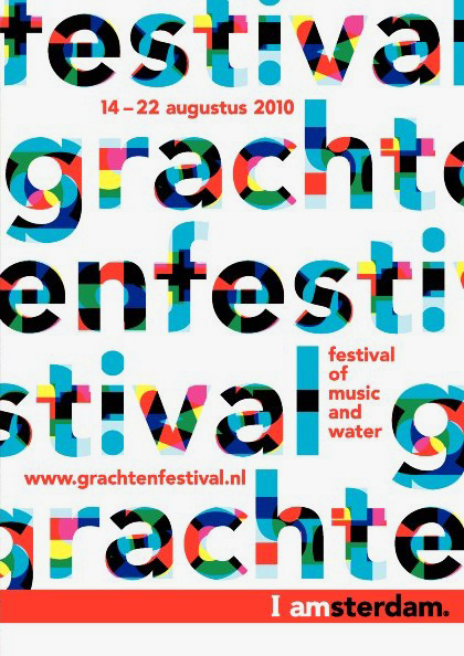
Poster designed by Thonik for Grachtenfestival, 2010. Amsterdam city brand by KesselsKramer
These designers are naturally aware of the Netherlands’ prodigious graphic tradition and, as if to reassure themselves and their design colleagues that they belong in its ranks, they sometimes invoke their forebears, even as they assure potential clients that everything will be simple and effective. Thonik follows its declaration about clear concepts and minimum means by stating that it “also has an anarchistic side and we regard each project as a chance to experiment.” De Designpolitie’s online profile informs visitors that “its members were brought up in the Dutch design culture and rich tradition of Dutch art, design and tolerance.” Their ruthlessly stripped-down designs, they claim, are both critical and communicative. The inherent tension of trying to have it both ways and relate to the great Dutch tradition of graphic design, while moderating the visual freedom that gave it life, can be sensed in a comment that Hans Wolbers of Lava left on Dorresteijn’s Visual Branding website in 2007. “I must tell you honestly that I am not very keen on theories,” writes Wolbers. “One sees regularly all kinds of ‘brand’ gurus selling an incredible amount of bullshit. Personally I place more and more belief in talented creatives that touch the right chord.”
This is another version of Studio Dumbar’s “free spirit” plea: stop trying to micro-manage the design process with an endless stream of self-justifying concepts, precepts and admonitions. Trust talented and committed designers to come up with truly fresh and surprising visual ideas, and then trust visually aware viewers to respond to them. Accept the subjectivity of the creative process, the element of chance, the things you shouldn’t even try to control. Eventually, the wheel might even turn again.
Perhaps it sounds as though I have fallen out of sympathy with Dutch graphic design. The disappointment, as I have tried to show, comes from the strength of admiration that preceded it. Dutch graphic design’s astonishing, inspiring achievements showed what could sometimes be possible in visual communication. Its innovations provided unusually exacting benchmarks that could be used to assess graphic design anywhere. I can only suggest that it would be dishonest now — and self-deceiving on the part of Dutch designers — not to apply these benchmarks to the contemporary graphic design scene.
The authentic historical voice of Dutch design
One of the most encouraging and energising developments in Dutch graphic design has come, since the end of the 1990s, from a perhaps unexpected direction. In Word of Image: Metaphorical Thinking in Dutch Graphic Design (2004), Jan Middendorp reprises the frequently heard view that Dutch designers are “no great theorists”, preferring instead to concentrate on the practicalities of making things work. Wolbers voices his own reservations about the perils of theorising in the statement above. But the idea that theory-averse pragmatism is particular to the Dutch has always seemed questionable: first, because only a minority of graphic designers anywhere are ever much given to theorising; second, because some Dutch designers — Crouwel and Van Toorn to name but two — have always been prepared to reflect trenchantly on the ideas that support their design methods.
In the last decade, two design groups, Experimental Jetset and Metahaven, have taken this commitment to intellectual reflection to a higher plane. Although it hasn’t been widely remarked, which may serve to underline the continuing paucity of close critical attention given to graphic design, both teams consistently offer some of the most cogent thinking about the discipline, its present condition and possibilities, happening today. In each case, independent critical reflection becomes an inseparable component of everyday practice. Nor are these the usual tiresome, spirit-crushing bromides about branding and marketing. Metahaven has recently published a book, Uncorporate Identity (2010), and both studios — they are emphatically studios — are interviewed in Iaspis Forum on Design and Critical Practice: The Reader (2009). Since space is limited, I will concentrate here on Experimental Jetset, the longer established team.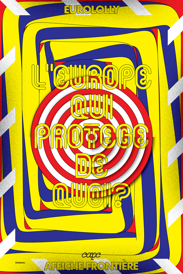
Poster designed by Metahaven for CAPC Musée d'art contemporain de Bordeaux, 2008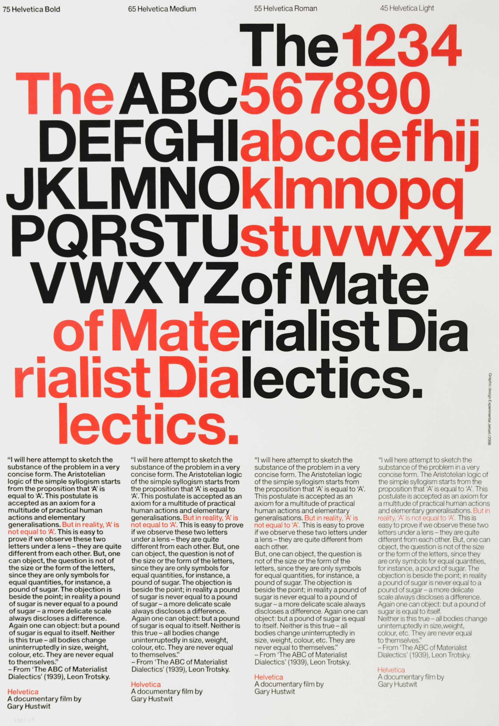
Poster designed by Experimental Jetset for Helvetica documentary, 2006
In Experimental Jetset’s uncompromising statement of their position, we hear the authentic historical voice of Dutch graphic design, a reminder of how the country attained its elevated position on the global design stage. The three members, Erwin Brinkers, Danny van den Dungen and Marieke Stolk, explain that “the reason we exist as a studio is because we have a singular aesthetic/conceptual vision, a very specific language we speak.” (See Studio Culture, 2009.) They are only interested, they say, in working with clients who understand this vision and who expect them to bring “a specific viewpoint, an aesthetic/conceptual language, an ideological approach” to the table. Clearly, this is a radically different style of self-presentation from one that promises a chameleonic ability to adapt the design output to fulfil a client’s expectations.
Experimental Jetset have a self-conscious relationship with the Dutch design tradition, most clearly seen in their frequent tributes to Wim Crouwel, the elder statesman most revered today by young designers outside the Netherlands. As a viewer, I have sometimes struggled with the Crouwel-esque modernism of Jetset’s visual palette. This doesn’t excite me greatly in 2010, even though I appreciate the source and understand the thinking — their desire to stress the materiality of design and create objects rather than images — that led them to these stark visual conclusions. It is characteristic of their clarity as commentators, though, that they freely admit the drawbacks of their hero’s former empire. “Total Design signalled in many ways the beginning of the sort of studios that we very much dislike: large communication conglomerates, where the actual practice of graphic design is overshadowed by branding strategies, marketing theories, advertising models, etc.” In their view, the over-complication of the commissioning and design process has been caused by layers of marketing and communication people who create unnecessary work to keep themselves employed.
“We feel we are now at a point in history where we actually have to go in the opposite direction,” they say. The solution to the bloating of the design business is not for design “agencies” to grow even bigger, but for marketing to shrink. Resolutely, Jetset remains a three-person studio that only takes on what it can handle. Here again, we encounter a variation of the “free spirit” argument, only his time from a studio that has found a way to make freedom of manoeuvre a central plank in its self-determined charter. If we care about graphic design — Dutch graphic design — as a still potentially limitless means of visual communication, then this modest proposal from one of the most thoughtful studios now at work in the design field must be correct. The future of graphic design, if it is to have one, can only lie in focusing on graphic design. Dutch designers who refuse to give up the ideal of studio practice are keeping the flame alight.
This essay first appeared in the Dutch Design Yearbook 2010 (NAi Publishers, Rotterdam, 2010) and is republished here with permission.
A Dutch translation of the essay is available here.

