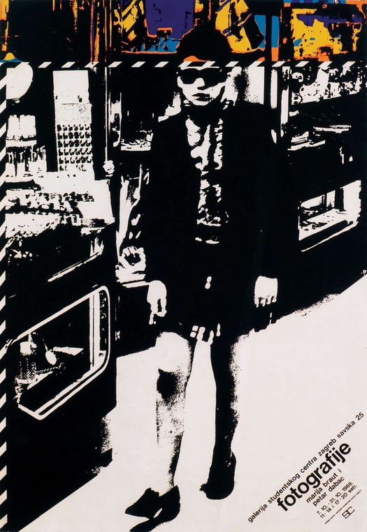
Boris Bućan, Marija Braut and Peter Dabac: Photographs, Student Center Gallery, silkscreen, 1969
In 2002, on a visit to Zagreb, the capital of Croatia, a colleague took me to an exhibition of posters that she thought would interest me. It was a cold winter day, there was slush underfoot and we trudged across a deserted courtyard to find the gallery’s entrance. The place was closed and my companion had to unlock the door. I had no idea what I was about to see. The posters inside, lining the walls with such cool authority, were by Boris Bućan, a designer from Zagreb until then barely known to me, and they dated from the late 1960s and early 1970s. For their time, these stark, conceptual designs seemed to me to be remarkable. This focused and private viewing was like being initiated into a secret circle.
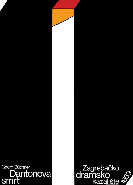
Boris Bućan, Danton’s Death, Zagreb Drama Theater, silkscreen, 1969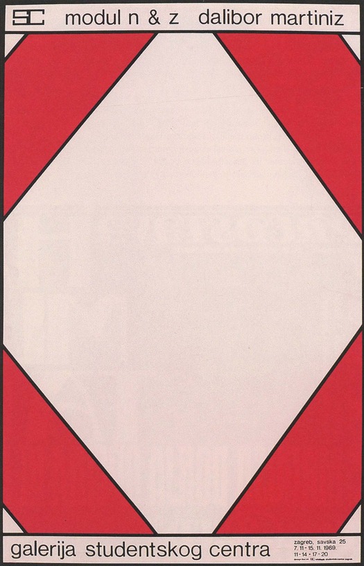
Boris Bućan, Dalibor Martinis: Module N & Z, Student Center Gallery, silkscreen, 1969 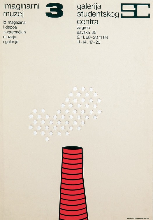
Boris Bućan, The Imaginary Museum 3, Student Center Gallery, silkscreen, 1968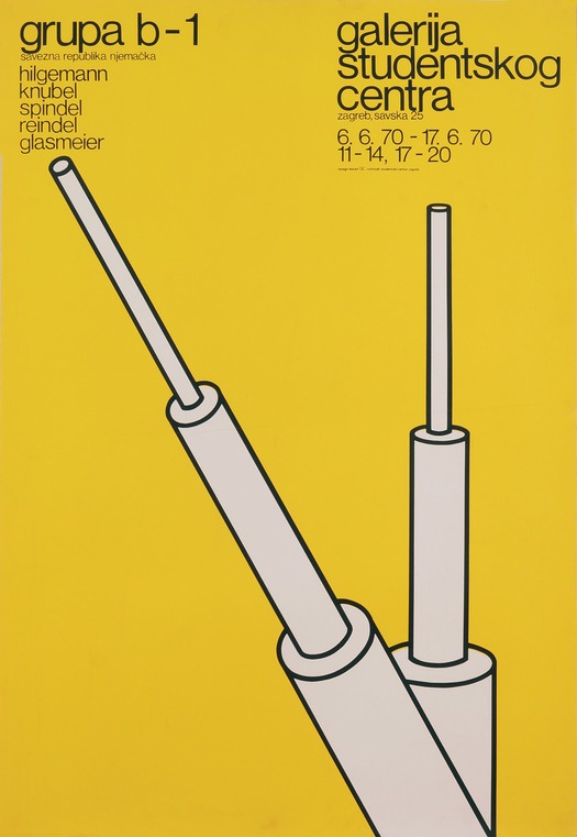
Boris Bućan, Grupa B-1, Student Center Gallery, silkscreen, 1970
I intended to write something about the posters, but a good opportunity never seemed to arise — the task would require another visit to Zagreb and perhaps the services of an interpreter, which is never ideal — and the moment slipped by. A book about Yugoslavian visual culture that I mentioned here recently, Socialism and Modernity, reminded me of Bućan’s early work, and around the same time there was an exhibition in Paris of his later posters, which are much more ornate and painterly in style. If Bućan, born in 1947, now has a growing Internet presence, it’s largely thanks to publicity generated by the enthusiastically received French show. Even so, the early posters, which seem more interesting than ever in light of graphic design’s conceptual turn in the last decade or so, remain all but invisible online, though MoMA has three acceptable examples. Recently, rummaging through some old CDs, I found scans of the early posters sent to me a few years ago by Dejan Kršić, author of the chapter on graphic design in Socialism and Modernity. I present them here.
What still seems surprising about these posters designed for the Student Center Gallery, the Zagreb Drama Theater, and other clients is how confidently reductive they are. If this is not quite anti-design, it is certainly design gripped by a powerful sense of restraint. The most obvious contemporary parallels are from art, not graphic design, from Patrick Caulfield’s deadpan delineations of objects to the suspicion of images surfacing widely at that time in early conceptual art. We should make allowances, though, for the distortions of small-scale reproduction on screen. Elementary as they might appear here, stylized devices such as the telescopic poles (above) and the inflated strawberry have high impact at their original size because they are so pared down and diagrammatic, so uninflected by sentiment, as to seem barely illustrative at all. 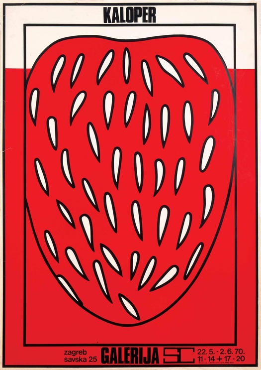
Boris Bućan, Jagoda Kaloper, Student Center Gallery, silkscreen, 1970
Far from being a joyfully succulent image, the strawberry is squeezed by a box that doesn’t fit, and threatens to drown in a rising tide of juice. In the poster (third from top) for Dalibor Martinis, who would go on to have a long career as a video artist, the incomplete diamond-shaped frame offers only a central void. I remember my impression, confronted by a gallery full of these images for the first time, of how sharply defined, cerebral and enigmatic they appeared. They have something of the same rigor as Jan van Toorn’s contemporaneous posters for the Van Abbemuseum Eindhoven, though they make Van Toorn’s austere visual concepts look effusive by comparison.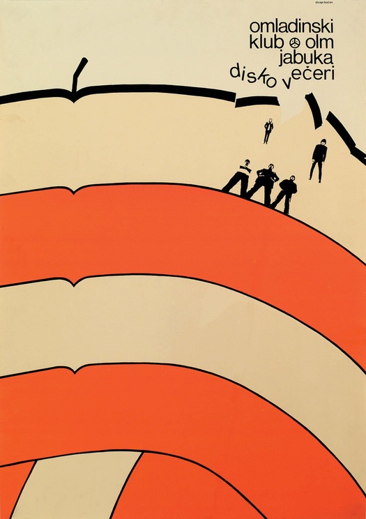
Boris Bućan, Jabuka Youth Club, silkscreen, 1969
Yet Bućan’s posters also possess a light touch without becoming twee. They are humorous, too. In the poster for an exhibition of work by Total Design, Bućan caricatures the modernist Dutch design company’s method as a sheet of Letraset Helvetica missing the 22 letters used to construct the exhibition’s title, “TD total design amsterdam.” This poster also cautions against aligning Bućan’s designs with Swiss-derived modernism simply because they favor clear forms and lower-case sans serif type. There is little sign that he relished the aesthetic properties of Swiss Style for their own sake and he quickly left such severity behind.
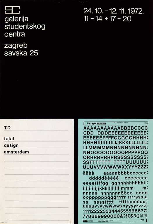
Boris Bućan, TD total design amsterdam, Student Center Gallery, silkscreen, 1972
“Bućan’s basic communicative idea was paraphrase and irony,” writes Fedja Vukić in A Century of Croatian Design (1998). “His witty ideas were always based on his belief that humor can replace seriousness and enables a better communication with the spectator and recipient of the message.” Kršić, too, sees Bućan (like his contemporary Mihaljo Arsovski) as a designer “whose work method was not defined by aesthetics and visual parameters, but primarily by an idea, concept, and communication.” In a photographic poster for a 1972 exhibition of Arsovksi’s work at the Student Center Gallery, Bućan frames and celebrates the random collisions of the poster wall — a picture of the chaotic street conditions in which design must so often operate.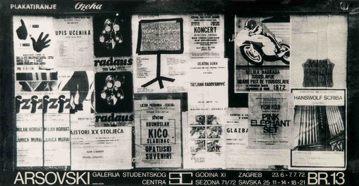
Boris Bućan, Mihajlo Arsovski, Student Center Gallery, silkscreen, 1972
This early phase in Bućan’s career as a poster artist lasted just four or five years and it has been eclipsed by the more lavishly pictorial images that came later. In 1998, the Victoria and Albert Museum used the most famous of these designs, from 1983, for the cover of The Power of the Poster. Today, Bućan has a dual career as both designer and artist. Nevertheless, it’s the internationally unknown early work that seems closest to current graphic interests and tastes, whether seen as a precursor of conceptual design, or as a forebear of the graphic minimalism that has flourished with such persistence in recent years.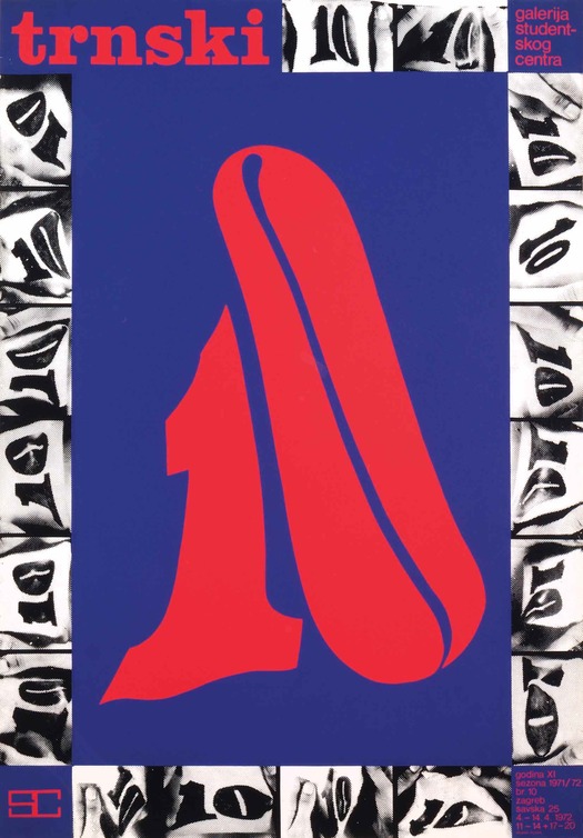
Boris Bućan, Trnski 10, Student Center Gallery, silkscreen, 1972
See also:
Socialism and Modernity: A Hidden History
