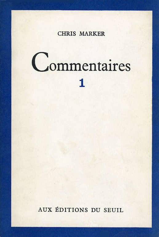
Commentaires 1, published by Éditions du Seuil, Paris, 1967
Chris Marker’s Commentaires, published in 1961 by Éditions du Seuil in Paris, is as innovative as book design as his documentaries are as film essays. This is the book that, 10 years later, inspired Richard Hollis’s landmark design for John Berger’s Ways of Seeing. The volume collects the “commentaries” or scripts — effectively spoken essays — written by Marker for his earliest films. Yet despite the high regard in which the French director (1921-2012) is held for masterworks such as La Jetée (1962), A Grin Without a Cat (1977) and Sans Soleil (1983), Commentaires has received barely any attention in English language writing about design, and I have seen no evidence online that French design writers have given it any consideration either.
The most obvious reason is the title’s rarity now — copies change hands for inflated prices. I have the second edition from 1967, retitled Commentaires 1 and reissued with a companion volume, Commentaires 2, and I am showing pages from the later edition here. There are some minor and insignificant differences: a few small pictures have been removed and a few have been repositioned. In all cases, the layouts have been slightly improved by these adjustments, in my view, though it isn’t clear who made the changes. The 1961 edition has a line in a paragraph of credits saying that the book follows maquettes (layouts) by Marker; this has gone in the reissue, leaving only a credit for Juliette Caputo, who was responsible for overseeing the book.
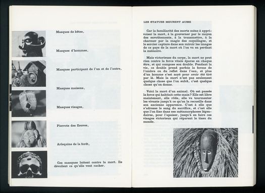
Spread from Les statues meurent aussi (1953) in Commentaires 1, 1967.
The five pictures on the left are laid out slightly differently from the six in the 1961 edition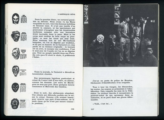 Spread from L’Amérique rêve (1959), outline for an unmade film, in Commentaires 1, 1967
Commentaires presents the scripts of five films directed by Marker: Les statues meurent aussi (1953, co-directed with Alain Resnais), Dimanche à Pékin (1955), Lettre de Sibérie (1957), Description d’un combat (1960) and Cuba si (1961), as well as an unmade project, L’Amérique rêve (1959). In each case, Marker puts stills from the film into or alongside the text. It would be easy to take such plasticity for granted today, although this degree of integration of text and image in a film book, or any kind of small-format book for continuous reading rather than reference, is still unusual. At the time, it was a remarkable accentuation of the image in relation to the text. Marker uses wide fore-edge margins, and spaces between the paragraphs and other kinds of writing, such as song lyrics, to create open, dynamically organized layouts. The effect is to make all the elements appear to float in loosely placed, almost provisional arrangements. Turning the book’s pages, text and image strike the eye as being equally important.
“As you read [Commentaires] you knew exactly what was being talked about,” Richard Hollis notes in an interview with Eye. “It was a substitute for description: instead of talking about something, you show the objective visual evidence. That’s how I wanted to do Ways of Seeing, rather than have images by the side or text followed by a page of images.” In Commentaires, though, the image isn’t a substitute for the text (as it was sometimes in Berger’s book) but rather a selective approximation and evocation of the film experience, running in parallel with the words.
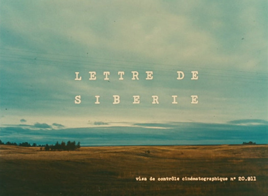
Opening titles of Lettre de Sibérie, directed by Chris Marker, 1957
Unfortunately, none of these films is available at present on DVD in an English subtitled version — another reason, perhaps, why Commentaires has been overlooked. The longest, Lettre de Sibérie (Letter from Siberia), was recently released in France by Tamasa accompanied by Dimanche à Pékin (Sunday in Peking). An English translation of the Lettre de Sibérie script is available at markertext.com. A version of the film with an American voiceover, from an unknown source, can be found in fragments on YouTube, but the loss of Gallic flavor distorts the viewing experience and the image quality is poor.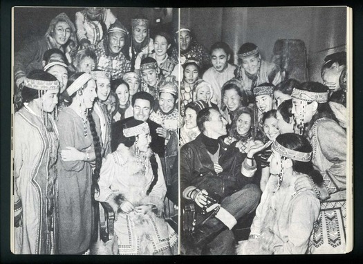
Spread from Lettre de Sibérie (1957) in Commentaires 1. Photograph shows Chris Marker in Siberia
All this might sound rather offputting, but for anyone with an interest in the development of the increasingly significant genre of the essay film, Lettre de Sibérie is rewarding viewing from one of the medium’s pioneers. By the time he made it, Marker had written a novel, worked as a journalist, taken photographs, and acted as an editorial consultant at Seuil, where he supervised the visually and conceptually adventurous Petite Planète series of travel guides. His Siberian “letter from a distant land” — his opening words — is a roving ethnographic report enthralled by everything he encounters and learns about: people, animal life, the landscape, towns, industry, scientific research centers, and the Siberian gold rush. Mixing narrative and rhetorical styles freely, he uses animation to chronicle the history of the mammoth and interrupts the film with a parodic commercial, complete with framed picture of Alfred E. Neuman, to advertise the merits of the reindeer as provider of transportation, clothing, sustenance, decoration and good fortune, as well as making a fine pet.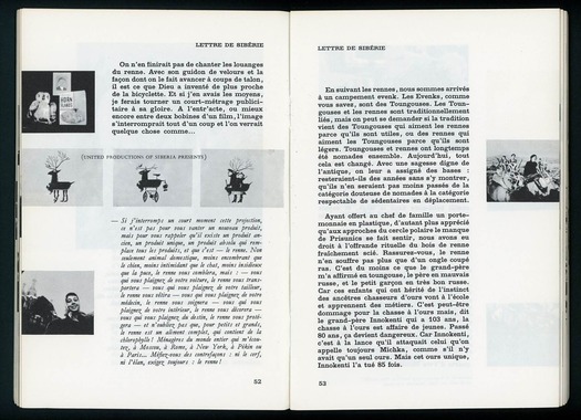 Spread from Lettre de Sibérie (1957) about reindeer in Commentaires 1.
The picture on the right has been moved down from its position at the top of the column in the 1961 edition
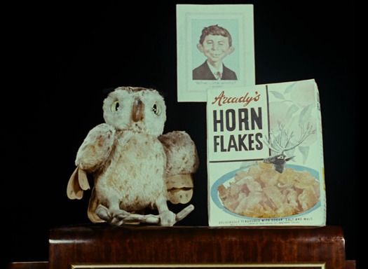
Lettre de Sibérie, directed by Chris Marker, 1957
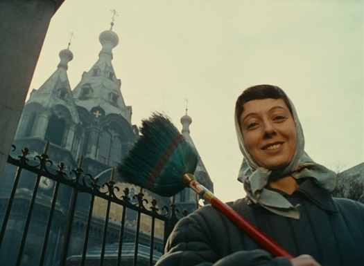
Lettre de Sibérie, directed by Chris Marker, 1957
In one of the film’s most audacious conceits, Marker shows the same sequence three times: a bus goes past, some men work on the road, another man walks by. With each viewing, the voiceover changes to describe the city of Yakutsk first as a worker’s paradise, then as hell on earth, and finally in more measured terms. The man walking by transforms from a “picturesque denizen of the Arctic reaches” into a “sinister looking Asiatic” before becoming merely a worker “afflicted with an eye disorder.” But even objectivity, notes Marker, can end up being a form of distortion; Yakutsk cannot be understood just by walking (and filming) the streets. After this piece of demystification, the reliability of any documentary, including his own, must forever be in doubt. When the sequence is translated into a layout in Commentaires, there is no need to repeat it to make the point. Marker compresses the narrative into a triptych of representative images displayed opposite the three competing modes of voiceover.
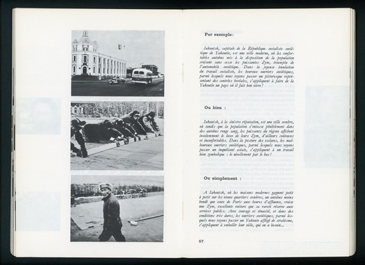 Spread from Lettre de Sibérie (1957) about Yakutsk in Commentaires 1
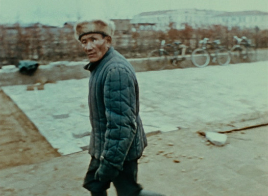
Lettre de Sibérie, directed by Chris Marker, 1957
One final example taken from a sequence about the Siberian gold rush that turned the Aldan district into a lawless territory over which the Soviet government, a decade after the revolution, could maintain no control. Marker teases the viewer: “You expected to see Indians? There were Indians, cowboys, sorcerers, trappers, fights and romances.” The oval vignettes used on the page on either side of the descriptions are a direct re-creation of the devices employed ironically in the film to mythologize the figures in these old photographs. A bearded, modern-day worker living in the area is shown in the same manner before the moving image expands, like an iris-in, to fill the full frame.
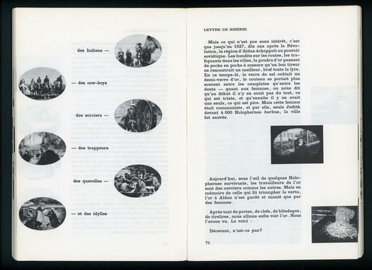
Spread from Lettre de Sibérie (1957) about the Siberian gold rush in Commentaires 1
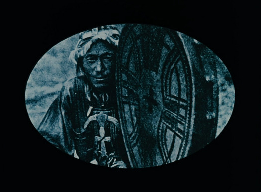
Lettre de Sibérie, directed by Chris Marker, 1957
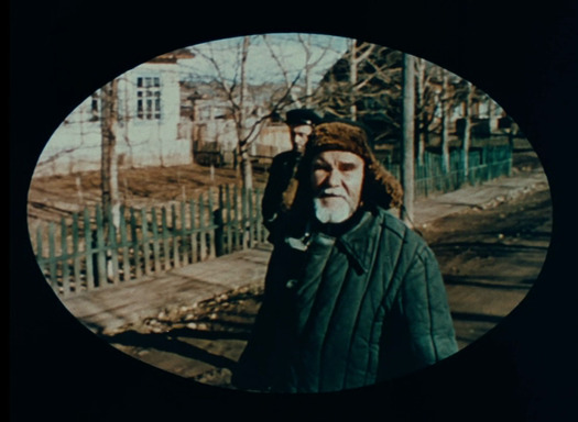 Lettre de Sibérie, directed by Chris Marker, 1957
The final likely reason that Commentaires has been neglected as a piece of advanced editorial design is that its layout was not the work of an established graphic designer. We are back to the familiar limitation that graphic design history tends to concern itself with the output of people formally identified as professional designers. As it happens, Marker was an outstanding example of the kind of communicator many designers now aspire to be, a versatile, multi-talented figure able to cross disciplinary boundaries — in his case writing, photography, filmmaking and design — and combine these endeavors in a unified personal life project. It’s hardly surprising that critics who analyse his work primarily as a filmmaker haven’t taken a close interest in Commentaires, the multi-volume Petite Planète series (1954-64), or Coréennes (1959), his book of photographs of Korean women, as designed objects. The two volumes of Commentaires are highly imaginative, inventive and challengng interpretations of the book form and, quite apart from their importance as documents in film history, they rightly also belong within an expanded historical understanding of editorial design.
See also:
Commentaires (1961) full pdf
Commentaires 2 (1967) full pdf
Chris Marker: Notes from the Era of Imperfect Memory
The exhibition Chris Marker: A Grin Without a Cat will be at the Whitechapel Gallery, London from April 16 to June 22, 2014.
