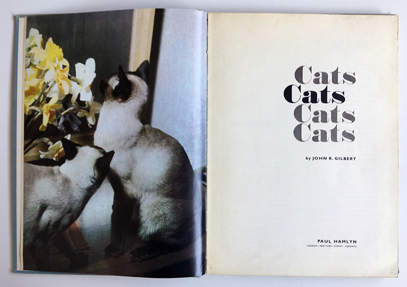
Cats Cats Cats Cats title page, designer unknown, 1961
When I present a project, and a client is pleased, I often say, “It’s easy to do good work with a great subject.” Which is, in fact, relatively accurate. For example, many of the books submitted for competition are often about photography, art, or cultural issues. Young designers typically have book projects, completed in school, with the same esoteric content. It’s rare, as a competition judge, that I find a book on semi-trucks. Of course, I have nothing against beautiful books about photography or fine art. I’ve designed many of these. But, I appreciate a beautiful book about wrenches with admiration for the bland subject and beautiful design.
Piet Zwart’s catalog for NKF (1928) is a perfect example of a common subject. Produced for the Netherlands Cable Factory (actual cables, not television), the publication is energetic, innovative, and typographically flawless. What could have been a mere catalog of cables became one of the twentieth century’s iconic pieces of design. If anyone doubted the maxim there are no bad subjects, just bad designers, the NKF catalog is the proof.
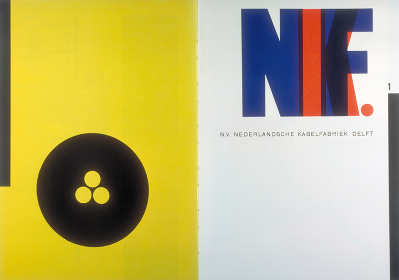
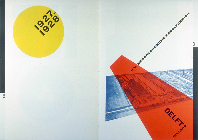
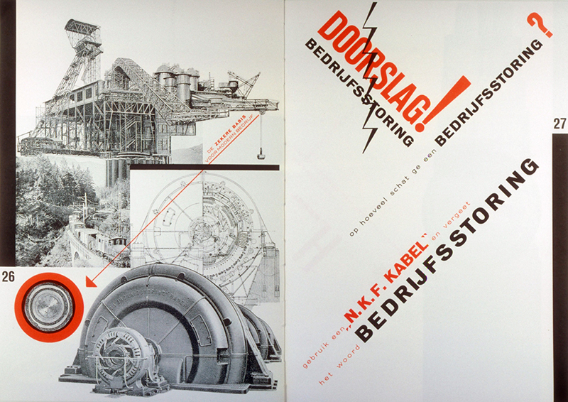
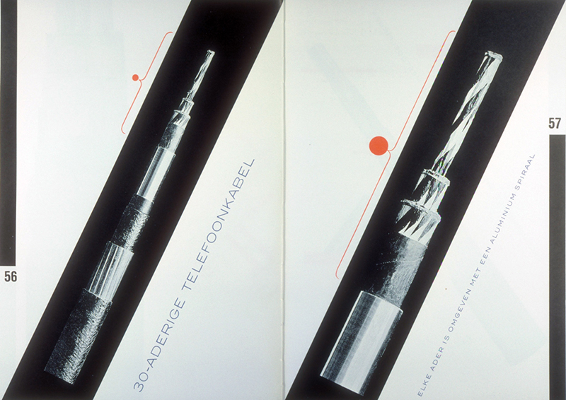
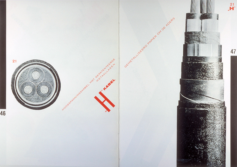
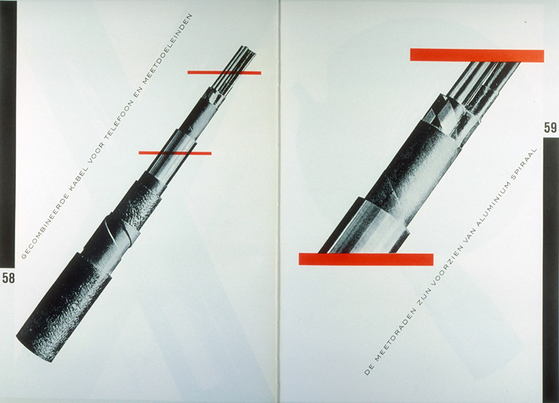
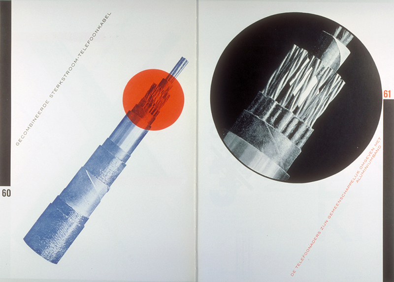
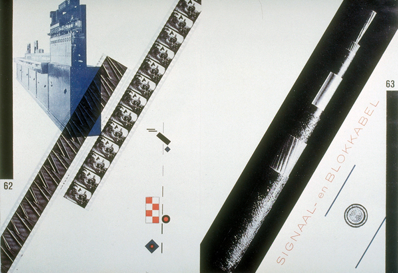
NKF catalogue pages, Piet Zwart, 1928
My response to the issue of purpose and design is to assign a book project based on dull content. Before the term begins, I visit an eccentric used bookstore in North Hollywood that focuses on the occult and New Age material. I go there, not for the books on astrology, but for the giant table of books under $5. The subject matter varies, and I carefully select the most banal or disturbing books. It is awkward and somewhat rewarding to hand a stack of books to the cashier with titles that include, Sensual Massage and Loving, Wrenches, Lithography in Theory and Practice, The Cars of the 1970s, and The Costumes of Liberace. In class, students choose one book and reframe, augment, or interpret the content and redesign the book to reflect the new concept.
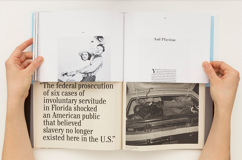
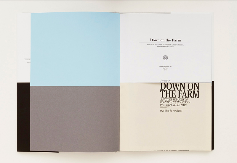
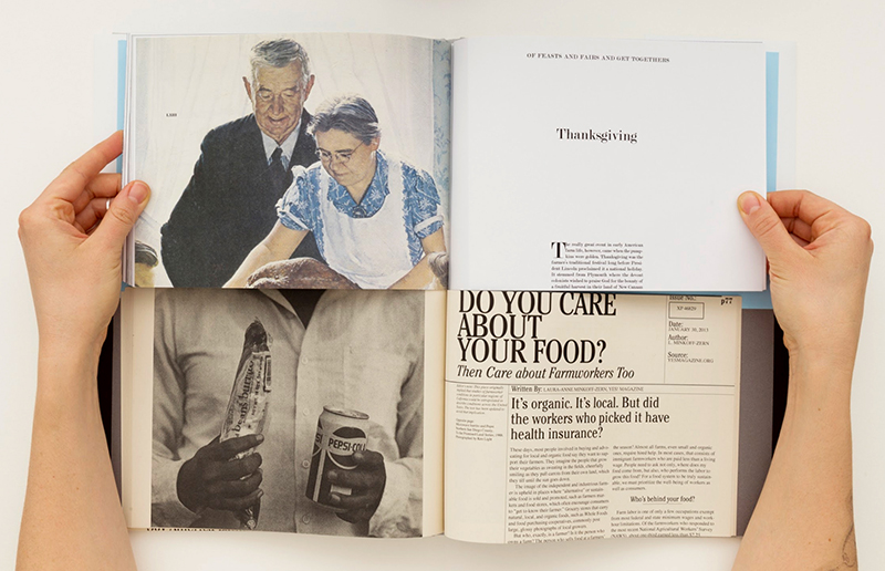
On the Farm spreads, Simona Szabados, 2016
Designer Simona Szabados’ book used On The Farm (1948) as the basis for her redesign. The original content focused on the joys of living on a farm, traditional gender roles, and a bucolic agrarian existence. Szabados used the text of the book and designed a classic and large-scale format to augment the utopian message. She incorporated Bell, a 19th-century typeface, and nostalgic illustrations and photographs of farm life. But, she also designed a second book, this one dealing with contemporary issues of immigration and migrant farmworkers. Szabados used straightforward journalism imagery and typography related to newspapers. When both books were complete and printed, Szabados cut them in half horizontally. She bound them together with one-half of the utopian book on the top, and one-half of the immigration book below. The result is a book that only tells part of each story; both concepts slam into each other.
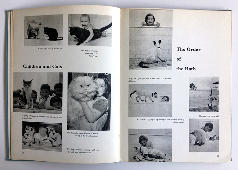
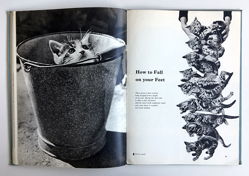
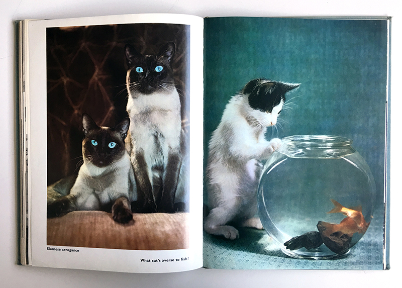
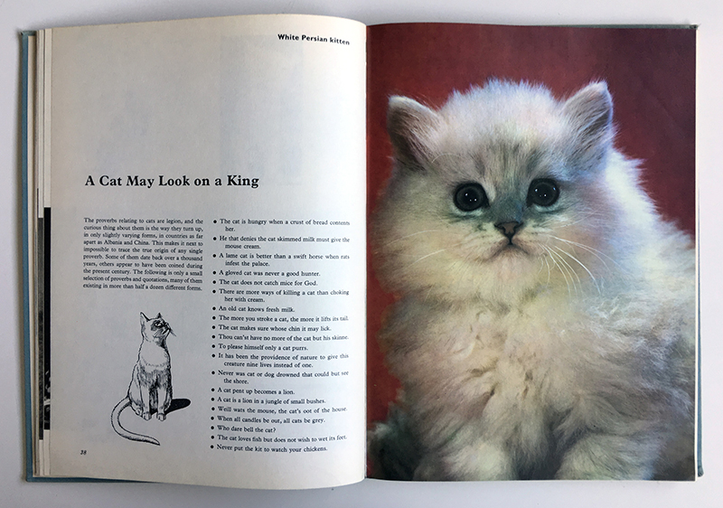
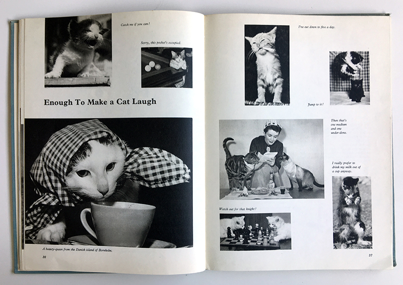
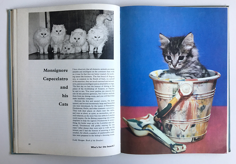
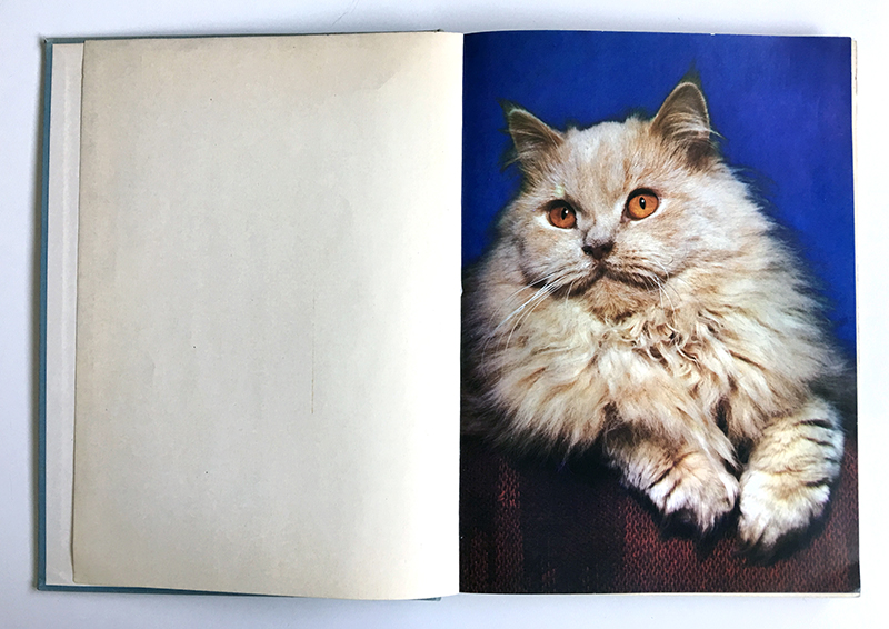
Cats Cats Cats Cats spreads, designer unknown, 1961
Unfortunately, nobody has chosen my personal favorite. Each term I bring it in and push it like a drug, but there are no takers. Personally, I love the book. The title is ambiguous and direct: Cats Cats Cats Cats (four “Cats”) on the title page, or Cats Cats Cats Cats Cats (five Cats”) on the spine. This book is what people gave as a gift before the internet and funny cat videos. I can’t imagine the selling points when the author approached the publisher. The content is remarkably shallow and pointless with subjects such as cats in the bath, funny cats, the feelings of cats, and cats that look like kings.
Perhaps the audience was die-hard cat lovers who only wanted a book with cat photos. Much of it is indeed an arbitrary excuse for an image. There are useful tongue-twisters to be said five-time fast, like “The Past of Cats.” However, I do not believe the cat was feeling “mirth.” I don’t want to be overly critical of the cover, but that is not a cat. It is a dog with a funny tail. The book, however, provides the valuable and often ignored option of using one title on the spine and changing it on the title page if it looks better shorter. If Ladislav Sutnar could make cables poetic, surely, someone can save the Cats Cats Cats Cats book.
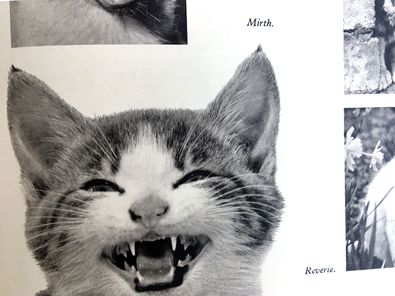
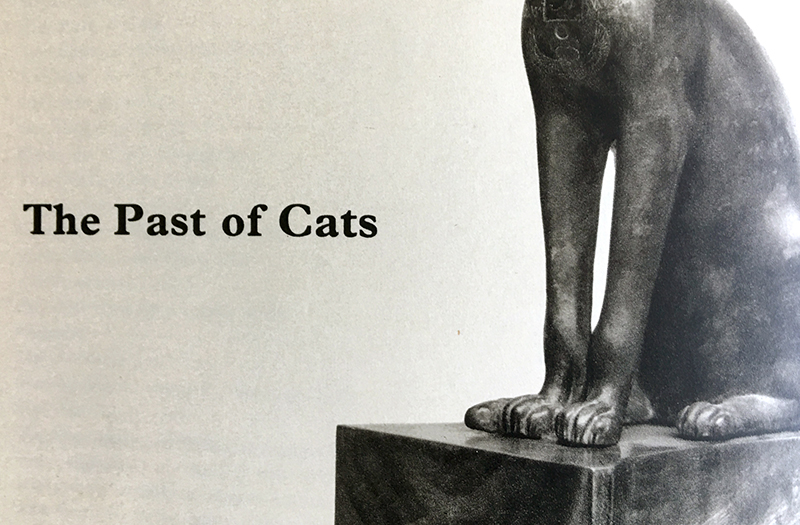
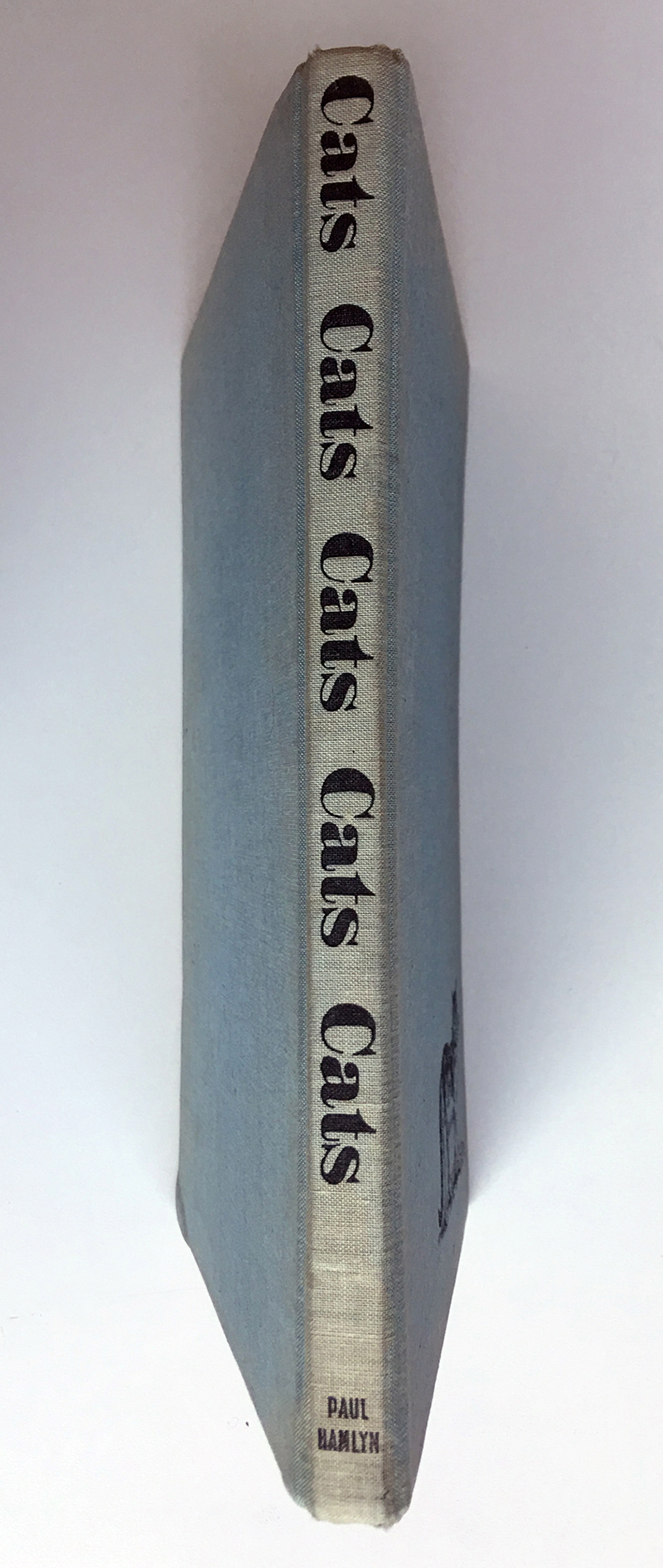
Cats Cats Cats Cats details and spine, designer unknown, 1961
