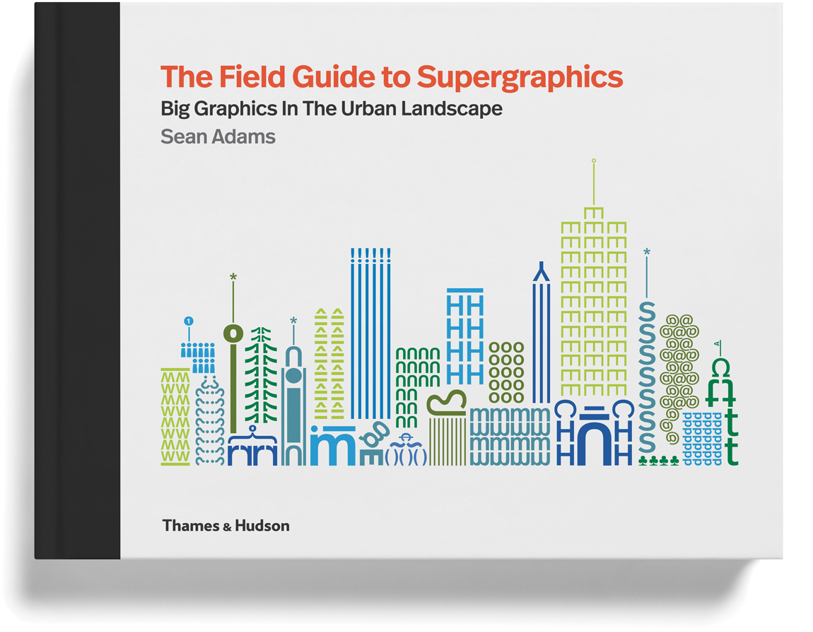
When faced with a composition that is not working, or an idea that is not communicating, I typically make the parts giant or tiny. Design that is polite, medium, and “meh,” is just plain dull. Remarkable large scale environmental graphics (supergraphics) are a testament to the power of big. To promote these concepts, I wrote a book that celebrates environmental graphics that change culture, affect behavior, and improve pedestrian experience.
There are clear masterpieces of supergraphics such as Lance Wyman’s Mexico City Olympics (1968), Deborah Sussman’s Los Angeles Olympics (1984), Barbara Stauffacher-Solomon’s Sea Ranch (1965). I wanted to find the best examples of the next generation of designers and artists in the field. The end product is The Field Guide to Supergraphics: Big Graphics in the Urban Landscape. The best part of writing a book is learning about a new approach, or discovering incredible designers. This book did both. And for those concerned about the size, it’s much thicker than I expected. It has 384 pages.
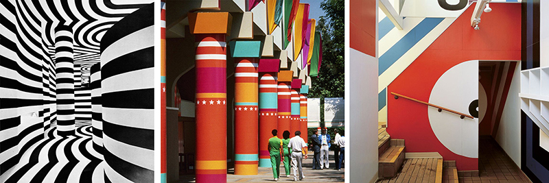
LEFT: Lance Wyman, Mexico City Olympics, 1968. CENTER: Deborah Sussman, Los Angeles Olympics, 1984. RIGHT: Barbara Stauffacher-Solomon, Sea Ranch, 1965
The following text and images are excerpted from The Field Guide to Supergraphics: Big Graphics in the Urban Landscape, Sean Adams, Thames & Hudson, 2018
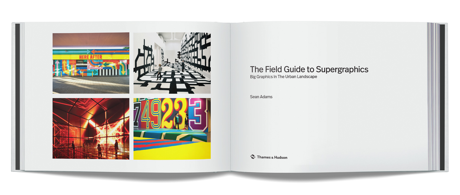
HERE AFTER, London, England, Craig & Karl, 2017. Rapport: Experimental Spatial Structures, Berlin, Germany, J.Mayer.H, 2011. Magic Box, State Grid Pavilion, Shanghai, China, ATELIER BRÜCKNER GmbH, 2010. Adidas Gym, Germany, Herzogenaurach, Germany, Büro Uebele, 2011
Introduction
As a species, we have added language and imagery to our structures for thousands of years. The Egyptians adorned their temples with hieroglyphs and paintings to tell stories and explain how to live and die. The Olmec and Aztecs built large cities and huge pyramids, and then filled the interiors with words and images. Western cultures built great cathedrals and used stained glass and Biblical stories to create narratives for a mostly illiterate population.
Today, we continue to use words, symbols, images, and forms as part of our built environment. We may not be telling the story of Hathor, Quetzalcóatl, or Moses, but we use design to bind communities, create branded spaces, help a visitor find the way, and create delight with colour and typography. Supergraphics were long considered an inferior form of communication, used on dull architecture to hide flaws, and in many instances, this is exactly what happened.. Large bands of coloured stripes adorned bland waiting rooms and municipal government offices in the 1970s. However, the definition of supergraphics has changed over the last twenty years. Once, only a large geometric design on a wall or building was a supergraphic. Today, the term encompasses architectural delineation, wayfinding and identifying signage, illustrative murals, and branding elements.
Digital technology now allows for interaction and screen-based media on a large scale. The audience can now actually communicate with an architectural space in a unique and personal manner. The difference between a large overwrought design on the wall and a successful supergraphic is typically based on three points: a strong concept, interaction with the architecture, light, and space, and relationship to the viewer. Many people can paint stripes on a wall, whereas a designer can use the entire volume, sense of place, and context, and change the environment to create a story with words, colour, and shapes. This book includes examples of the best supergraphics internationally. These are evidence of the sense of delight evoked when a beautifully crafted graphic solution, smart concept, and awareness of the community are combined.
 Vai com Deus (Go with God), Lisbon, Portugal, R2 Design, 2008.
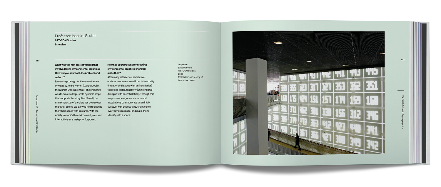
BMW Museum, ART+COM Studios, 2008.
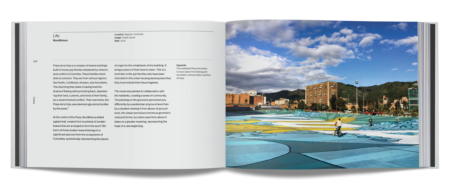
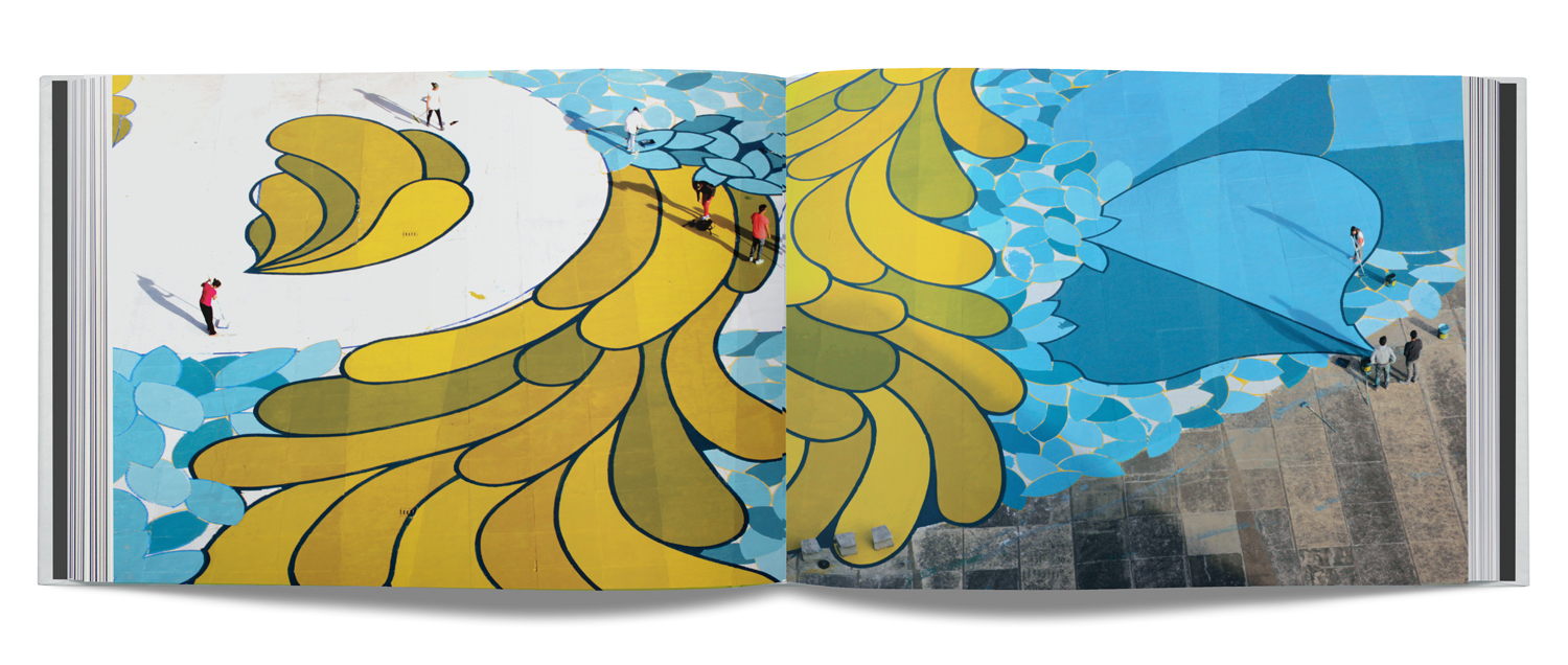
Life, Boa Mistura, Bogotá, Colombia, 2016.
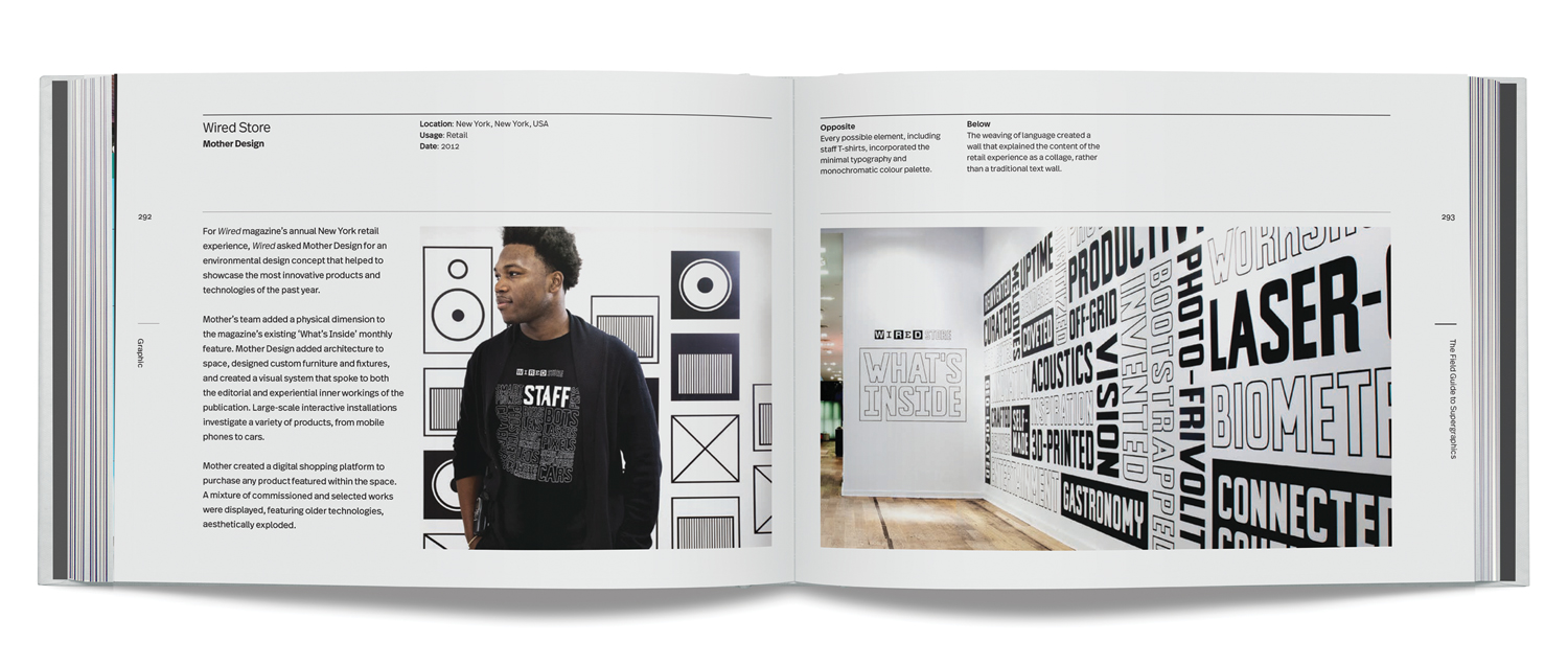
Wired Store, Mother Design, New York, New York, USA, 2012.
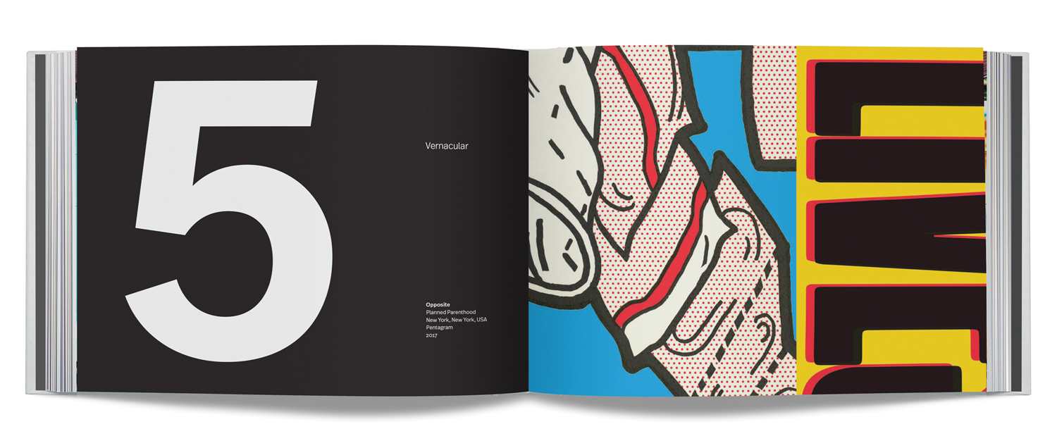
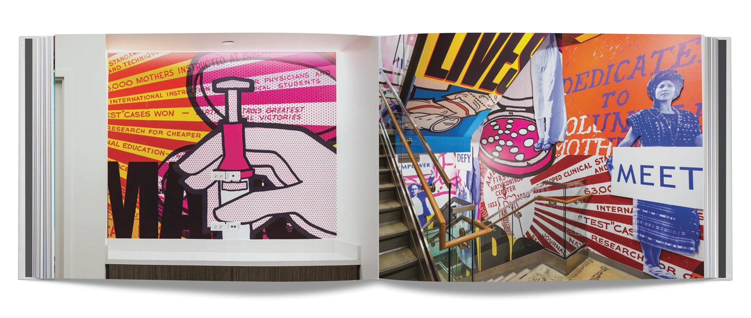
Planned Parenthood, Pentagram, New York, New York, USA, 2017
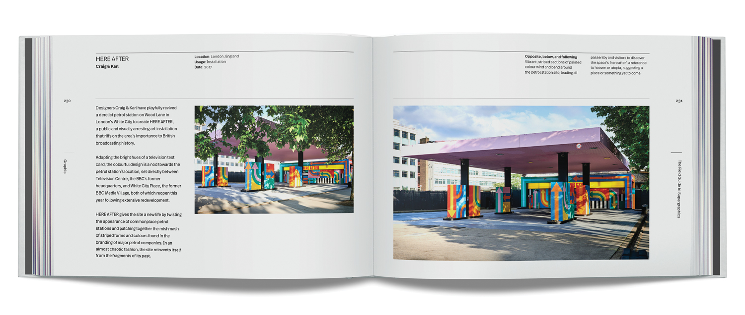
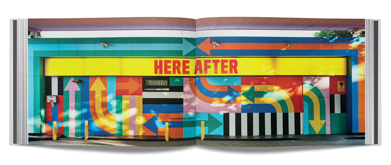
HERE AFTER, London, England, Craig & Karl, 2017
For more, pick up a copy of The Field Guide to Supergraphics: Big Graphics in the Urban Landscape.
