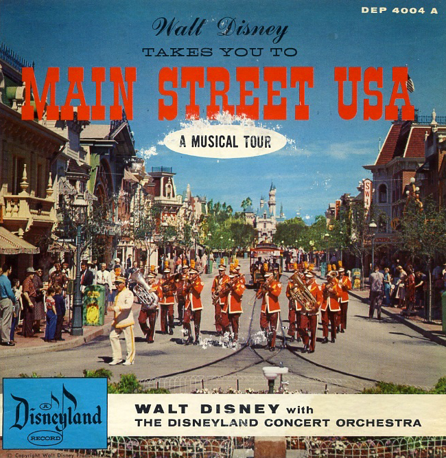
Main Street USA: A Musical Tour Album cover, 1956
Several years ago, the organizers at TypeCon asked me to do a presentation on the typography of Disneyland. I assumed that the research would lead to a collection of novelty typefaces. What I found, however, was an incredibly dense design solution beyond typography with intentional choices to create a specific experience. The typography, color, scale, point of view, sounds, and smells worked as a whole communicating energy, invention, American ingenuity, mid-western values, and reassurance.

Warrensburg, Missouri, ca. 1890s, Main Street, USA, ca. 1955
Main Street, USA, is the entry point at Disneyland, Walt Disney World’s Magic Kingdom, and other Disney parks globally. It is a representation of small-town America at the turn of the twentieth century. Main Street is not a perfect recreation of a town in 1890. There are no garbage filled doorways, telephone poles, muddy streets, and rather unpleasant drunk people carrying guns. Main Street is a representation of the idea of a mythical small town.
Disneyland’s original designers came from a film background. They designed every element to work cohesively to convey a narrative. Main Street is not a cute and saccharine mini-mall of false fronts. It is a well-considered and detailed construction.
The park’s guests are not spectators in the environment. They are actors on a stage. The designers created the experience of entering the park to simulate the beginning of a motion picture theater experience. The guest passes through a dark tunnel below the railroad tracks in the same way that theater lights dim as a film starts.
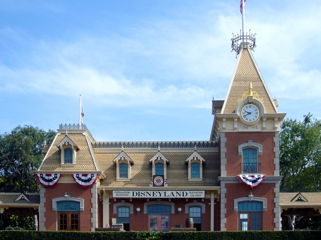
Disneyland Railroad Station
Posters highlighting attractions in the park serve as coming attractions. The guest exits the tunnel into the light and sets foot onto the Main Street set. But, unlike a film, the guest is now integrated as a participant in the narrative. These filmic devices are repeatedly employed.
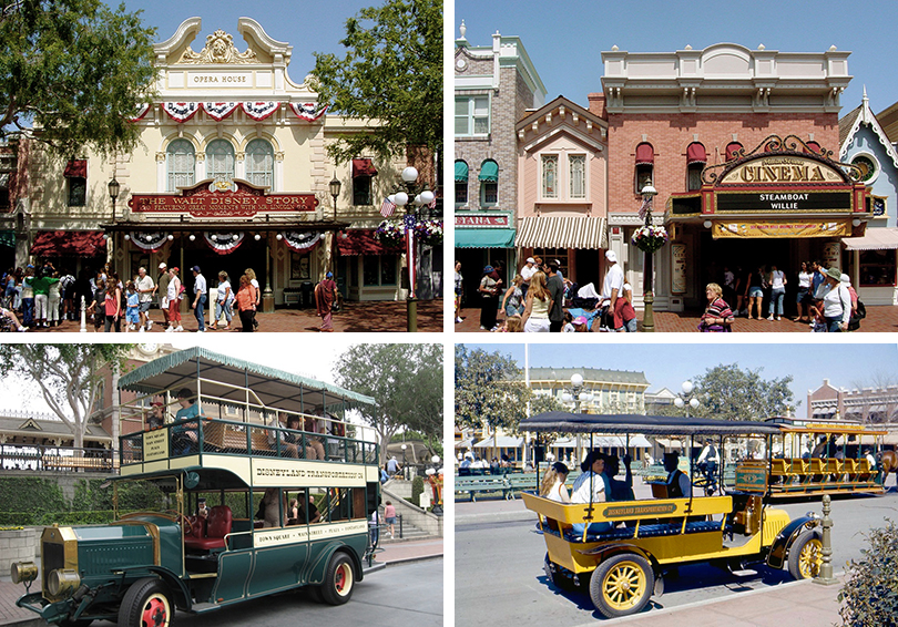
Main Street lighting and vehicles
While Main Street may seem to be a quaint and sleepy small town, it is representative of a period of intense social and technological change in America. New inventions such as the telephone, phonograph, the telegraph, and motion pictures confront the guest as she moves along the street. The railroad embodies the opening of the American continent. Horse-drawn streetcars operate alongside the early automobile. The street-lights change from gas-powered at the north end to electrical nearest the railroad station. These subtle changes in technology communicate innovation, self-reliance, youth, and optimism in the future.
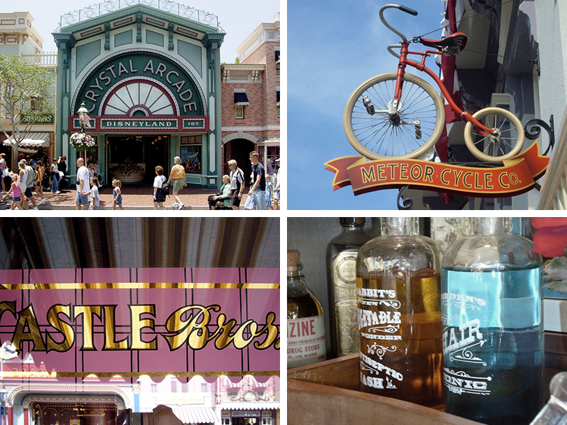
Main Street signage, establishing-shot, long-shot, medium-shot, and close-up
The typography helps to unify the experience and create distinct points of view for the guest. He or she sees typography for the entire street as an establishing-shot. The larger signage at the second story level, such as the Crystal Arcade, is a long-shot. The signage that runs along a horizontal band above the entrance of each shop is a medium-shot. The messages of information on the windows or in the displays serve as the close-up. While the typography is different on each sign, they work together using forms that may not be historically accurate but are what we “think” typography was in 1890.
A typical small town street will have signage competing for dominance and unique forms. One building is torn down, and a new one in a different style replaces it. The drug store installs a large plastic illuminated sign out of scale with the market next door. A shop-owner decides that a garish color is an excellent choice for the storefront. On Main Street, a harmonious set of forms and colors replace these jarring visuals.
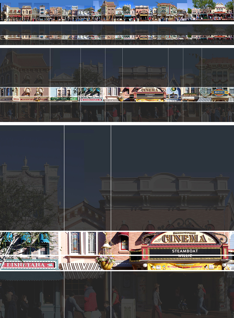
Main Street signage horizontal bands
First, decisions of unknown outcome create stress. The different, yet unified signage serves to generate a sense of comfort for the guest. The typography defining the structures reassures the guest that there is no wrong choice. Each decision is safe. From a distance, she can determine the building's purpose. The window signage provides a more personal invitation to the guest as she moves toward the store.
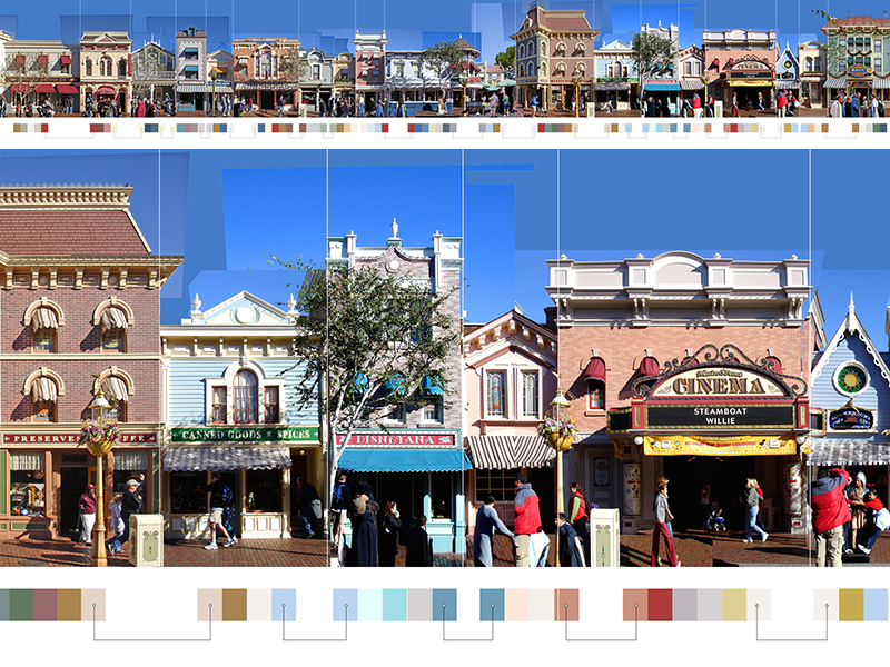
Main Street color palettes
Second, the color palette also reinforces the sense of comfort and reassurance. The colors are not a straightforward palette of limited choices. A palette of only five colors creates a flat and pre-fabricated simulated environment. A dominant color identifies each structure. The park's geographic location informs the palette. Main Street in Florida has cooler tones to offset the heat. Disneyland in California has neutral colors.
The buildings are unified and harmonious using a classic technique in set design. The designer applies a color of the first building on the next as an accent color. He or she then paints that building’s color on the following as window trim, and so on. The effect is a calm juxtaposition. Although the guest may never notice the color connections, a blue structure coexists next to a pink one, and they appear somewhat related.

Main Street east and west
Reassurance and optimism in the future are two themes that are repeated on Main Street. The design choices allow the guest to integrate these personally, beyond the experience of viewing a film. There are many arguments to be considered regarding the economic, social, cultural, and architectural questions are raised with the simulated experience. The success of Main Street as a guest experience is based not on exciting attractions or recurring character sightings. It is a demonstration of the gestalt in design as the viewer’s perceptions are formed with the interaction of multiple elements and media to create a narrative.
