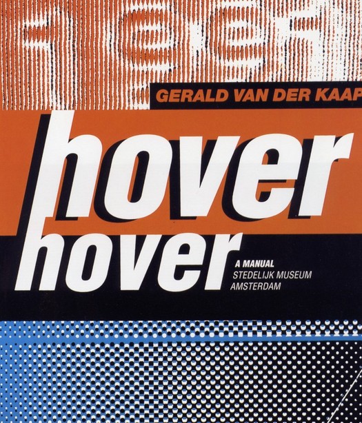
Hover Hover catalogue cover by Mevis and Van Deursen, 1991
Armand Mevis and Linda van Deursen belong to that elite group of designers who possess the magic ingredient that qualifies them, at least for a time, as it. How do we recognise such designers? One of the most reliable indicators is the Idea magazine portfolio test. If the punishingly expensive Japanese über-review features your work, you are well on your way to design hipdom. If its roving editors make you a cover-story centrepiece, devoting 60 or so pages to a no-holds-barred project round-up, and encourage you to lay out the whole thing yourself in an act of exquisite self-deification, you have unquestionably arrived. Welcome to the club.
Mevis and Van Deursen are now paid-up members, along with Alexander Gelman, Tomato, M/M, Cyan, The Designers Republic, Jonathan Barnbrook, and other luminaries. The Dutch duo has just been profiled in Print magazine's European Design Annual, their work features in "The European Design Show" at the Design Museum, London — another copper-bottomed guide to international design coolness — and a monograph about them, titled Recollected Work, has been published in The Netherlands by Artimo.
While they may seem like newish arrivals, they are now in their 40s and began working together in 1986 after studying at the Rietveld Academie in Amsterdam. It was an interesting moment for Dutch design. The country's designers had made an exceptional impact in the 1980s and, as the 1990s began, it was natural to wonder whether they would be able to produce successors to design figureheads such as Wim Crouwel, Jan van Toorn, Anthon Beeke and Gert Dumbar — Mevis and Van Deursen had been interns at Studio Dumbar. By 1991, when they designed the startlingly confident Hover Hover Stedelijk Museum catalogue for Dutch artist Gerald van der Kaap, Mevis and Van Deursen were producing highly distinctive work, but they were modest with it. I wanted to publish a profile of them in Eye. They felt they hadn't done enough, though in 1992 they agreed to a short feature. They attracted attention throughout the 1990s, but never became "industry leaders". They still haven't got round to designing their own website. The book could have come out several years ago if they had wanted.
Is it true, then, as the Design Museum claims, that Mevis and Van Deursen "have played a critical role in modernising Dutch graphic design and redefining it as a dynamic medium"? It's not clear how. Dutch design has been famous for decades for being unusually modern and dynamic. They seem more like a continuation of this tradition than a radical departure. Yet they have certainly had an influence on younger designers through their teaching — Mevis at Jan van Eyck Academie, Werkplaats Typografie and Yale, Van Deursen at Rietveld Academie and Yale.
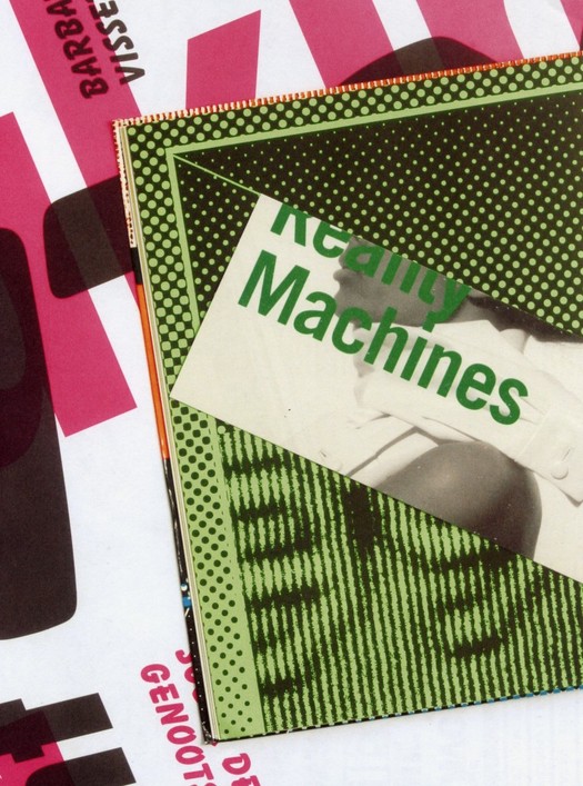
Recollected Work is shot through with ambivalence about the undertaking. Their friend, fellow Yale teacher and occasional collaborator Paul Elliman is a quirkily original thinker and I was looking forward to hearing his analysis. His text, "Too Much Information", turns out to be a series of transcripts based on conversations with them, but only Mevis and Van Deursen's side of it. Although they were both involved and speak in the first person, the narrative appears to be uttered by a single speaker. Mevis and Van Deursen drop short blocks of this text into the flow of visual material, a continuous collage made from fragments of their output. Seventeen years of work blurs together, like grubby laundry turning over and over in a washing machine. Nothing has any space around it. Everything becomes flotsam. Any sense of development is erased. To find out what these glimpses of work represent, you have to turn from the small reference numbers to the back of the book where they list all the jobs.

Page from Recollected Work showing a recycled page from Hover Hover and other elements, 2005
This is a pain. When a project is mentioned, there is no easy way to locate a picture, although you can be certain it won't be next to the passage you are reading. But the text is fascinating. These are some of the most unsparingly candid confessions about the sheer slog and awkwardness and grinding disappointment of designing ever committed to print. Looking back over their work, Mevis and Van Deursen find it "full of mistakes and bad choices and missed opportunities", the inevitable result, they suggest, of taking creative risks. They admit they are prepared to accommodate almost any petty demand from their clients — make it bold, make it black, make it italic, put it on the back, take it off the back — but they never walk away from a job and somehow something tolerable usually emerges in the end. "As my father would put it," says one of them, "We have no spine! Perhaps you need to have no spine."
In one of the best sections, they describe the debacle of their 1996 diary for KPN, the Dutch telecommunications company, which used informal photographs of ordinary environments — images intended to show "how casually the company's services were integrated into people's daily lives". The diary, regarded as a prestigious design commission in The Netherlands, was created for KPN's 60,000 employees. Mevis and Van Deursen wanted it to represent everyone from the mailman to the director. The company hated its inelegance and destroyed many copies. "Nobody yelled at us," say the designers. "It was all very interdepartmental ... everybody wants to be on one of these groups, everyone is willing to give up some of their free time to meet designers and artists, it's exciting. But then once the project is completed, once this thing comes back as a kind of monstrous thing, suddenly the committees have dissolved, nobody is responsible. No-one signed it off. There's nobody there. There's only the rumour of a raging director who wants to throw them all away and threatens to cancel the whole project for ever ..."
People use the phrase "too much information" when someone has said rather more than the etiquette of a situation demands. I would guess that Elliman knew he had some unusually frank observations in the can and decided to quit while he was ahead.
Mevis and Van Deursen's honesty and openness, their utter lack of self-serving bullshit — to recall a recent DO thread — is hugely refreshing. Designers putting together their own monographs are often constrained by the idea that their book can serve as a glorified practice brochure. Here, for once, is a monograph that seems oblivious to what future clients might think if they happened to see it. Mevis and Van Deursen's self-critical account of their fallibility as designers is all the more intriguing in the light of how their colleagues see them. For Danny van Dungen of Experimental Jetset, quoted by Emily King in her Print profile, "Trying to stay true to your principles is extremely hard in graphic design ... In these times, we really draw a lot of inspiration from the mere idea of Mevis and Van Deursen being around." And despite what the pair say about producing perhaps one project a year with which they can be entirely happy, their work mainly for the cultural sector has always seemed highly uncompromising in its structural organisation and sometimes brutal typographic form.
One thing Recollected Work does seem to confirm is that Mevis and Van Deursen are — as King reports they claim themselves to be — "post-political". In Print, Van Deursen is quoted as saying: "We just try to take the work we do seriously, and to come up with answers within graphic design, but we are not ideologically driven."
There is no further discussion of this point so it's not clear why this is considered important to state or what its implications might be for their way of designing. If Mevis and Van Deursen are non-ideological, but they nevertheless advocate designer autonomy, then what exactly is it they bring to the design process? To assert that designers should "have a say" that goes beyond the customary degree of professional involvement in a project is simply to repeat yet again, with diminishing returns, what designers have been demanding for the past two decades. Far more interesting to consider, if this claim is serious, is what designers, having sometimes won that freedom, can do with it. There has to be a basis for action. Mevis and Van Deursen see themselves in some sense as editors and the term "visual editor" has a certain amount of currency in Dutch graphic design. But to make a selection, to decide what to leave out, to put things together, to create meaning of whatever kind, an editor needs a point of view and a sense of purpose that goes some way beyond simply saying: "Editing is good! I should be allowed to edit!"
It's disappointing that when they do have a completely free hand as editors of their own book, Mevis and Van Deursen seem so unsure of how to go about explaining their work using a carefully considered interaction of image and text. They turn their backs on their own professed commitment to ideas — "the idea is the most important thing" — and treat the book mainly as an opportunity for undemanding aesthetic play.
See also:
We Are All Editors Now. Or Are We?
